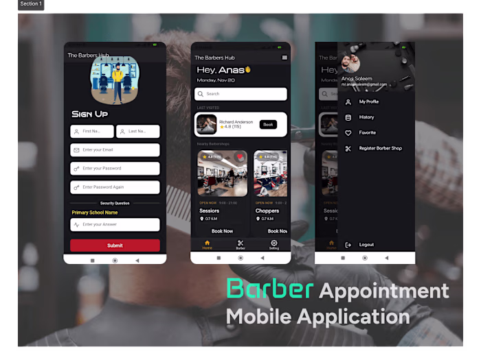
Podcast Mobile App
Anas Saleem
Podcast Mobile App
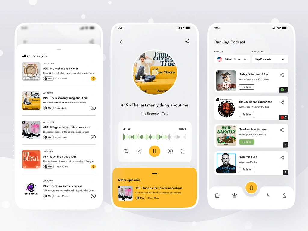
This Podcast Mobile Application design offers a vibrant, user-friendly interface tailored to enhance the podcast listening experience. With a modern aesthetic and intuitive navigation, it allows users to effortlessly discover and enjoy their favorite podcasts.
Homepage: The design highlights trending podcasts with eye-catching visuals 🎧 and an organized layout. Sections like "Top Categories" 🗂️ and "Continue Listening" 🔄 ensure users remain engaged with personalized content. The Search Bar 🔍 and Filter Button 🛠️ at the top make exploring new podcasts seamless and efficient.
Now Playing Screen: A sleek and immersive interface features a striking podcast cover 🌟, a detailed episode summary 📝, and an interactive playback panel ▶️. The inclusion of a waveform visualizer 🎵 creates an engaging audio experience.
The color palette features deep tones complemented by vibrant highlights, ensuring a modern, polished look. Icons are strategically placed for functionality and aesthetics, such as category icons (e.g., 💼 for Business, 🎨 for Design) and action buttons for downloading ⬇️ or sharing 🔗. This design elevates the user experience, combining style, functionality, and accessibility into a professional and captivating mobile app.
Like this project
Posted Jan 1, 2025
A vibrant podcast app with sleek design, intuitive navigation 🎧, personalized content 🔍, and engaging playback features 🎵 for an immersive experience.