The Prasar - Brand Identity

Lakhi Kanta Das
Brand Designer
Logo Designer
Typographer
Adobe Illustrator
Adobe Photoshop

The Prasar Brand Identity Design
Overview:
The Prasar is a development agency for the new age, offering plug-and-play applications that seamlessly integrate into businesses, eliminating hassle and streamlining operations.
Challenge:
The primary challenge was to create a unified brand identity that is both professional and visually appealing, accurately reflecting The Prasar's innovative and client-focused ethos.

Primary Logo
Approach & Process:
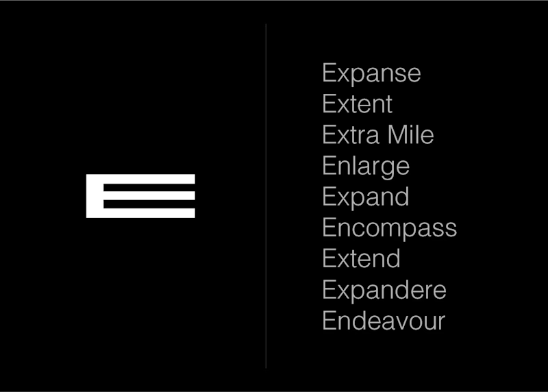
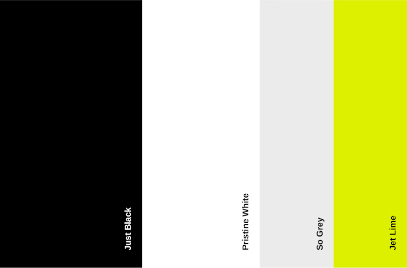
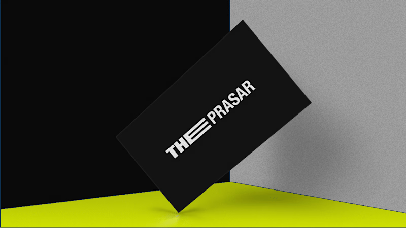
I maintained a collaborative approach, reviewing designs with the client and guiding them to make informed decisions that aligned with their vision. I began the project by focusing on the logo, aiming for a design that was both simple and effective. The letter ‘E’ was chosen as the focal point, symbolizing "Expand," "Extent," and "Extra Mile." This design choice was intended to clearly convey The Prasar's values and ensure readability across all platforms, particularly on mobile devices. The next step involved developing a modern color palette that represented agility and energy, aligning with The Prasar's dynamic and forward-thinking nature.
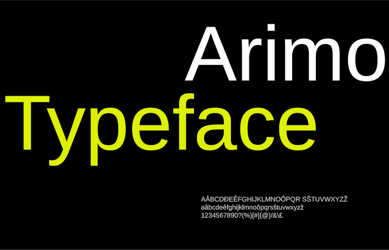
In parallel, I selected Arimo, a sleek sans-serif typeface designed by Steve Matteson, for its legibility and contemporary feel, emphasizing The Prasar's commitment to prompt and efficient services. To further unify the brand identity, patterns and lines were incorporated into the overall design, creating a cohesive visual language. Finally, I compiled a comprehensive style guide to ensure consistent application of the brand identity by staff and developers across all materials and platforms.
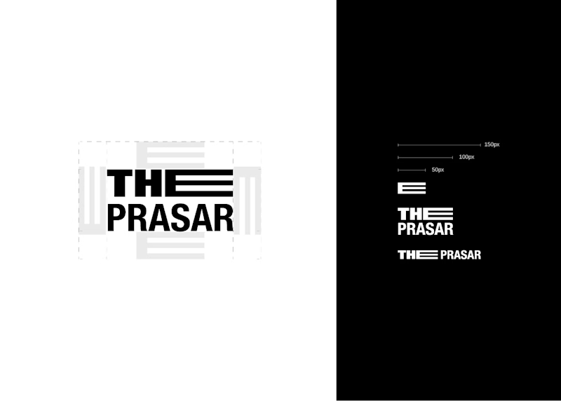
Clearspace & Minimum Size
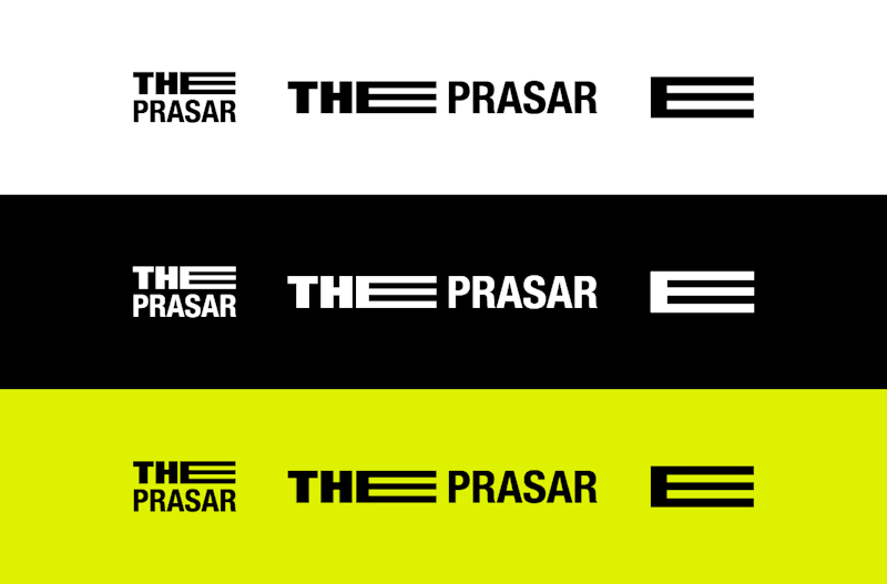
Logo Variations
Color Palette
Typography
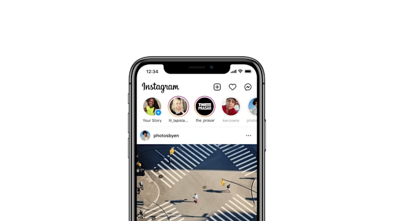


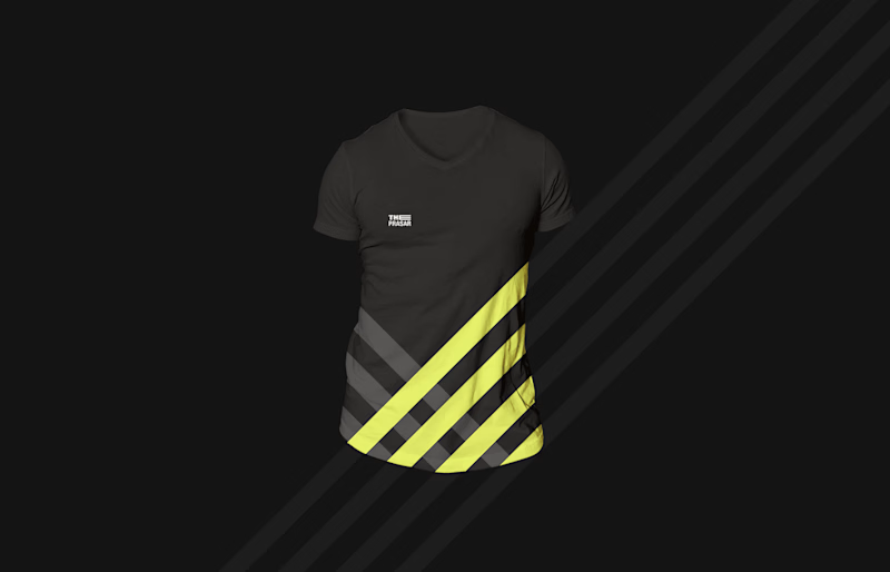
Brand Elements

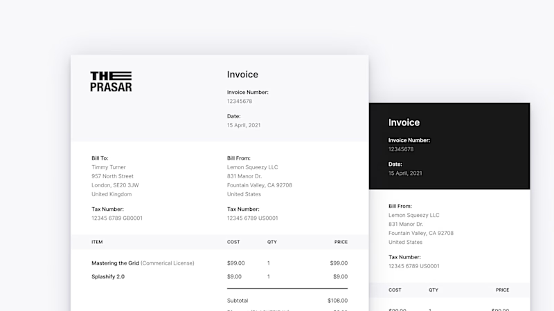
Invoice Template
Outcome:
The new brand identity effectively captures The Prasar's innovative spirit and commitment to excellence, providing a cohesive and professional visual presence that resonates with their audience.
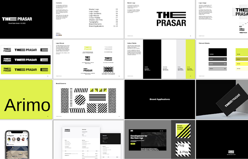
Brand Guidelines


