WalkIt • Website UI & Brand Identity Design

Daniel Adeeri


Overview
At the heart of this project was the goal of creating a brand identity and website design that reflected Walkit's mission and vision. I started by designing a brand identity that was clean, modern, and memorable, creating assets that are both professional and approachable. The logo, colour theory, and other assets are a body of work that represents what the company is about, helping to visually convey the purpose of the product.
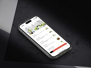
When it came to designing the website, I focused on creating an intuitive, user-friendly experience that would help potential customers learn more about Walkit and its revolutionary product. I used high-quality images and created a video section to showcase the product, and also put accessibility into utmost consideration.
Website: https://walkmobility.com/

About WalkIt
"Walk Innovation Technology". “WalkIt” for short, is a hardware company that builds revolutionary devices designed to help visually impaired individuals navigate the world around them with ease and confidence.

Design
Logo & Its Anatomy

A logo mark and word mark make up the brand logo which is a body of work that represents what the company is about, its mission, and its vision

The logo mark is a combination of two symbols
A - The wifi-like symbol represents the connectivity and smart intelligence of her products
B - The walk stick/white cane (usually used by the visually impaired) symbol represents the inclusion of the visually impaired.

The wordmark is the brand's name
Color & Typography

Color Theory
Purple is a colour that brings up a feeling of trust and reliability. it is also associated with creativity, mindfulness, and inspiration. These qualities align with Walkit being aware of issues faced by the targeted community, thereby creating products that are reliable and trustworthy, most especially a product that “works”
Yellow on the other hand is often associated with positivity, optimism, and warmth. It is a color that symbolizes energy, hope, and happiness, which aligns with Walkit's goal to empower its users to navigate the world with confidence, ease, and a happy place.
Website


Brand Tone of Voice
Walkit’s brand tone is empathetic, empowering, and innovative.
We recognize the daily challenges that visually impaired individuals face in navigating the world around them, and we are committed to providing innovative solutions that empower them to live life to the fullest. With this, we are inclusive and it reflects our commitment to making a positive impact in the lives of visually impaired individuals.
Stationeries, Merch and other brand assets


Thank you for viewing.
In general, I feel a great sense of pride in the results achieved with the Walkit project. I firmly believe that the combination of the new brand identity and website design will enable Walkit to have an even more significant influence in the field of assistive technology.