Scribely AI Landing Page Design
Nikk Badlani
Scribely is an AI-powered writing assistant designed to help people write clearly, confidently, and effortlessly — wherever they type.
The goal of this project was to design a landing page that feels:
Calm, not overwhelming
Powerful, but invisible
Helpful without breaking the user’s flow
This wasn’t about flashy AI visuals. It was about trust, clarity, and everyday usability.
The Problem
Most AI writing tools:
Interrupt your workflow
Force you into separate editors
Feel robotic or over-engineered
Change your natural writing style
Writing should feel natural — not like operating software.
The Solution
Scribely works in the background, offering smart suggestions without pulling users out of what they’re doing.
The product is positioned as:
“The only AI writing tool you’ll ever need — everywhere you type.”
Key principles behind the solution:
Zero friction
Context-aware suggestions
Minimal UI
Focus on real-world writing, not demos
Make AI feel invisible but powerful
Balance dark & light sections for visual rhythm
Keep the interface distraction-free
Build trust through clarity, not hype
Every section was designed to answer one question: “How does this make writing easier in my daily life?”
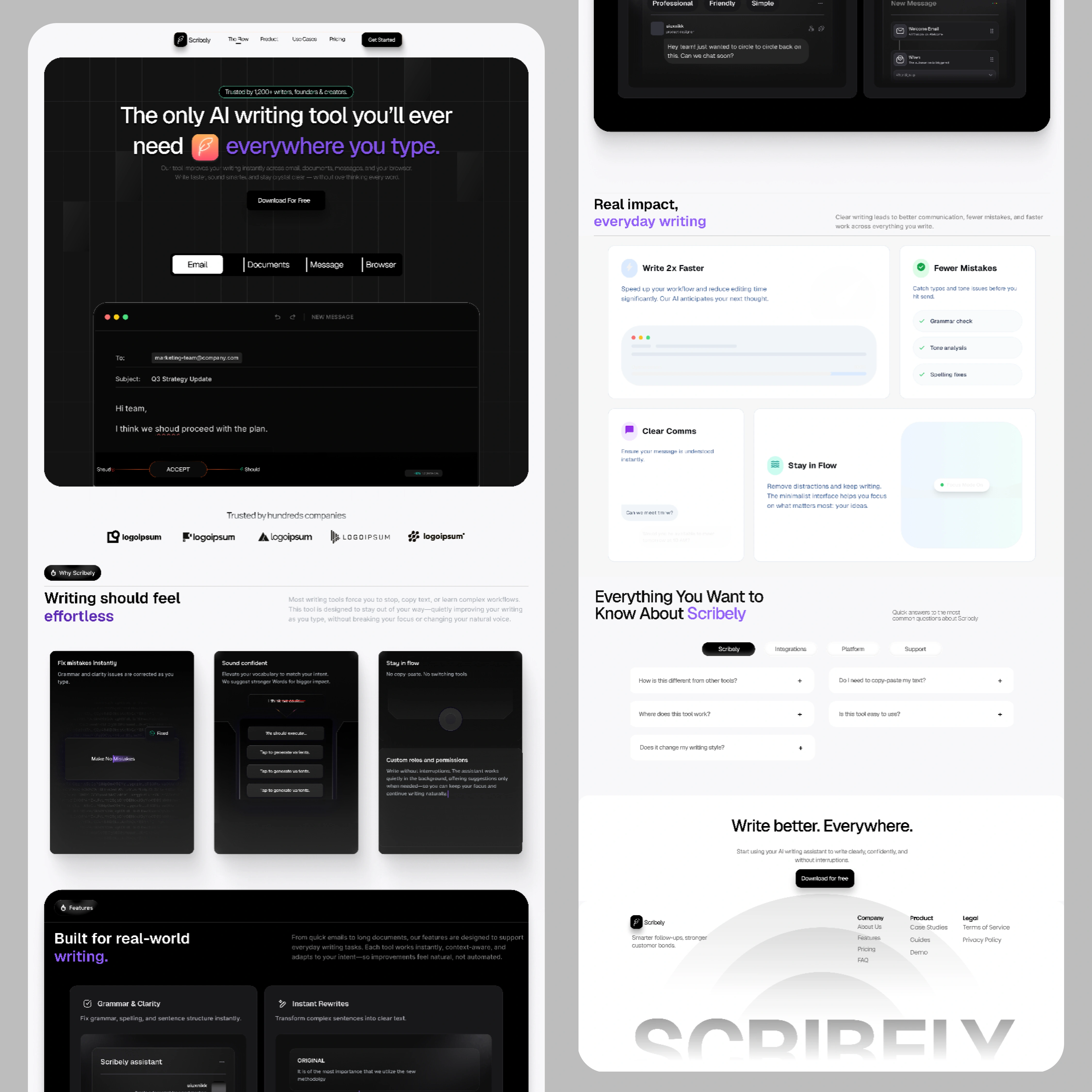
Key Sections & UX Decisions
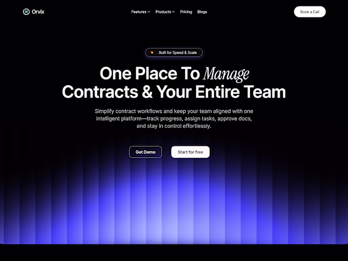
Hero Section
Clear value proposition in one line
Emphasis on “everywhere you type”
Product shown inside a real email context
Single primary CTA to reduce decision fatigue
Writing Should Feel Effortless
Focused on emotional reassurance:
No learning curve
No workflow changes
No copy-paste behavior
Each card highlights a single benefit, not a feature dump.
Built for Real-World Writing
Instead of listing AI buzzwords, this section shows:
Grammar & clarity fixes
Instant rewrites
Tone adjustment
Smart templates
Everything is framed around outcomes, not technology.
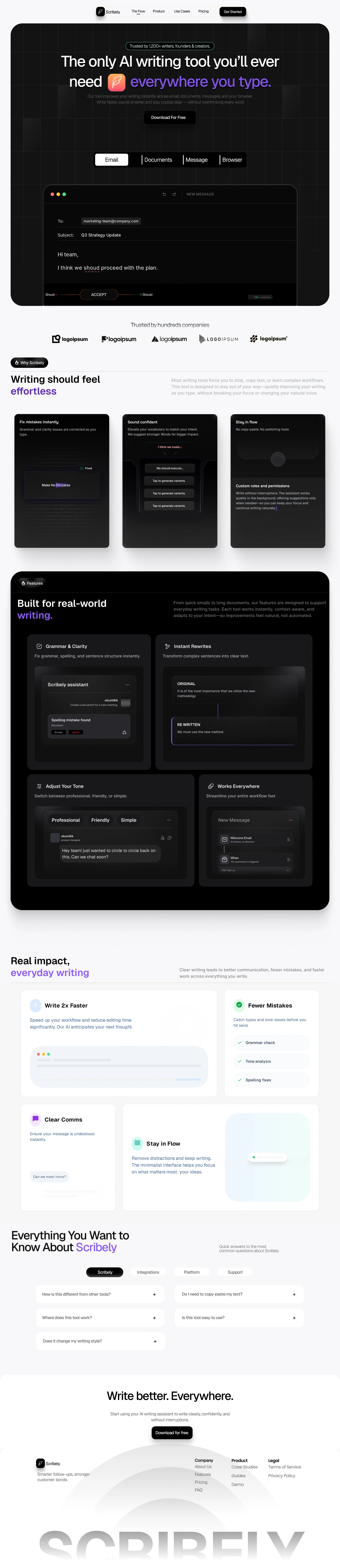
Real Impact, Everyday Writing
This section reinforces value with simple, scannable benefits:
Write 2× faster
Fewer mistakes
Clear communication
Stay in flow
The design uses lighter surfaces to visually signal “ease” and relief.
FAQ Section
Designed to remove hesitation:
No copy-paste required
Doesn’t change your writing voice
Works across platforms
Simple to start
This builds confidence before the final CTA.
Visual Style
Dark UI for focus & depth
Soft gradients for emphasis
Minimal color accents for hierarchy
Rounded surfaces for approachability
Typography and spacing were intentionally restrained to let content breathe.
Final CTA
“Write better. Everywhere.”
The CTA closes the loop by reinforcing the core promise — not discounts, not pressure.
This project demonstrates:
SaaS landing page storytelling
Strong UX writing hierarchy
Clean visual systems
Product-first thinking
It’s designed to feel ready to ship, not just concept art.
Tools Used
Figma
Custom grid & spacing system
UX writing framework
Scribely represents how I approach modern product design: clarity over complexity, experience over noise.
If you’re building a SaaS product and care about how users feel — this is the level I aim to deliver.
Like this project
Posted Dec 29, 2025
High-converting landing page for an AI writing tool. Designed to communicate product value fast, reduce bounce, and drive free trial signups through clear hierarchy and purposeful motion.
Likes
0
Views
5