Conceptual Chatbot Management App
Simple Design and Navigation:
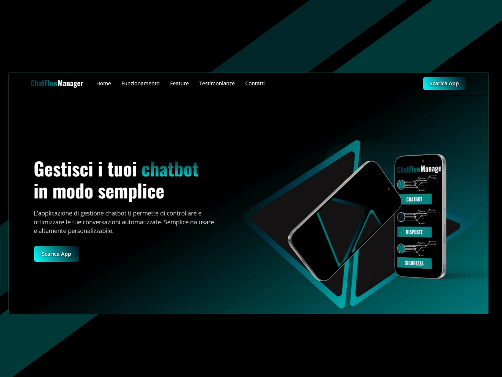
For this project, I chose a single-page design to emphasize clarity and direct accessibility, providing a modern user experience that highlights the core features without distractions. The single-page format is ideal for presenting the chatbot management app concept concisely, focusing on its innovative functionality and demonstrating design potential in a clear, concentrated space.
Utilization of the Client First Framework:
The site was built using the Client First Framework, ensuring a cohesive design and high-quality standards. This framework promotes a clear structure and easy maintenance, allowing precise and purposeful placement of each element to reflect impeccable attention to detail.
AI-Generated Images and Mockups:
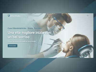
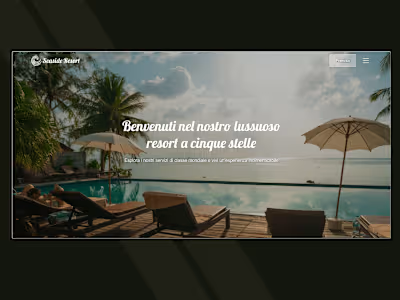
Some images were generated using artificial intelligence to showcase cutting-edge technologies in web design, while mockups were created using Figma and Canva. This combination of tools ensures unique, custom visuals tailored to the app's innovative features.
Fonts:
For headings, I selected Oswald 700 Bold to deliver strong, modern headings that draw attention to key sections, while the body text employs Open Sans 400 Normal for clean, readable content. Both fonts convey a sense of sophistication and accessibility, aligning with the app's innovative and tech-forward nature.
Colors:
The color palette includes:
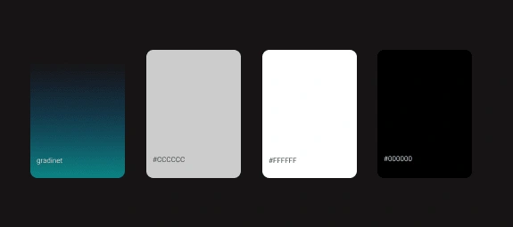
This modern selection creates a sleek, high-contrast aesthetic that emphasizes the app's innovative features and provides a professional, tech-savvy user experience.

Like this project
Posted May 6, 2024
Responsive, single-page chatbot management app concept built with the Client First Framework. Features AI-generated images and Figma&Canva mockups.


