Built with Kajabi
Premium Kajabi Course Portal Experience Design
Stephen Kolawole
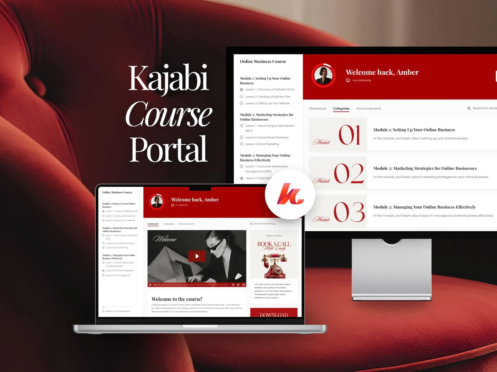
Premium Kajabi Course Portal Experience Design
Overview
Online courses often rely on Kajabi's default layouts — functional, but visually generic and lacking brand authority.
This project focused on transforming a standard course portal into a refined, premium digital learning environment designed to increase student engagement, usability, and perceived program value.
The goal was to create an experience that feels intentional, structured, and high-end across both desktop and mobile.
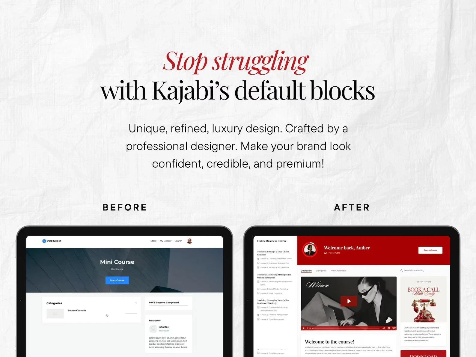
The Challenge
Most Kajabi portals suffer from:
Template-driven layouts
Weak visual hierarchy
Poor lesson navigation clarity
Low perceived value for premium programs
Inconsistent mobile experience
The challenge was to redesign the portal while working within Kajabi's platform constraints — creating a custom feel without breaking usability.
Design Approach
The redesign focused on three core principles:
Premium Visual Positioning Using controlled typography, refined color contrast, and generous spacing to create a luxury brand feel.
Student Momentum Flow Designing the dashboard and lesson structure to guide users naturally from welcome → modules → lesson completion.
Frictionless Navigation Simplifying module discovery, sidebar hierarchy, and lesson access to reduce confusion and increase engagement.
Visual Direction
The visual system combines:
Bold structured layouts for clarity
Elegant serif typography for authority
Strong red accent palette for brand presence
Clean neutral backgrounds for readability
This balance creates a learning interface that feels both editorial and functional.
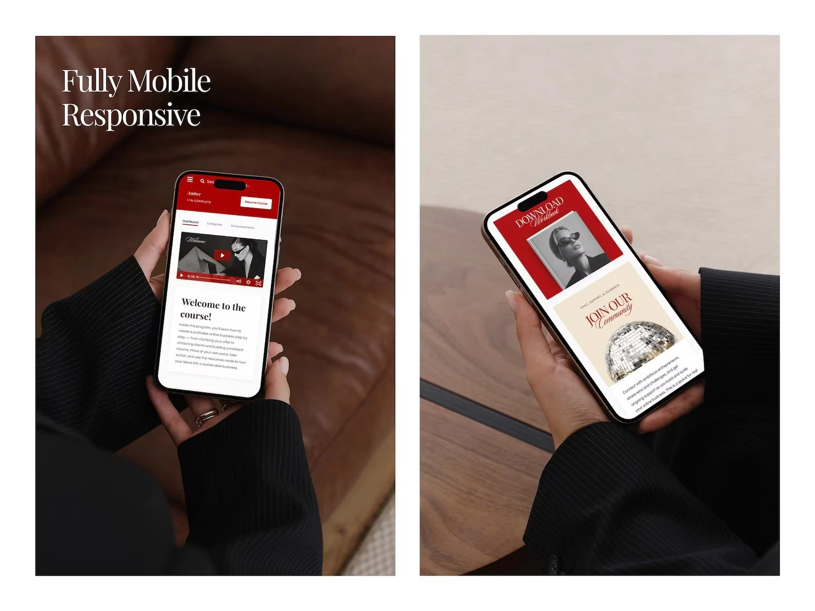
Mobile Experience
Since many students access courses on mobile, the portal was designed mobile-first.
The layout ensures:
Clear lesson visibility
Easy tap navigation
Strong CTA readability
Consistent hierarchy across screen sizes
Results & Impact
The redesigned course portal transformed a default Kajabi layout into a polished, branded learning environment. The final experience delivered:
A premium visual identity that elevated perceived program value
Clearer lesson flow and module navigation, reducing friction for students
A mobile-first layout ensuring consistent usability across devices
Stronger brand positioning through editorial typography and intentional color hierarchy
A scalable portal structure ready to support additional courses and content without redesign
The portal moved from looking like a template to feeling like a custom-built product, giving the brand a competitive edge in how students experience and perceive the program.
Like this project
Posted Feb 16, 2026
Structured for clear lesson flow, seamless navigation, and strong brand positioning—combining clean UI and bold hierarchy to boost engagement and completion.
Likes
2
Views
19