Built with Kajabi
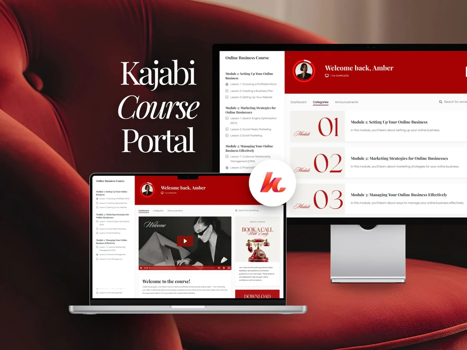
Custom Kajabi Course Portal Redesign

Stephen Kolawole


The problem
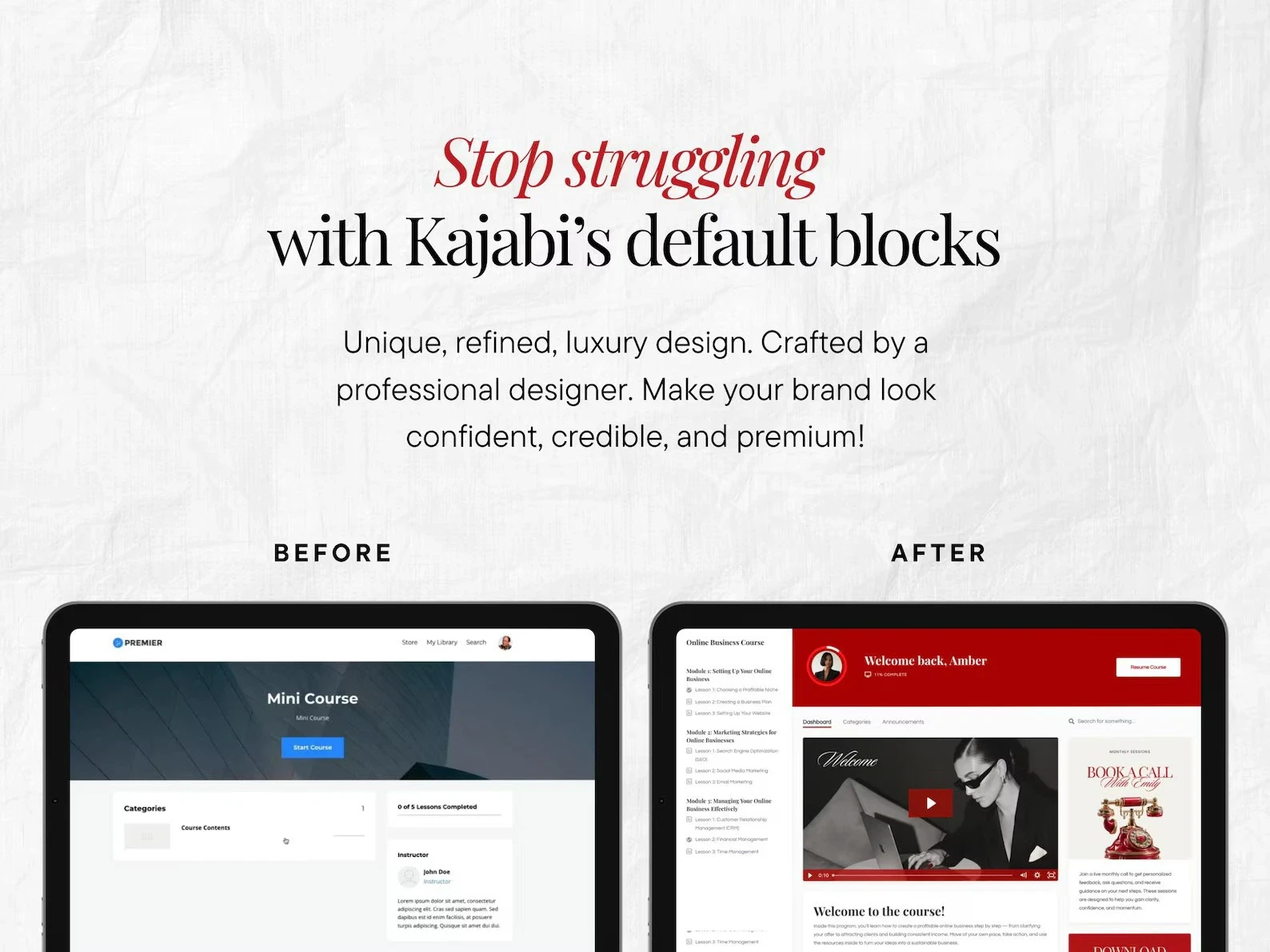
Most Kajabi course portals look like Kajabi: generic layouts, weak hierarchy and confusing lesson navigation. For a premium program, that quietly lowers how much students think it's worth.
What I designed
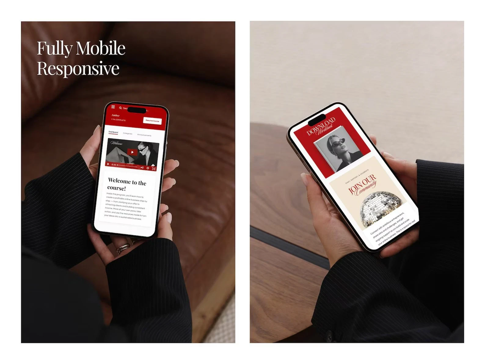
A branded dashboard that guides students from welcome → modules → lesson completion
Simpler module discovery and sidebar hierarchy so students always know what's next
Editorial serif typography, a bold red accent and clean neutrals for a premium feel
A mobile-first layout, because most students learn on their phones
All within Kajabi's platform constraints, with no hacks that break on updates
The result
A portal that feels custom-built instead of templated
Clearer lesson flow and less student confusion
A scalable structure ready for new courses without a redesign
Charging premium prices for a course that lives in a default portal? Message me for a portal refresh.
Like this project
Posted Feb 16, 2026
Redesigned a default Kajabi course portal into a premium, mobile-first learning experience that raises perceived program value.
Likes
2
Views
40