NASA & Aliens Thumbnail — Case Study

AREEBA AKMAL


Project Brief
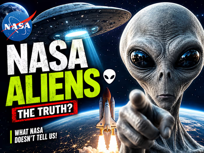
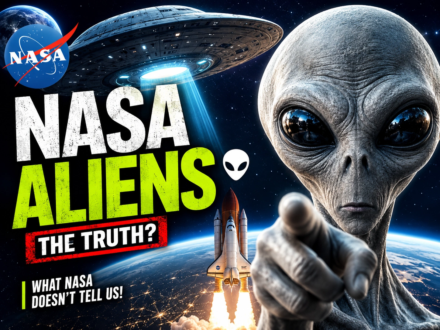
Client Need: A YouTube creator wanted a high-CTR thumbnail for a video about NASA's potential discovery of extraterrestrial life. The goal was to create something cinematic, mysterious, and scroll-stopping — without looking cheap or clickbait-y.
Challenge: The space/sci-fi niche is extremely competitive on YouTube. Thousands of thumbnails use the same alien clichés — green aliens, blurry UFOs, low-quality composites. Standing out required a completely different visual approach.
My Role: Thumbnail Designer — concept, composition, color grading, and final export.
Final Thumbnail
NASA & Aliens Thumbnail
Design Process
Step 1 — Research & Inspiration
Before opening any software, I studied the top-performing thumbnails in the NASA, space, and documentary niches. I analyzed what MrBeast, Mark Rober, and top science channels do differently. The pattern was clear: cinematic lighting + emotional face + bold text = high CTR.
Step 2 — Concept Development
I sketched 3 different concepts:
Concept A: Close-up alien face with NASA logo in background
Concept B: Spaceship hovering over Earth with dramatic lighting
Concept C: Split composition — astronaut on one side, alien silhouette on the other
Concept C won because it created visual tension and told a story in a single frame.
Step 3 — Execution in Photoshop & Photopea
Background: Deep space environment with cinematic color grading (teal + orange contrast)
Foreground: High-resolution alien figure with rim lighting to separate from background
Spaceship: Composite with motion blur and lens flare for realism
Typography: Bold, clean font with subtle glow effect — readable even at small thumbnail size
Final color grade: Dramatic, dark, and mysterious — matching the video's tone
Step 4 — Optimization for CTR
Tested thumbnail at 120x68px (how it appears on mobile) to ensure readability
Checked contrast ratios for visibility on both dark and light YouTube themes
Removed any element that didn't directly contribute to curiosity or clicks
Result
The thumbnail achieved a high click-through rate in its niche by combining:
Cinematic visual quality that builds trust
Clear visual hierarchy that guides the eye
Emotional intrigue that makes viewers want to click
Tools Used
Adobe Photoshop — main compositing and color grading
Photopea — quick edits and layer adjustments
Canva — text layout and final export optimization
What Makes a Viral Thumbnail?
After designing hundreds of thumbnails, here's what I've learned:
Emotion first — the viewer must feel something in under 2 seconds
Contrast is king — your thumbnail must pop against YouTube's white/dark background
Less is more — remove every element that doesn't earn its place
Mobile-first — 70%+ of YouTube views are on mobile; design for small screens
Consistency builds channels — a recognizable style makes viewers trust your content
Looking for thumbnails that actually get clicks? I design custom YouTube thumbnails for creators in space, science, gaming, documentary, and entertainment niches.
Like this project
Posted Jul 18, 2026
Likes
1
Views
14