Cherry Fizz Springs Case Study
Shawn Meekins
Case Study:
Cherry Fizz Springs
The Concept
Not every great project starts with a client brief. Cherry Fizz Springs began as a self-initiated brand concept — a creative challenge to design a complete beverage identity from label to lifestyle, using only the tools already in the workflow.
The goal was simple: build something that looks like it belongs on a shelf next to nationally distributed brands. No shortcuts. Just intentional design decisions from the first mark to the final ad.
The Design Challenge
Beverage packaging is one of the most competitive design environments that exists. A can has roughly two seconds to communicate flavor, personality, and trust — simultaneously, at small scale, from across a refrigerated aisle.
The design had to answer three questions instantly:
What flavor is it?
Who is this brand for?
Why should I pick this one?
The Design Decisions
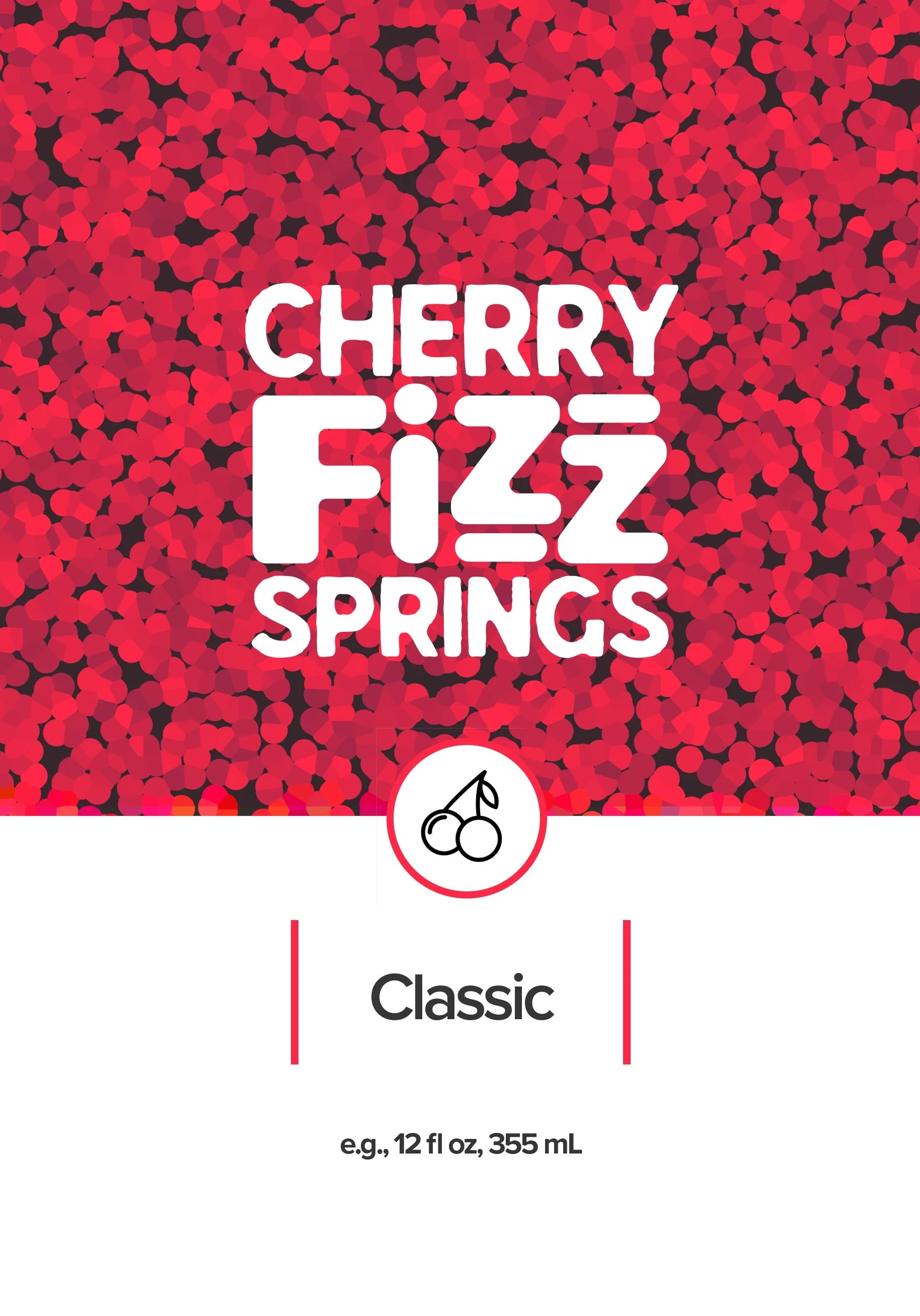
The Cherry Texture Pattern
The background pattern is built entirely from abstract cherry shapes — dense, layered, and rich in color. No photography. No illustration of a single fruit. The texture is the flavor communication. A consumer doesn't need to read the word "cherry" to know what this tastes like — they feel it before they read it.
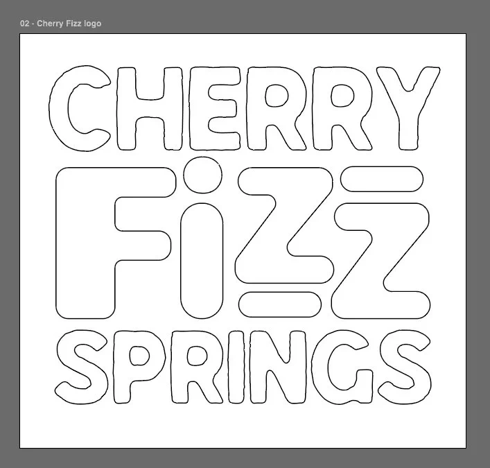
The FiZZ Typography
The wordmark leads with bold, rounded letterforms that feel energetic and approachable — right for a sparkling beverage. The double-Z with the horizontal bar treatment is the brand's signature detail — a small typographic decision that makes the name instantly distinctive and ownable across every touchpoint.
The Cherry Fizz Springs wordmark pairs two typefaces intentionally — Laiyah MDS, a custom-designed geometric sans by Shawn Meekins, brings expressive energy to "FiZZ" — the product's defining characteristic. LL Hayloft anchors the brand name with clean authority. Two fonts. One voice.
Two-Section Label System
The label is divided into two clear zones — a texture-rich upper section that carries the brand name and flavor identity, and a clean white lower section that handles product information with calm clarity. The cherry icon mark at the dividing line serves as the visual bridge between the two. This system creates hierarchy without clutter and scales cleanly across flavor variants.
The Icon Mark
A simple cherry illustration enclosed in a circle — clean enough to work at small scale, distinctive enough to function as a standalone brand symbol. Designed to sit at the label's midpoint as both a divider and a brand signature.
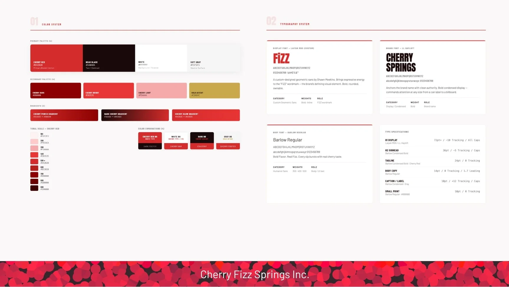
Color System
Deep cherry red anchored by near-black shadow tones in the texture — rich and premium without feeling heavy. The clean white lower section prevents the label from becoming visually overwhelming and gives the eye a place to rest. Red accent bars flanking "Classic" add a subtle brand color echo in the information zone.
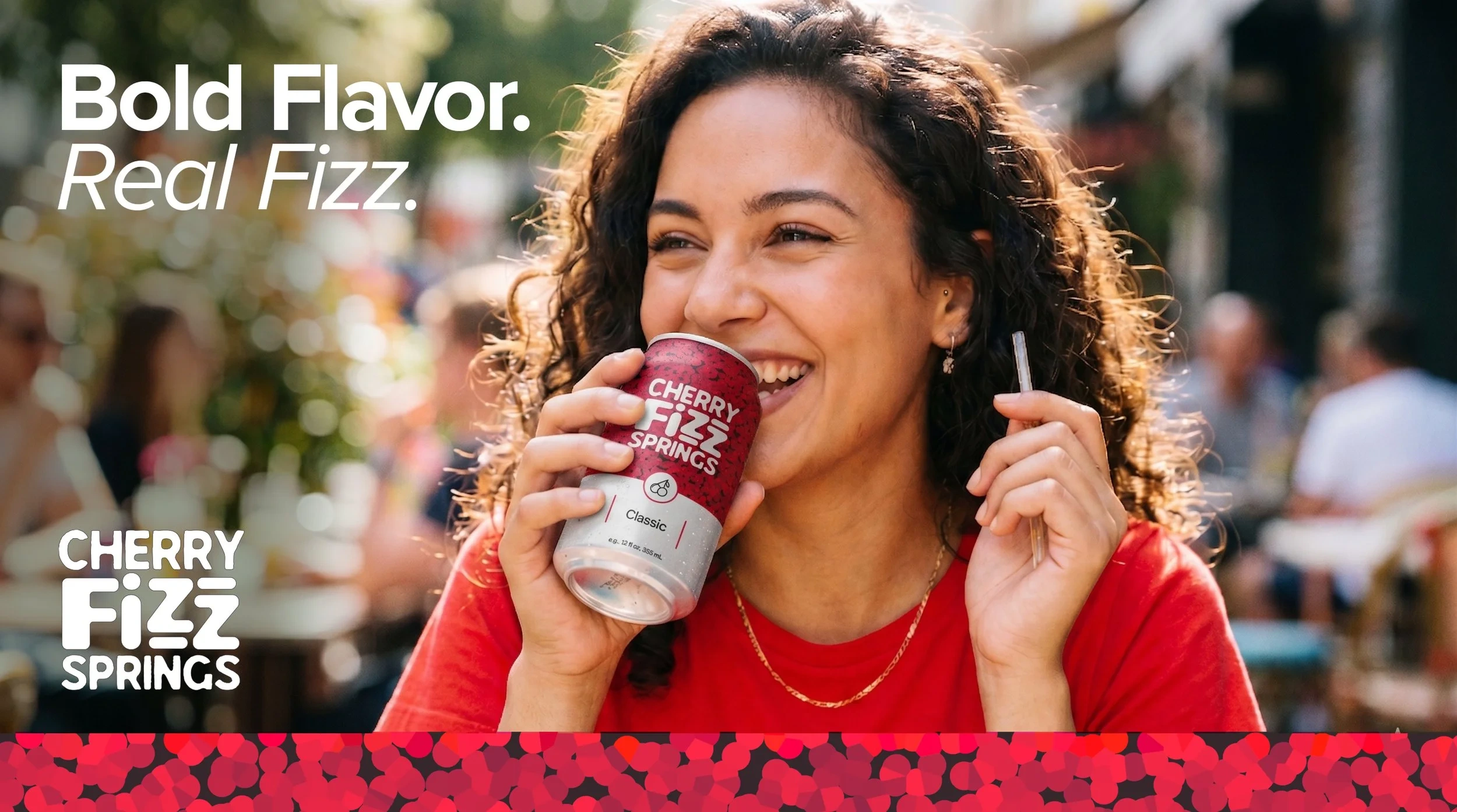
From Label to Life
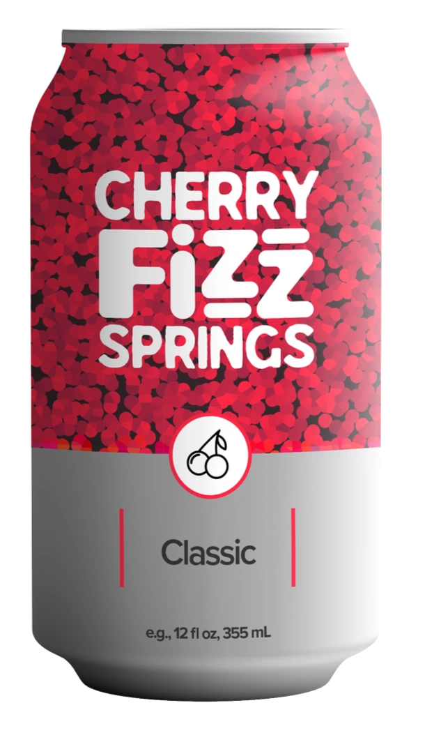
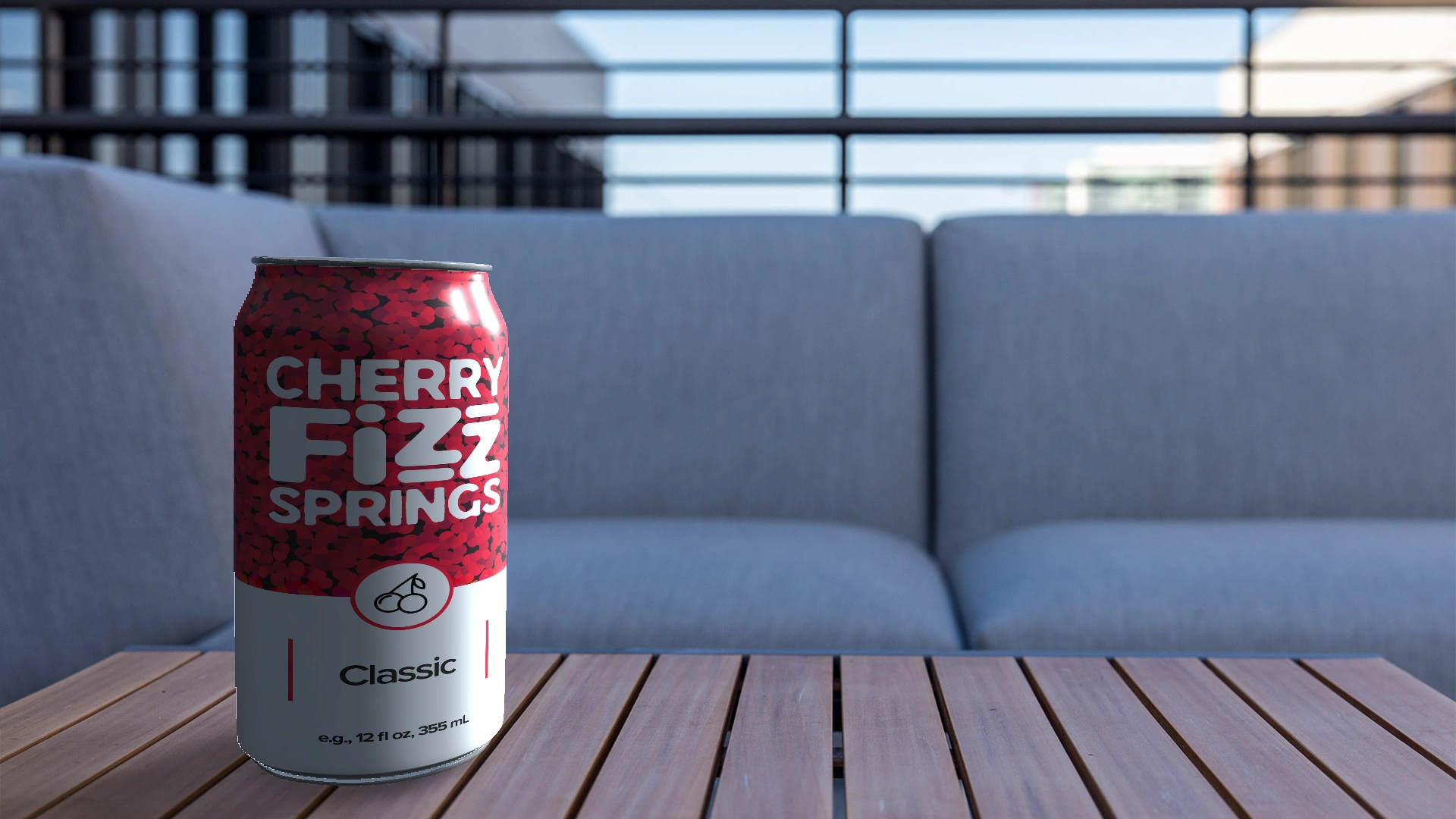
The Can Mockup
The flat label design applied to a 3D can render — the first real test of whether a label design actually works. Wrapping a 2D design around a cylinder changes everything: scale, curvature, light, and legibility all shift. The Cherry Fizz Springs label holds up at every angle.
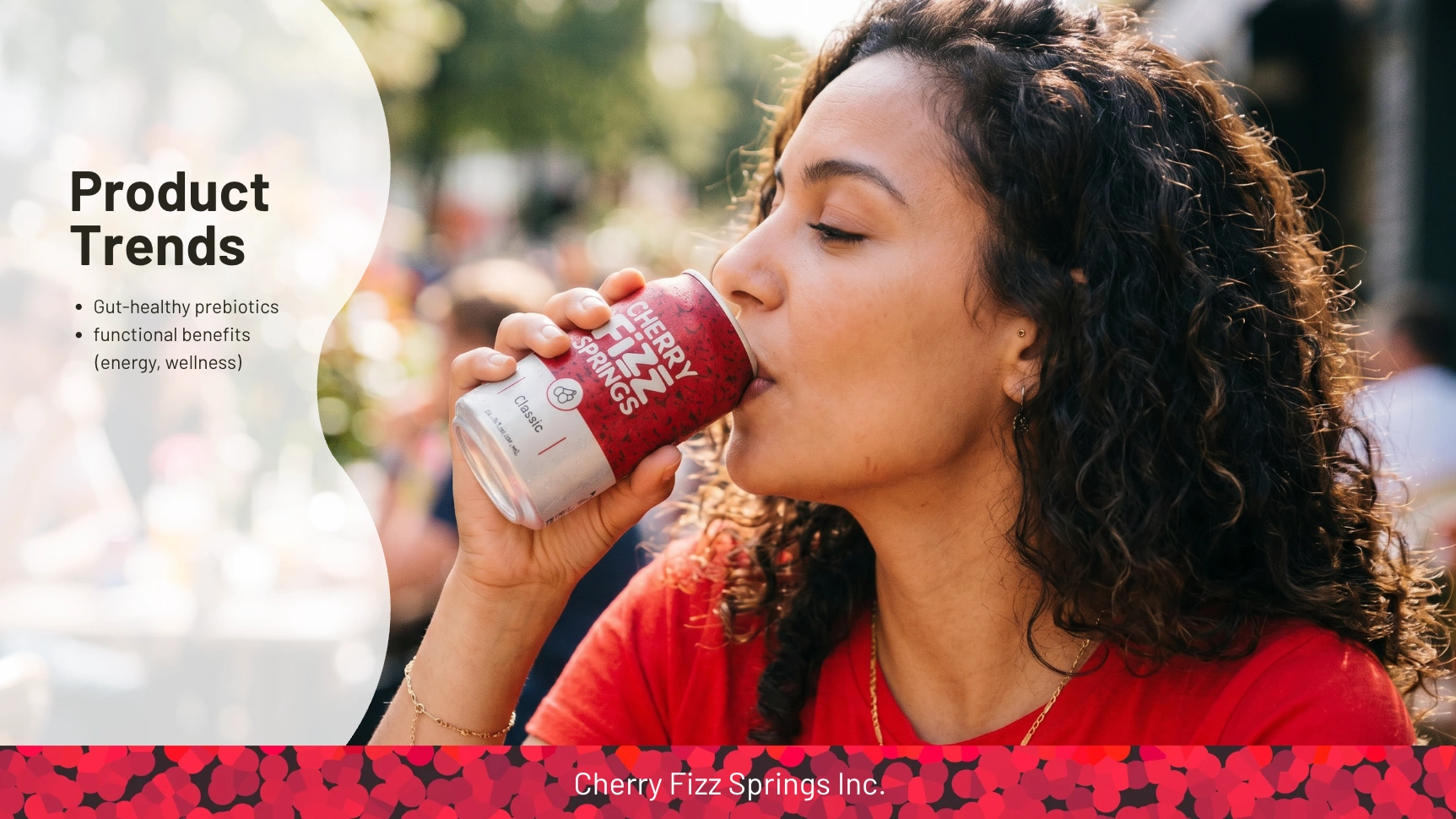
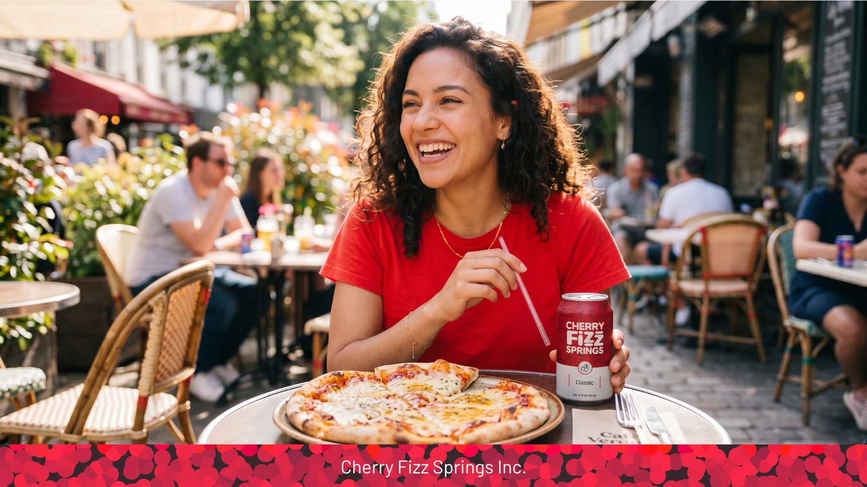
The Lifestyle Ad
A product only becomes a brand when it exists in the world — in someone's hand, at a table, in a moment. The lifestyle ad was created using Google Gemini and Artlist, placing the Cherry Fizz Springs can in a real-world outdoor setting. The result: a campaign-ready visual that makes the product feel like it's already on shelves.
This is what takes a packaging project from a design exercise to a brand launch.
Tools & Process
Deliverable Tool Label design: Adobe Photoshop
Can mockup: unblast.com 3D product render and Adobe Photoshop
Lifestyle ad: Google Gemini and Artlist
This project was also a deliberate exploration of AI tool integration in a professional design workflow — using Gemini not as a replacement for design thinking, but as a production accelerator for lifestyle content that would otherwise require a full photo shoot.
What This Project Demonstrates
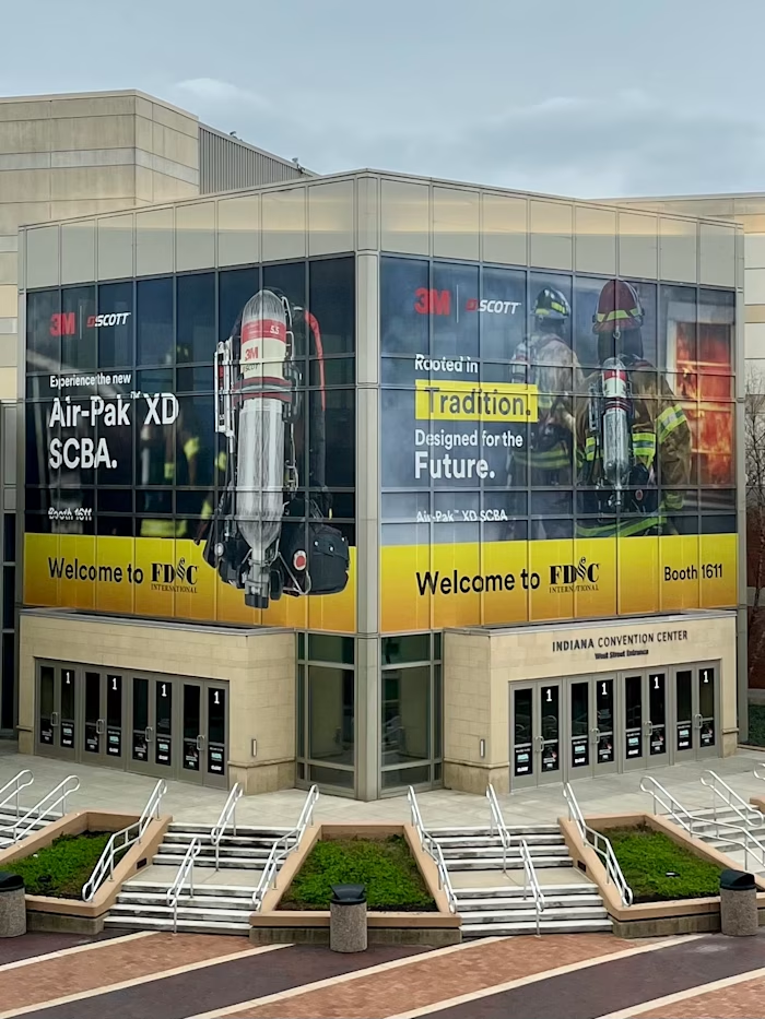
Consumer packaged goods design requires a different discipline than corporate branding — it's faster, more visceral, and less forgiving. Cherry Fizz Springs was built to prove range: that the same designer who can execute a Fortune 500 brand system for 3M Scott can also build a consumer brand identity from scratch with the same level of craft and intention.
From pattern design to typography to mockup to lifestyle advertising — this is a complete brand pipeline in three deliverables.
Adobe Dimension Render
Cherry Fizz Springs · 3D Product Render · Adobe Dimension
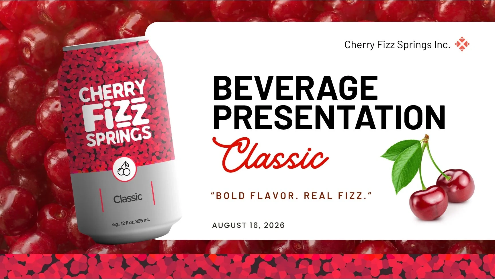
Canva Presentation Design
Cherry Fizz Springs · Canva · Beverage Pitch Presentation
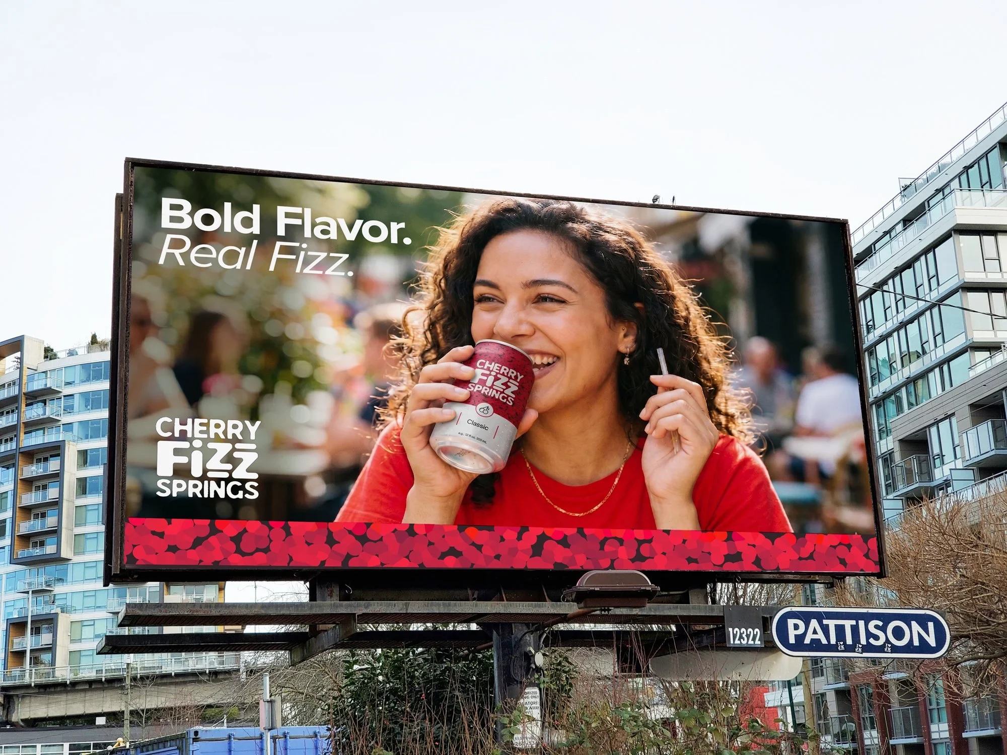
Billboard Mockup — Pattison outdoor
Cherry Fizz Springs · Outdoor Billboard Mockup · Adobe Photoshop Billboard template photo by Gennifer Miller / Unsplash
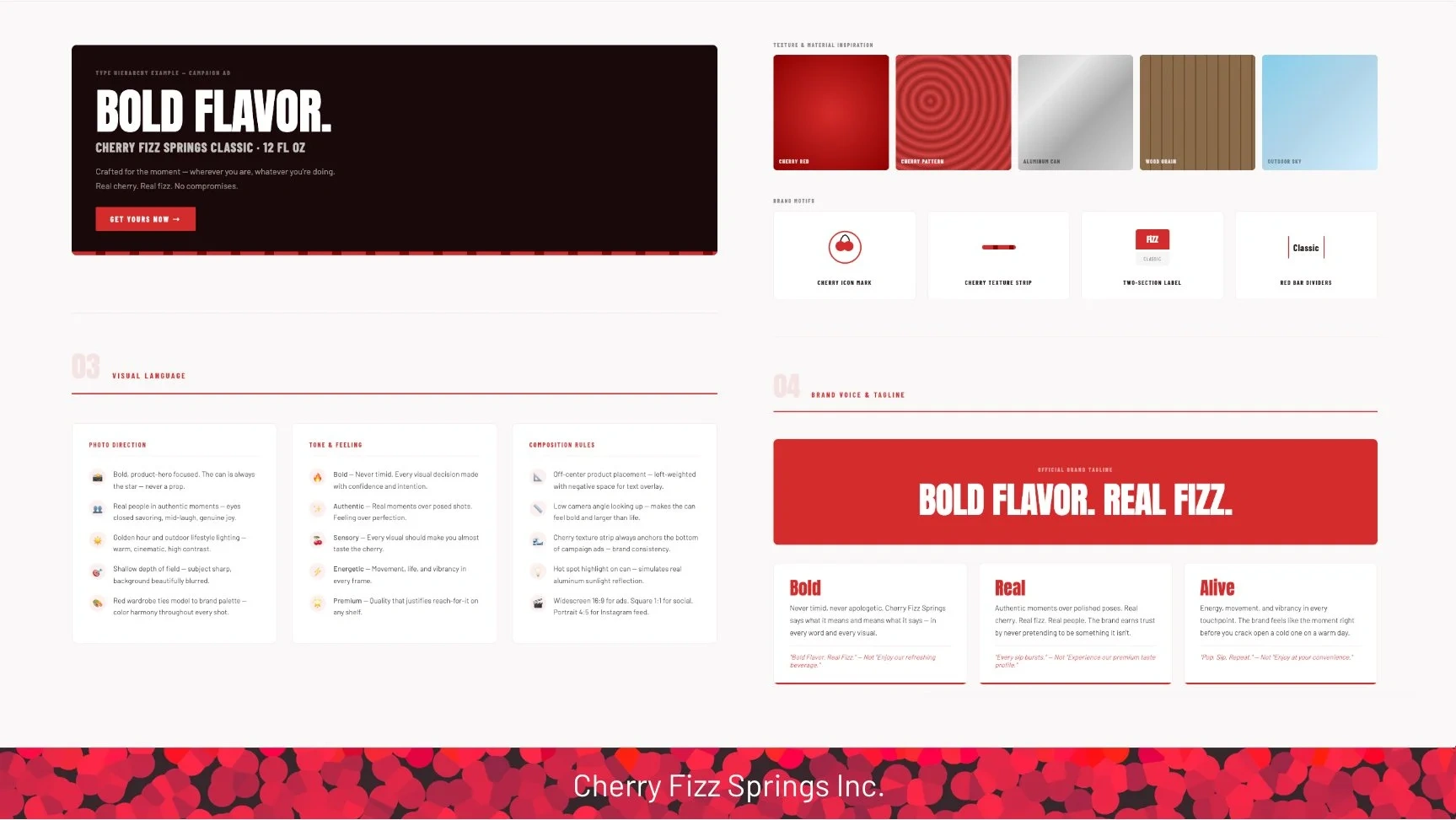
Official Brand Tagline
BOLD FLAVOR. REAL FIZZ.
Brand Voice & Tagline
Bold
Never timid, never apologetic. Cherry Fizz Springs says what it means and means what it says — in every word and every visual.
_"Bold Flavor. Real Fizz." — Not "Enjoy our refreshing beverage."
Real
Authentic moments over polished poses. Real cherry. Real fizz. Real people. The brand earns trust by never pretending to be something it isn't.
_"Every sip bursts." — Not "Experience our premium taste profile."
Alive
Energy, movement, and vibrancy in every touchpoint. The brand feels like the moment right before you crack open a cold one on a warm day.
_"Pop. Sip. Repeat." — Not "Enjoy at your convenience."
Like this project
Posted May 13, 2026
Created a brand identity for Cherry Fizz Springs, showcasing design from concept to execution.
Likes
0
Views
0