Built with Framer
Framer build for a facial salon
Alex Nicolai
Client Introduction and Project Overview
Ksenia salon approached me through a referral about building out a simple site for showcasing her services and photos of the salon. This was a newly launched business so she didn't have a website. I had a chance to introduce a fresh design for her facial salon business.
Research and Exploration
Before designing anything, I explored other salon sites to see what was out there in terms of visuals. I noticed a few common things like the use of photography, a soft color palette and simplistic designs. She also shared with me a few sites she admired. Using the information I gathered in this exploration phase, I was ready to begin designing a mock draft.
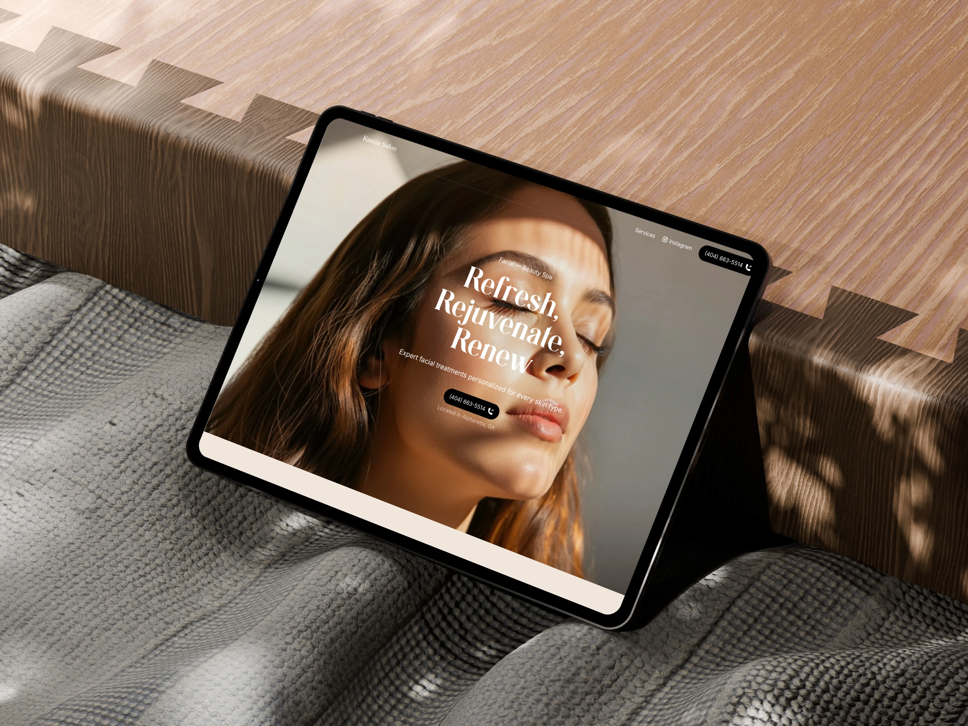
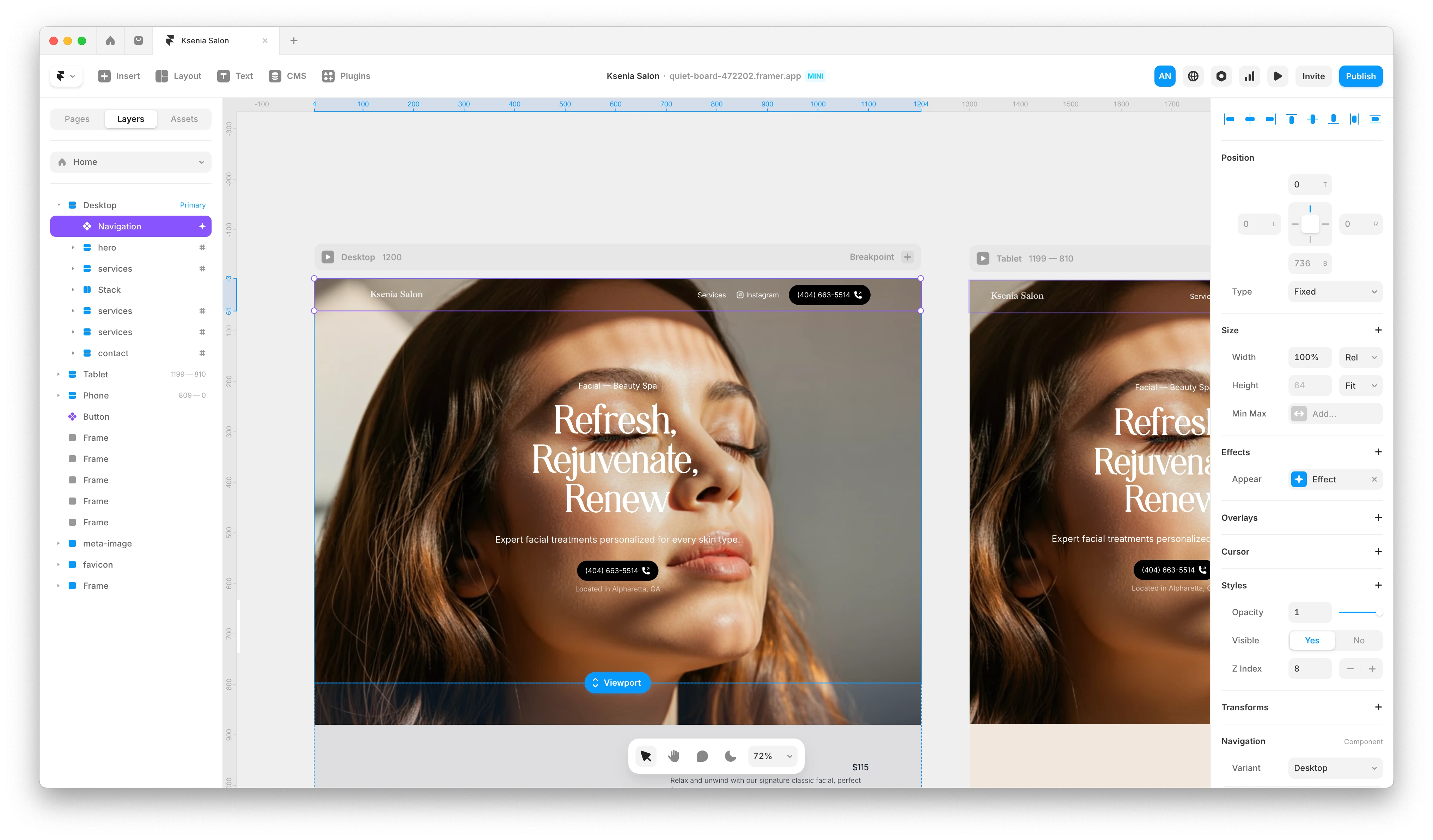
Start with the Hero Section
I started with the hero section. Sometimes having a strong, well defined hero section helps me identify the visual direction for the rest of the site. I spent time designing what a hero section might look like. Trying out a variety of layouts but finally landing on a centered focused layout. Since she was starting out, she didn't have much photography to use. At this point, I was designing directly in Framer.
Photography with AI
I used Visual Electric to generate a few photographs of faces to use as the main hero photo. I was surprised at how well VE did. It took 2 prompts to get the image I was looking for.
Visual Electric
Page Design and Aesthetic
After carving out the hero section, the rest of the page naturally flowed. Clear headers, pricing columns, a CTA, footer. Minimal design to inspire a calming aesthetic. I used earthy tones to create a sense of calm you'd expect at a facial salon and spa.
Client Feedback
The client was happy with the results. She had a couple of minor tweaks regarding the gallery section.
Like this project
Posted May 15, 2025
Used Visual Electric to generate AI photography for a simple, beautiful Framer site for a facial salon small business.
Likes
2
Views
36
Timeline
Apr 22, 2025 - Apr 25, 2025