Color Grading Case Study with DaVinci Resolve
FLIPSIDE
This is a brief breakdown of my color grading process. From ingesting footage to final color output.
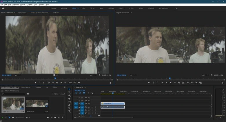
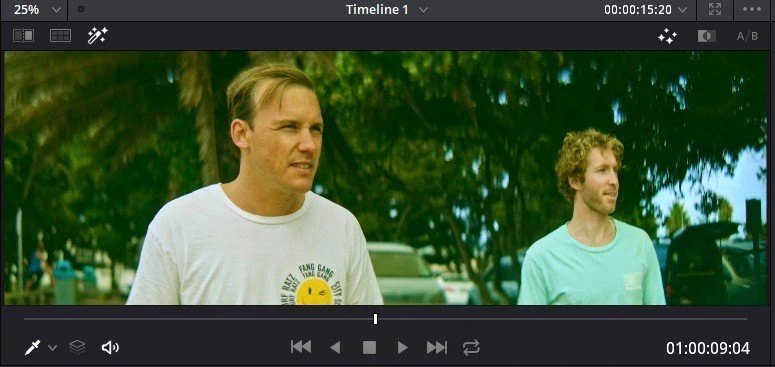
The footage was taken with Sony Slog2 which means it had quite a flat picture profile. These flat looking footage is often referred to as 'Digital Negatives'
Now the footage doesn't look so squeezed does it? The video was taken with a 2X anamorphic projection lens which meant that it had to be de-squeezed and cropped in post to fit the standard widescreen formats.
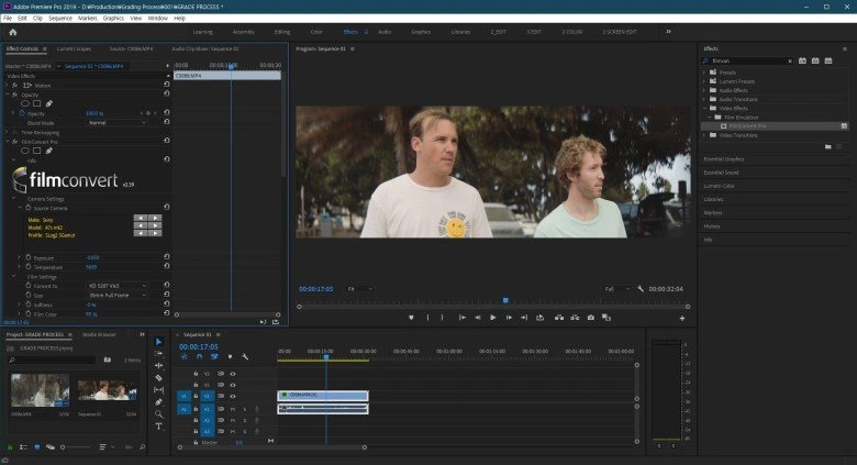
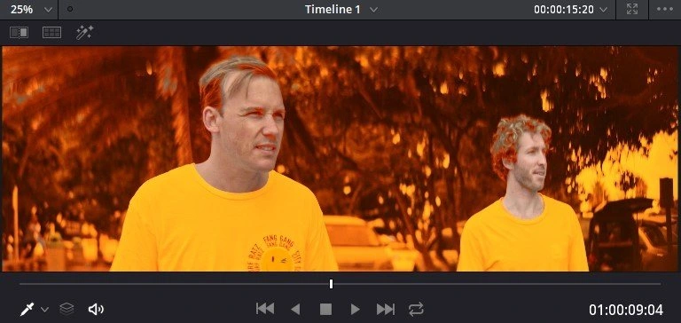
To move quickly away from the flat look, I use a LUT, in this case a plugin called filmconvert. Filmconvert is unique from other LUTs because they use different camera sensors and log profiles to match the desired color profile.
Back in the Davinci Color mode after applying filmconvert.
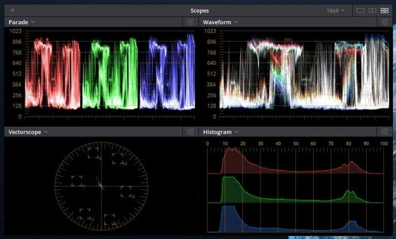
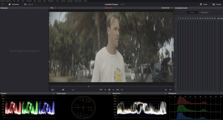
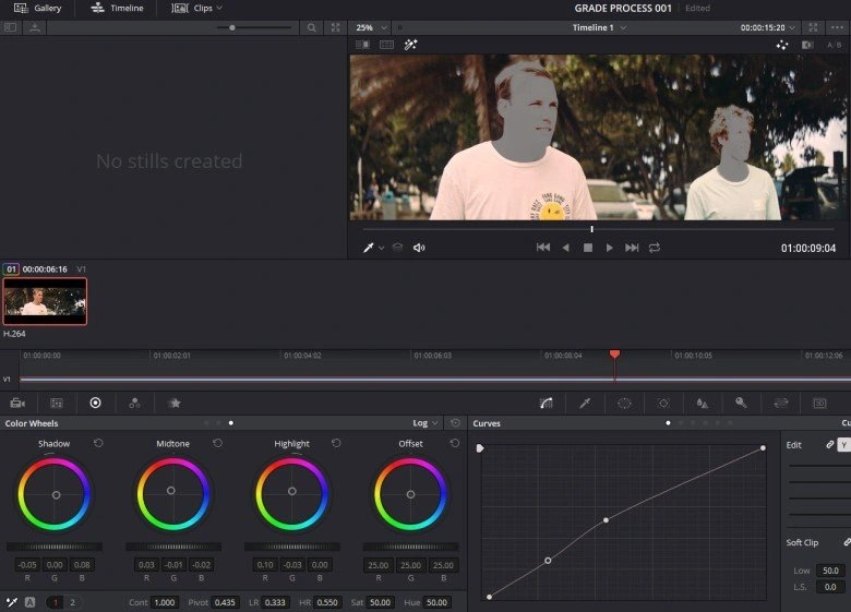
Davinci window with various scopes. It's imperative for me to refer to scopes as I adjust anything to do with the image. If you even have a rough idea of what all these graphs mean, you will make very good use of them as you work.
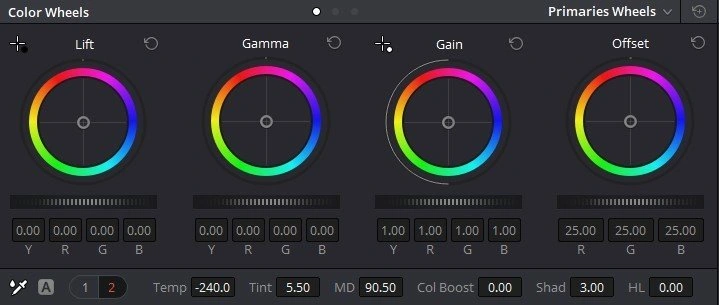
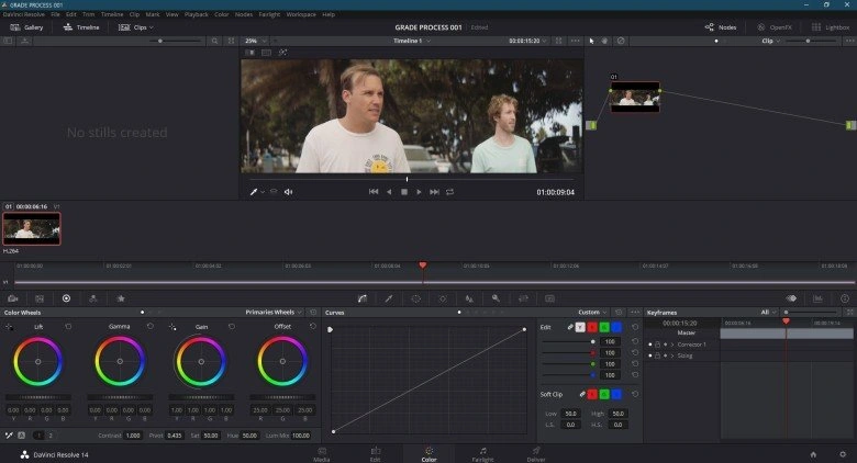
Color wheels and adjustment parameters. I usually adjust global parameters first and then go into more specific ones.
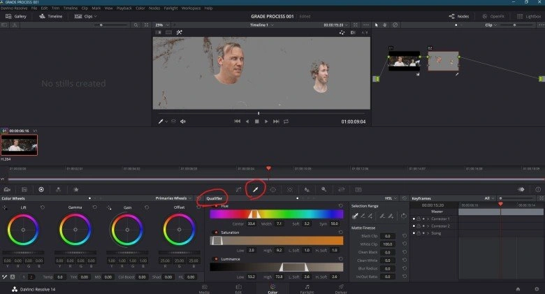
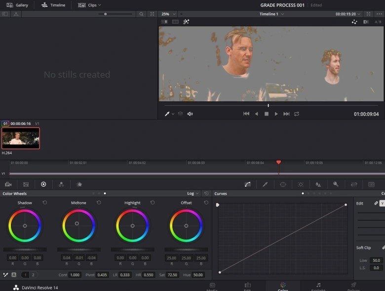
Using the qualifier tool, I've selected the skin from the footage. Davinci automatically tries it's best to get just the color you are picking with the tool.
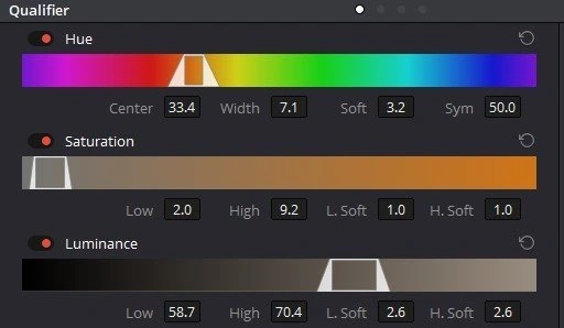
However the picker is often not accurate enough so you probably want to make friends with the qualifier adjustments as well. You can fine tune your color selection.
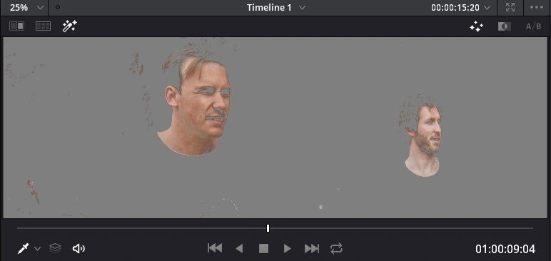
If you just pick out the skin color, it looks bit like this. So why pick out just the skin?
This is an extreme example of a grade without skin separation. You can see the whole image goes green including the skin and the colour ends up looking quite wrong on the characters.
This is another extrememe example grade. You can adjust the background separate to the skin.
Ok enough playing around, when it comes to color grading, subtlety is really the name of the game. Extreme grades never really work out very well. Adjusted the temperature, saturation of the background.
After that I adjust the skin tone for saturation, and overall hue so that it suits the mood but doesn't stand out too much from the background. Not an absolute rule but the highlights are usually skewed towards a similar tone to the background, midtones for the original skintone and for the shadows I give it a hint of red.
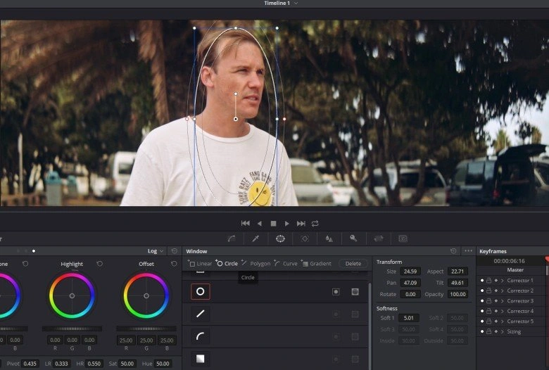
After I'm happy with the general tone and saturation of the image, I bring in power windows. This is to select a general area of the image I want to emphasize. In this case it's the characters. I can apply sharpen or any other effects to a selected area of the video using power windows.
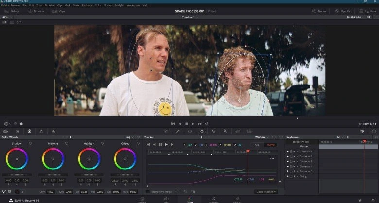
Davinci resolve can automatically track the motion of your figure pretty well as long as they don't move too fast. Using this feature, I can just set the power window at the first frame and let Davinci do it's thing.
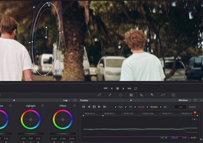
Of course when they turn and walk away like this, it stops tracking them at some point. You can over ride the wrongly tracked frames and manually adjust them.
Not all projects require or can afford to have flat shooting profiles and color grading but having a good knowledge of the process is certainly useful for a video editor.
Like this project
Posted Dec 23, 2025
Color Grading case study with Surf Friends
Likes
0
Views
4