Packaging Redesign
Emma Klarin
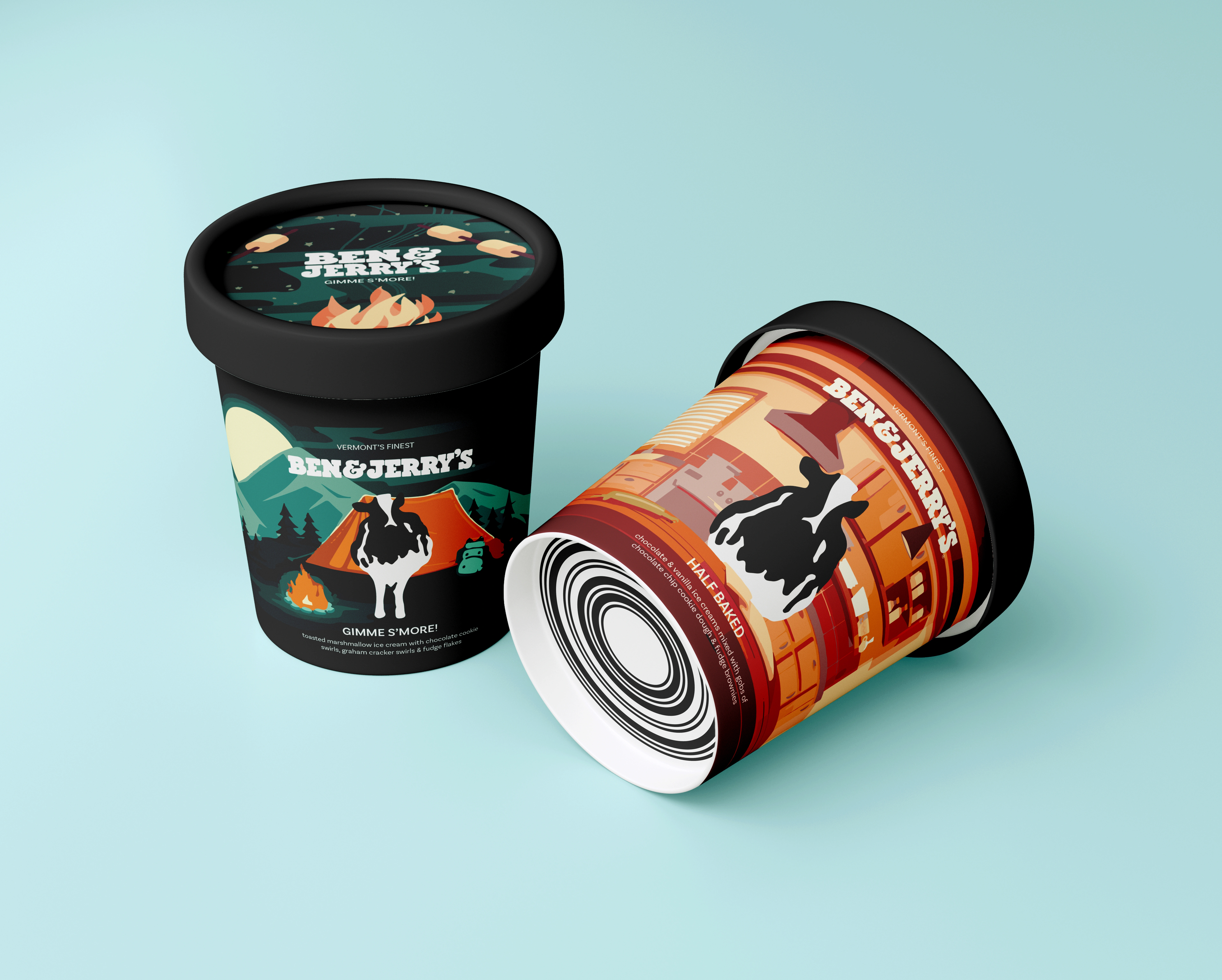
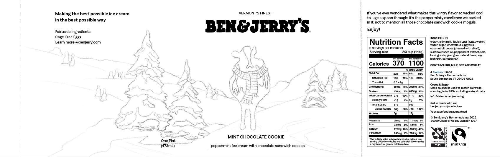
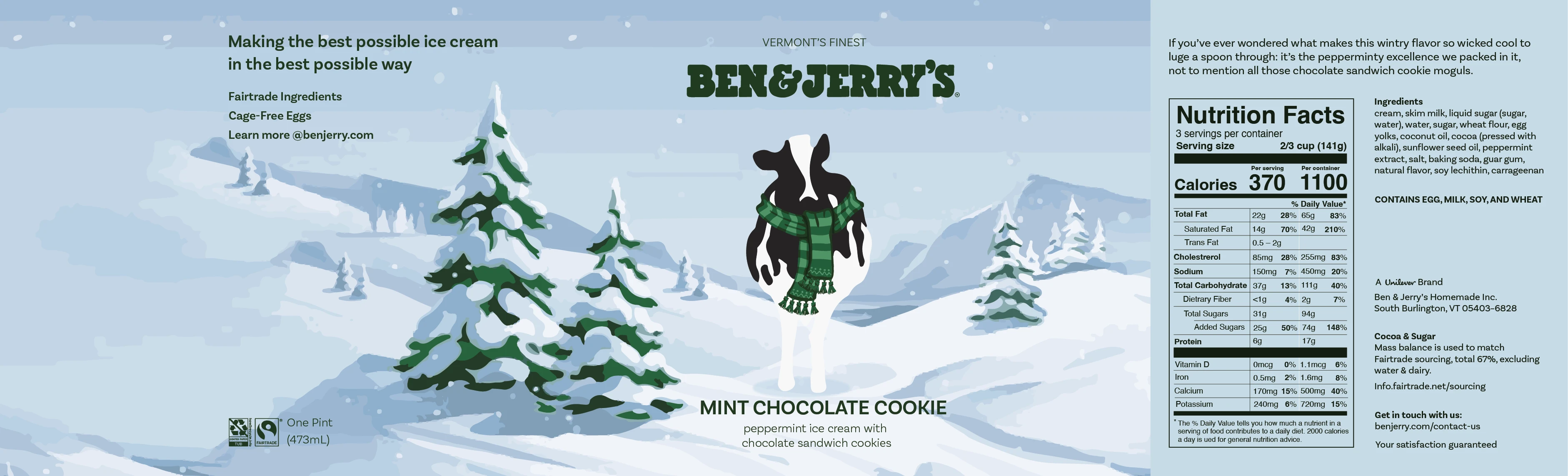
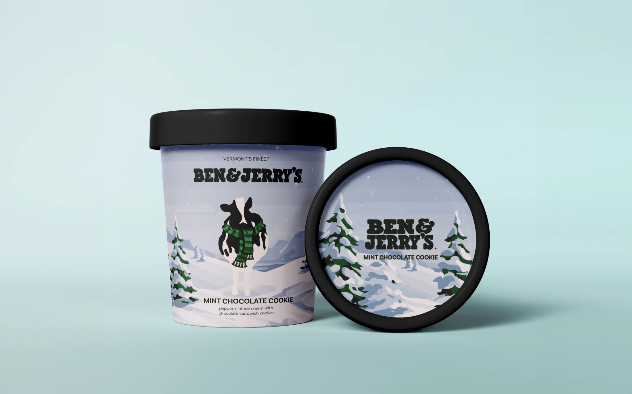
I reassessed their layout and typography deciding to illustrate my new designs. This choice provides the brand with enhanced personality and vitality, adding to their shelf appeal.
Through my competitor research, I determined that Ben & Jerry’s was the only brand to use illustration on their packaging. Leaning into that will make them stand out from their competitors and resonate more with their target audience.
Like this project
Posted Jul 17, 2025
Redesigned packaging with illustrations for brand vitality. Created as part of a design school case study to explore visual storytelling and shelf impact.