Mivov Dijital Marketing Agency Logo
Serkan Hürsgünel
Overview
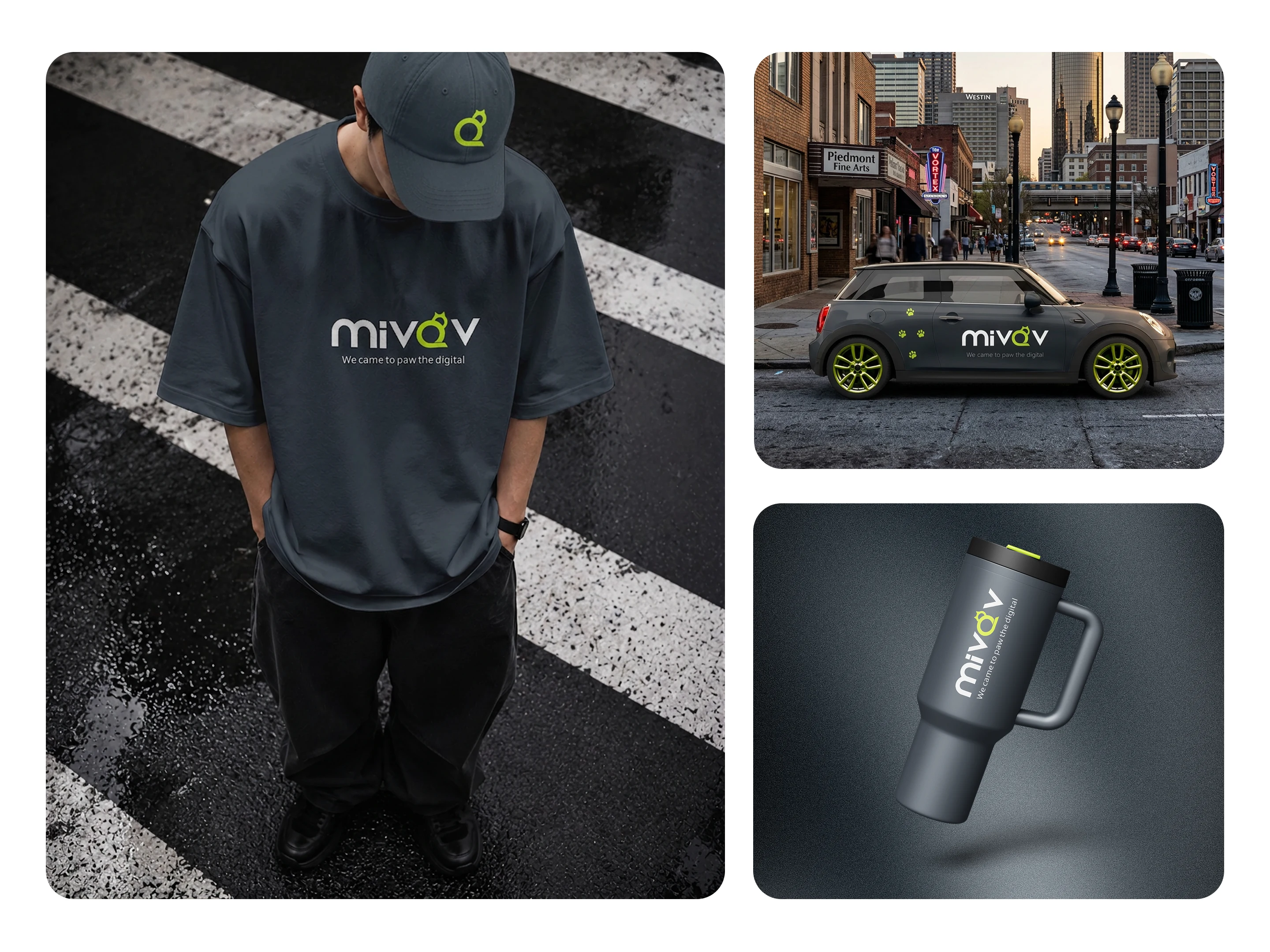
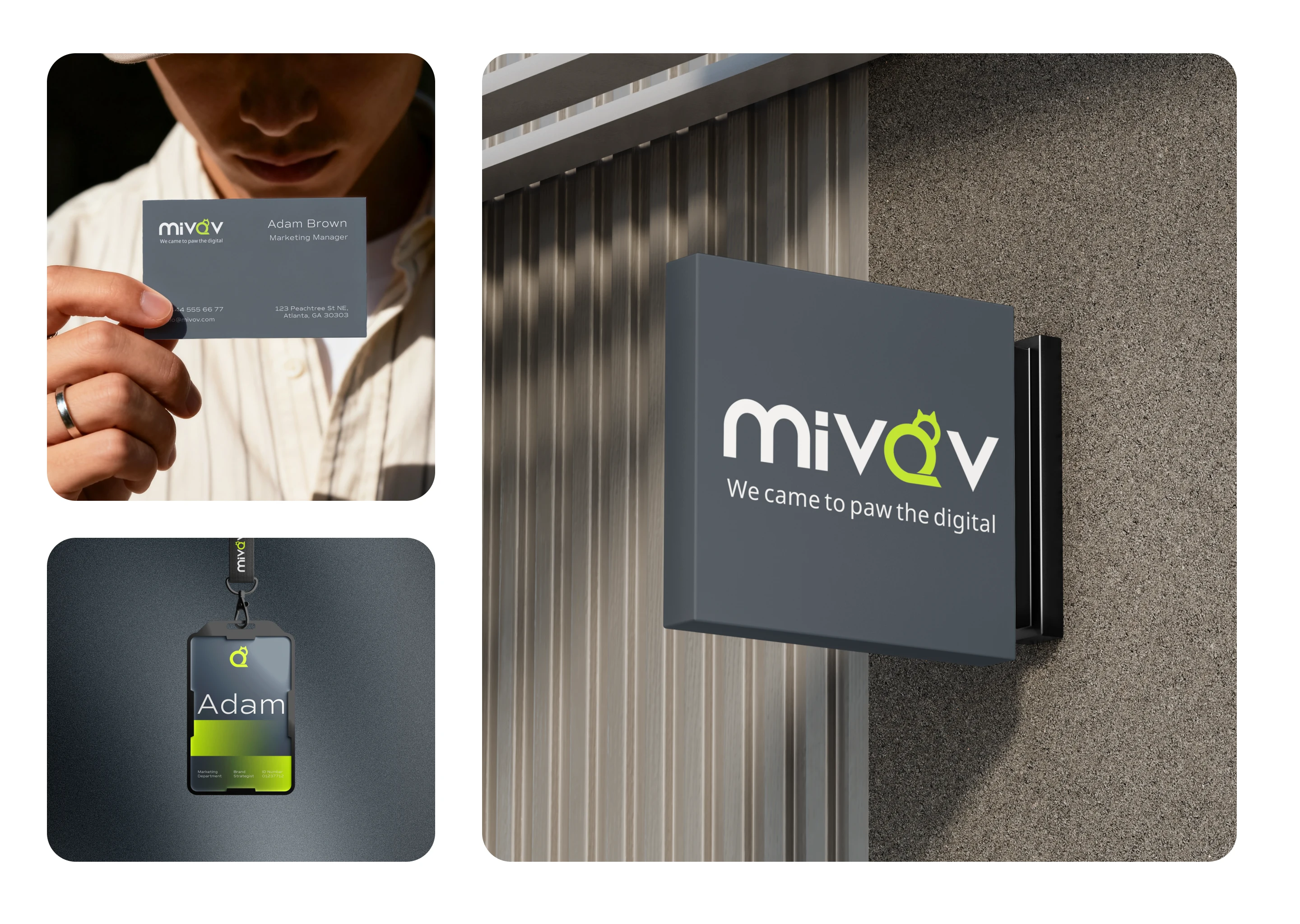
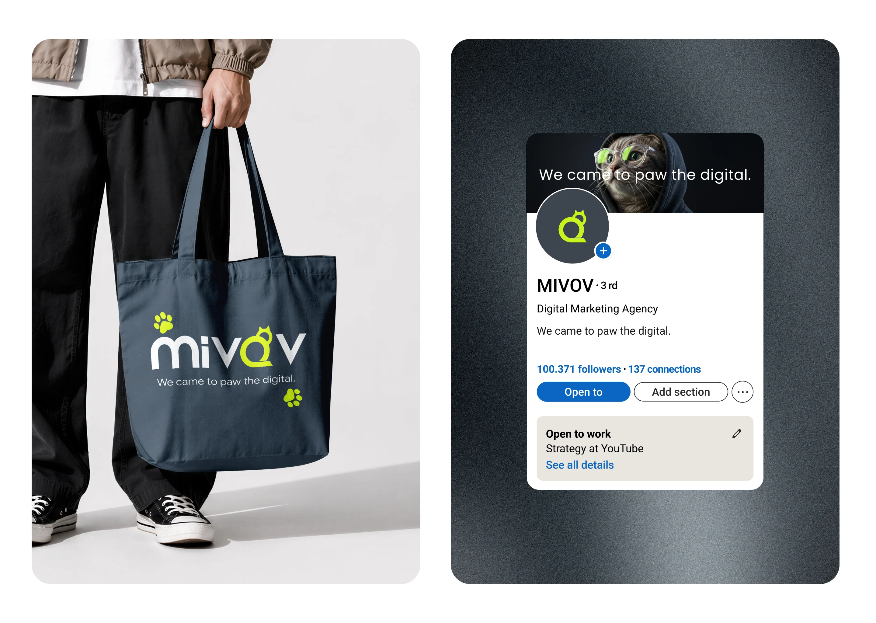
Mivov Dijital is a digital agency offering video production, content creation, and data-driven ad management. They needed an identity that would stand out in a crowded market: playful yet trustworthy.
Story
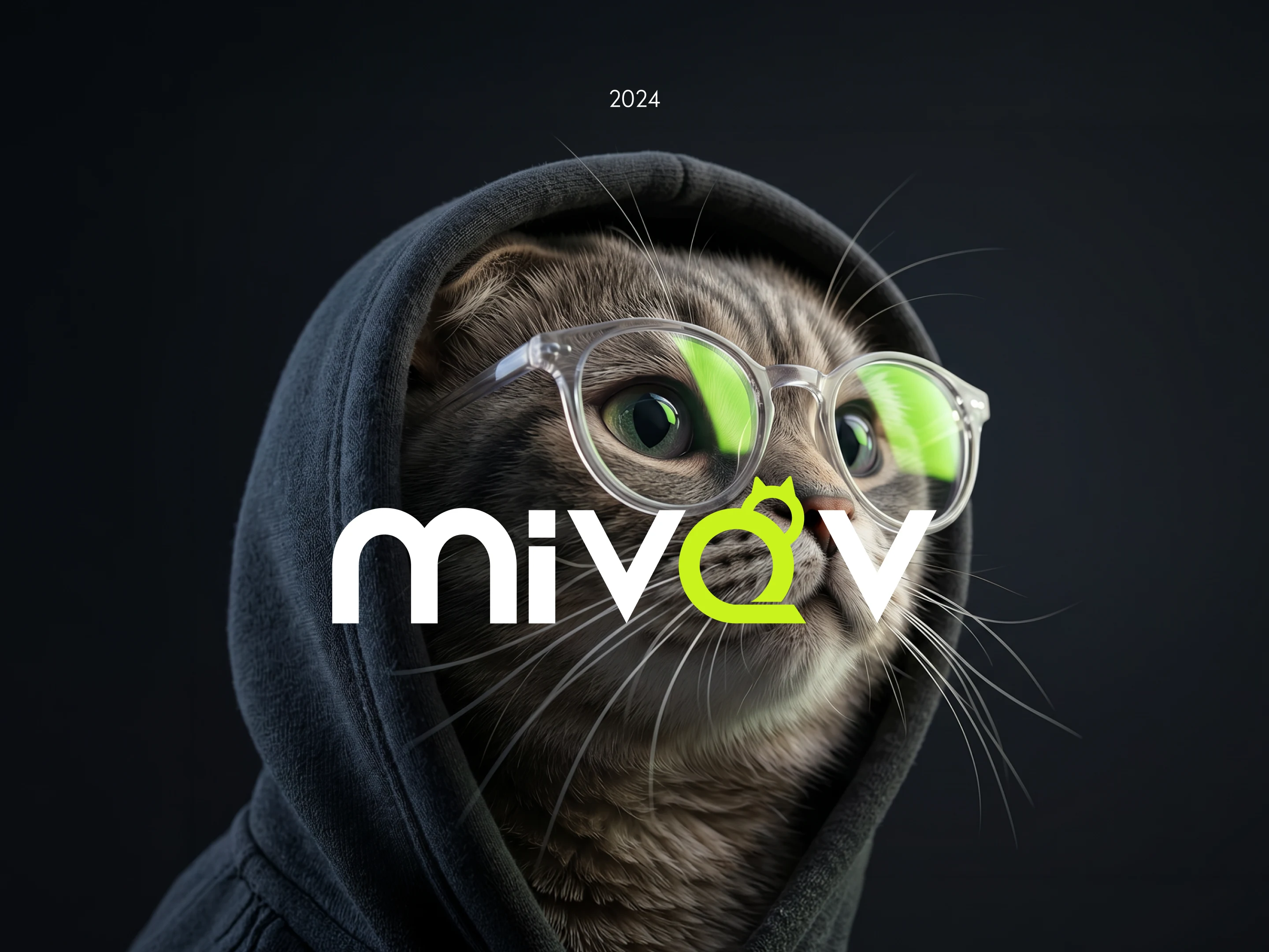
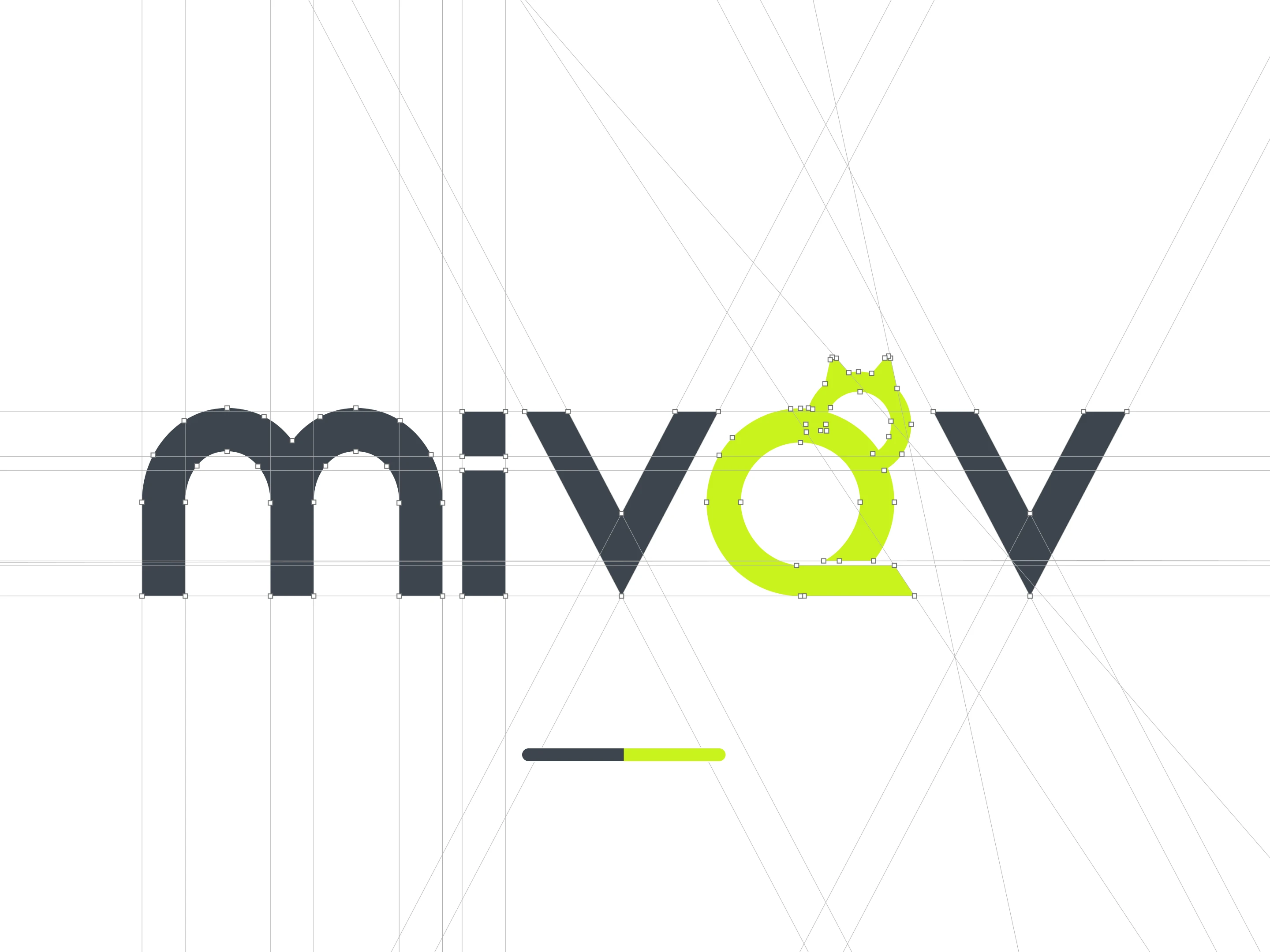
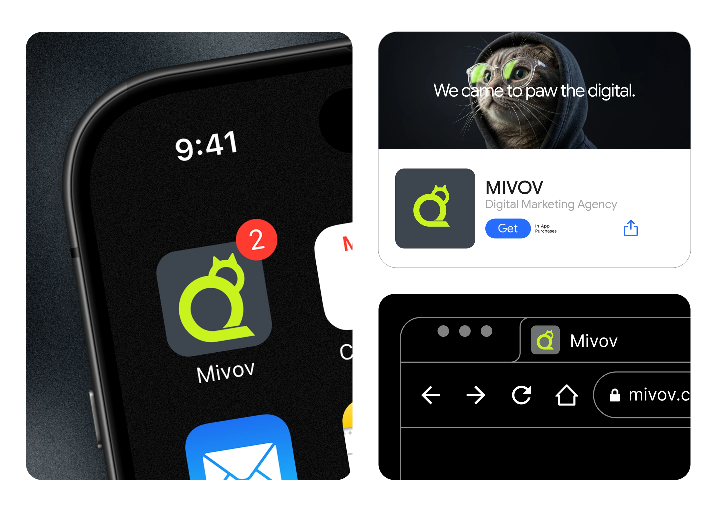
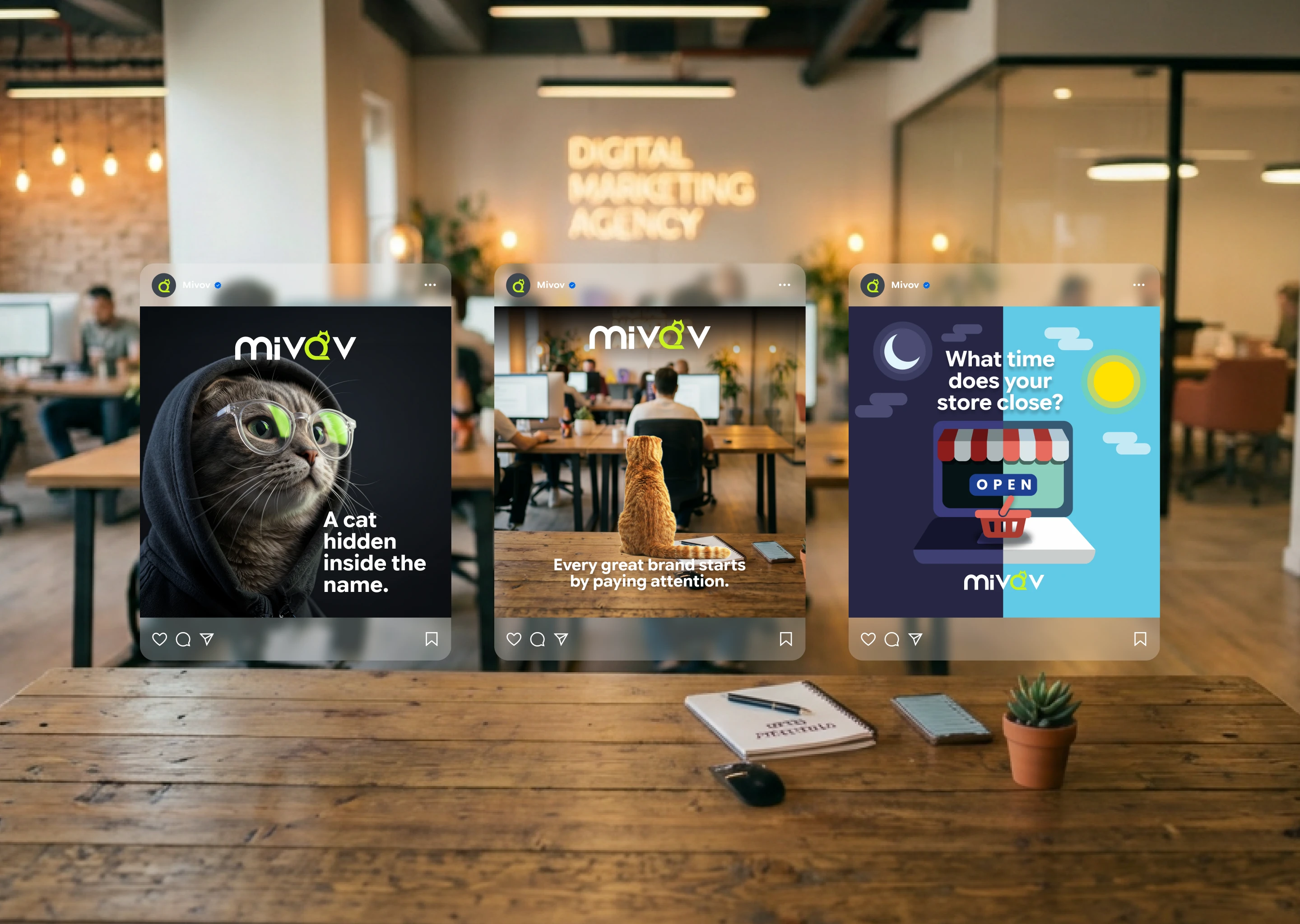
Most agency logos look alike. For Mivov, instead of adding a symbol from the outside, I pulled it from within the name itself. The second "o" in "mivov" transforms into a seated cat silhouette with ears, body, and tail. The logo stays readable, then reveals the paw on second glance.Lime green carries the digital energy, while the charcoal background brings corporate trust. The result holds both sides of the brand in a single mark, just like the tagline: "We came to paw the digital.“🐾
Like this project
Posted Jun 20, 2026
There's a cat hidden in this logo. 🐾 Look at the second "o" in "mivov"; ears, body, tail. I didn't add a mascot. I found one in the name.
Likes
1
Views
6
Timeline
Nov 8, 2024 - Nov 22, 2024