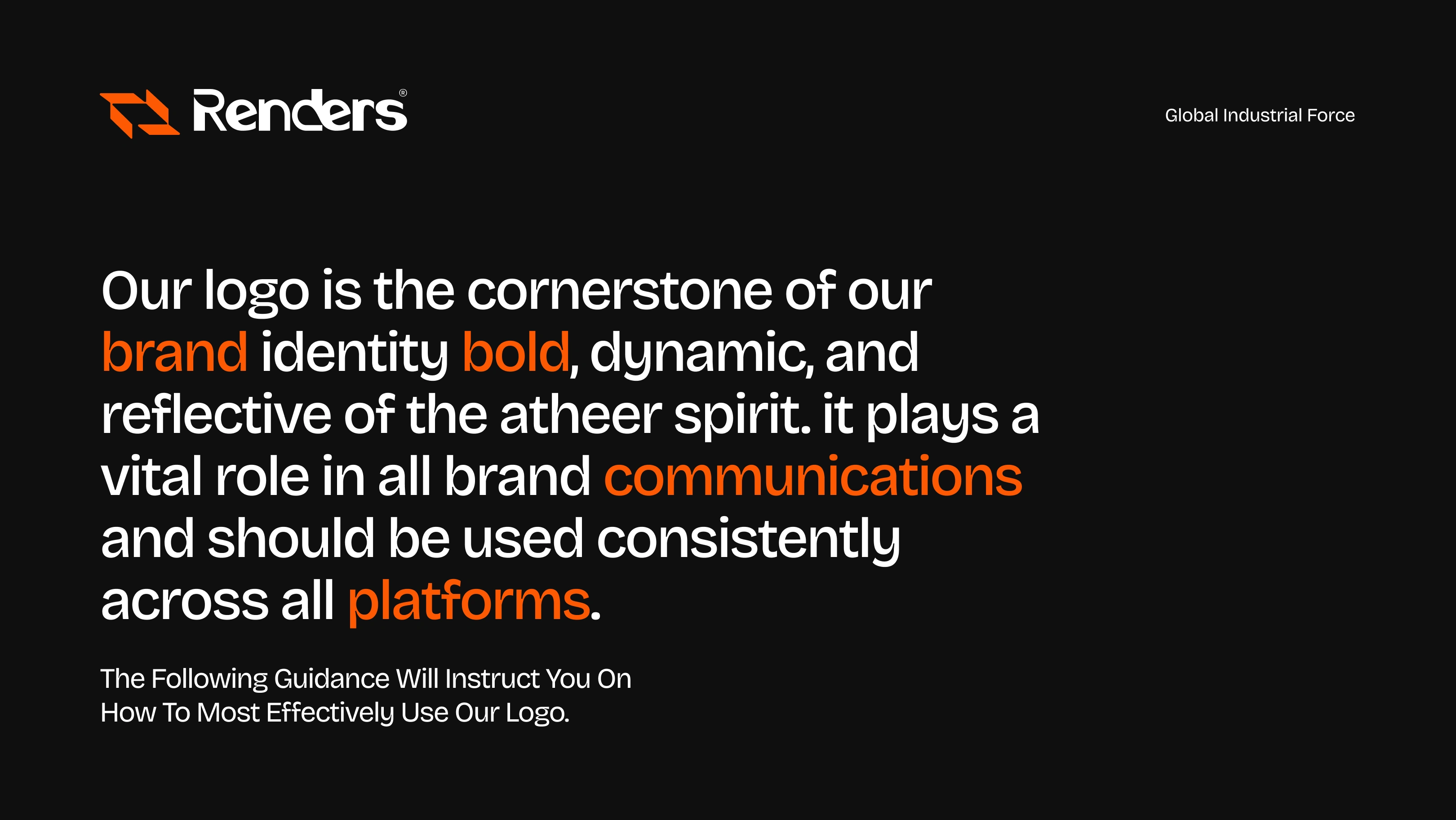
Renders New Logo Design
Darshil Lathiya

My Perception of the Brand
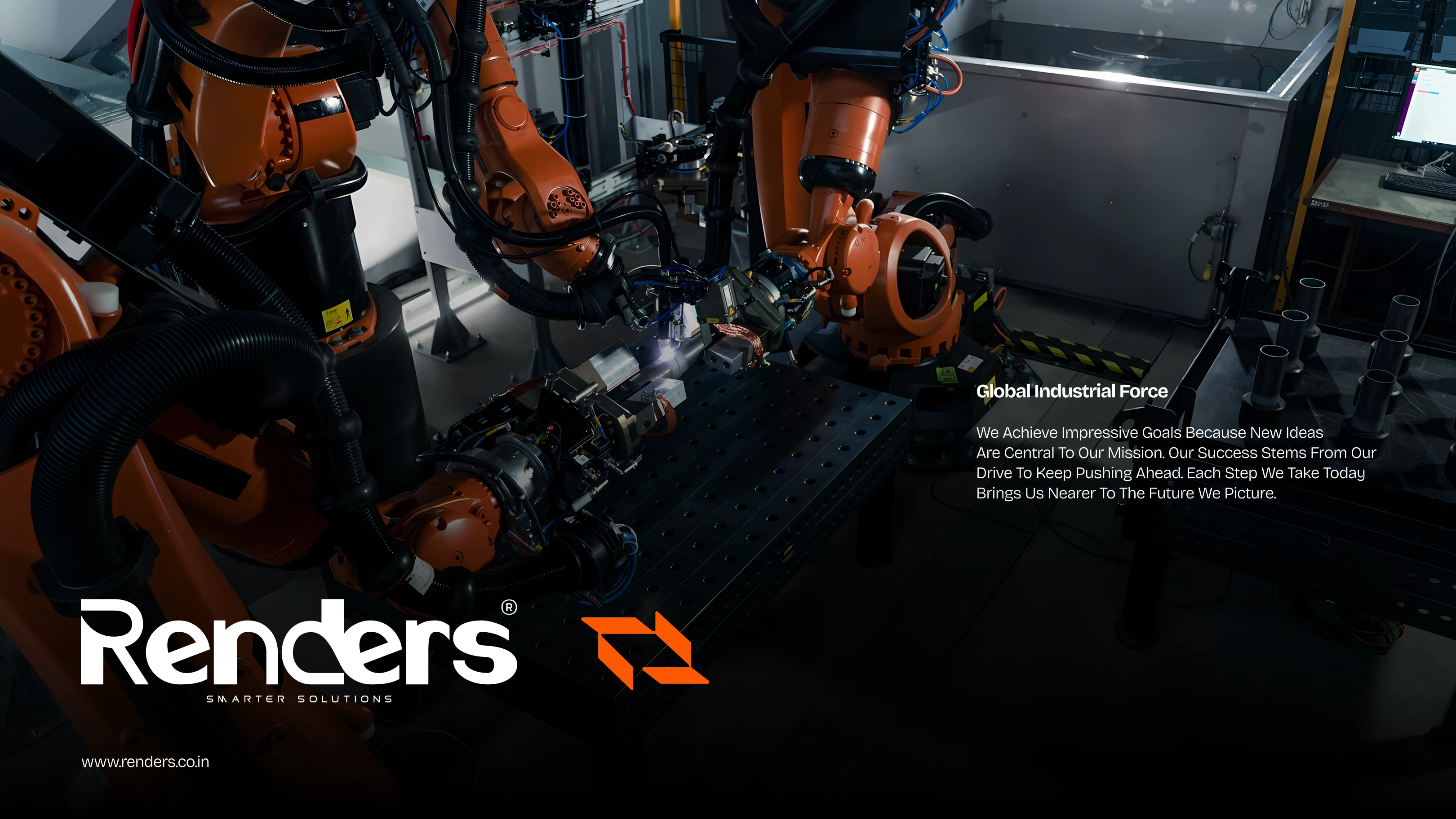
Renders India Pvt. Ltd., to me, is a company of strength achieved by precision. It is an engineering innovation-based firm that has helped industries such as paints, pharma, and food processing, among others, operate optimally. The brand is industrial, future-focused, solution-oriented, and a complex technical one, but still human. Renders is not only a manufacturer; it is a process change partner. The logo was to communicate that strength, no-nonsense, and action in a forward motion.
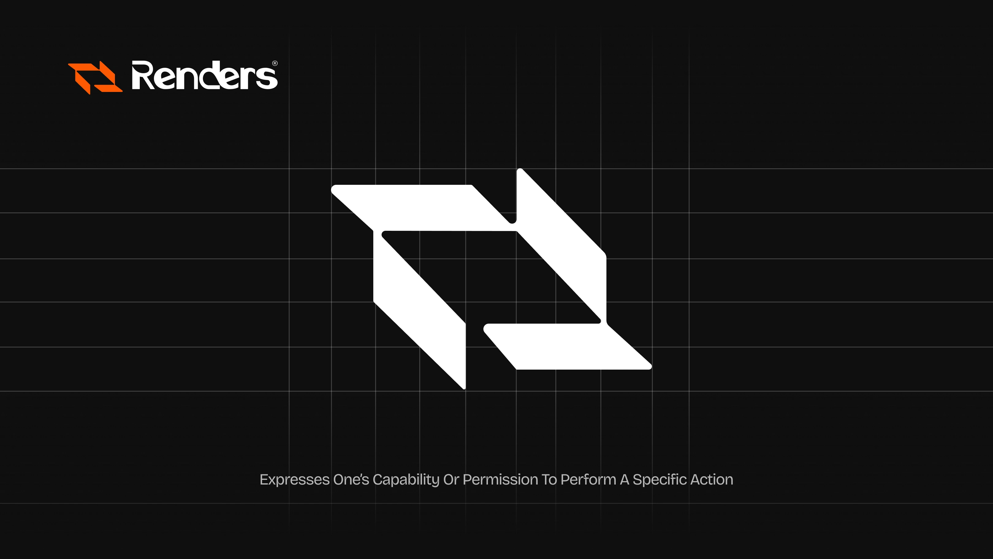
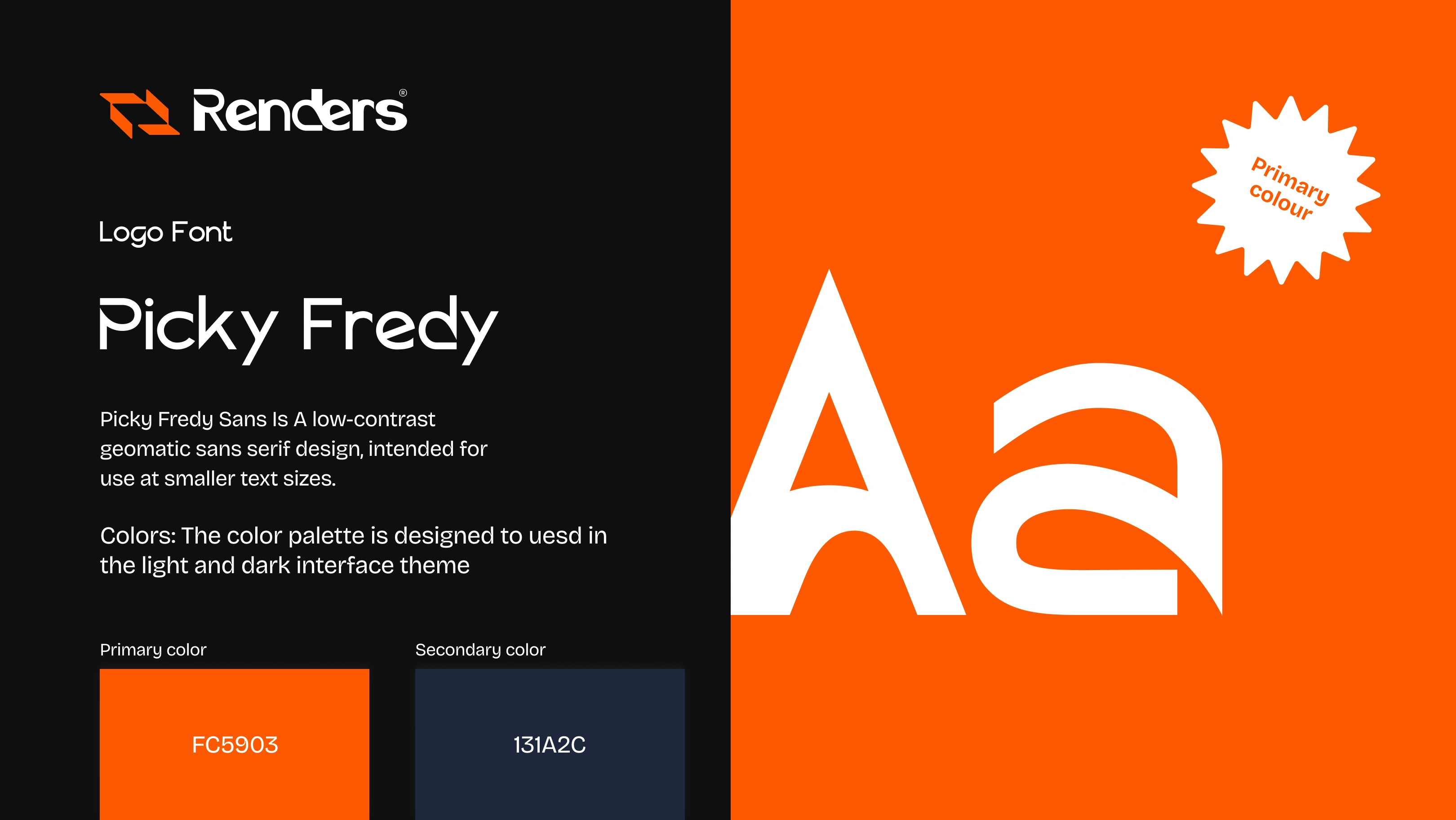
Typography Choice
The font that I selected was a modified geometric sans-serif font that exhibited modern rounded characteristics to convey:
● Effectiveness in communication.
● Be friendly without losing authority.
● Accuracy and contemporaneity-the kind that can carve the perfect and precise, which is a must for an engineering firm.
The angularized version of the letter “R” and a flowing amalgamation of the “E” loop include custom accents, but with high legibility even at a small scale.

Like this project
Posted Aug 14, 2025
Renders India blends precision and innovation, driving industries forward as a strong, solution-focused partner in engineering and process change.
Likes
1
Views
3
Timeline
Aug 1, 2025 - Aug 4, 2025
Clients
YES!