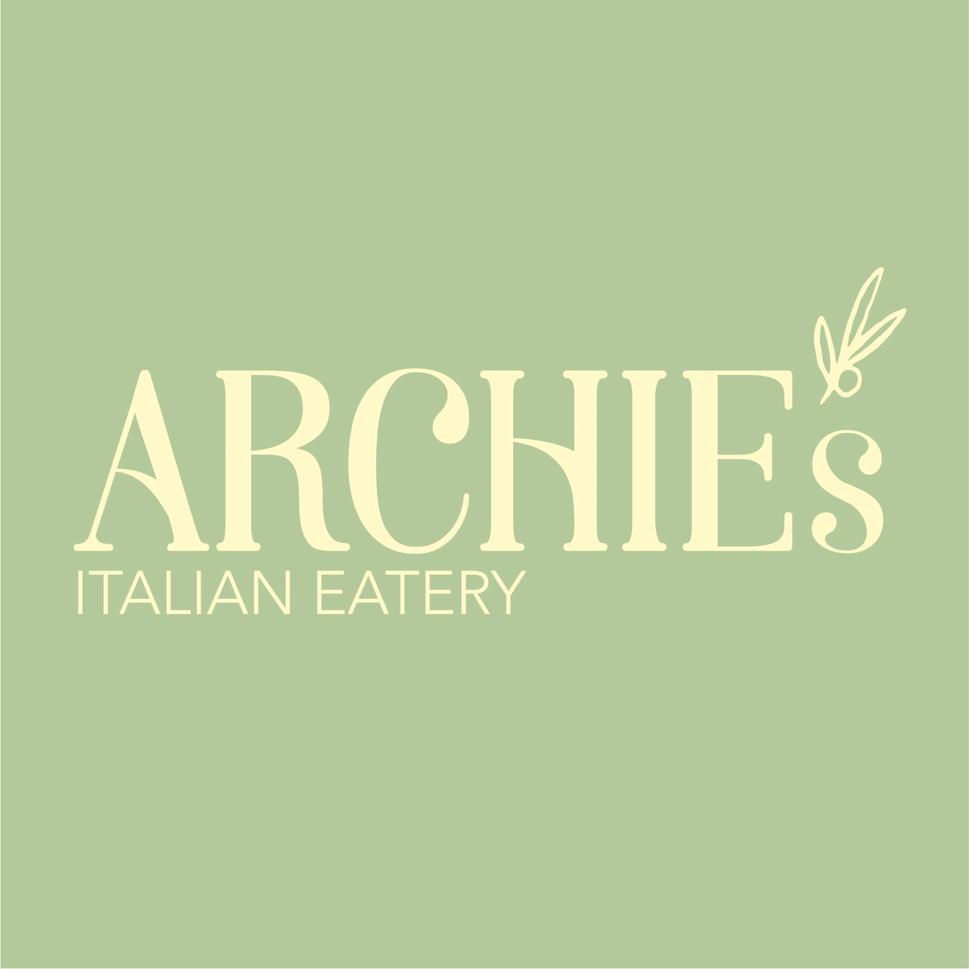
Archie's Italian Eatery New Logo and Rebrand

Munga Thigani


Case Study: Archie's Italian Eatery
Executive Summary
Archie's Italian Eatery, a local Italian dining establishment with years of history, faced the challenge of an aging clientele and outdated branding. A targeted rebrand successfully modernized the restaurant, luring a younger audience and increasing sales.
Problem Statement
Though reputable, Archie's Italian Eatery was missing out on the younger demographic due to its dated look and feel.
Objective
To rebrand Archie's Italian Eatery with a modern yet rustic touch, aimed at attracting younger customers and boosting revenue.
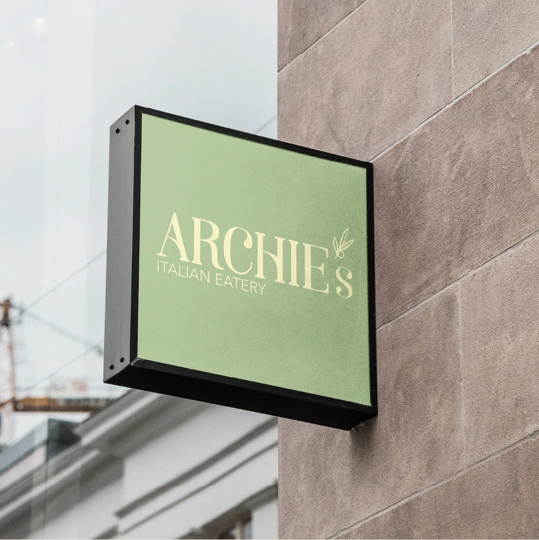
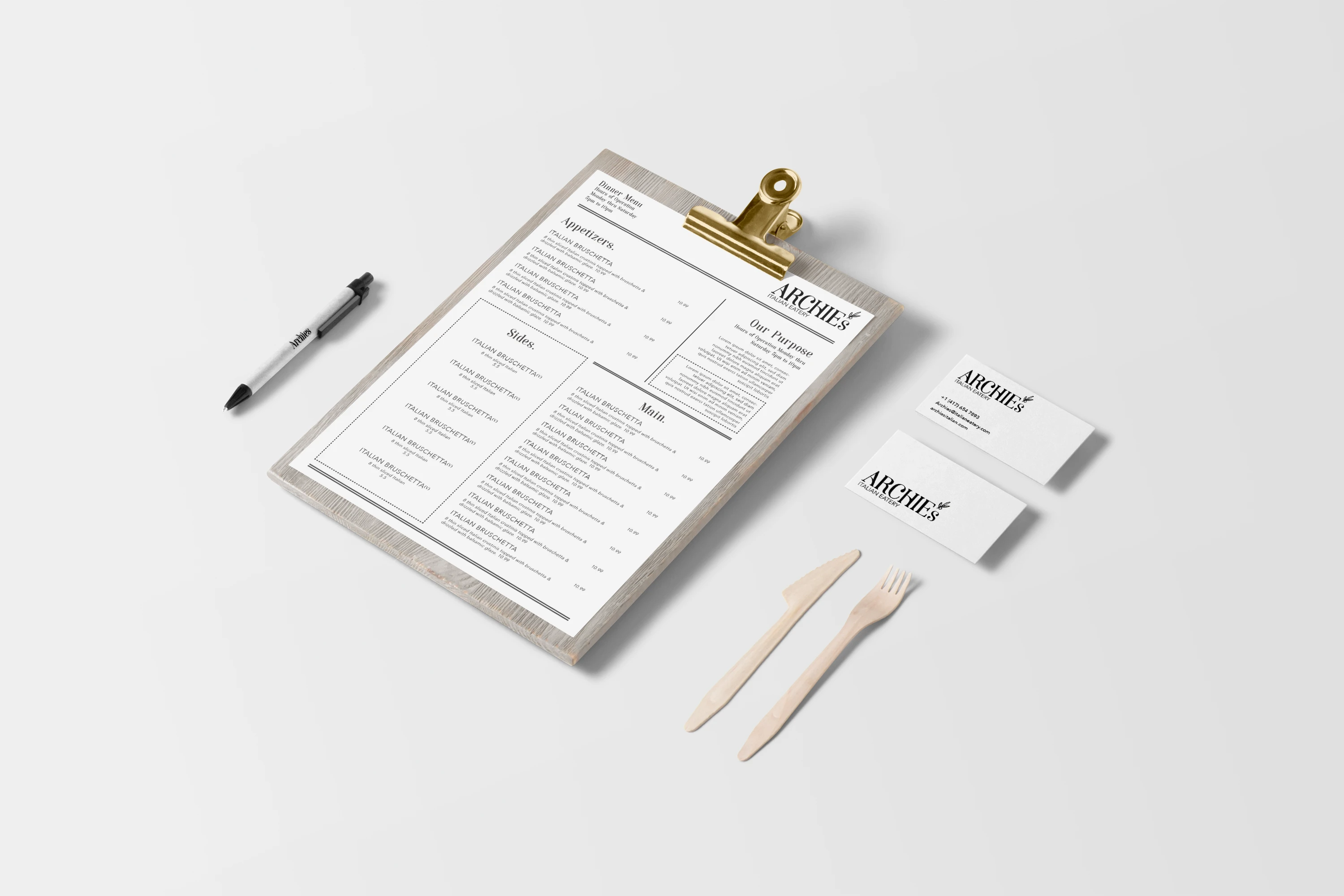
Rebranding Elements
Color Palette:
Logo Design:
Interior Patterns:
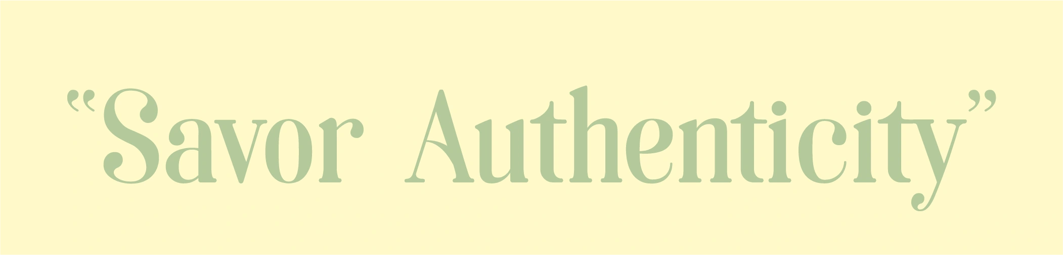
Brand Image & Messaging:
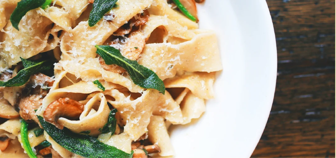
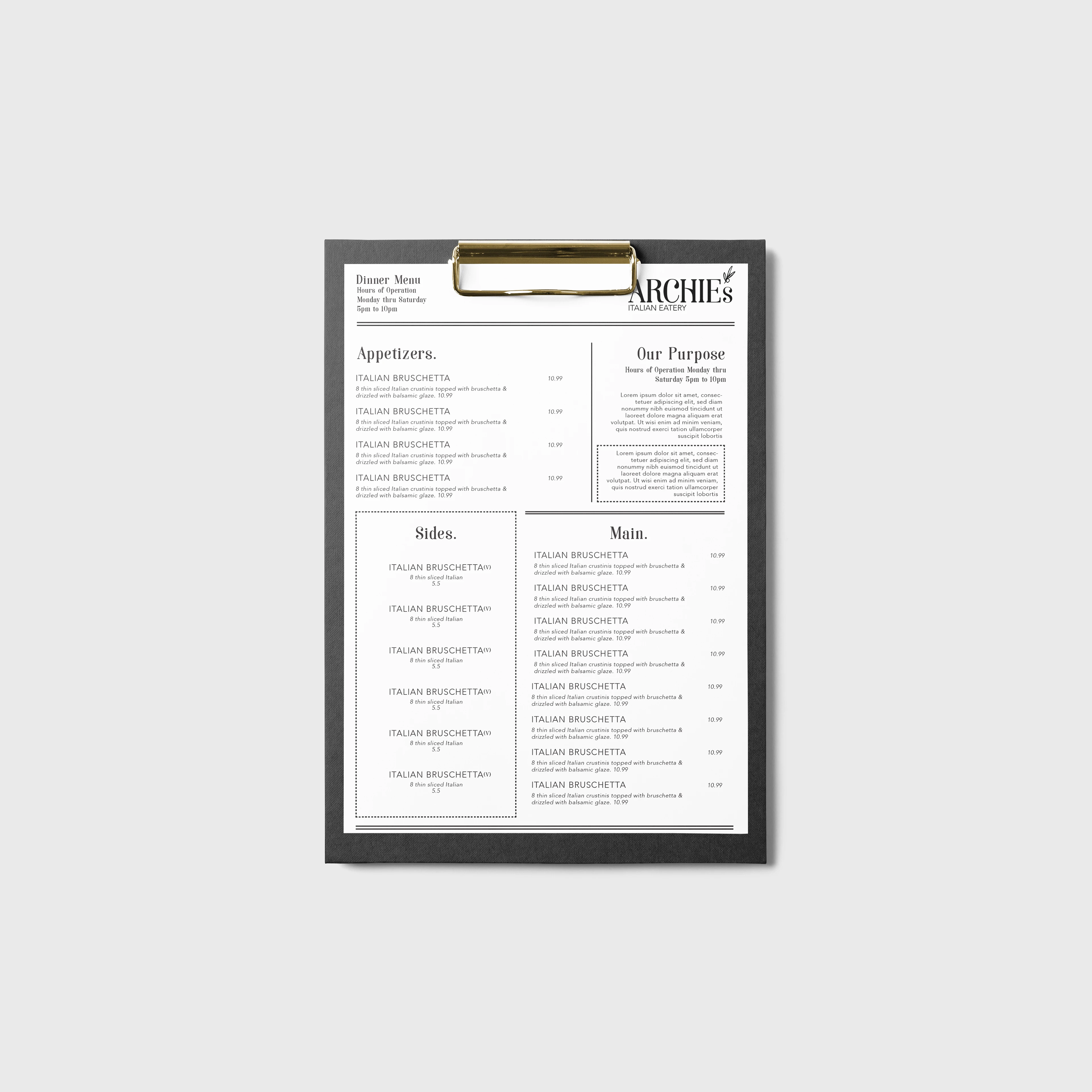
Menu Design:
Results
Successfully pulled in a younger crowd.
Saw a noticeable uptick in sales.
Received positive media and customer reviews.
Lessons Learned
A well-executed rebrand can reinvigorate a stagnant business.
A carefully chosen color palette and fonts can significantly influence customer perception.
Having a concise, resonant brand message is critical.
The aesthetic appeal of a menu can enhance customer experience and drive sales.
Like this project
Posted Sep 10, 2023
Local Italian restaurant's brand board includes a rebrand, logo redesign, and menu redesign for improved visuals and clearer message.
Likes
0
Views
4


Airbnb Membership Wallet Pass Idea
O'Reilly Hospitality Management Website Redesign V1

Weeknd Poster Concept