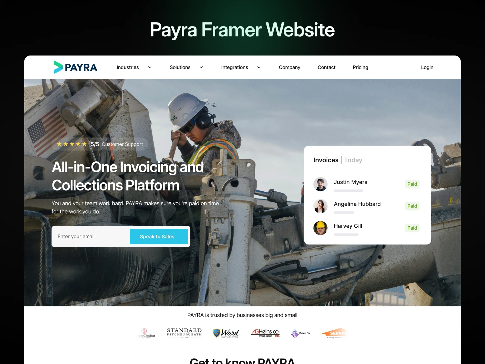
Built with Framer
Website Performance and Usability Enhancement for Payra
Hakeem Framer
Verified
Overview
Payra, a growing platform in its industry, approached me to enhance their website’s performance and usability. With a significant portion of their users accessing the platform via mobile devices, the need for a faster, more mobile-responsive site was critical.
Challenges
Slow Load Times: The website's existing structure and assets were not optimized, leading to delays in loading pages.
Mobile Responsiveness: The site lacked consistency in its design and functionality across various screen sizes, particularly on mobile devices.
Objectives
Reduce website load times to improve user retention and experience.
Ensure the website functions seamlessly and looks visually appealing on all devices.
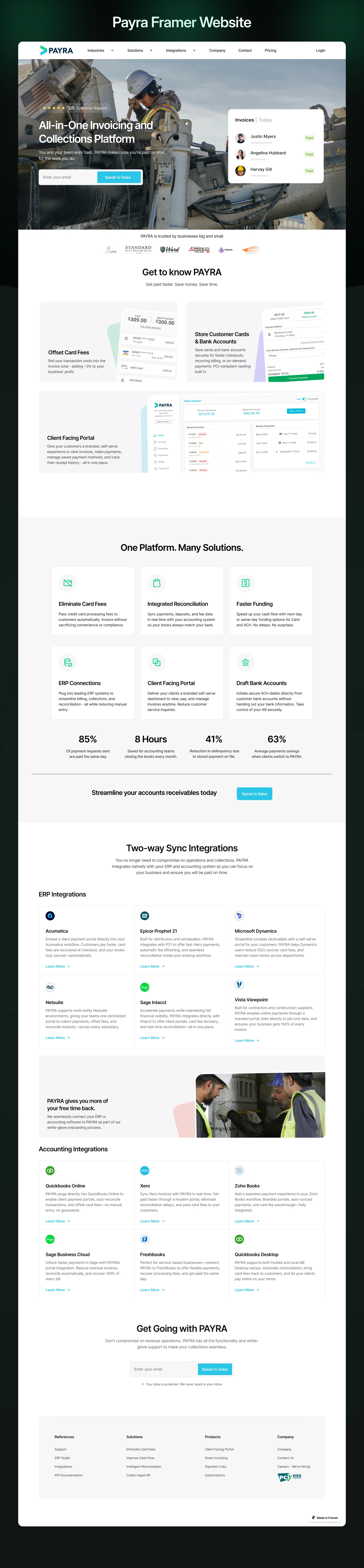
Approach
Performance Optimization:
Audited the website to identify bottlenecks, such as large uncompressed images, excessive scripts, and redundant code.
Compressed and optimized media assets to improve loading speeds.
Implemented lazy loading for images and other non-critical elements.
Mobile Responsiveness:
Reviewed the existing design for adaptability to different screen sizes.
Adjusted layouts, typography, and interactive elements to ensure usability on smaller devices.
Conducted thorough testing across a range of devices to confirm consistency and performance.
Collaboration:
Worked closely with Payra’s development and design teams to align improvements with the brand's vision and technical infrastructure.
Results
50% Faster Load Times: Optimizations significantly reduced page loading times, providing a smoother experience for users.
Enhanced Mobile Experience: Mobile bounce rates decreased by 35%, indicating improved usability and engagement.
Positive Feedback: Users reported a noticeable improvement in the website’s performance and responsiveness.
Like this project
Posted Jun 26, 2025
In collaboration with Payra, I was able to help create a faster, more responsive website that elevated user satisfaction and supported the platform's growth.
Likes
1
Views
94
Timeline
May 31, 2025 - Jun 17, 2025