Usability Testing for a University App
Discovering the Problem 🔎
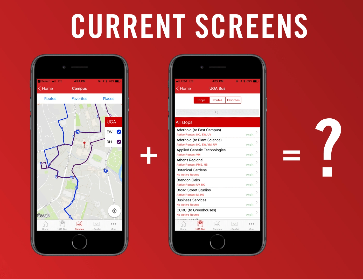
Digging into our Google Analytics data revealed a problem for our University's app: one module of our transportation feature, Live Map, wasn't seeing much use relative to other modules.
We hit campus and started talking to users.We found that users were unaware of the functionality or simply preferred the other options for bus tracking. Newer students seemed to prefer Live Map while older students relied on Stops.
In order to improve the discoverability of Live Map, we decided to try bringing it into the heavily trafficked UGA Bus module. But how?
Group Ideation 🤝
To generate solutions to our app’s problem, we decided to take a page from Google Venture’s Design Sprint framework. Each member of the team from our project manager to our developers came up with solutions for the problem. We then had a design round table to discuss our ideas.
By giving each team member a say, we were able to collect different ideas from each solution and frankenstein them into wireframes.
Revisiting Navigation 🚌
Currently, users navigate the “UGA Bus” module with a segmented controller on iOS or a tab-bar on Android (this post will focus on iOS flat design). Rather than rock the boat and force users to re-learn our navigation, we decided to bring in “Map” as a new tab on the segmented controller.
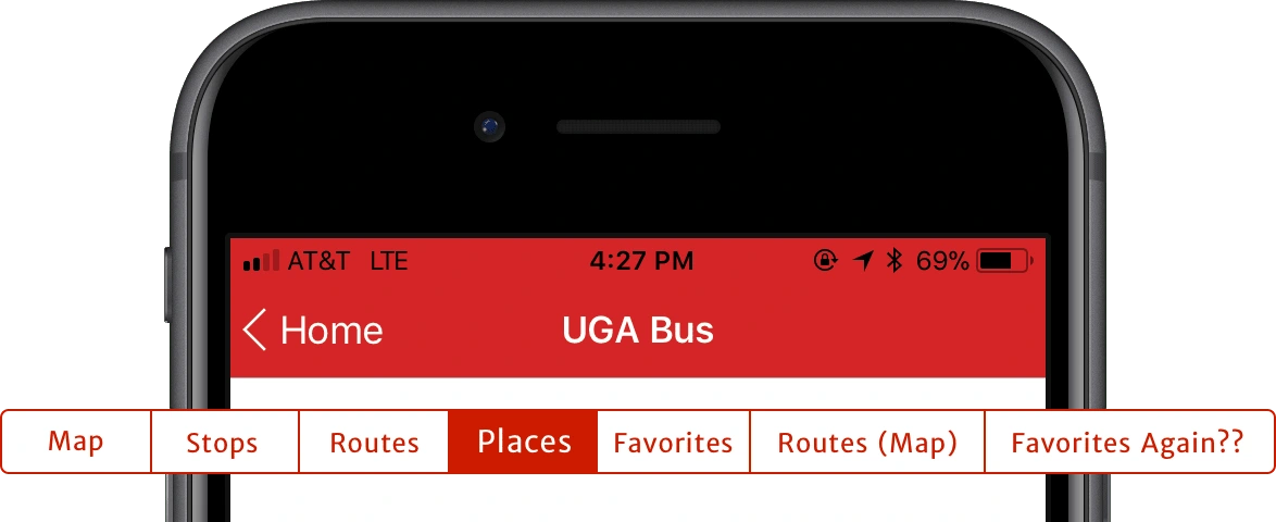
The “Map” module is more than just a map — it also has its own tabs for adding routes and searching places.This functionality couldn’t just be lumped on as more tabs or we’d have a seven-segment controller. Instead,we eliminated redundancies to stay at a legible four segments while still maintaining and highlighting key functionality.
Playing Favorites ⭐️
Analytics data showed us that the “Favorites” tab was underutilized. One reason was made clear in our testing: the path to adding favorites was obscured behind two taps. Until a favorite was added, the “Favorites” tab was totally blank.

One iteration was to add a plus button to the “Favorites” tab, ala album creation in Apple’s “Photos.” While this idea seemed promising, we decided to try freeing up the segmented controller by adding “Favorites” in at the top of the “Stops” listview.
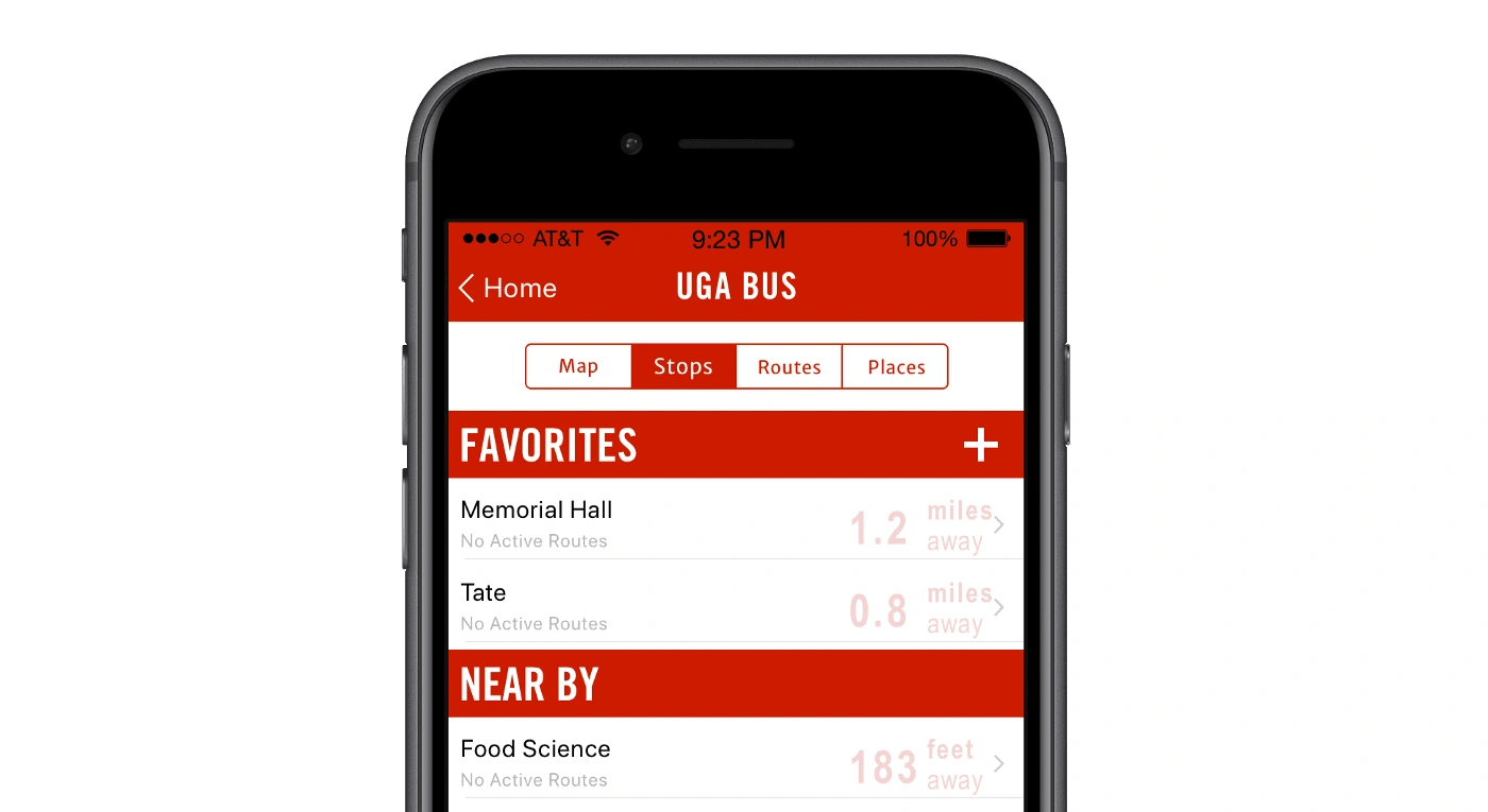
Since “Favorites” is currently exclusive to adding stops, this was an easy choice that freed up space for a “Places” tab on our segmented controller. “Favorites” keeps its ease of discoverability while still bringing in an add option to guide users.
Usability Testing 🤳
Taking a page from Eric Ries’ Lean Startup, I quickly mocked up a minimum-viable product (MVP) with the proposed changes in InVision. As the team’s sole designer, I didn’t want to limit user testing to just people I’d interact with, so I formed a four-person research team with some of our student developers.
“The bottom line is that confronting your target customers is nonnegotiable. We must learn as quickly as possible if the idea we are working on is stupid and worthless. We need to have an open mind to experiment and fail.” — Jaime Levy, UX Strategy
I created a document for all of our testers detailing the path they should tell users to follow as well as follow-up questions to get the user talking. Following Steve Krug’s Rocket Surgery Made Easy: The Do-It-Yourself Guide to Finding and Fixing Usability Problems, testers watched users interact from over their shoulder, recorded findings, and ensured that users were comfortable speaking aloud as they accomplished specific tasks in the prototype.
Rather than having one linear path through the prototype, we gave users multiple options and silently took note of which one they intuitively chose.
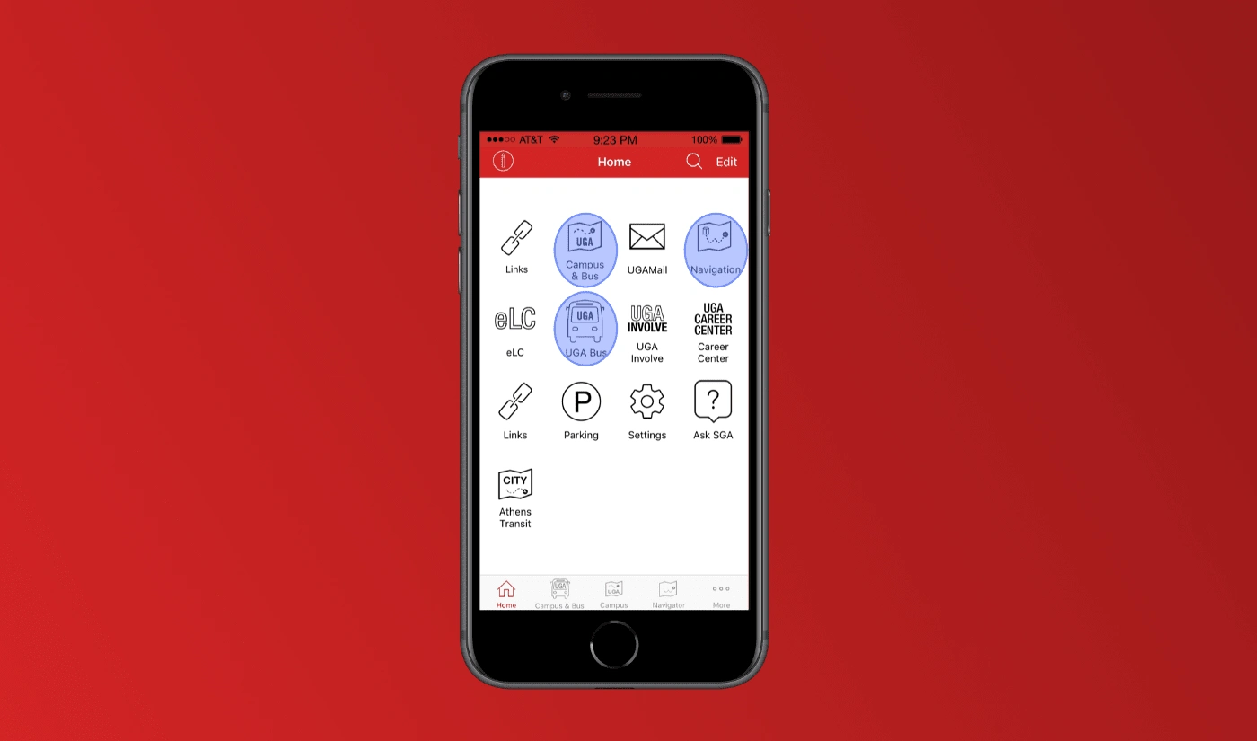
This all started with the home screen, where three separate icons/names all led into the “UGA Bus” module. We wanted to test which icons students would naturally associate with bus tracking, and emerged with a clear winner.
Later on in the prototype, users had multiple choices for how to add routes and places to the live map.

Actionable Insights 📈
It’s scary putting your ideas out in front of people, and it sucks to watch someone struggle to use your product, but it’s always best to fail fast without any investment from the development team.
And fail fast our MVP did.
When adding routes to the map, users were confused about where to go. Once they selected a route, a lack of feedback meant they didn’t know they had successfully completed a task.
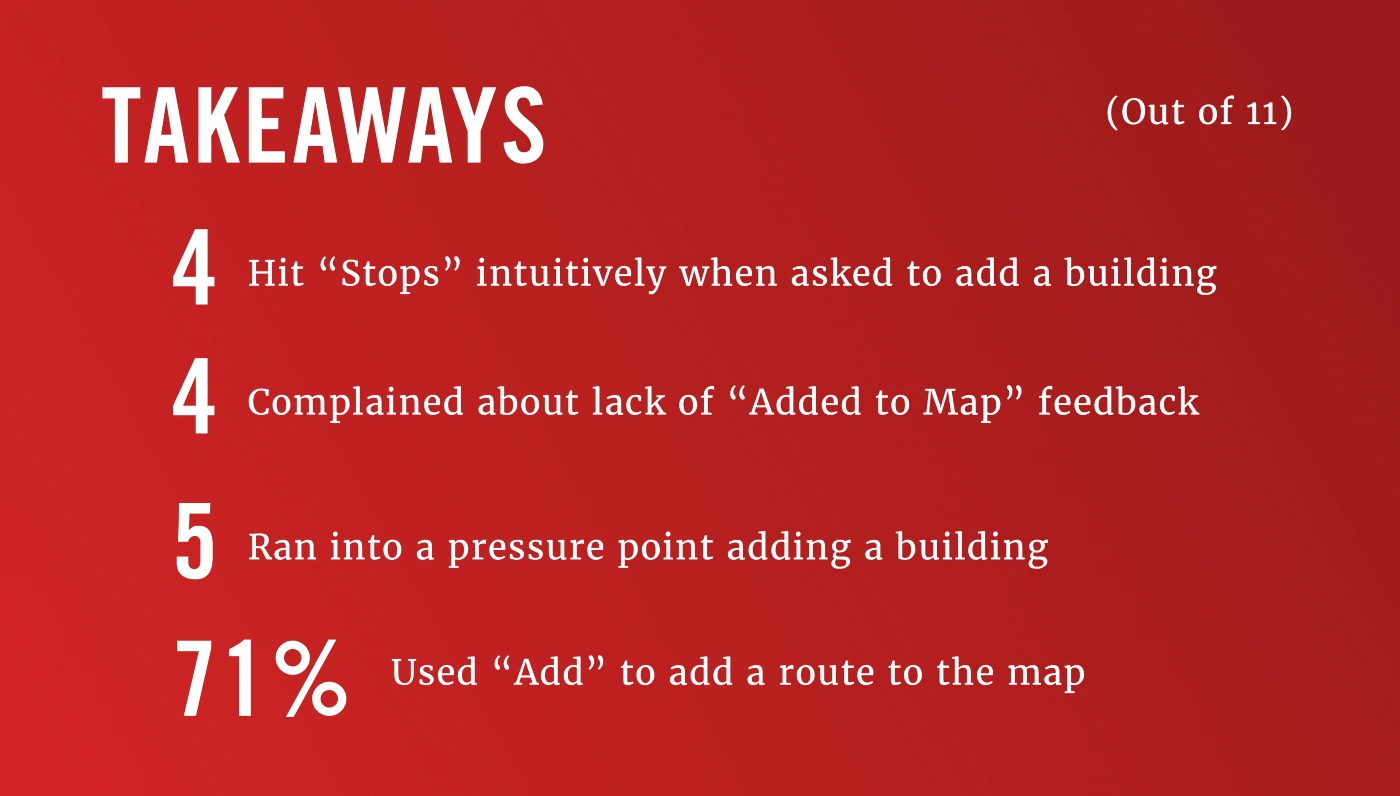
At the end of the week, I compiled data from all of our tests and presented it at a team meeting.Rather than presenting all of the problems at once, I architected a hierarchy that ranked each problem by frequency and severity— a tip I picked up from Erika Hall’s Just Enough Research.
Informed Solutions 📲
Demonstrating Affordances
In the current app, the users’ path to adding routes to the map is anything but clear. So in the prototype, we gave multiple options and watched how users reacted.
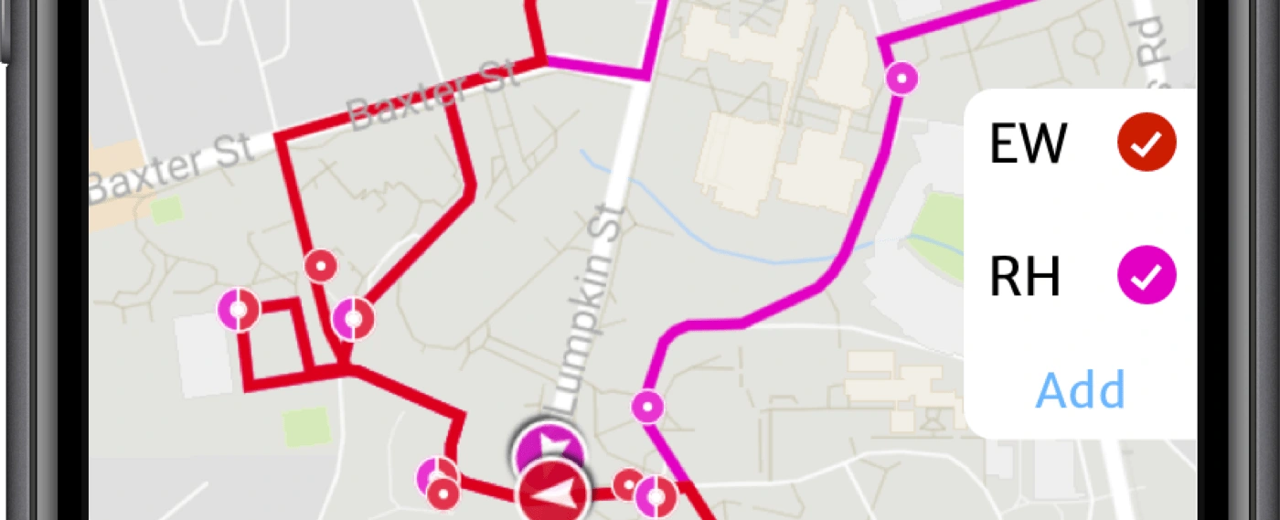
Adding a clear signifier in the form of an “Add” button proved to solve the problem. By making the button label iOS blue, it’s clear to the user that the button is interactive.
Giving Feedback (Now that's Thinking with Modals!)
Don Norman’s easiest-to-follow piece of advice might be that “when all else fails, standardize.” After identifying the feedback problem in user testing, I turned to Apple’s Human Interface Guidelines for inspiration.
“Modality creates focus by preventing people from doing other things until they complete a task or dismiss a message or view . . . When a modal view appears onscreen, the user must make a choice by tapping a button or otherwise exiting the modal experience.” —
Routes are added in a completely linear way, and a modal view is the perfect way to communicate that to our users. Modals solve the feedback issue by offering the familiar “Done” button while still allowing users to make multiple selections. Modals’ act of covering the entire screen emphasizes their linear nature — interact with this screen or not, then dismiss it to get back to what it’s covering.
Summary 💥
Every process of UX flows into the next, and by keeping the user at the eye of this creative storm you can insure your design hits. Informed design fights back against natural assumptions by rooting the process in user feedback.
Research identifies problems and potential solutions which are then readied and tested as MVPs as soon as possible. Harvest all the data you can to bring into the next cycle.
Like this project
Posted Jul 12, 2022
While working on my university's native mobile app, I conducted usability testing on our most popular feature: bus tracking.


