Object Permanence: A Sculptural Studio Design
Chayut C.
Object Permanence
A Sculptural Studio Design Concept
A dark, premium portfolio for a fictional sculptor—exploring typography, texture, and slow, deliberate interactions
Designing for stillness
Object Permanence isn't a real studio. It's a design exercise: something that felt like the work it represents—unhurried, confident, a little severe.
Most portfolios try to impress you immediately. I wanted this one to make you slow down.
The hero opens with a fractal glass shader—an abstract, almost alien texture generated in Three.js. It just sets a mood: this is not a template. Below it, the brand name "OBJECT PERMANENCE" establishes authority.
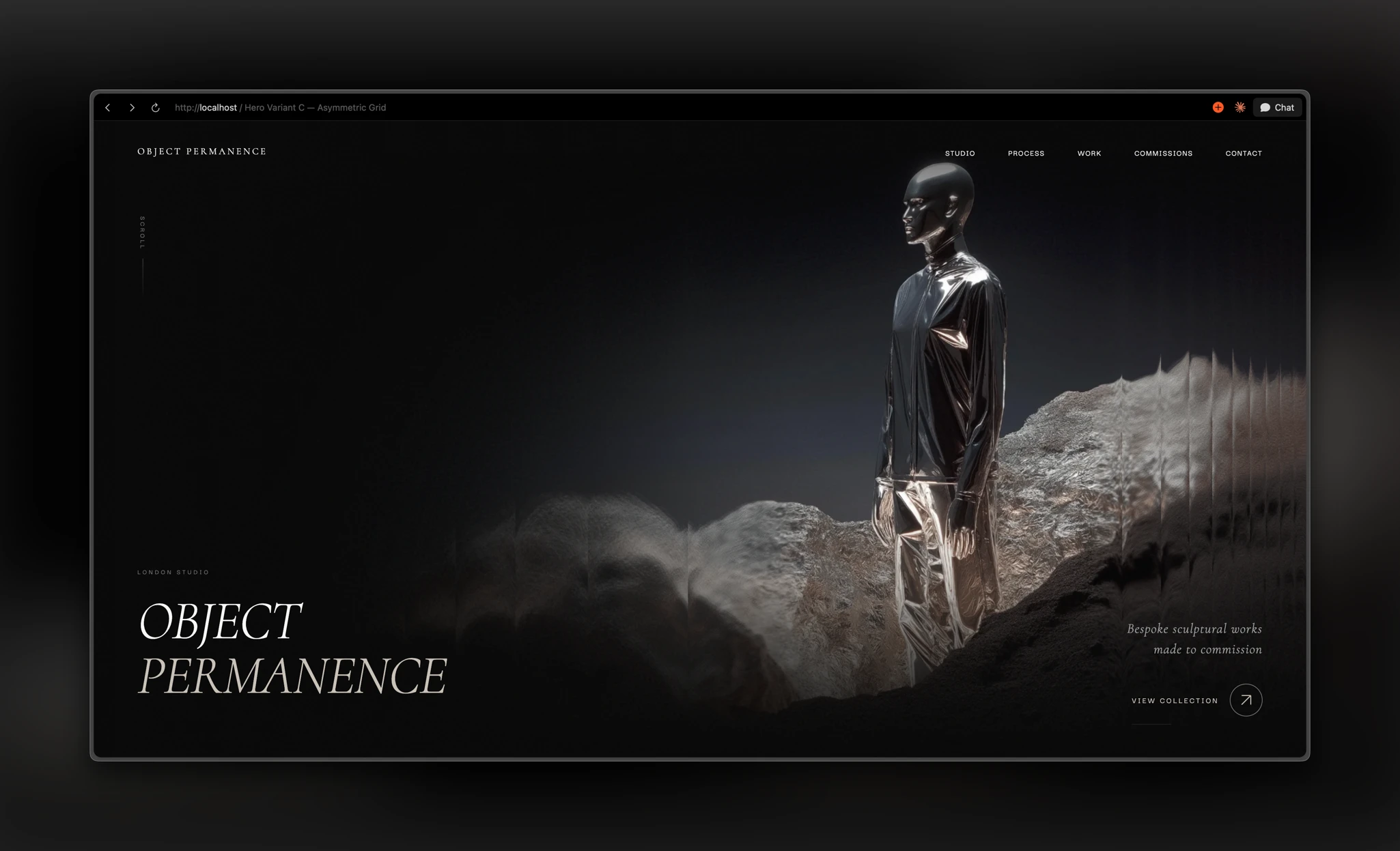
From there, the site breathes. Sections are tall. Text is sparse. Scroll animations are subtle, things fade and shift, but nothing jumps at you. The whole experience is designed to reward slow scrolling.
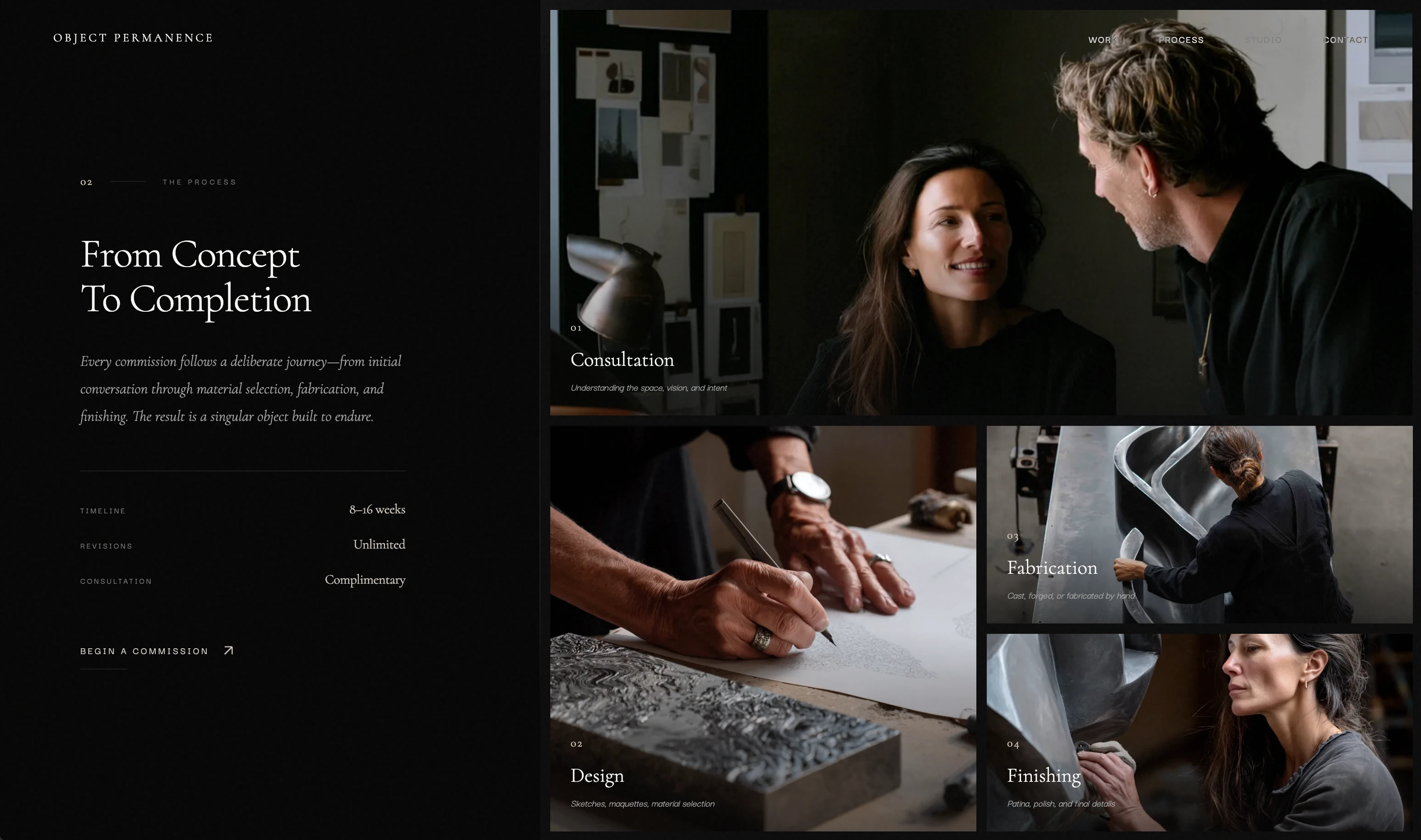
The pacing is intentional. A sculptor who spends 8-16 weeks on a single piece shouldn't have a website that feels rushed.
Typography and restraint
Cormorant carries most of the visual weight, from massive display headers to delicate details. It feels classical but not nostalgic.
The copy throughout is terse, almost curt. Section headers are numbered like chapters. Descriptions are fragments. I wanted it to feel like the fictional sculptor wouldn't waste words. So the site doesn't either.
The beauty of deliberate interaction
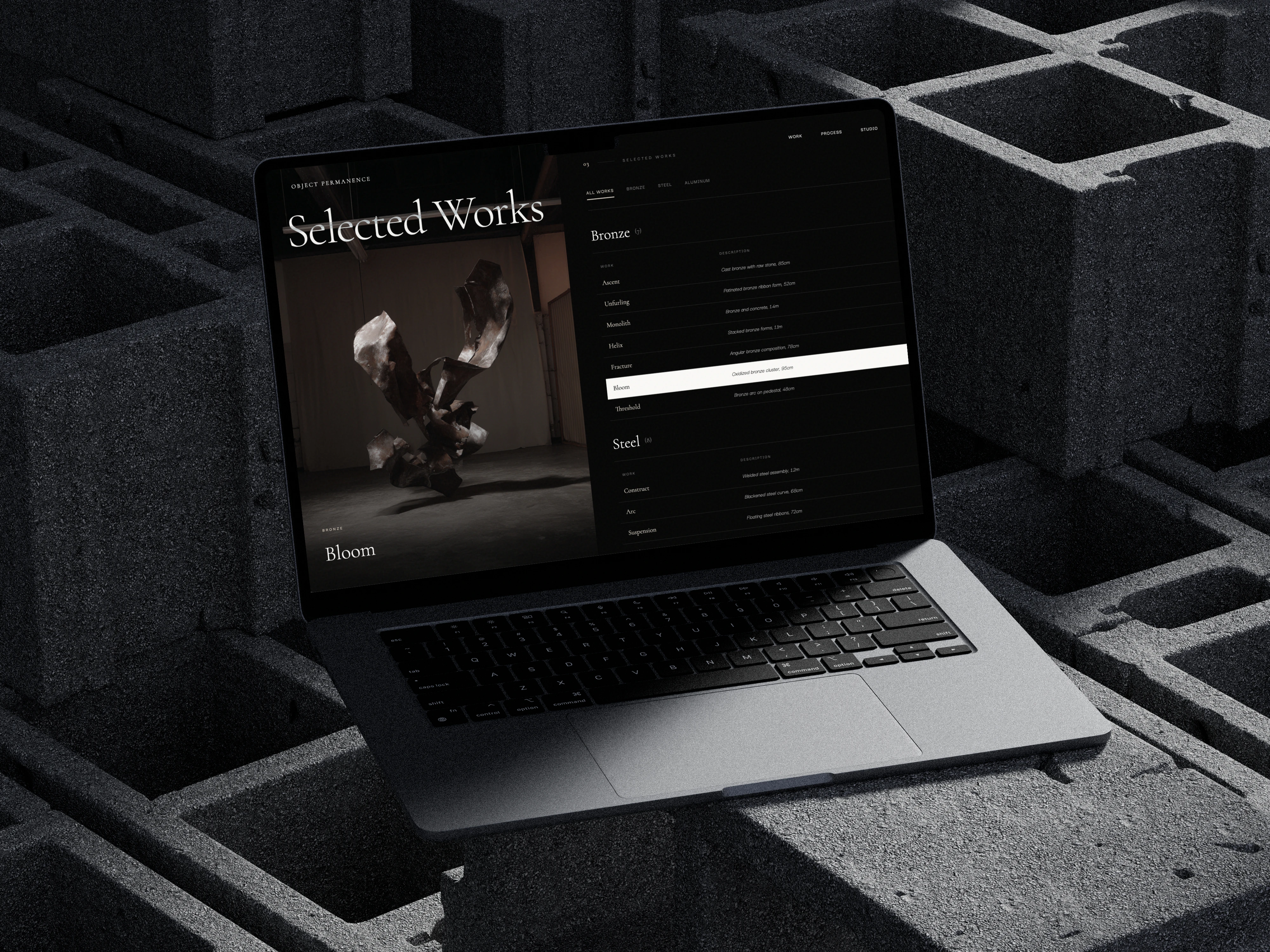
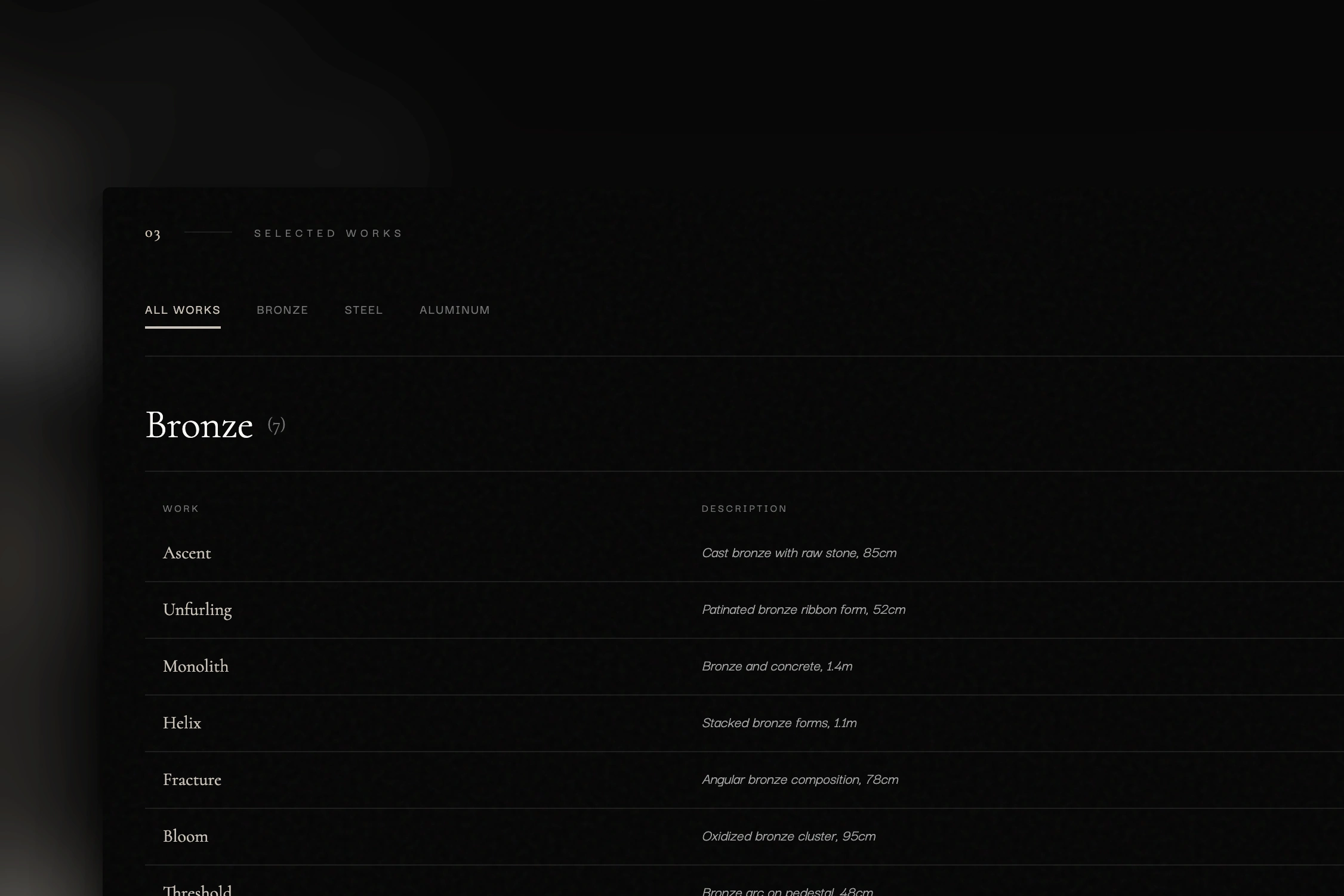
The Selected Works section is my favorite. Just a table: name, description, year. Hover to see a preview image that follows your cursor.
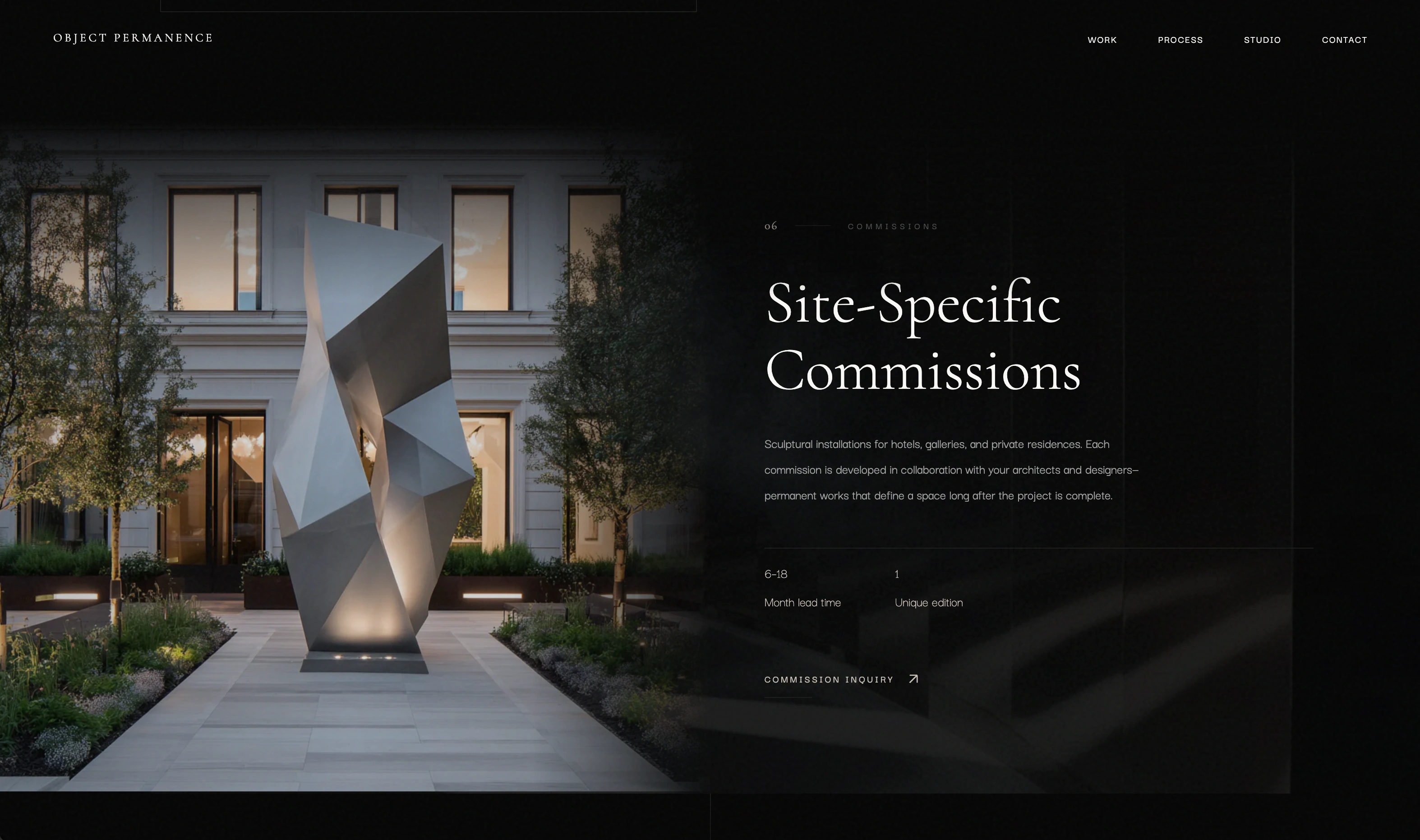
No hero shots, no grid layouts. The restraint says: the work speaks for itself. Even the filter tabs—Bronze, Steel, Aluminum—are about materiality, not category. Everything reinforces what this imaginary person cares about.
Grounding the fiction
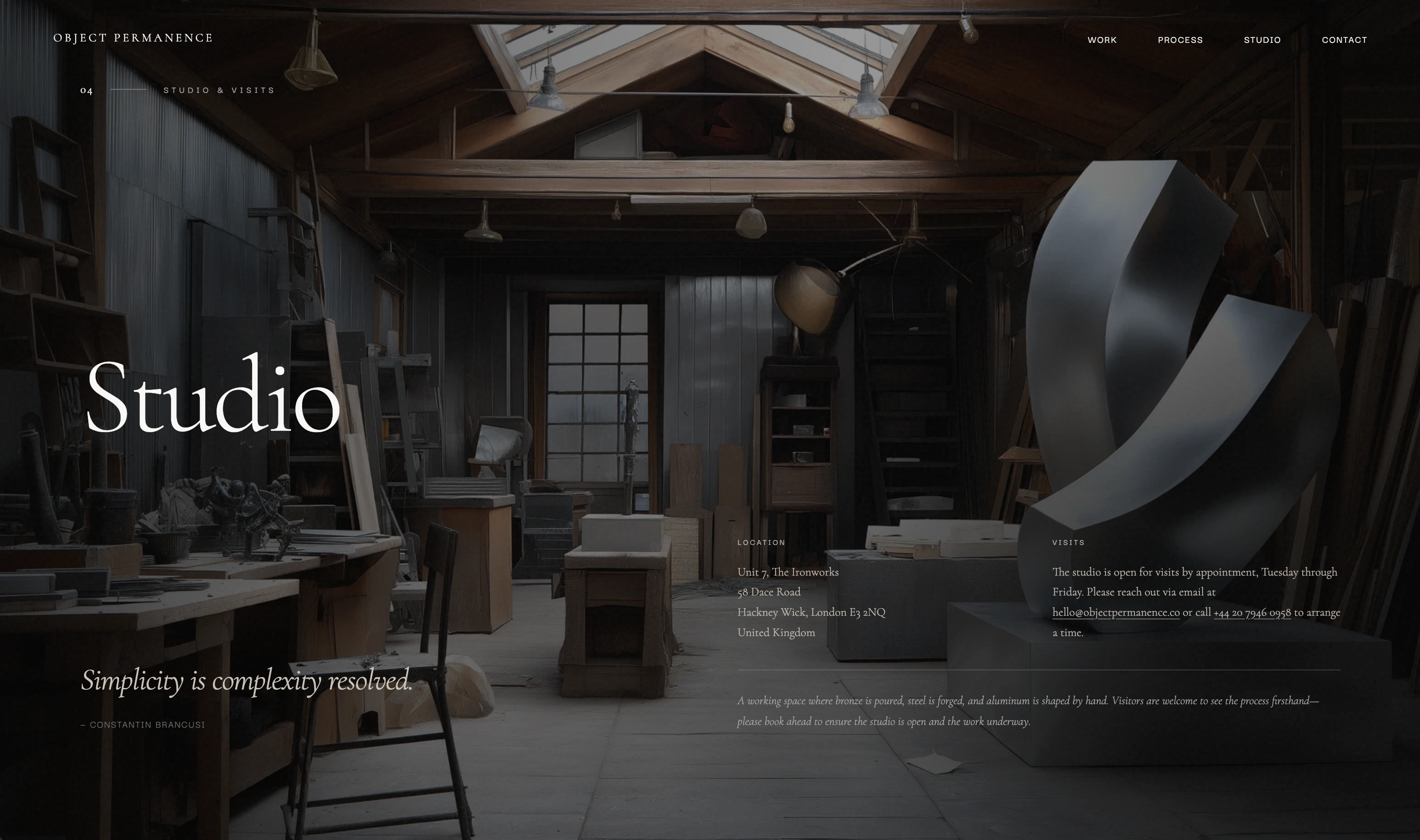
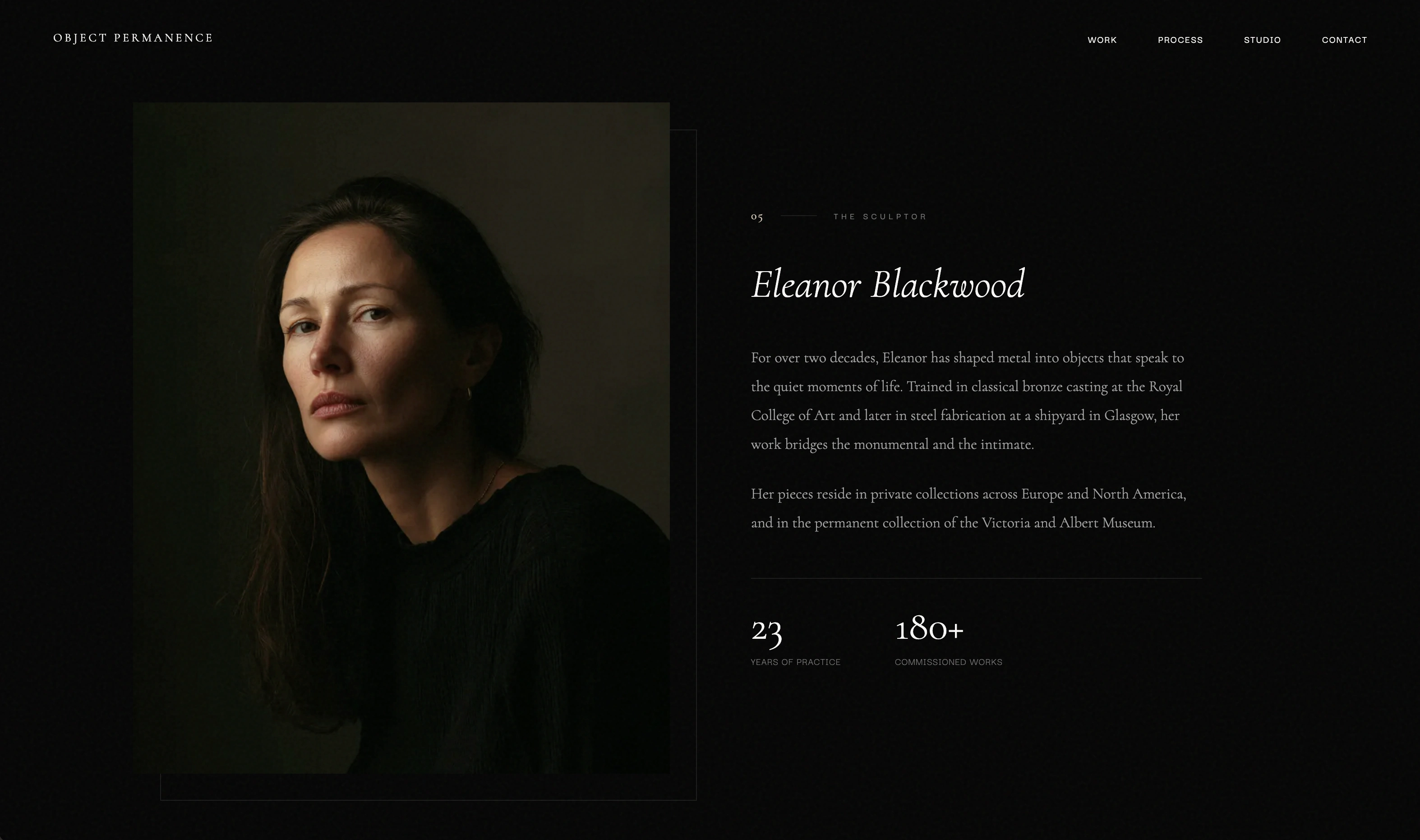
The site includes a studio address in Hackney Wick, a Brancusi quote, a sculptor named Eleanor Blackwood with pieces in the V&A. None of it is real, but it feels real—and that's the point. Good brand design makes you believe, even for a moment.
How it started
This project began as a test: could Claude Opus 4.5 generate a viable design direction? It produced the initial concept, the dark palette, and the general tone. From there, I refined everything: the typography, the pacing, the interactions, the shader.
Opus gave me a starting point I wouldn't have reached on my own. But the craft—knowing when to hold back, how the interactions should feel, where silence is more effective than content—that's where most of the work is.
View the live site:
Like this project
Posted Jan 19, 2026
A fictional sculptor's portfolio designed to make you slow down. Fractal shaders, cinematic scroll pacing, and deliberate restraints.
Likes
0
Views
10
Timeline
Jan 14, 2026 - Jan 20, 2026