Built with Webflow
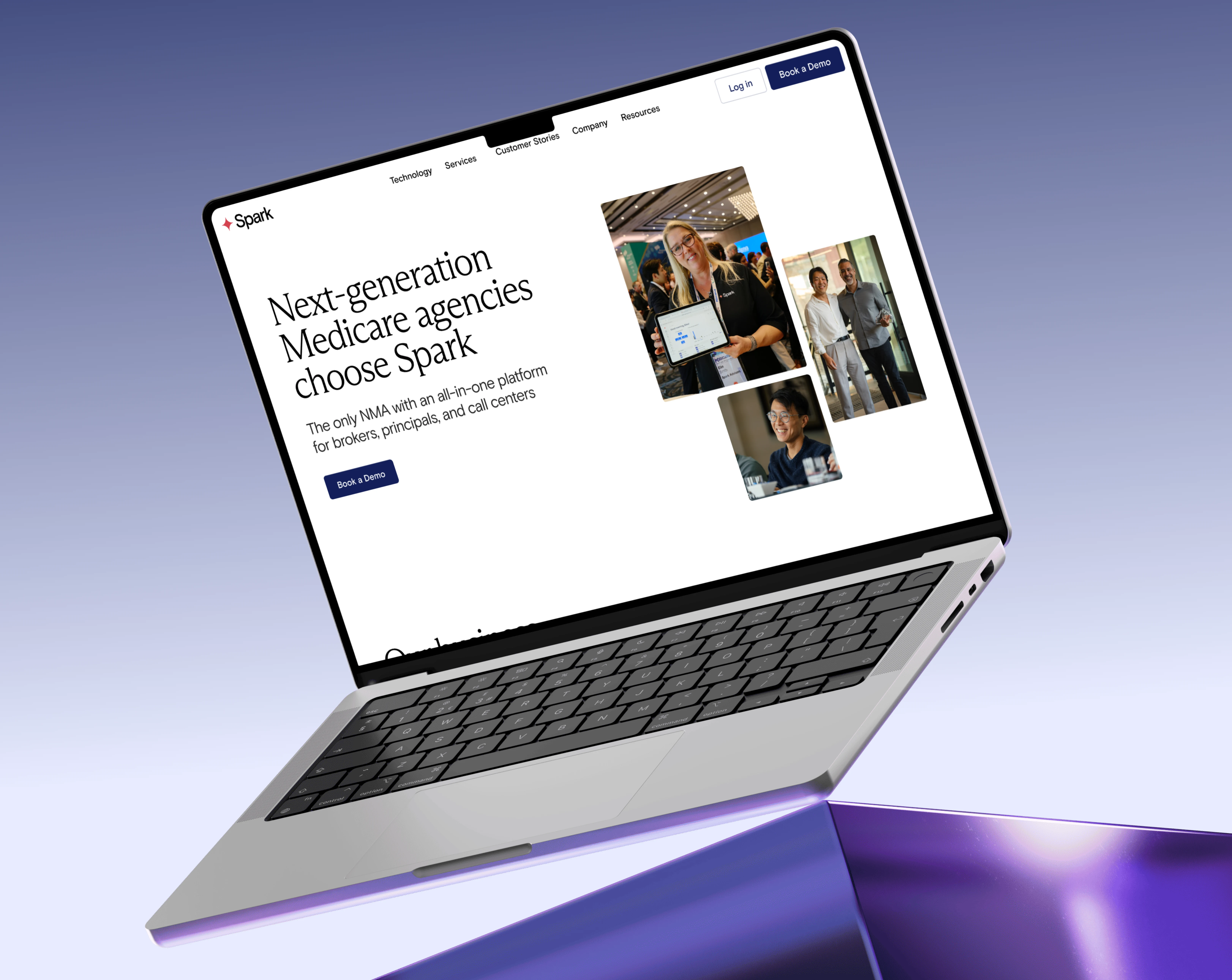
Spark Advisors — Figma to Webflow Development
Fahad Raee
Verified
Overview
Website: sparkadvisors.com
Industry: SaaS · InsurTech · Medicare Services
Services: Figma UI/UX Design · Webflow Development · CMS Integration · Conversion Optimization
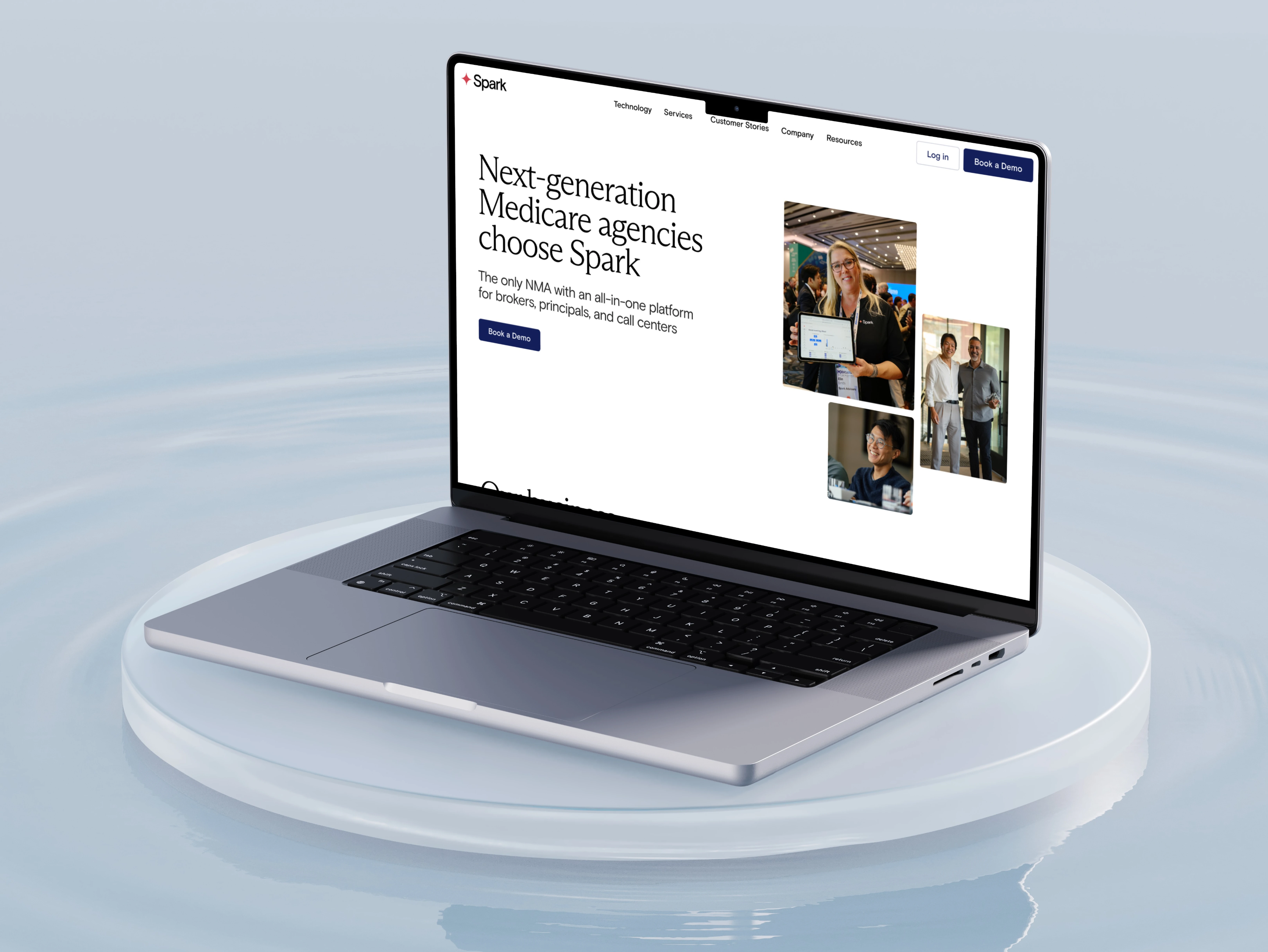
Spark Advisors is a technology platform built specifically for independent Medicare agents and agencies. It consolidates CRM, quoting, enrollment, marketing automation, and commission tracking into one unified system, eliminating the fragmented toolsets that hold most agents back from scaling.
The product was already excellent. The problem was that the website didn't reflect that.
Feature-heavy pages, unclear value proposition, and no strong conversion path meant traffic was arriving and leaving without booking a demo. My job was to design and build a site that positions Spark as the definitive growth infrastructure for Medicare agencies and converts visits into qualified conversations.
The website was strategically built to:
Position Spark Advisors as an all-in-one platform, not a collection of tools
Translate complex product features into clear, benefit-driven messaging
Build credibility with agents, agencies, and carrier partners simultaneously
Create a scalable CMS foundation for continuous content growth
Drive measurable conversion, more demo bookings, fewer drop-offs
The Challenge
1. Too Many Features, Not Enough Clarity
Spark covers five distinct product areas: CRM, enrollment, marketing, compliance, and commissions. Without the right structure, this level of depth overwhelms visitors before they understand the core value. Listing every feature created noise, not confidence.
2. Three Audiences, One Website
A solo Medicare agent evaluating tools has completely different priorities from a 50-agent agency or a carrier partner. The old site spoke to everyone the same way, which meant it resonated with no one specifically.
3. No Trust Signals Where They Mattered
Medicare agents are conservative buyers. They need social proof and credibility before they'll act. The existing site lacked the authority markers, agent stories, growth stats, and carrier relationships needed to move skeptical visitors forward.
4. Visitors Browsed But Didn't Convert
Traffic was arriving, but demo bookings were low. There was no clear, repeated CTA architecture, just a contact form buried at the bottom of the page.
The Solution
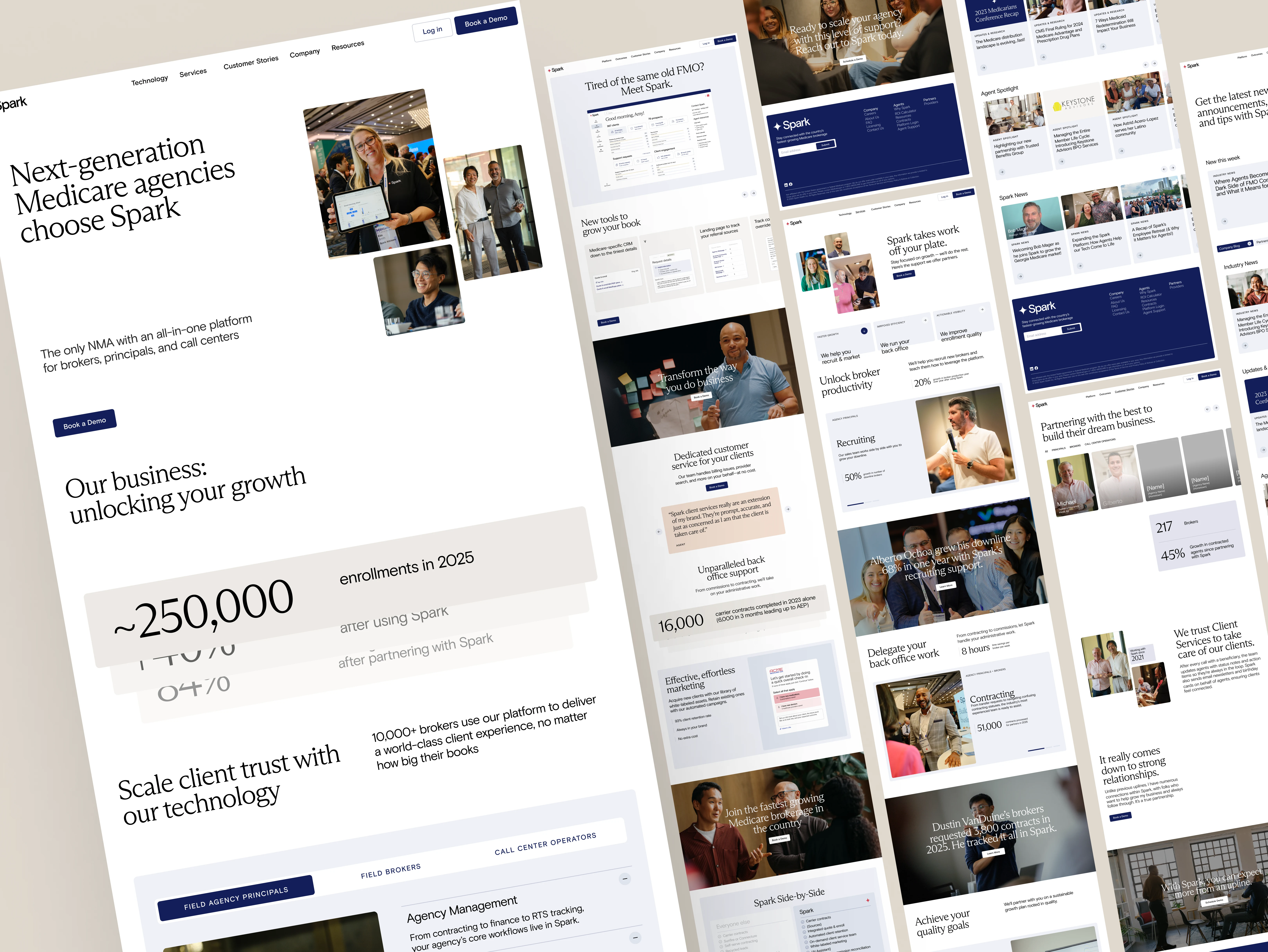
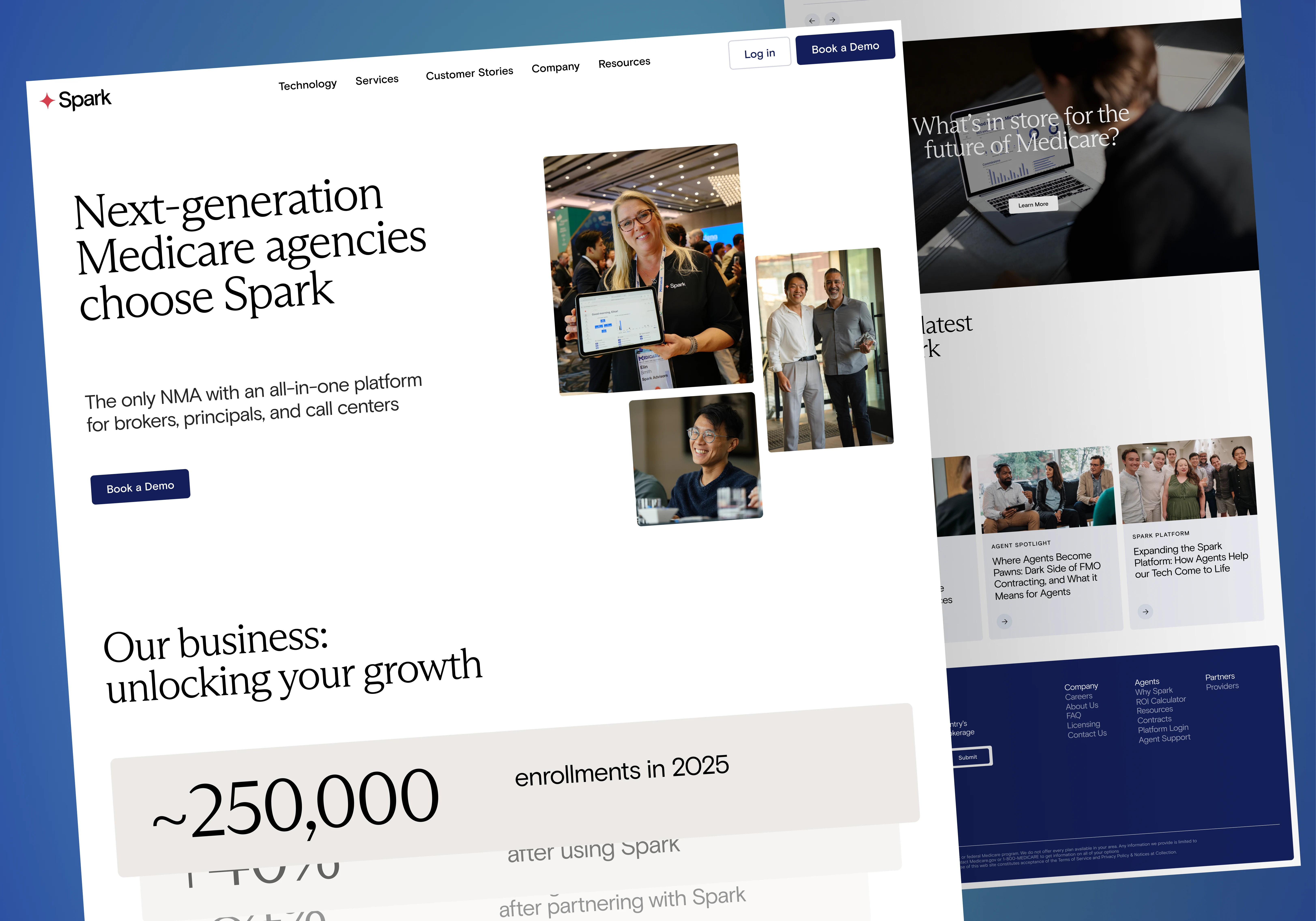
Narrative-First Information Architecture
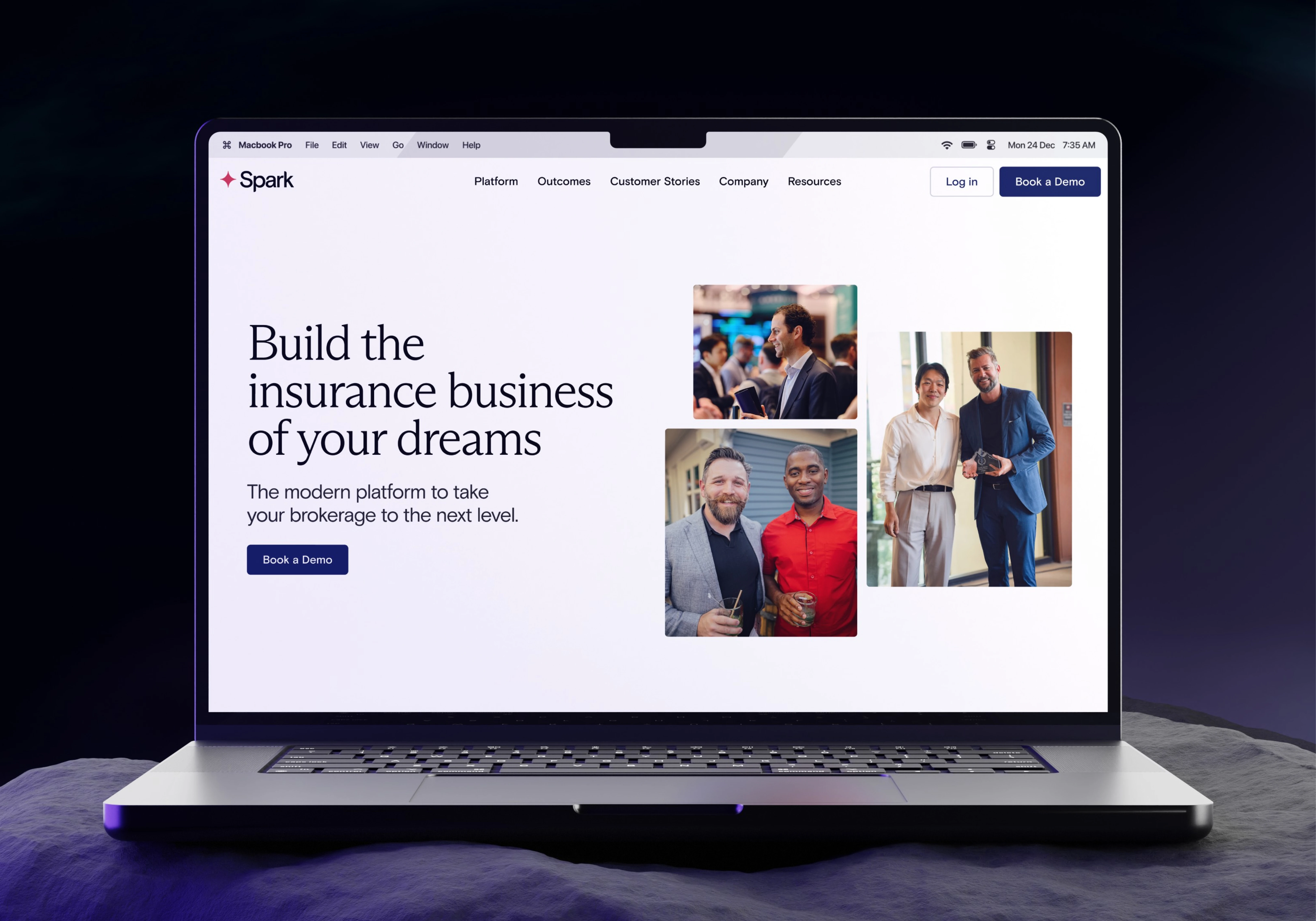
I rebuilt the page structure around the user's journey, not the product roadmap. The flow became: pain → platform → outcomes → action. Every section earns its place in the story.
Audience-Segmented Messaging
Distinct value layers for agents, agencies, and carrier partners so every visitor lands on messaging that speaks directly to their specific goals and objections.
Trust Embedded Throughout, Not Siloed
Agent success stories, growth metrics (250,000+ clients served), and carrier logos placed at the exact moments where hesitation is highest are not saved for a single testimonials section.
Conversion Architecture That Repeats
Multi-point CTA system "Book a Demo," "Talk to Our Team," "Get Started" calibrated to where the visitor is in their decision. Sticky navigation with persistent demo booking access. No dead ends.
Deliverables
UI/UX Design (Figma)
Full responsive design across desktop, tablet, and mobile
Scalable component library with documented variants
Typography hierarchy built for readability at scale
Professional visual system that balances authority with approachability
Webflow Development
Production-ready responsive build
CMS Collections for blog, resources, and team pages
Optimised Core Web Vitals for SEO performance
Component-based architecture for long-term scalability
Conversion Optimisation
Multi-point CTA placement throughout every page section
Benefit-led copy tailored to each audience segment
Trust signals at every key decision moment
Persistent sticky nav with demo booking access
Outcome & Impact
Clarity that converts — A platform spanning five product categories now communicates its full value in one cohesive scrolling narrative. Visitors understand what Spark does within seconds.
Immediate lift in demo bookings — The restructured CTA architecture drove a measurable increase in demo requests following launch.
A website the team owns — The CMS-powered Webflow build means Spark's team can publish content, update pages, and add resources without touching a line of code.
Built to grow The component system and CMS structure mean adding new pages, features, or content sections takes hours, not days.
If your SaaS product is powerful but your website can't explain it clearly, you're losing qualified leads every day.
I design and build conversion-focused websites for complex tech products, from Figma to Webflow, end-to-end.
→ View my full portfolio: contra.com/fahadraee
Like this project
Posted Aug 21, 2025
Designed and built a responsive Figma-to-Webflow site for Spark Advisors, simplifying a Medicare SaaS into a clear, conversion-focused experience.
Likes
1
Views
48
Timeline
Aug 19, 2025 - Aug 20, 2025
Clients
Artstak