TalkNotes Tech Startup Landing Page
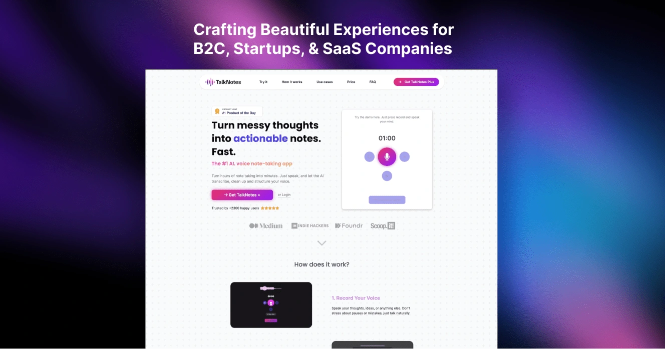
Overview
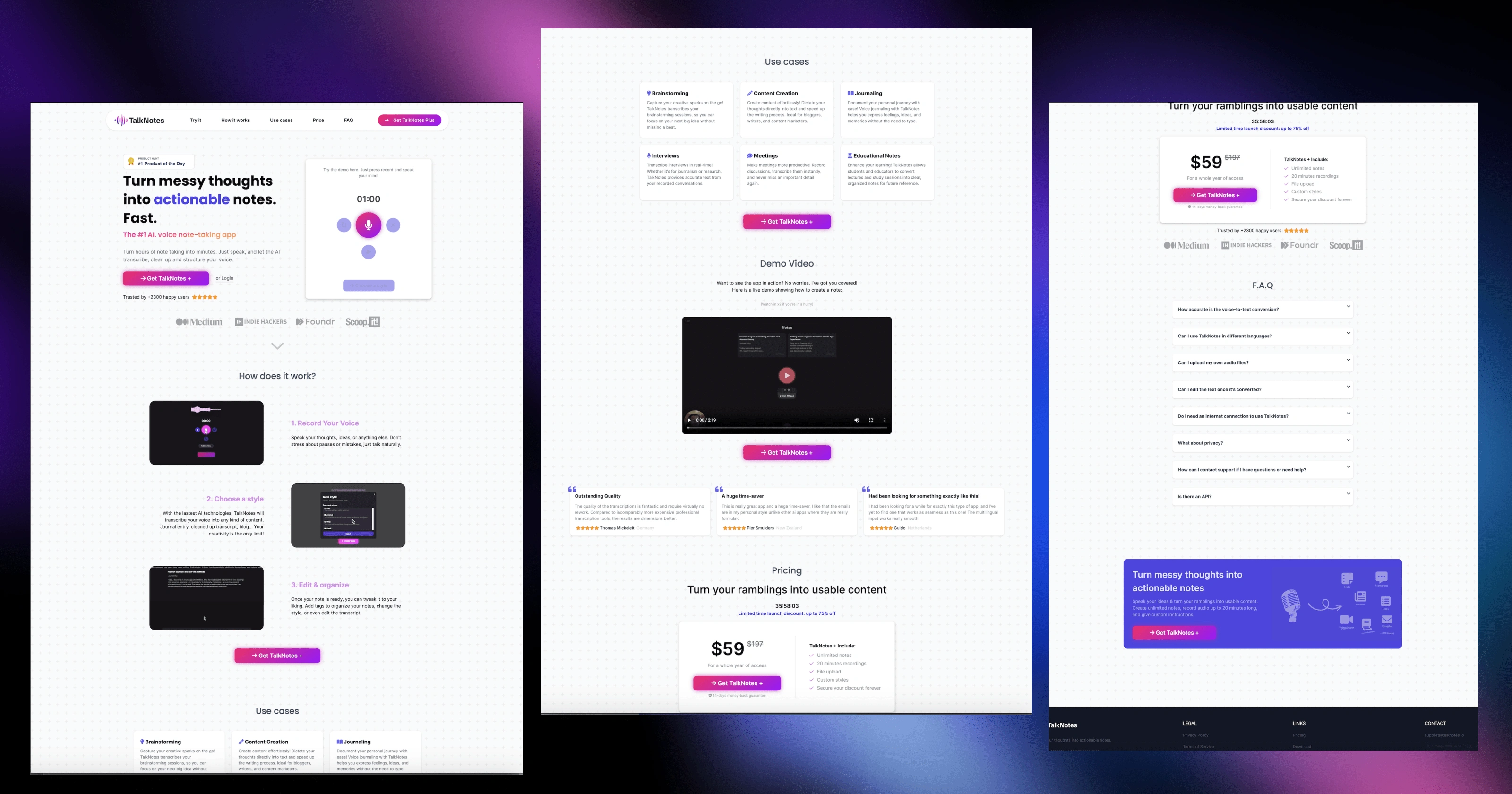
The goal of this project was to design and develop a Framer website design specifically tailored for TalkNotes, the actionable notes taker startup. A high-quality, futuristic image of a bustling tech hub or cityscape at night, subtly blurred to keep the focus on the content. By creating this design, I aimed to provide an affordable solution that would enhance an TalkNotes brand and online presence.
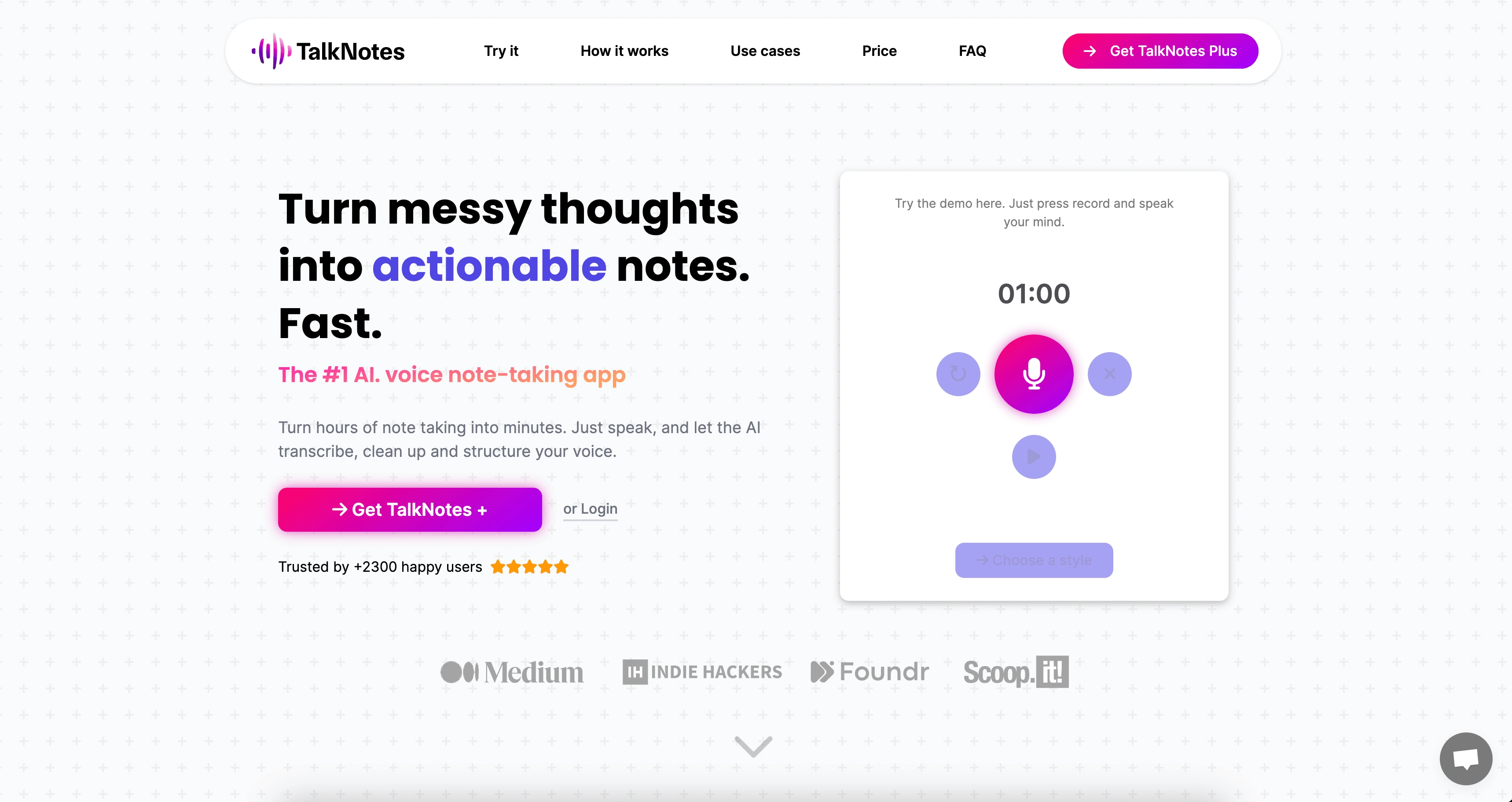
Landing page (Hero Section)
Navigation Menu: A clean, minimalistic menu with easy-to-read links, including "Try It," How It Works," "Use Cases," "Price," and "FAQ"
Project Details 🤝
During the project, I faced several challenges. One of the main challenges was designing a template that effectively highlighted an author's work while still providing insight into their personality and background. To overcome this challenge, I conducted thorough research on best practices in author websites and studied various design elements that could achieve our desired outcome.
Another challenge was creating realistic content for the website since it was a mock project. I had to come up with an entire persona, including names for books and designs for book covers, which would serve as placeholders until actual content could be added.
Overall, my approach involved close collaboration with clients to understand their needs and preferences throughout the entire design process.
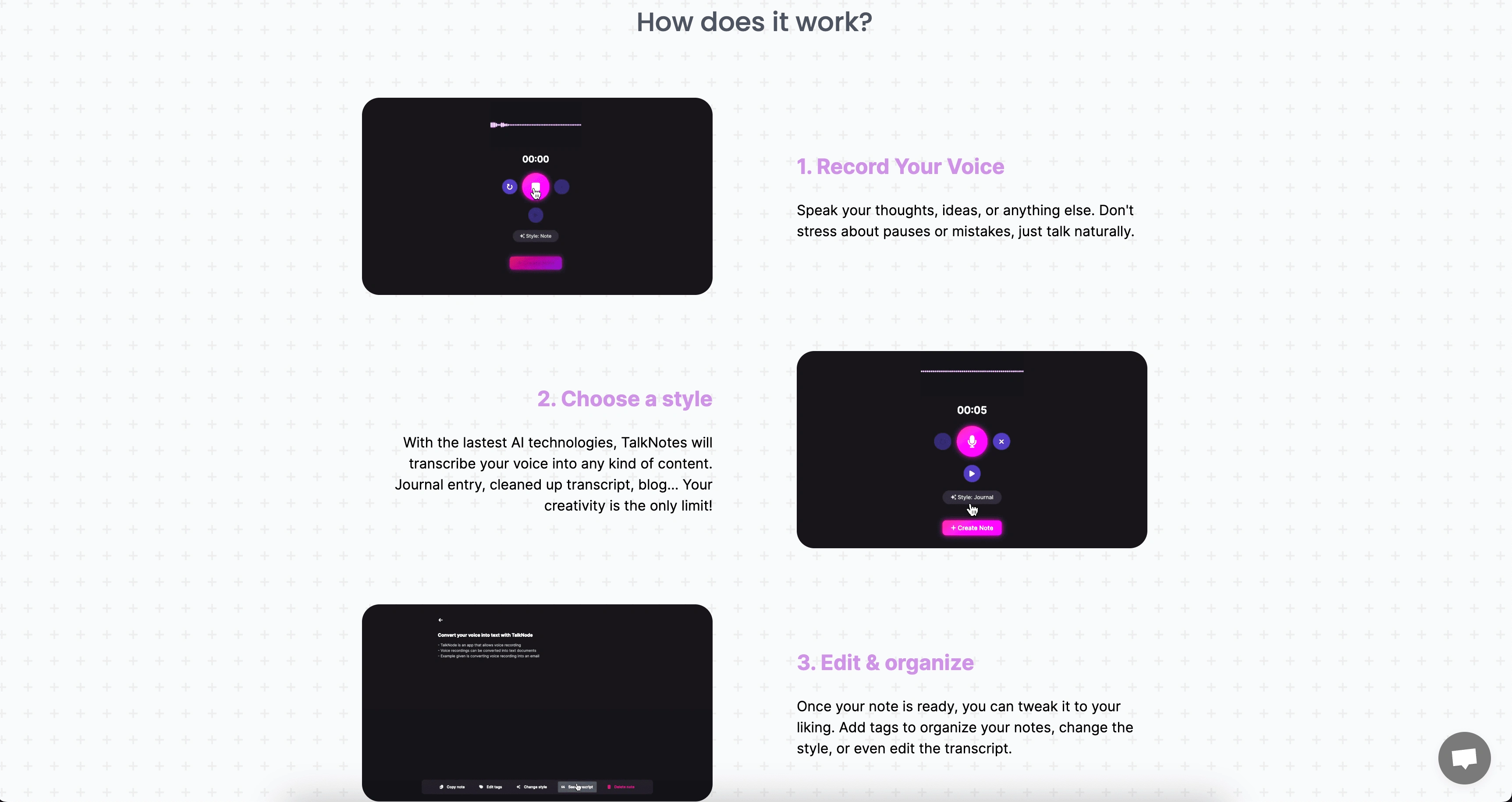
Mid Section (How does Talk Notes Work)
Product Cards: Eye-catching, high-resolution images or icons of the startup's key products or services, displayed in a grid.
Feature Highlights: A few key features or benefits of each product, using concise, persuasive language.
Results ✨
The final outcome of the project surpassed expectations. The Framer website I created provided TalkNotes with a stunning platform to showcase their product professionally while maintaining their unique style. The color scheme and overall aesthetic were carefully chosen to create an inviting atmosphere for readers.
By offering an affordable option that didn't compromise on quality or functionality, this website design became highly popular among TalkNotes.
Conclusion 💥
In conclusion, my experience in designing a flawless Startup Design specifically tailored for TalkNotes has been highly successful. The project showcased my ability to understand clients' needs, conduct thorough research, and effectively apply design principles to create a visually appealing and functional solution.
I am confident that this design will continue to empower TalkNote in establishing their online presence and connecting with their users.
Preview site: https://talknotes.io/
Like this project
Posted Oct 4, 2023
Discover the rebirth of a brand that understands what it means to truly love Notes – a brand that treats each shoe as a work of art, deserving of the finest
Likes
0
Views
18


