
DON'T FIT IN. STAND OUT.
A bold visual statement celebrating individuality, self-expression and the confidence to be different.
#GraphicDesign #PosterDesign #Typography #AdvertisingDesign #PrintDesign
The Concept
Not everything is meant to blend in. Some things are meant to challenge the ordinary, break visual conventions and demand attention.
"Don't Fit In. Stand Out." is a bold poster design built around the idea of individuality and unapologetic self-expression. The concept encourages people to embrace what makes them different rather than conforming to expectations.
The objective was to translate this message into a striking visual composition that communicates confidence, energy and attitude at first glance.
"Being different isn't something to hide. It's what makes you stand out."
The Creative Direction
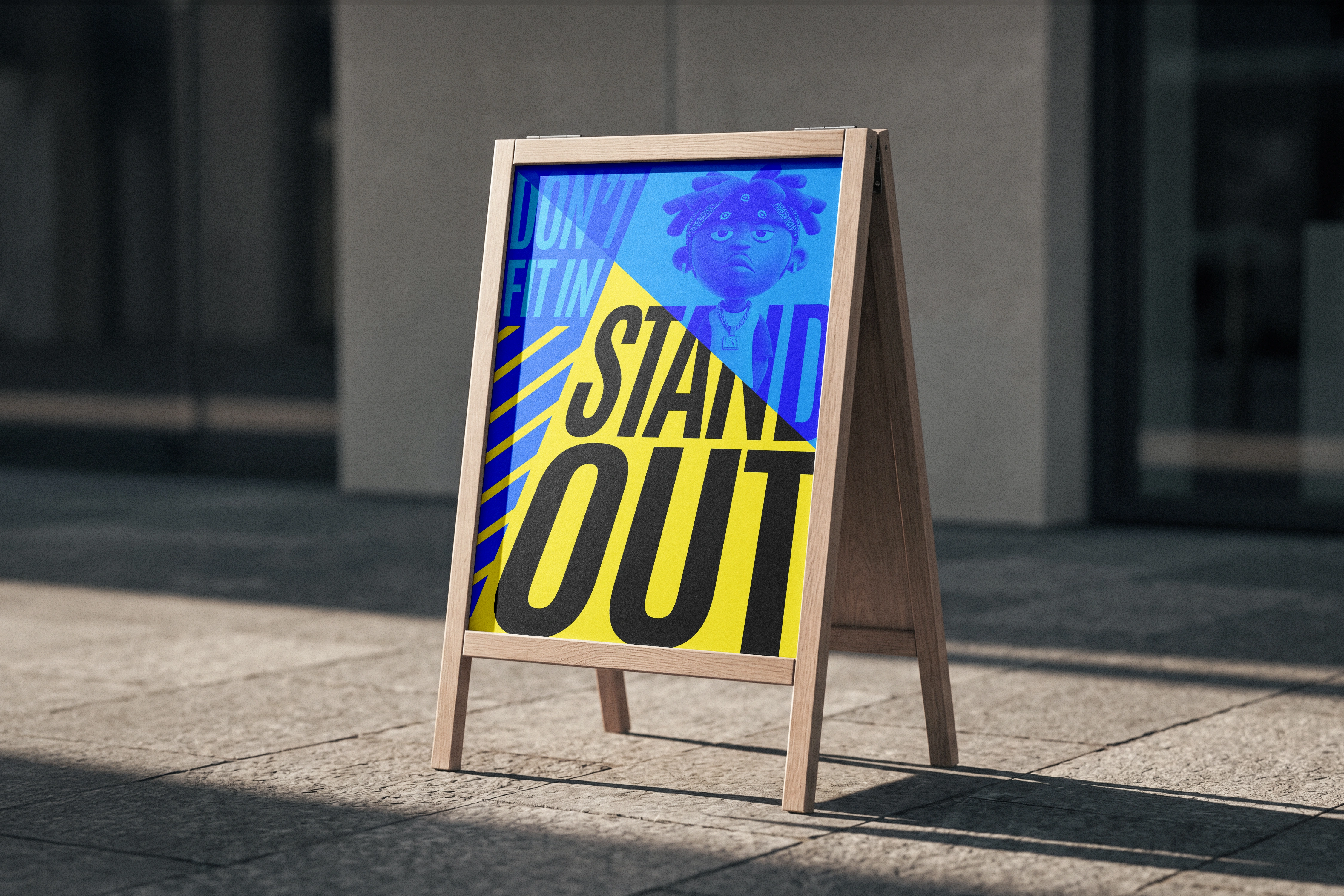
The visual direction revolves around oversized typography, vibrant colours and playful 3D elements. Every element was carefully considered to create a composition that feels energetic, expressive and impossible to overlook.
Rather than relying on a conventional poster layout, the design uses scale, contrast and visual interaction to give the message its own personality.
Key visual elements:
Bold typography: Oversized lettering creates an immediate visual impact and reinforces the central message.
Vibrant colours: A bright, high-energy palette adds personality and makes the composition visually engaging.
3D character: A playful three-dimensional element introduces depth, movement and character.
Strong composition: Layering, scale and contrast bring the different elements together into one cohesive visual statement.
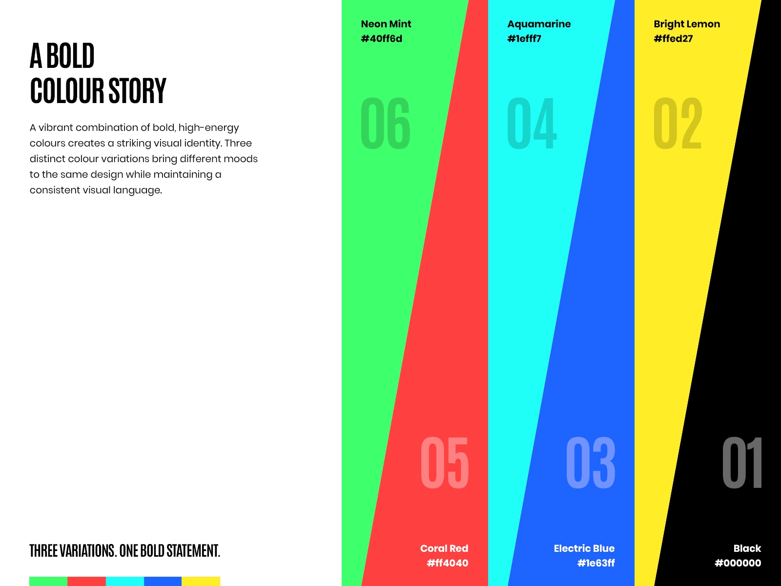
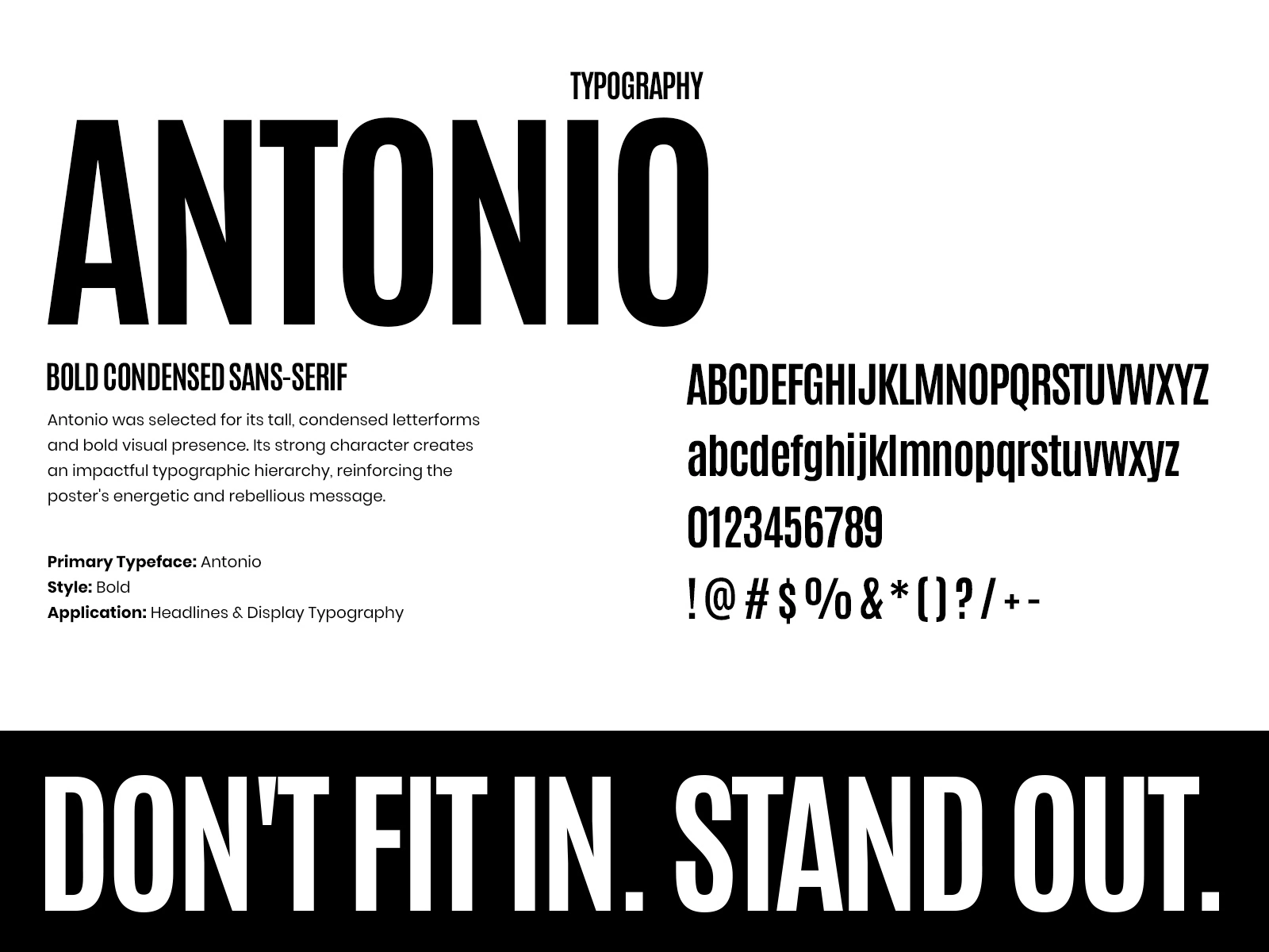
Color & Typography
Color and typography play a central role in shaping the personality of this design.
A vibrant color palette brings energy and excitement to the composition, while the use of Antonio, a bold condensed sans-serif typeface, gives the message a strong and unmistakable presence.
The combination creates a visual language that feels expressive, contemporary and confident.
Bringing the Design to Life
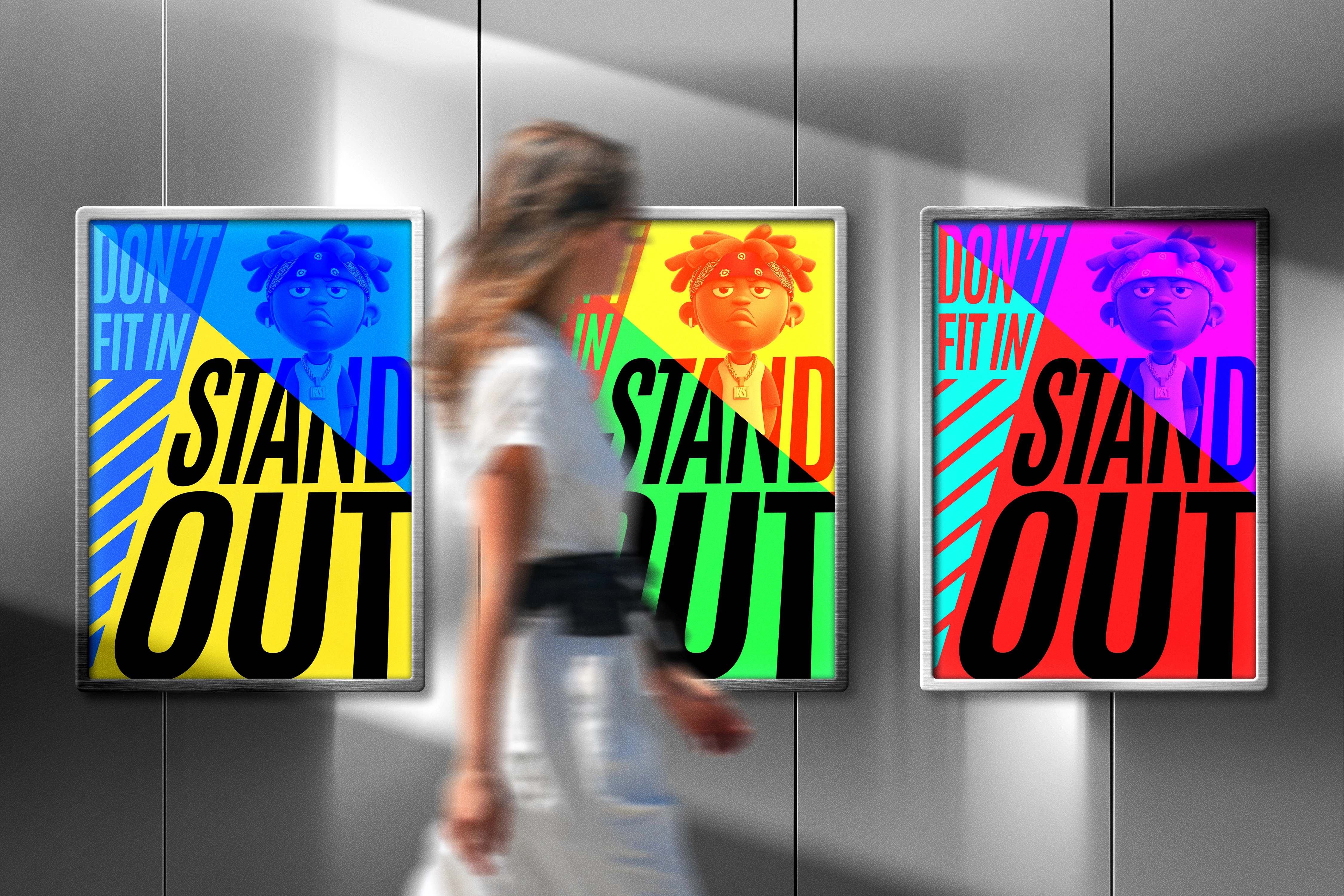
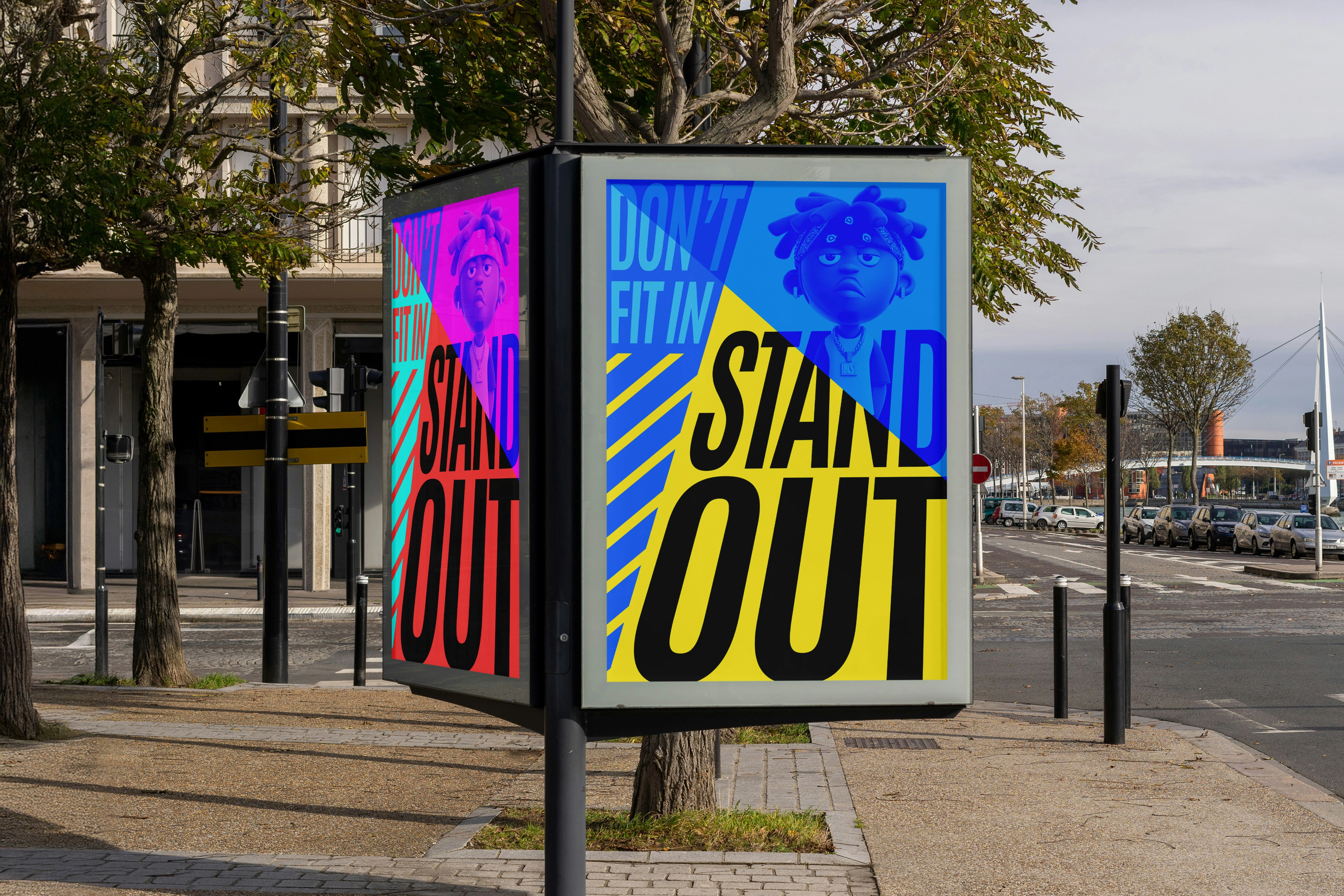
A poster should communicate effectively beyond the screen. To explore its real-world presence, the design was presented across different outdoor advertising applications.
From street-level poster displays and bus stop placements to large-scale billboards, the mockups demonstrate how the composition maintains its visual impact across different environments and viewing scales.
The applications help illustrate the versatility of the design while keeping the original message at the center of attention.
The Final Outcome
The final design brings together a simple yet powerful message with bold typography, vibrant colors and playful visual elements.
It is more than an attention-grabbing poster; it is a visual reminder that individuality deserves to be seen, celebrated and expressed.
DON'T FIT IN. STAND OUT.
0 likes · 1 view · Nov 12, 2026
A bold poster celebrating individuality through vibrant colours, expressive typography and playful visuals, inspiring uniqueness.
