Before → After: Turning a

Peace Olorundare

Before → After: Turning a Kajabi Website Into a Better Customer Experience
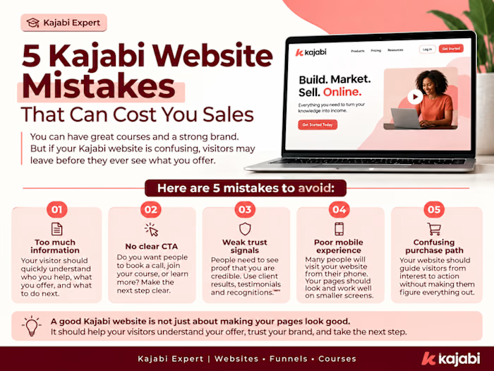
A Kajabi website can have all the right pages and still feel difficult to use.
That is why I focus on more than just making a website look good.
For this type of Kajabi project, I look at:
Before
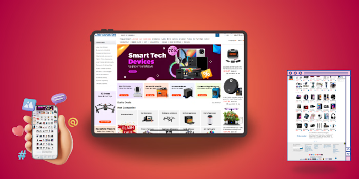
• Too much information
• Unclear navigation
• Weak calls to action
• Sales pages that feel overwhelming
• No clear path from visitor to customer
After
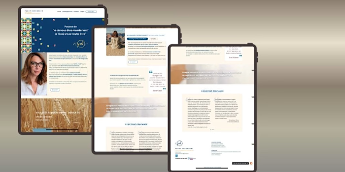
• Clear and simple navigation
• Strong visual hierarchy
• Clear calls to action
• Better sales page structure
• A smoother path to enrollment
The goal is simple:
Help visitors understand the offer faster, trust the brand, and know exactly what to do next.
That is the difference between a Kajabi website that simply exists and one that actually supports the business.
Good design gets attention.
Good structure helps turn that attention into action.
I help coaches, creators, and online educators build and improve Kajabi websites that are designed with both the customer and the business in mind.
#KajabiExpert #KajabiWebsite #KajabiDesigner #CourseCreator #OnlineCourse #WebDesign #SalesPage #OnlineBusiness
Like this project
Posted Aug 23, 2026
Before → After: Turning a Kajabi Website Into a Better Customer Experience A Kajabi website can have all the right pages and still feel difficult to use. Tha...
Likes
0
Views
1