Tellius Landing Page
Mat Przegietka
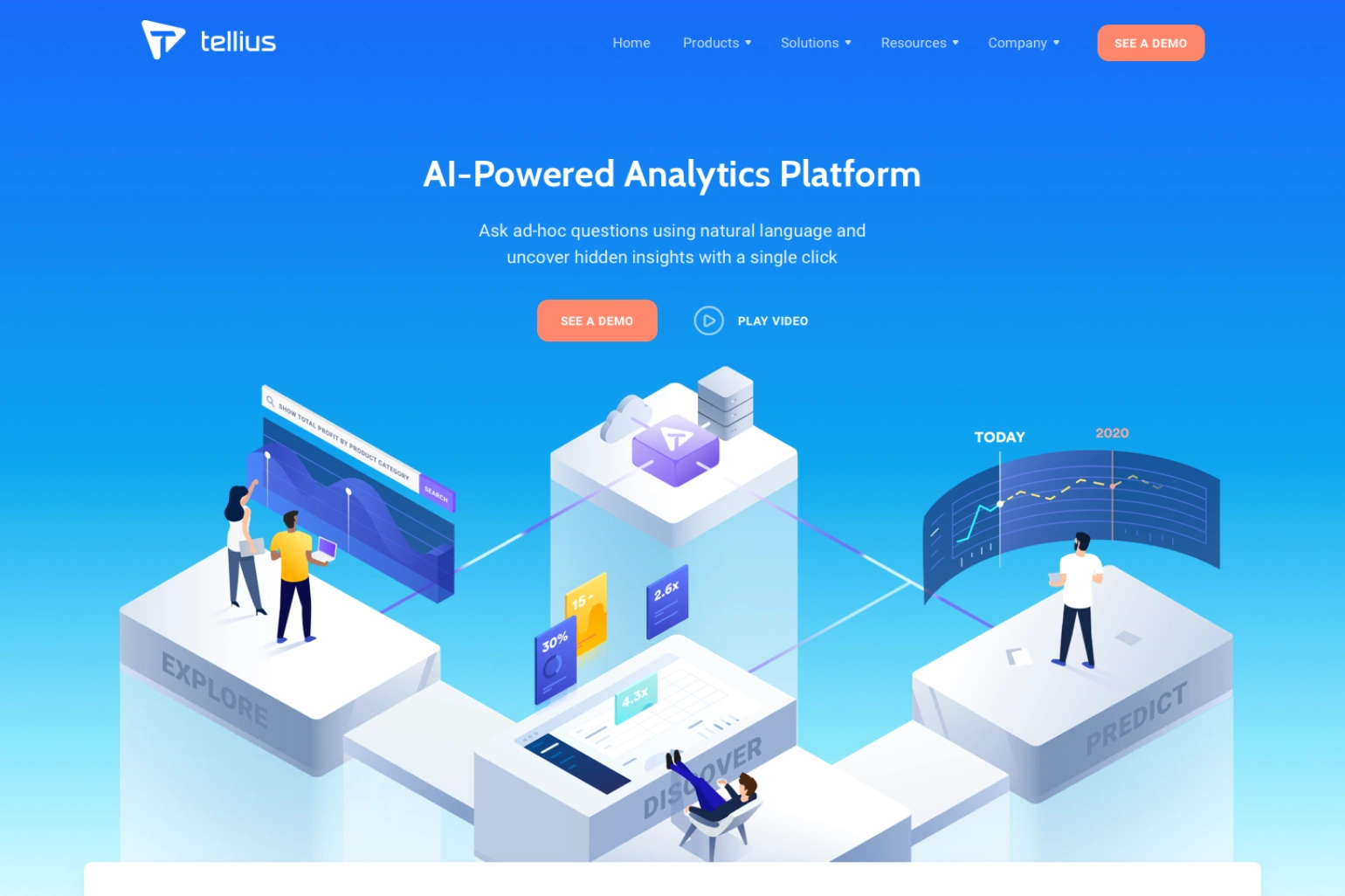
Tellius is a company that offers a platform targeted to data analysts. It is analyzing big data using machine learning. The goal of this project was to redesign the way Tellius communicates with potential users. They wanted to reach less technical people but still show the power of their software. On our first meeting the owner of the company showed us a demo of their app in action - for me it was like magic. It analyzed several databases with about million records in seconds, and provided an answer to a question written in natural language.
We decided to redesign the brand and simplify the message they communicate, focus more on the software features but present them in a more friendly way and what is more important - to capture the magical feeling of the app in action.
The work on the project began with the brand redefinition, I have prepared the propositions on the style and new message we wanted to communicate to the users. After that I began to work on their new logo focusing more on the symbol then the typography. They really liked the current typography so only slight corrections ware made there.
Due to the scope of the project (website was planned to get about 30 subpages) and the time restraints I have assigned additional designer to the project. We started working on the creative part - the communication tool - in this case it was a key visual illustration for each main feature and a overview one combining them together. In daily meetings with the clients we started with sketches to finally go for Illustrator and finish the illustrations. We focused on the relation between technology (Tellius) and real users.
After the main communication style was prepared we started working on the website itself. Result - a much better converting website, lots of new users, happy client and next assignment - the redesign of the app itself.
Like this project
Posted Jan 27, 2021
Likes
0
Views
4
Tags