Accessibility Startup Icon System
0
Iconography Designer
Icon Systems
Illustrator

Figma
Independent Disability
Independent Disability came to me with a mission: create modern, minimalist icons for their new disability card. These icons would act as a gateway, giving cardholders access to public facilities and communicating special needs efficiently. The key thing was communication – a quick glance at the icon should tell the story. It had to be clear, easy for everyone to understand, and grab people's attention.
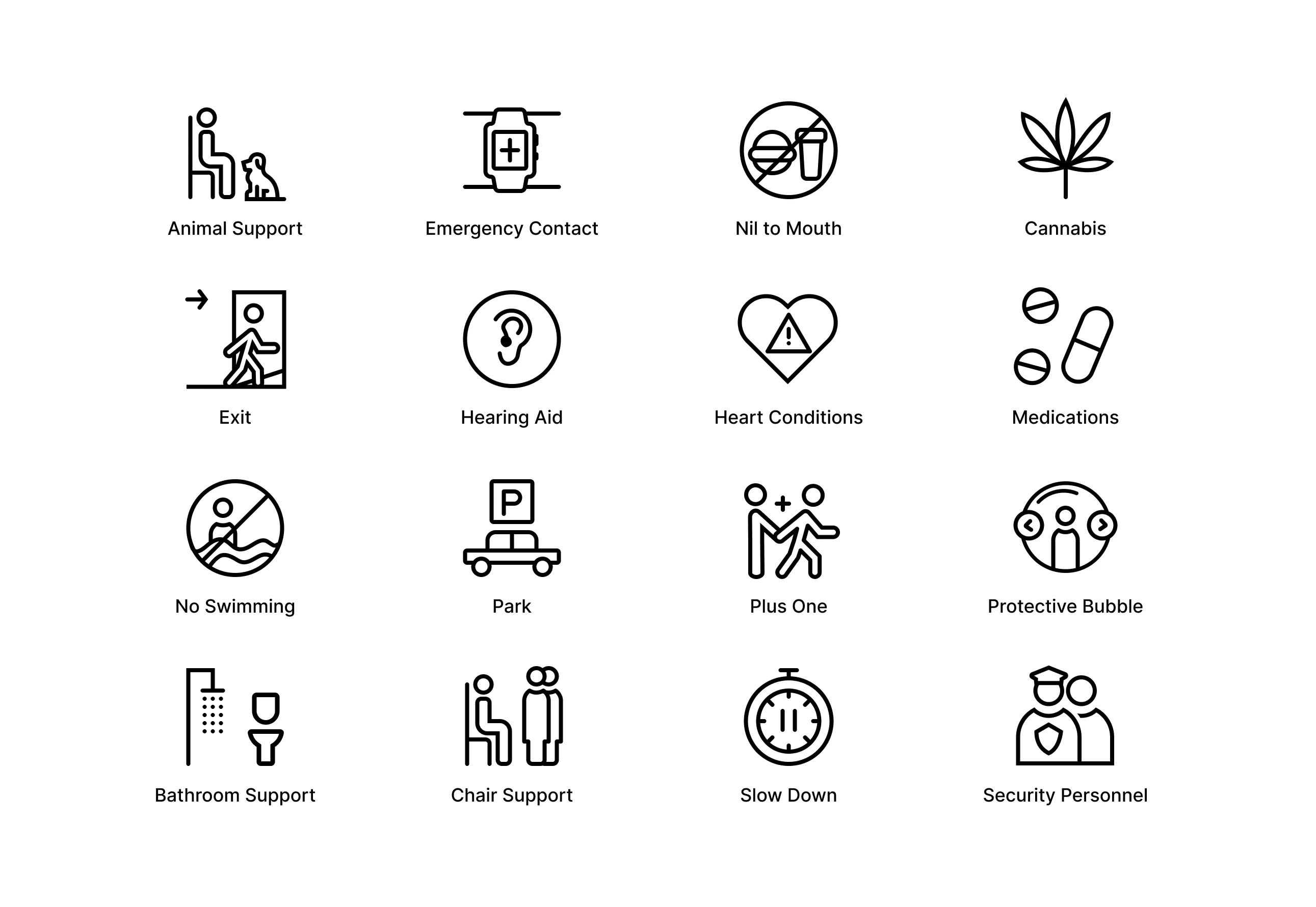
New icons created in consistent style
Framing the problem
Tone of current icons
Independent Disability wanted a fresh take on communicating disabilities and special needs. Most existing icons felt like labels, defining people by their disability rather than celebrating their full lives. These new icons needed to showcase the user's independence along with a disability or need.
Accessibility
The icons had to be easy to read and understandable at any size. This meant leaning away from complicated details.
Expanding Representation
Current icons were limiting, often cramming multiple needs into a single symbol. Independent Disability wanted a more inclusive system of icons for a wider range of disabilities and special needs.
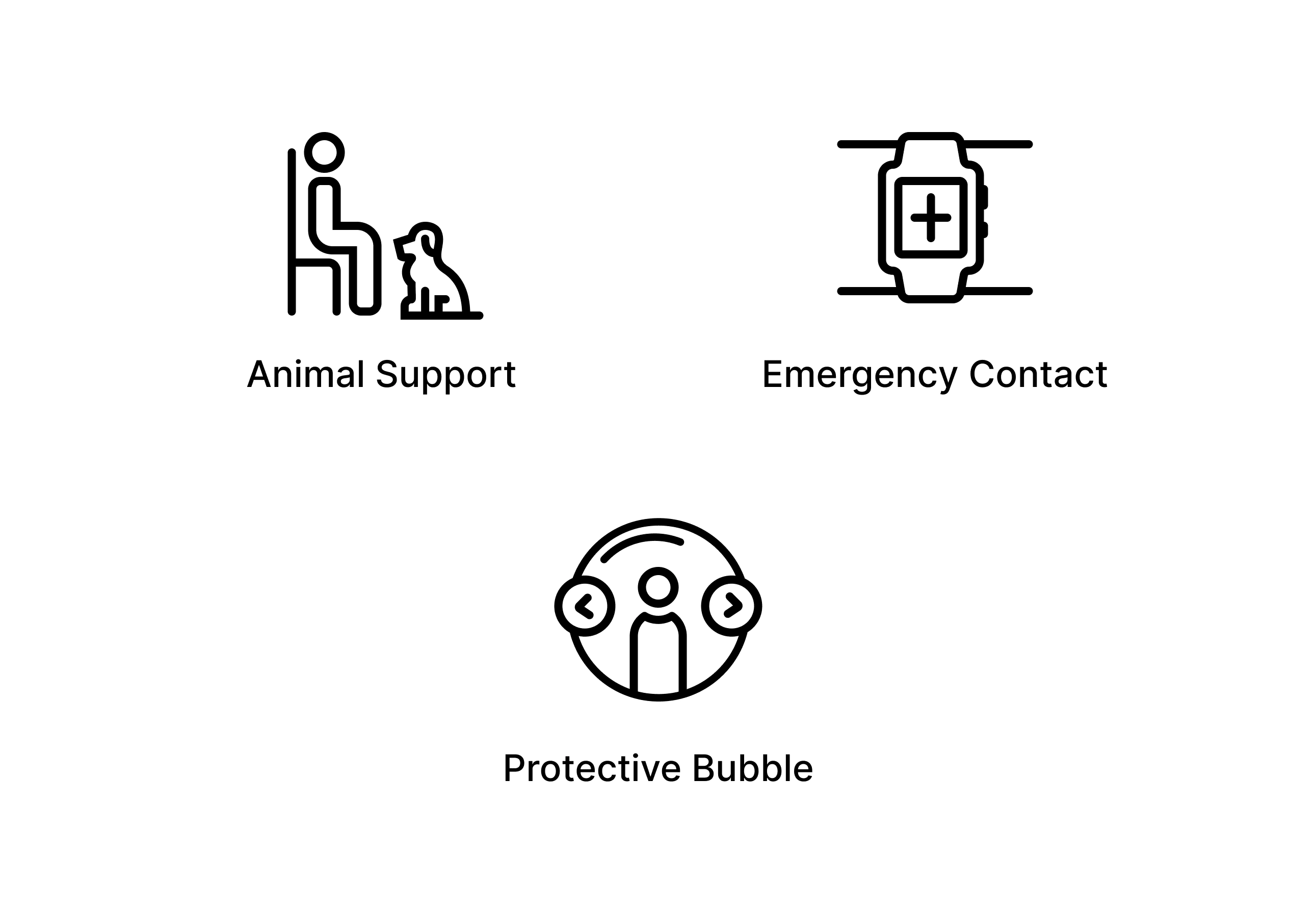
Close up of selected accessibility icons
Styles Explored
These icons were designed to be formal and to be used by a diverse range of users, including those with visual impairments. With this in mind, we explored styles that worked well in strictly black and white. After some back-and-forth, we narrowed it down to two finalists.
Style One (Solid Icons) utilized solid fills and a consistent third-person perspective. While it offered good recognition, this approach faced a challenge: expressing complex ideas could be difficult. Additionally, for users with visual impairments, solid icons risked appearing as smudges.
Ultimately, we chose Style Two (Line Icons). It offered greater flexibility for portraying complex concepts while remaining clear and easy to understand. The strategic use of white space also enhanced recognition for a wider range of users.
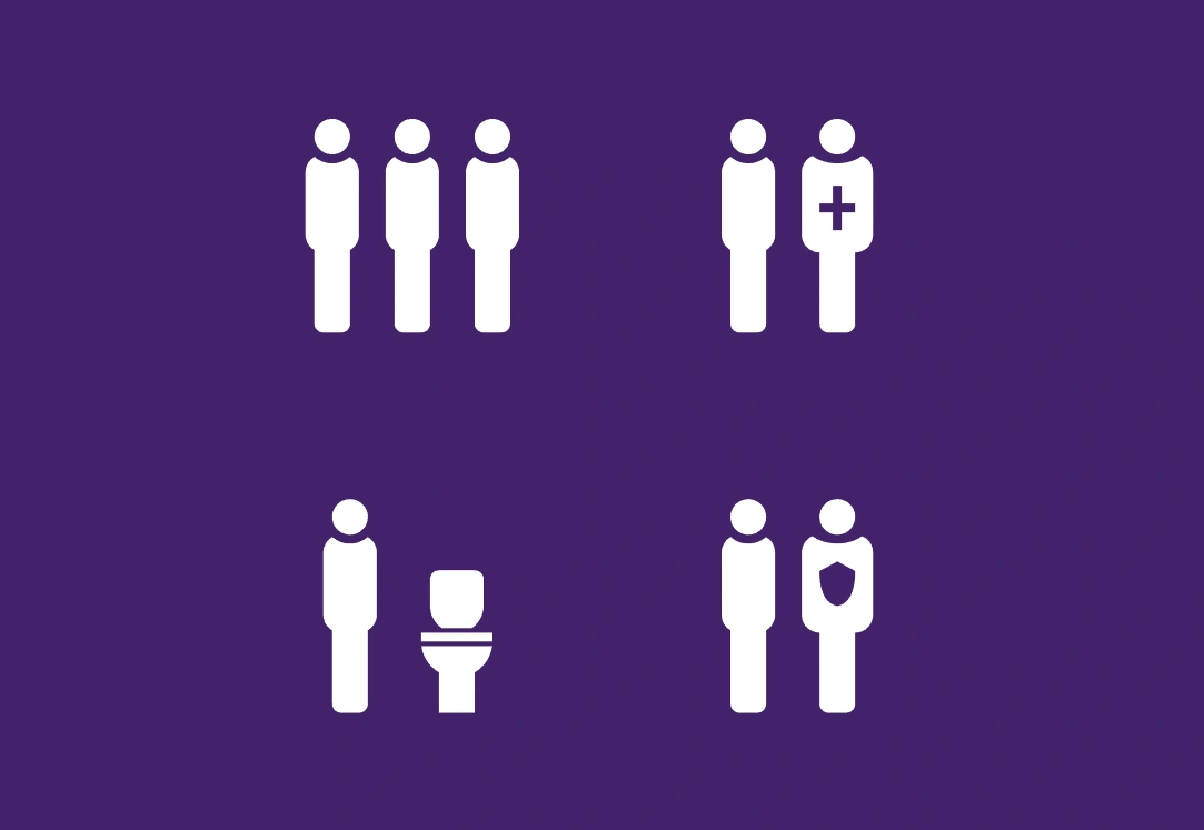
Filled icons
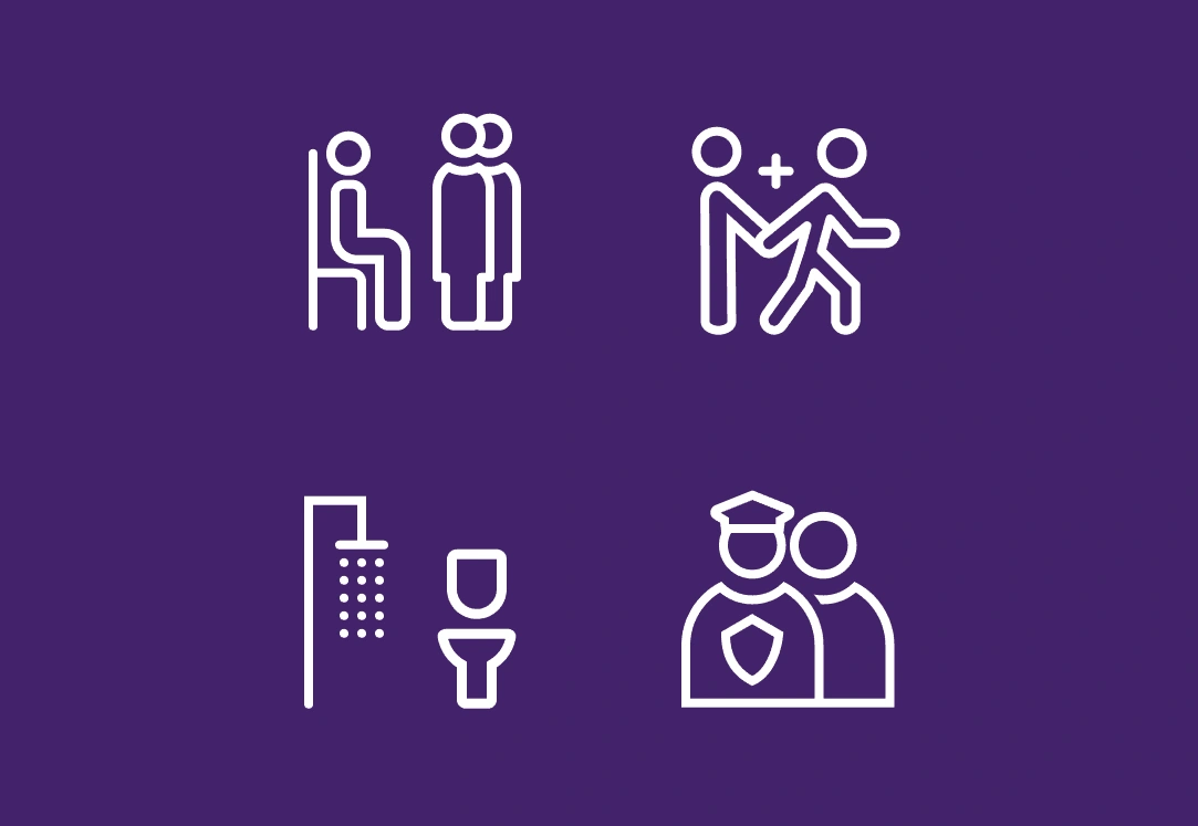
Line icons
Grid and key shapes
Imagine a blueprint for your icons – that's what grids and key shapes provide. The grid establishes a framework for consistent yet flexible arrangement of the various elements within each icon. Key shapes, on the other hand, act as the building blocks, the starting point for each unique icon design. Utilizing both grids and key shapes ensures that the entire icon set maintains a uniform, cohesive look.

24 x 24 grid

Keylines

Icon drawn using keyline
Icon Anatomy
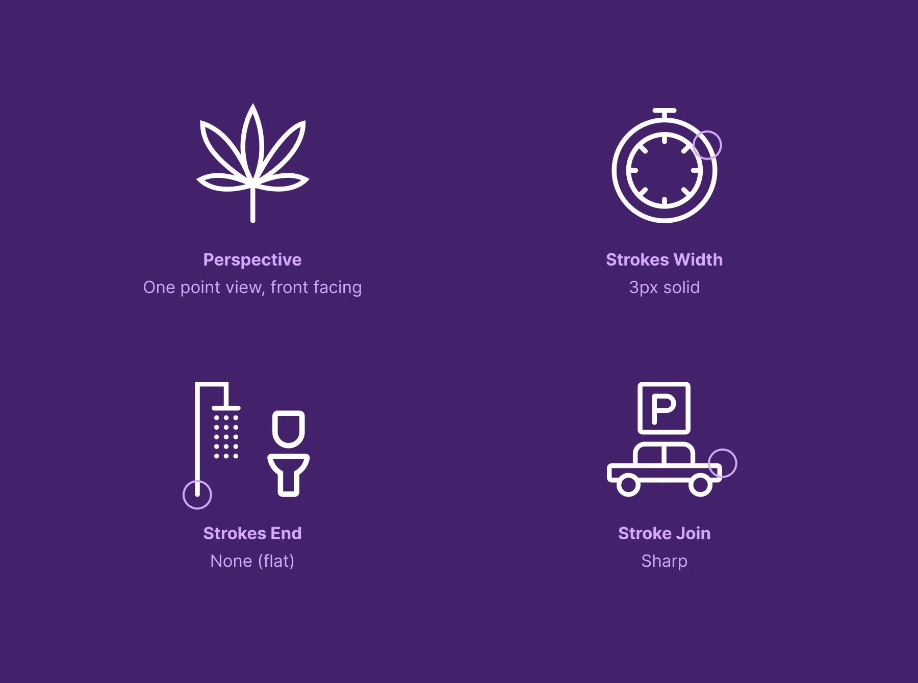
What's Next
The final set of icons will be integrated into Independent Disability's card design, improving the communication of disabilities and special needs in public spaces, especially.
We'll also be exploring collaborating with government entities on potential future applications of these icons to further promote inclusivity and understanding within public spaces.
Like this project
0
Design modern disability icons for a UK start-up. These icons would act as a gateway, giving cardholders access to public facilities with ease.
Likes
0
Views
1
Tags
Iconography Designer
Icon Systems
Illustrator

Figma


