Design System Case Study: Space Travel Agency
The Context
IPTS (Interplanetary Travel Services) is a fictional space travel company that offers affordable and accessible trips to various destinations in the solar system. IPTS aims to make space travel more mainstream and appealing to a wider audience, especially young and adventurous travelers.

As the Head of Digital, I have been tasked to design the following products to prepare IPTS for a launch:
ipts.org, an informational website where you can find the latest news and happenings with the IPTS
IPTS Travel, a website where you can browse and book travel to and from multiple destinations within our galaxy.
IPTS Rail, a real-time updated web app where you can view lines, routes, and times for all the different commuter lines.
The design system needs to reflect their brand identity, improve their user experience, and streamline their development process.
The Problem
IPTS is a relatively new player in the space travel industry, which is dominated by established and reputable companies such as SpaceX, Virgin Galactic, and Blue Origin. IPTS faces several challenges in competing with these giants, such as:
Building trust and credibility among potential customers
Differentiating themselves from other space travel providers
Creating a consistent and memorable brand image across all touchpoints
Adapting to the changing needs and expectations of space travelers
To address these challenges, IPTS needed a design system that would help them achieve the following goals:
Establish a clear and unique brand identity that communicates their vision, mission, and values
Enhance their user experience by providing intuitive, responsive, and delightful interactions
Increase their efficiency and productivity by reducing design and development time and effort
Ensure quality and consistency by following best practices and standards
Foster collaboration and innovation by enabling cross-functional teams to work together
The Solution
To ensure that IPTS meets their objectives, I designed a design system that consisted of four main elements: principles, patterns, components, and documentation.
Principles
Principles are the core values and beliefs that guide the design decisions and actions of IPTS. They define what IPTS stands for, what they want to achieve, and how they want to do it. They also help align the vision and goals of different teams and stakeholders.
I defined four principles for IPTS's design system:
Exploratory: We encourage curiosity and discovery by providing users with rich and immersive experiences that inspire them to explore the wonders of space.
Accessible: We make space travel accessible to everyone by designing products that are easy to use, understand, and afford.
Reliable: We build trust and confidence among users by delivering products that are safe, secure, and dependable.
Scalable: We adapt to the changing needs and expectations of users by creating products that are flexible, modular, and future-proof.
Patterns
Patterns are the common solutions or best practices that address specific user needs or problems. They provide consistency and familiarity across different contexts and platforms. They also help users achieve their goals more efficiently and effectively.
I identified four types of patterns for IPTS's design system:
Layout patterns: These are the basic structures or templates that define how content is organized and displayed on different screen sizes and orientations.
Feedback patterns: These are the visual or auditory cues that inform users about the status or outcome of their interactions or actions.
Interaction patterns: These are the common behaviors or functionalities that enable users to interact with the products or perform certain actions
Components
Components are the reusable building blocks that make up the products. They follow the principles and patterns of the design system.
Atoms: These are the smallest units of components that cannot be broken down further. They include basic elements such as colors, typography, icons, etc.
Molecules: These are the combinations of two or more atoms that form a simple UI or UX element. They include elements such as buttons, links, text inputs, etc.
Organisms: These are the groups of molecules that form a complex UI or UX element. They include elements such as accordions, cards, modals, etc.
Templates: These are the collections of organisms that form a complete page or screen. They include elements such as headers, footers, sidebars, etc.
Documentation
Documentation is the written or visual explanation that describes how to use or maintain the design system. It provides guidance and instructions for designers, developers, and other stakeholders who need to access or modify the design system. For this project, I focused on building the documentation for designers, covering the principles, patterns, and components. It includes information such as the rationale, usage, examples, and specifications of each element.
The Design Process
Understand & Discover
With the aim to create a consistent, engaging web experience for IPTS, I conducted the following research to understand trends and best practices in the space industry.
I analyzed how current space companies appeal to their customers. I found out that most of them use dark backgrounds with focus on imagery to create an immersive experience. For example, SpaceX and Virgin Galactic use large hero images and videos to showcase their rockets and spacecrafts. Blue Origin and Space Adventures use interactive elements and animations to highlight their features and destinations.
I researched several landing pages to see trending interface designs. I used Landingfolio, a website that curates the best landing page designs, to get inspiration and learn from best practices. I looked for landing pages that had similar goals and audiences as IPTS, such as travel, adventure, and exploration.
I researched several flight booking and rail checker sites to understand the features and functionalities that IPTS might need. I used Skyscanner, Kayak, Trainline, and Rail Europe as examples of websites that offer flight and rail services. I looked for features such as search, filters, booking, payment, confirmation, and customer support.
To keep the process efficient and “agile”, I engaged in the hot potato process by leveraging ChatGPT as my project collaborator to generate ideas and feedback quickly.
Content Structure
In this phase, I planned the content and the front-page information architecture of the 3 IPTS's products. I used various tools such as ChatGPT, Bard and Bing! to generate features and content ideas.
Some of the key outputs from this phase were:
A list of features and content ideas for IPTS's products generated by ChatGPT:
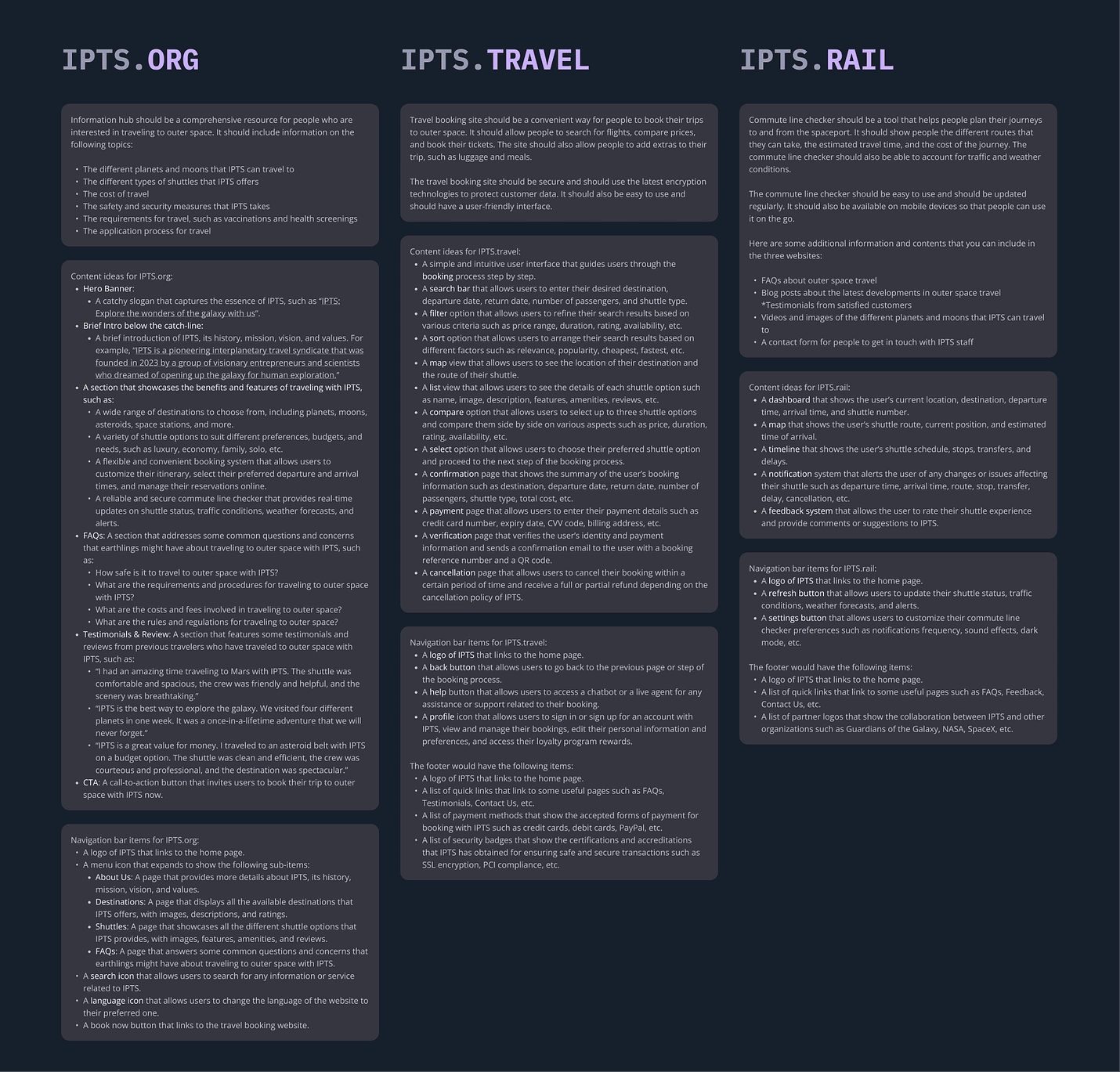
A content structure that shows the hierarchy of content of IPTS's products:
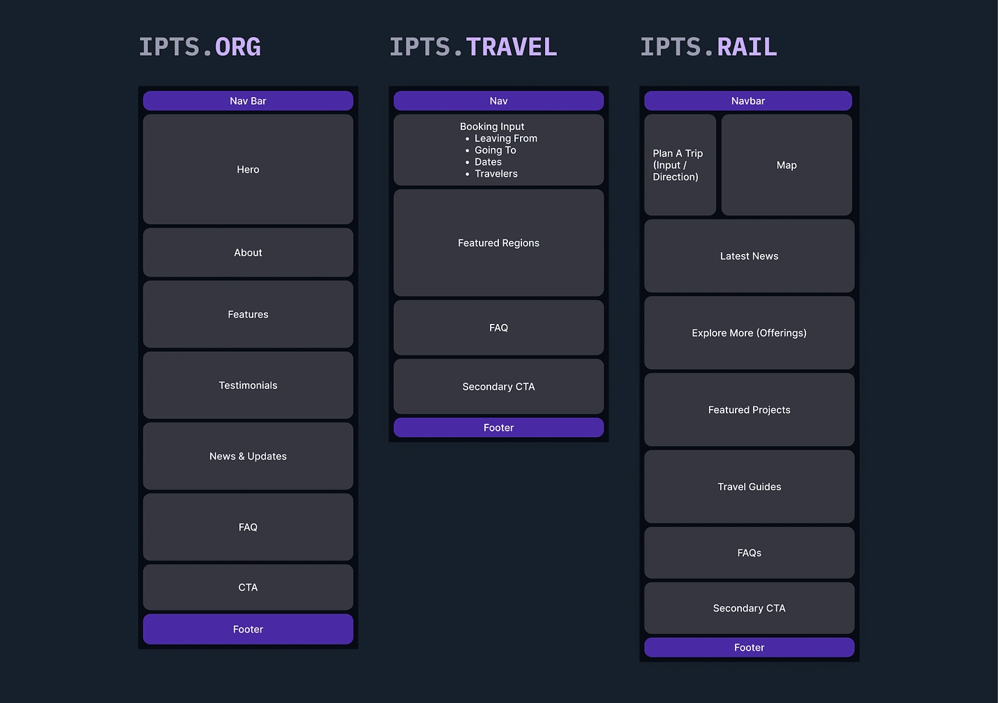
Wireframing
I quickly mapped the contents into place and sketched them into a semi-detailed wireframes using Figma to understand the components that I need to build from the 3 products. The wireframes show recurring UI patterns and components that need to be build later, hence allowing me to prioritize and plan my time in the next step.
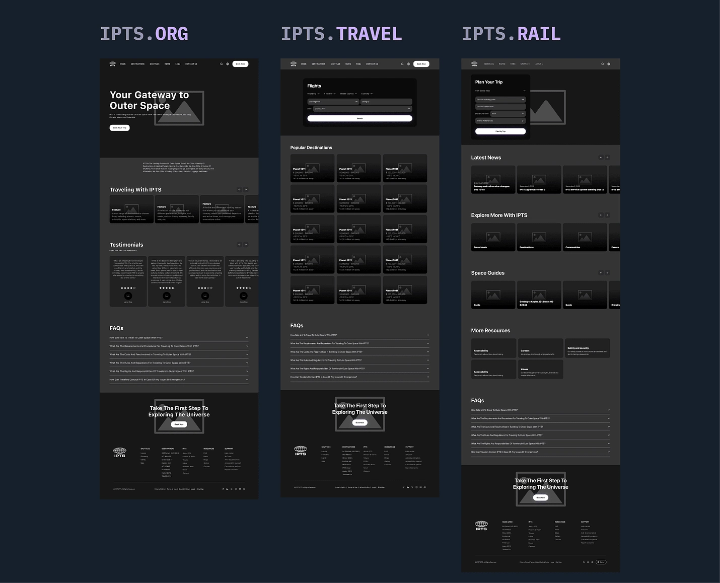
Wireframes of IPTS.Org, IPTS Travel and IPTS.Rail
Visual Design
The visual design goal was to create a captivating and immersive experience for the user, inspiring them to explore new destinations through the vast and beautiful cosmos. To achieve this, a dark background was chosen to contrast with stunning images of celestial features and exotic locations. A dreamy shade of purple was used as the accent color to add a sense of wonder and mystery to the design.
The travel form was among the most important component of the design, as it was the final step for the user to book their dream trip. To make it more appealing and engaging, I used the glassmorphism UI trend, which created a sense of depth and movement that contrasted with the space imagery background, making it stand out and invite user interaction. The interactive elements were also designed to be simple and intuitive, with clear labels and large buttons that are easy to click.
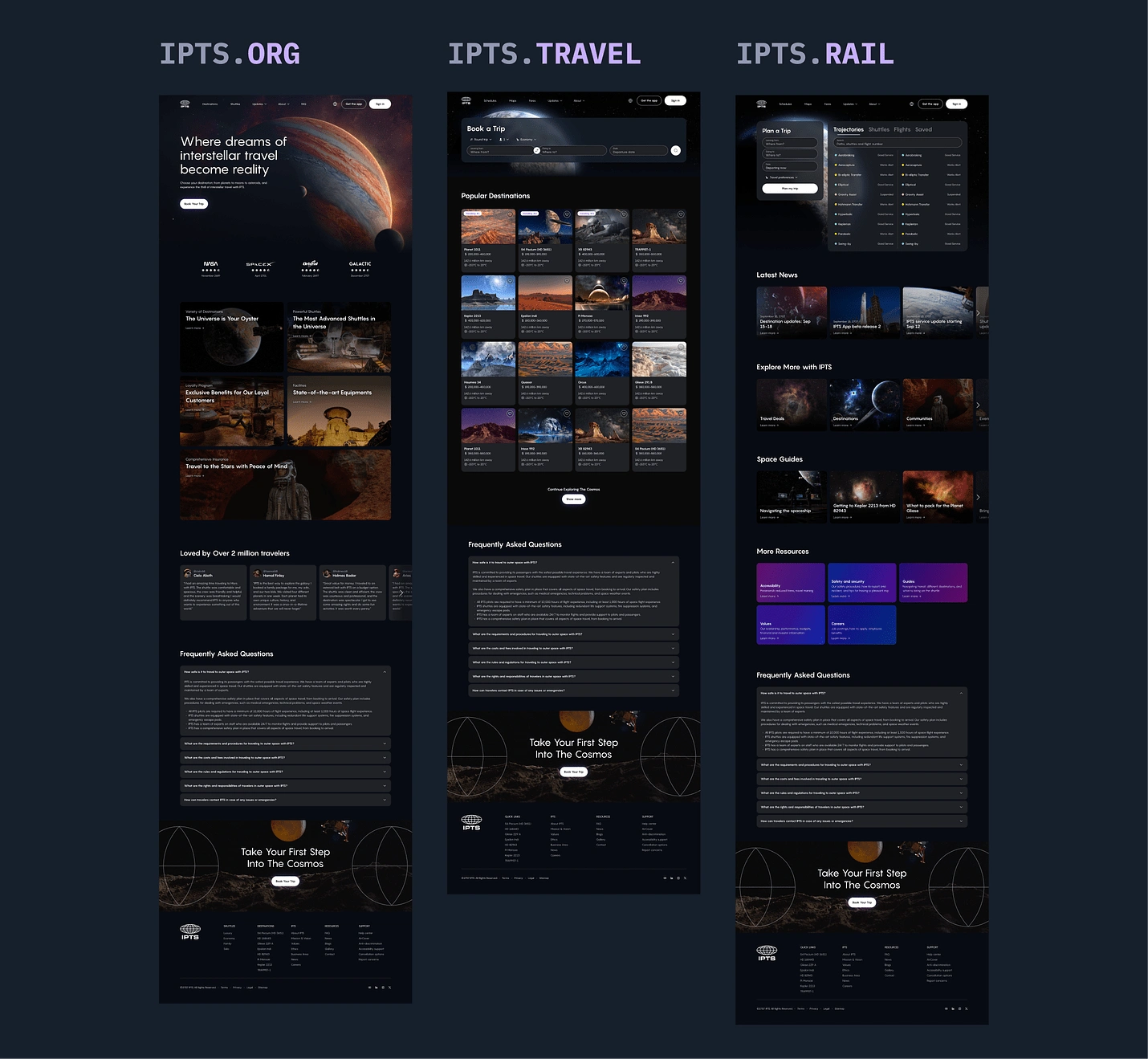
High-fidelity of IPTS.org, IPTS Travel and IPTS Rail

Close up on IPTS.org

Close up of IPTS Travel

Close up of IPTS Rail
Componentization
Repeating UI patterns were then broken down into reusable components that followed the design system.
A component library that contains all the UI and UX elements of IPTS's products
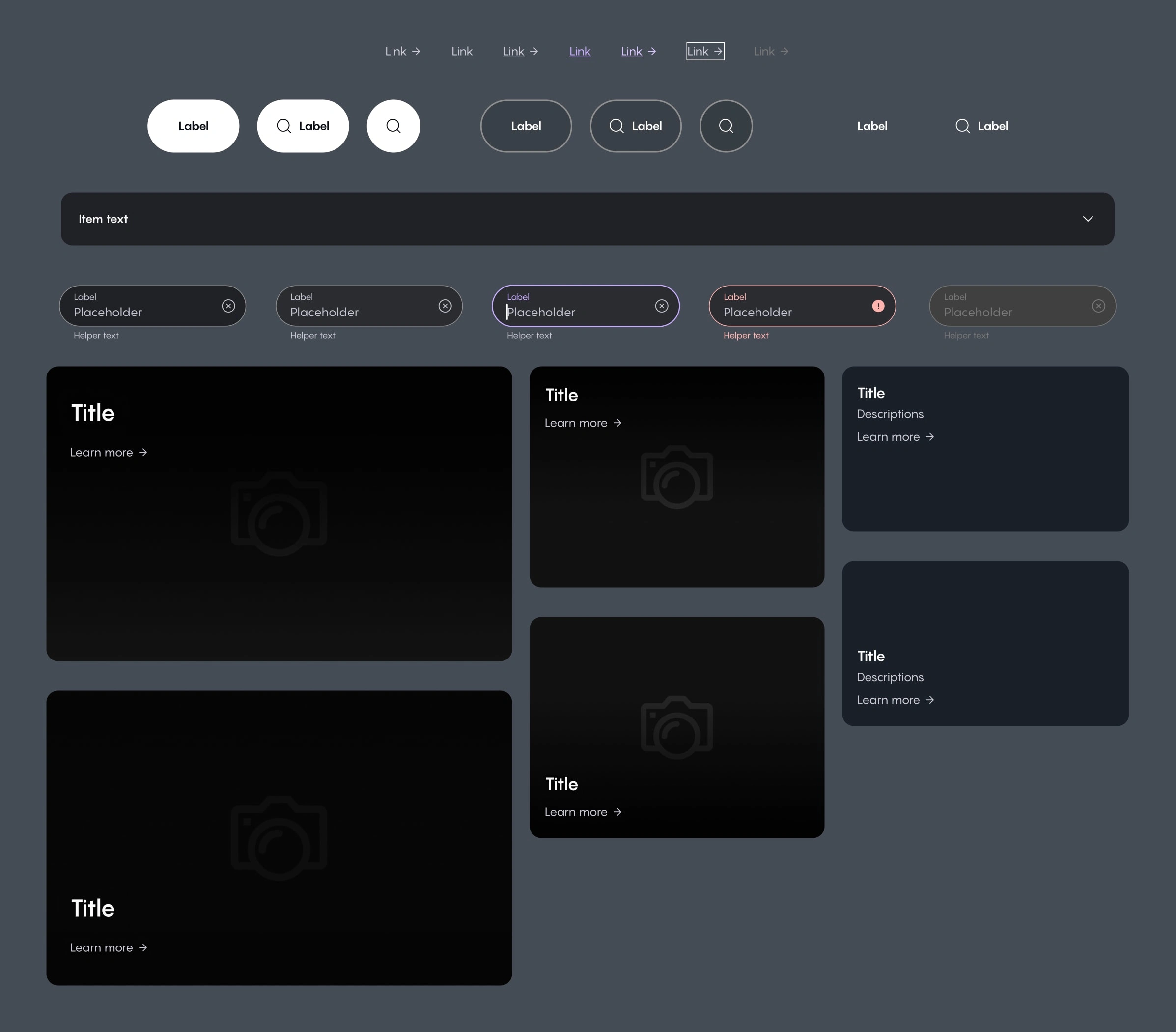
Overview of IPTS components
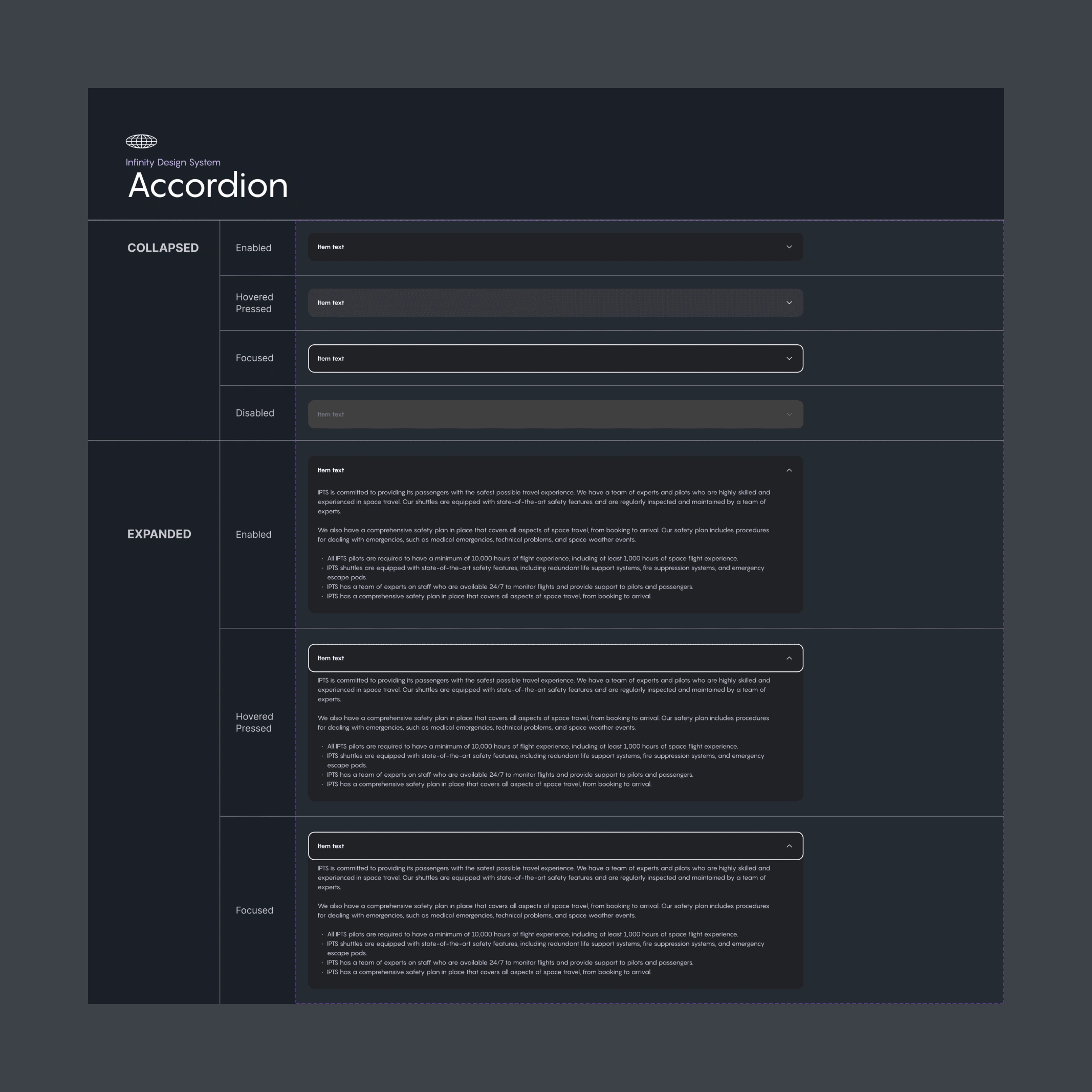
IPTS Accordion component
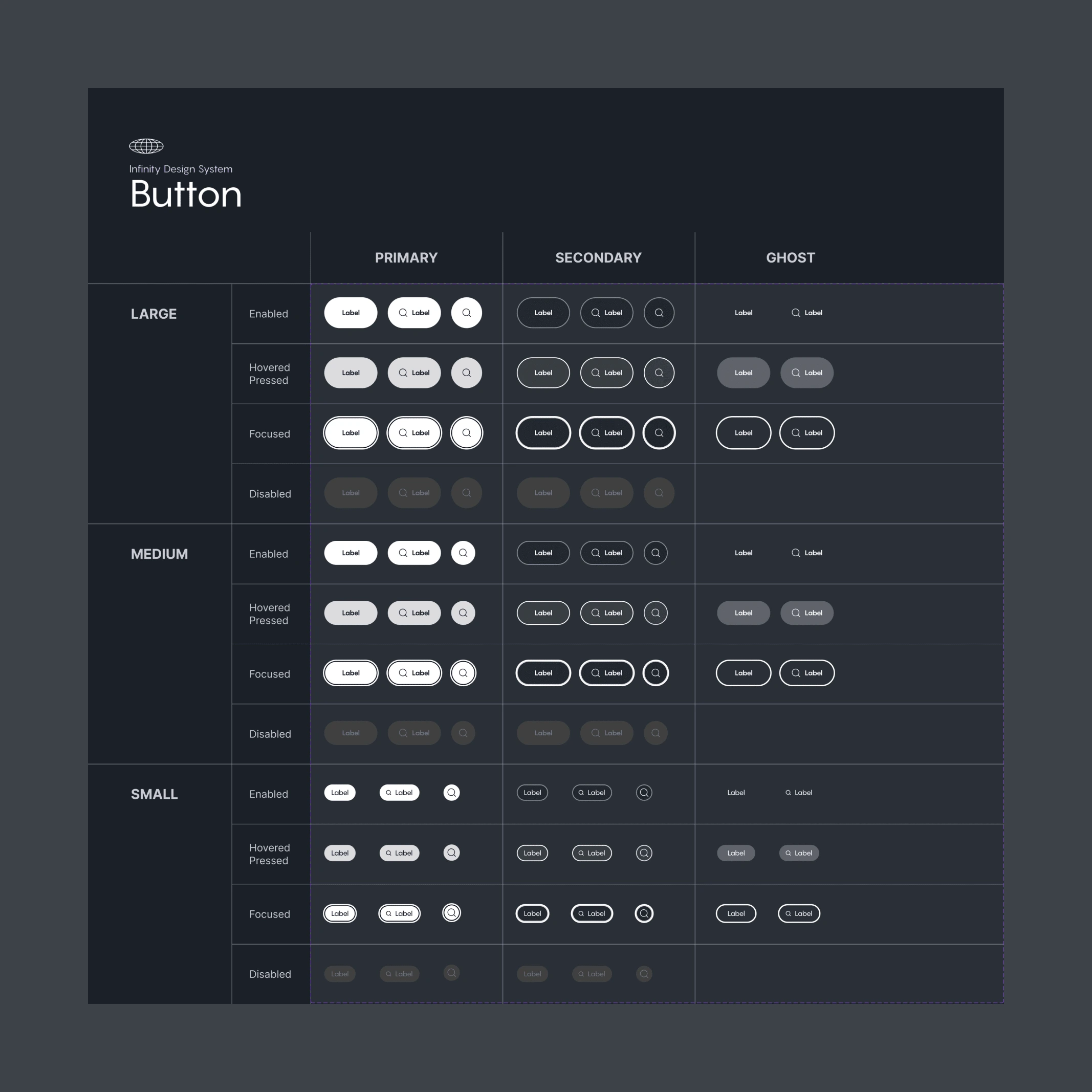
IPTS Button component
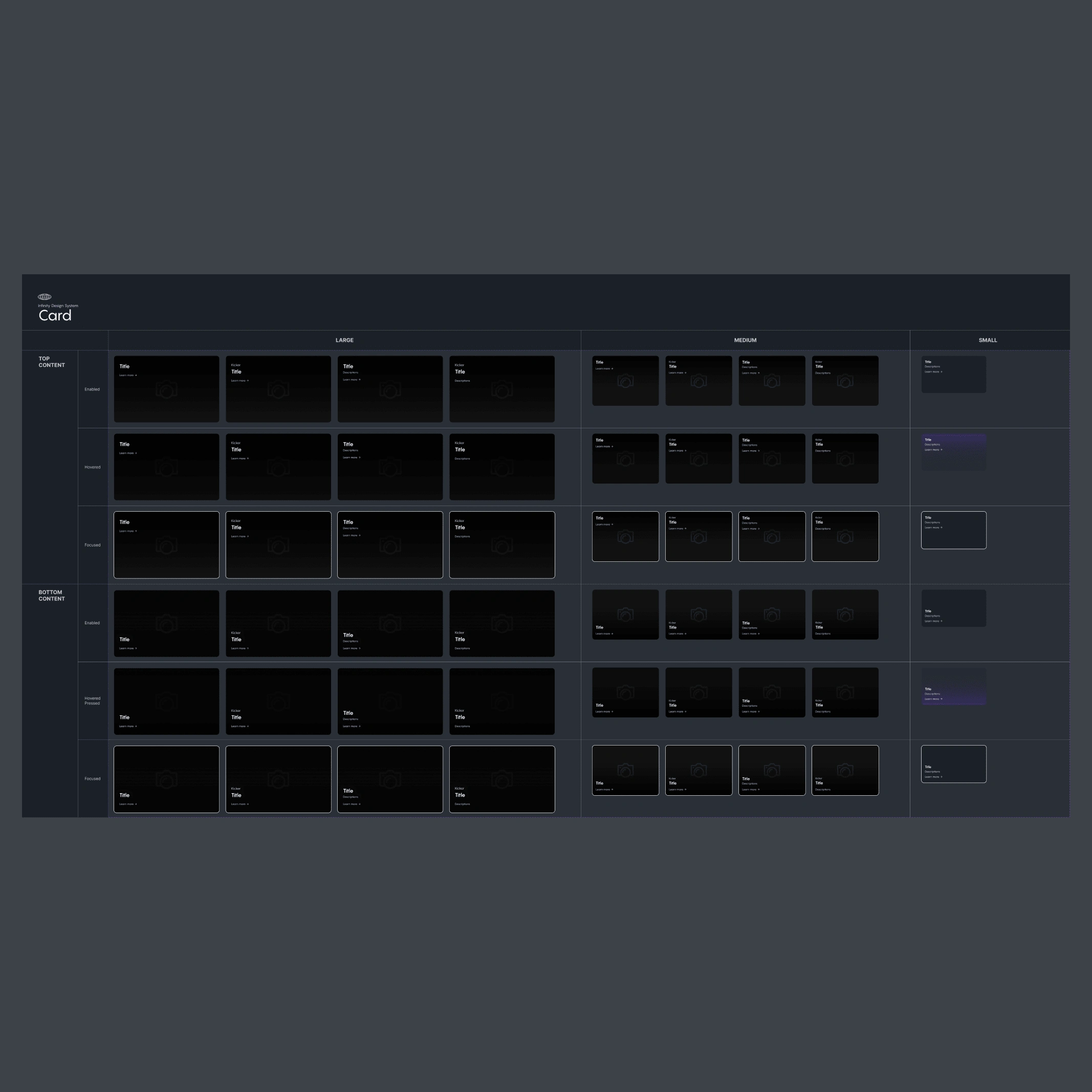
IPTS Card component
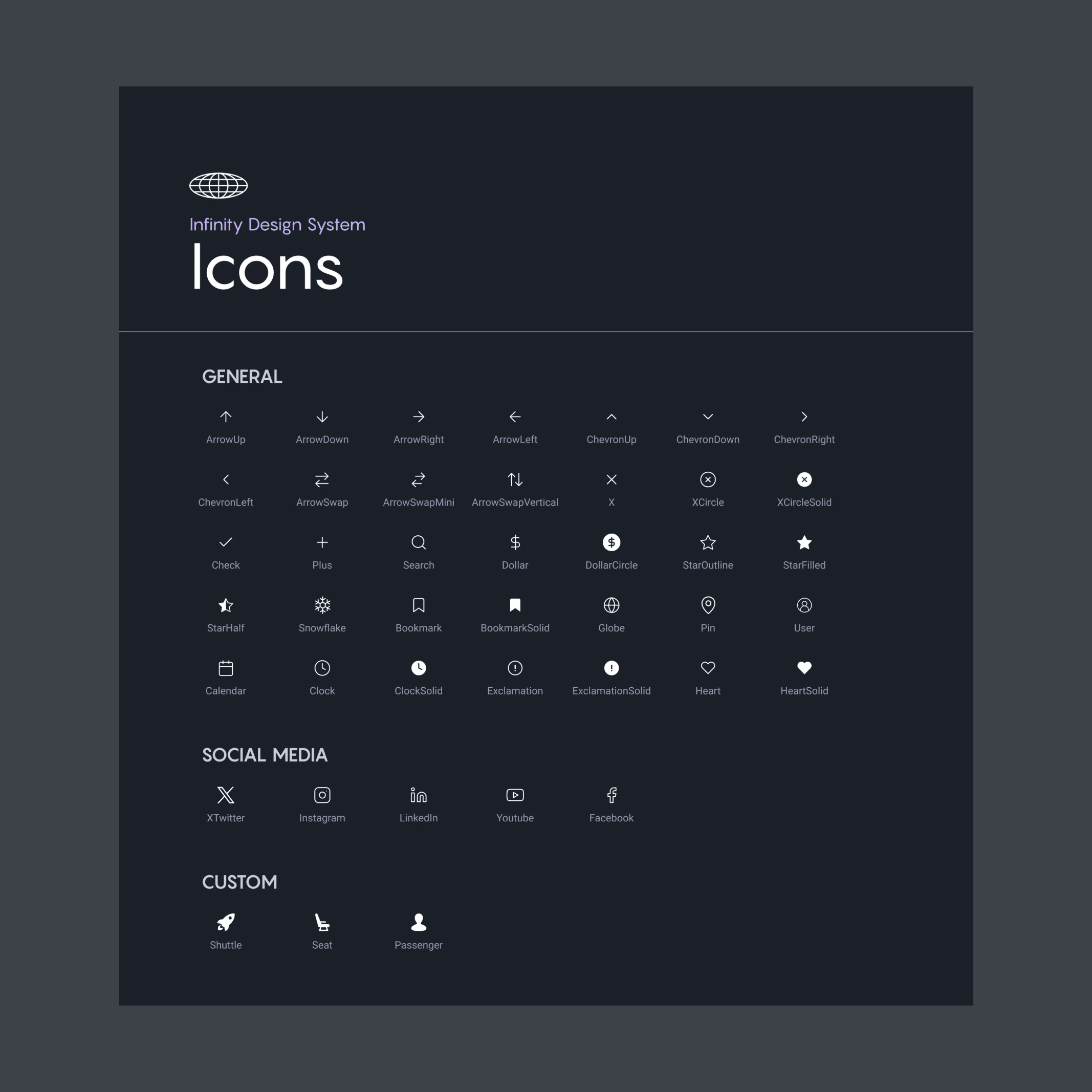
IPTS Icons
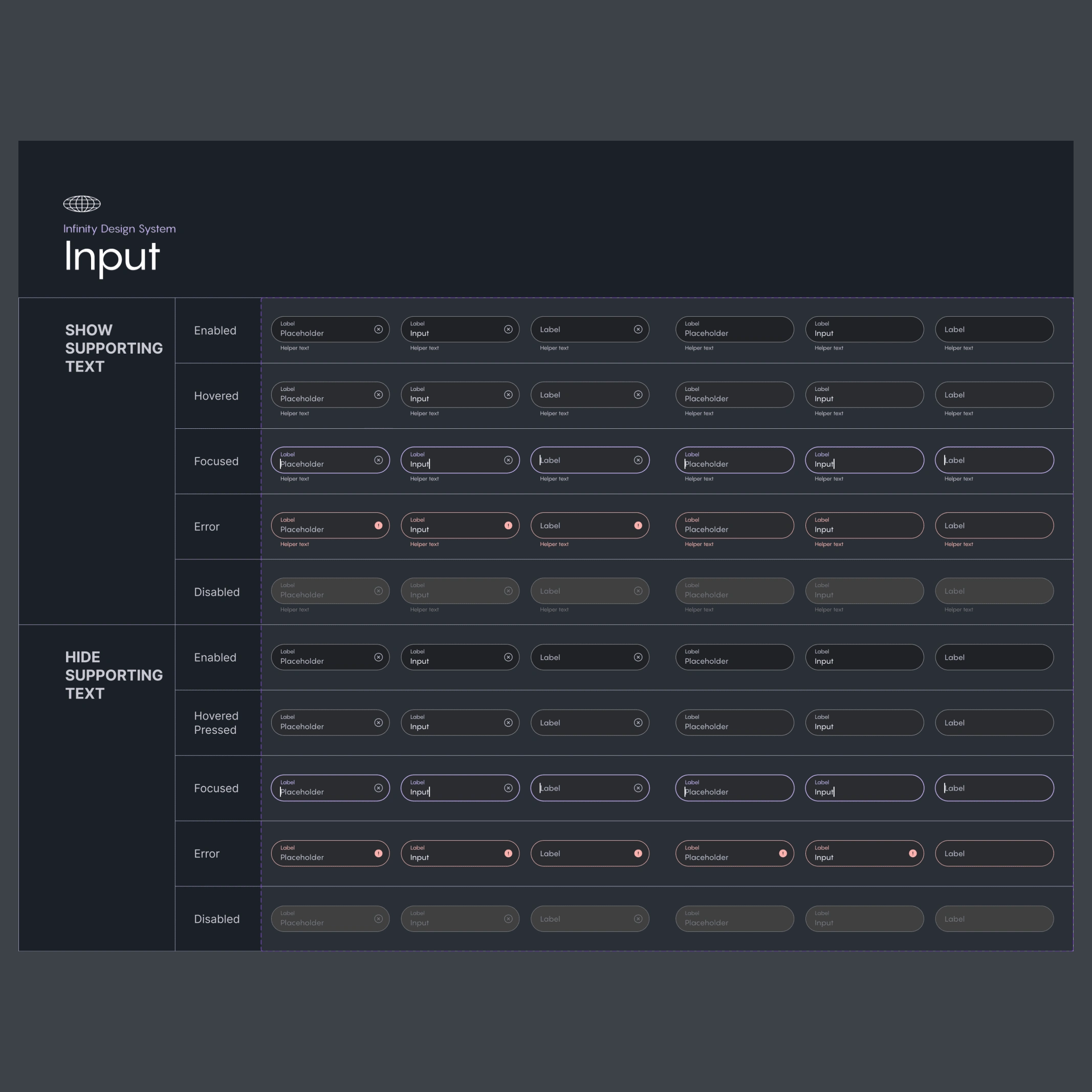
IPTS Input component
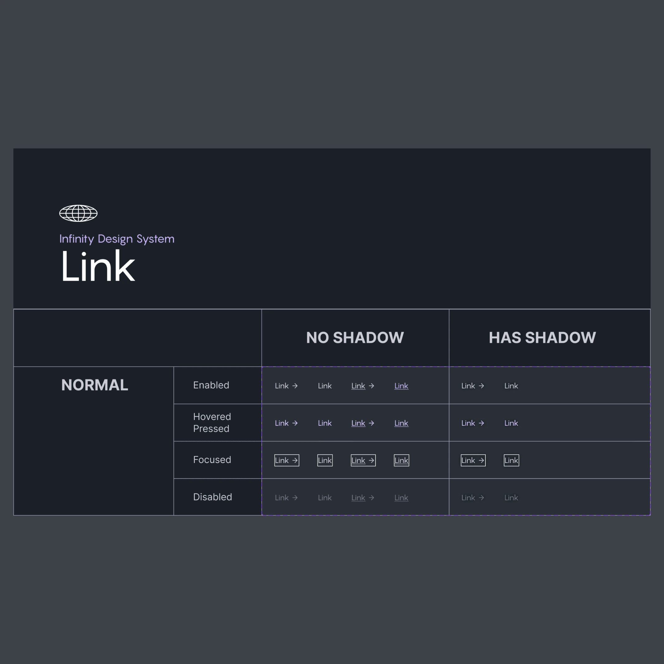
IPTS Link component
Putting the design system into action
By the time we reached the final week, we were assigned a new mission.
The leadership had hired MegaBrand, a famous branding agency, to help them create a new identity that would attract a younger and more adventurous audience.
MegaBrand discovered through focus groups that the IPTS name and logo felt very ominous, like it was cold, faceless corporation that was always watching. (“The eyeball-shaped logo doesn’t help,” said one candid participant.) In addition, the IPTS wants to appeal to a younger demographic.
After weeks of research and exploration, they’ve settled on the new name “Shuddle,” which feels more like a cool, new startup.
The color palette is fresh and vibrant, and the identity relies much more heavily on photography of younger people to feel more welcoming and inviting.
The typographic palette relies heavily on the IBM Plex superfamily to both give a wide range as well as make everything feel familiar.
The 3 main products have also been renamed to feel more like a family of products instead of independent offerings:
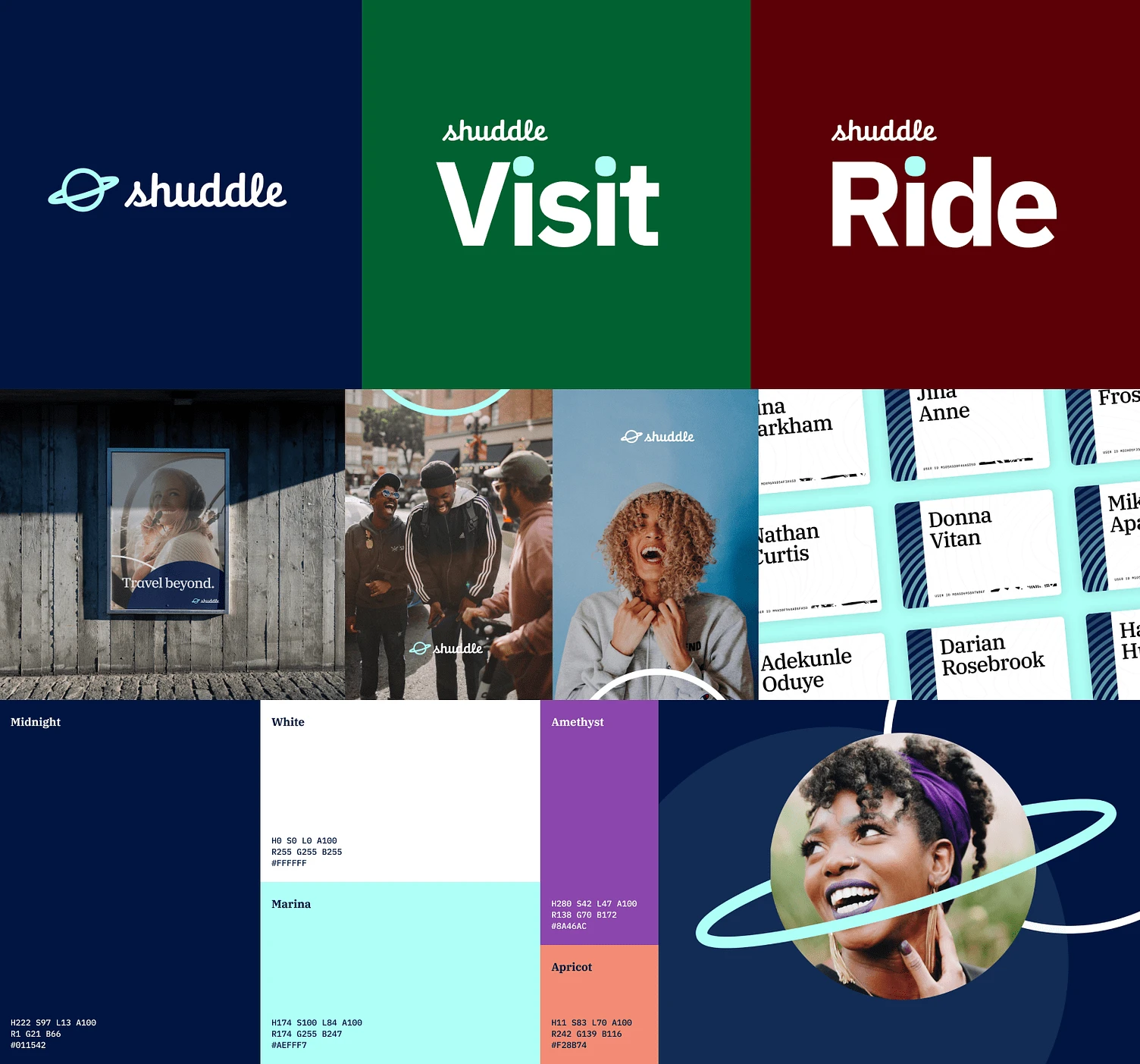
Overview of Shuddle's branding
“ipts.org” is now “shuddle.world.“
“IPTS Travel” is now “Shuddle Visit”
“IPTS Rail“ is now “Shuddle Ride“
Updating the Design System
Rebranding the Shuddle UI was a challenge, but it was also an opportunity to create a more vibrant and expressive design.
The original UI was designed with a monochromatic color scheme to match the space aesthetic. This meant that most of my components were built with limited shades of hue. When I needed to integrate the new color palette, which had five main colors, I had to experiment with every variation and combination to find the best way to adapt to the new brand colors.
I eventually settled on a design that used galaxy pitch black background to create a contrast with the new colors without sacrificing accessibility, usability, and aesthetics. I used amethyst for the primary buttons, and the legendary bright Marina blue for the secondary buttons and active states. The apricot was used for error states and the midnight blue reserved for enabled components surfaces. This way, I was able to create a harmonious and balanced UI that reflected the Shuddle’s brand identity.

Overview of Shuddle's components
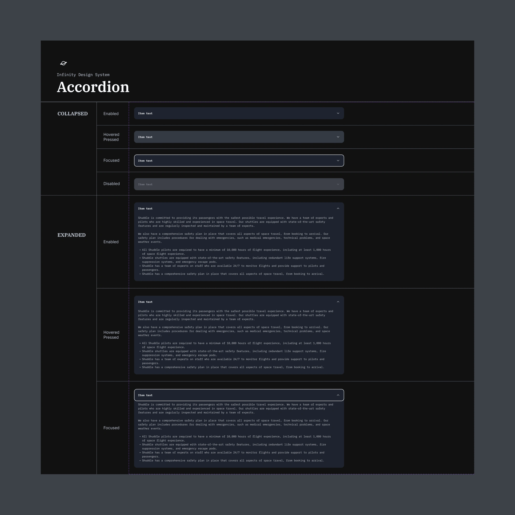
Shuddle accordion component
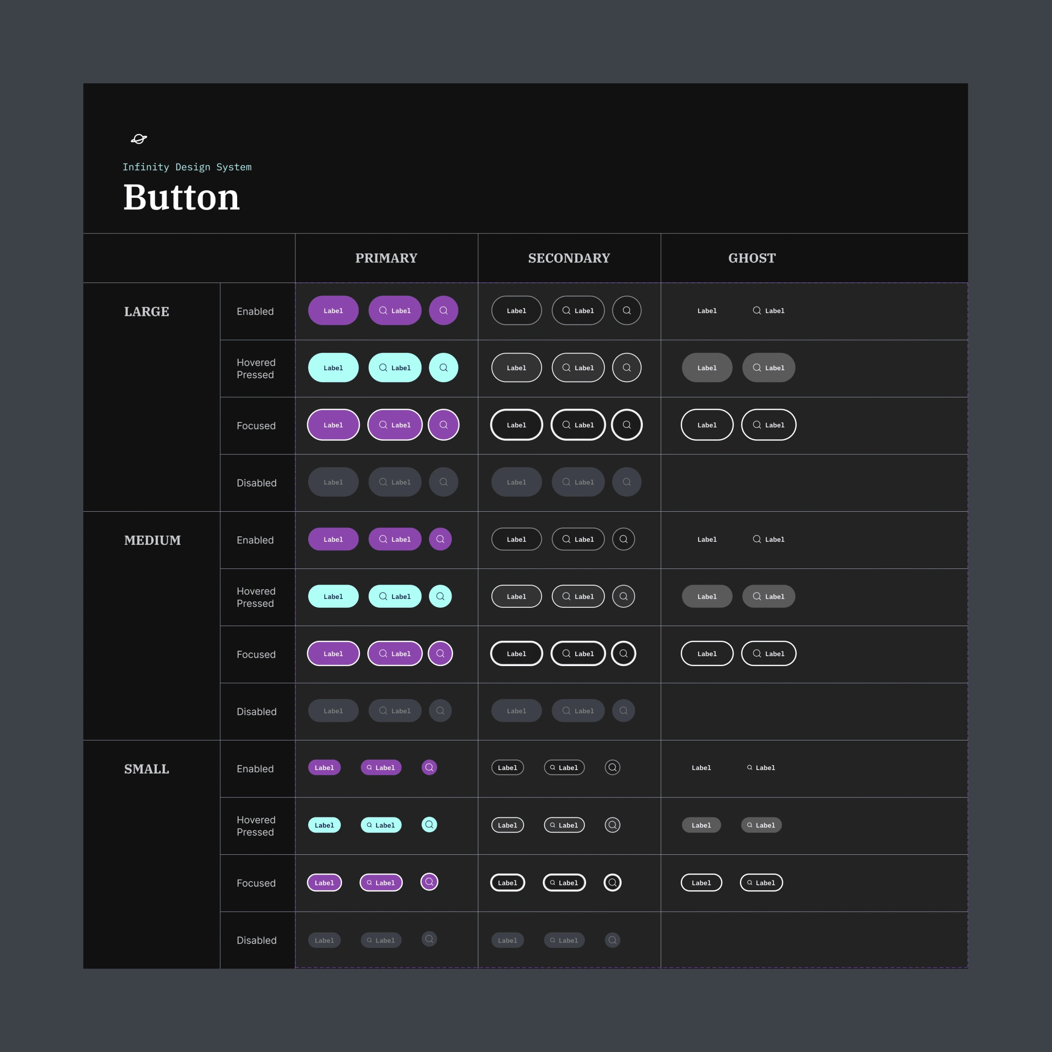
Shuddle button component
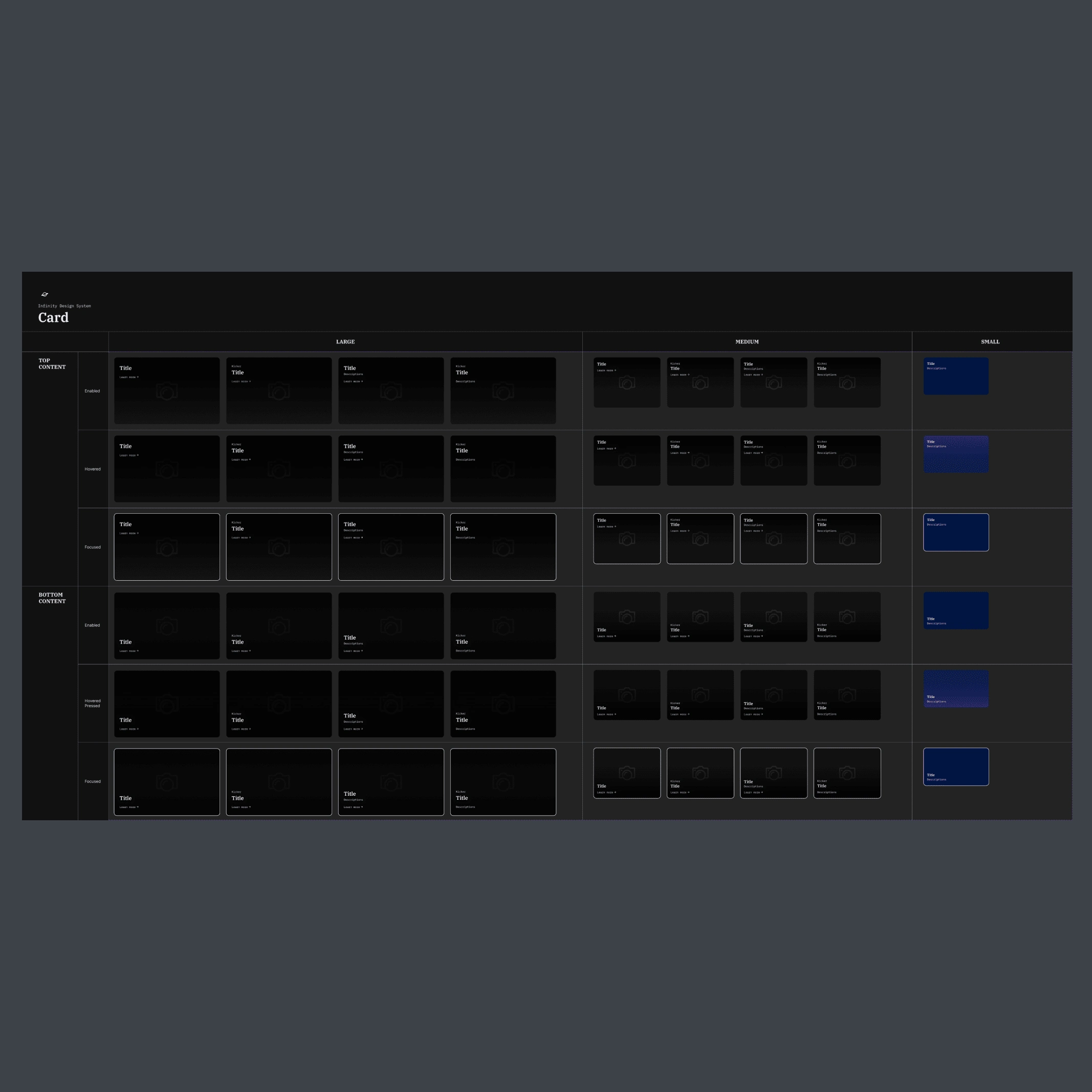
Shuddle card component
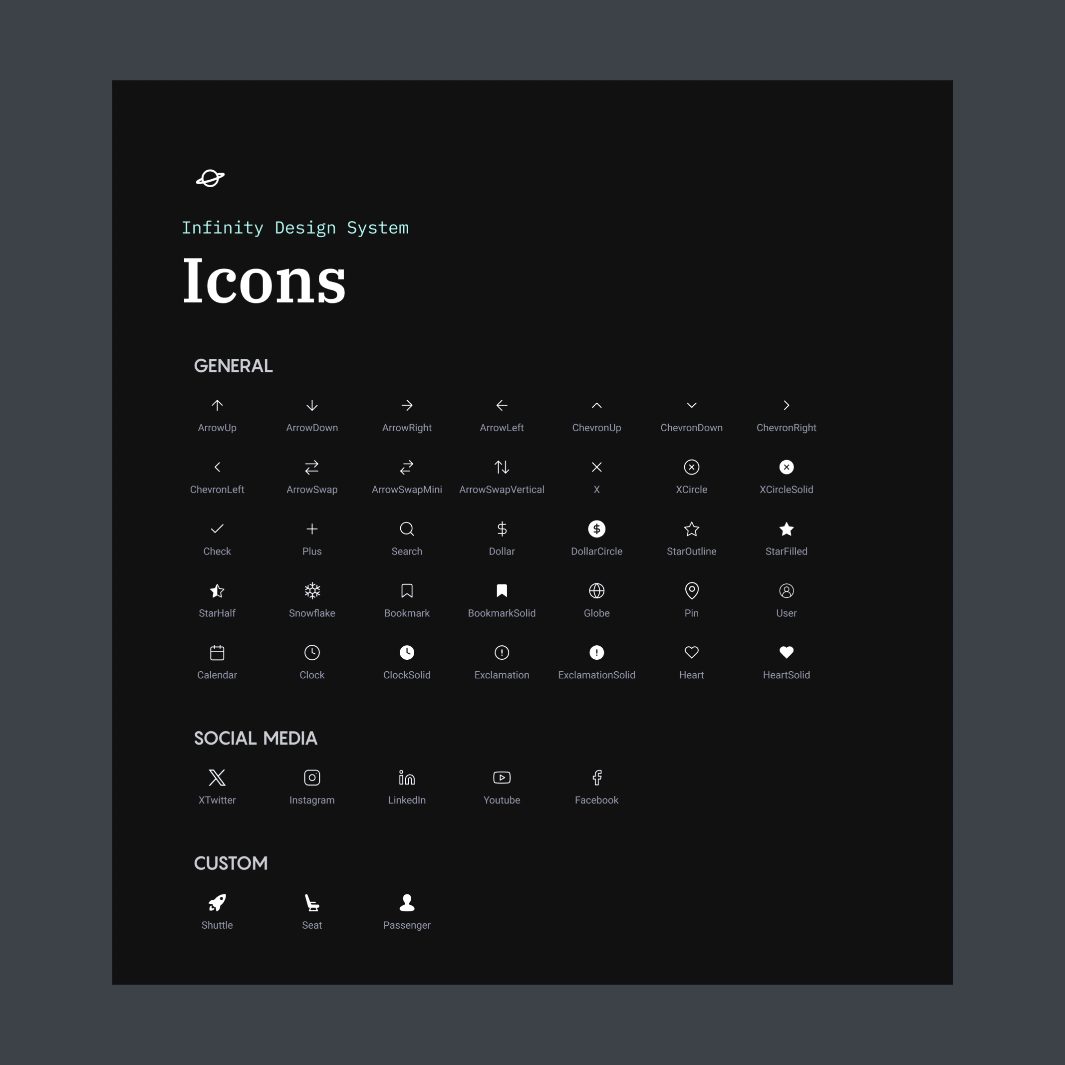
Shuddle icons
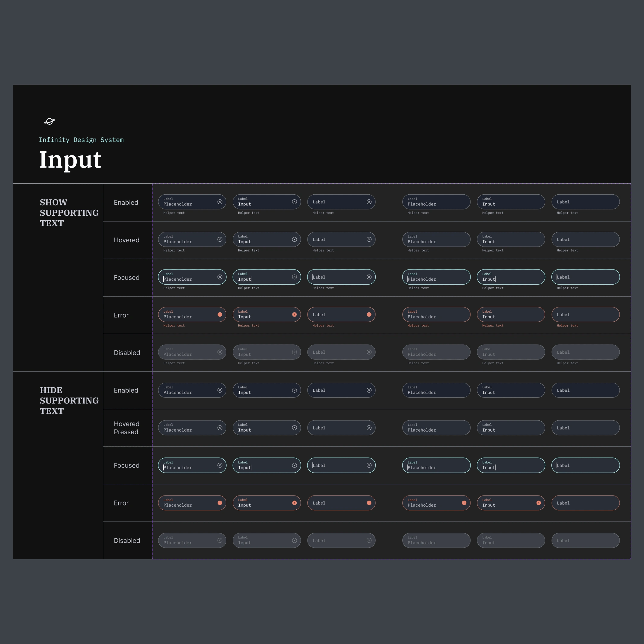
Shuddle input component
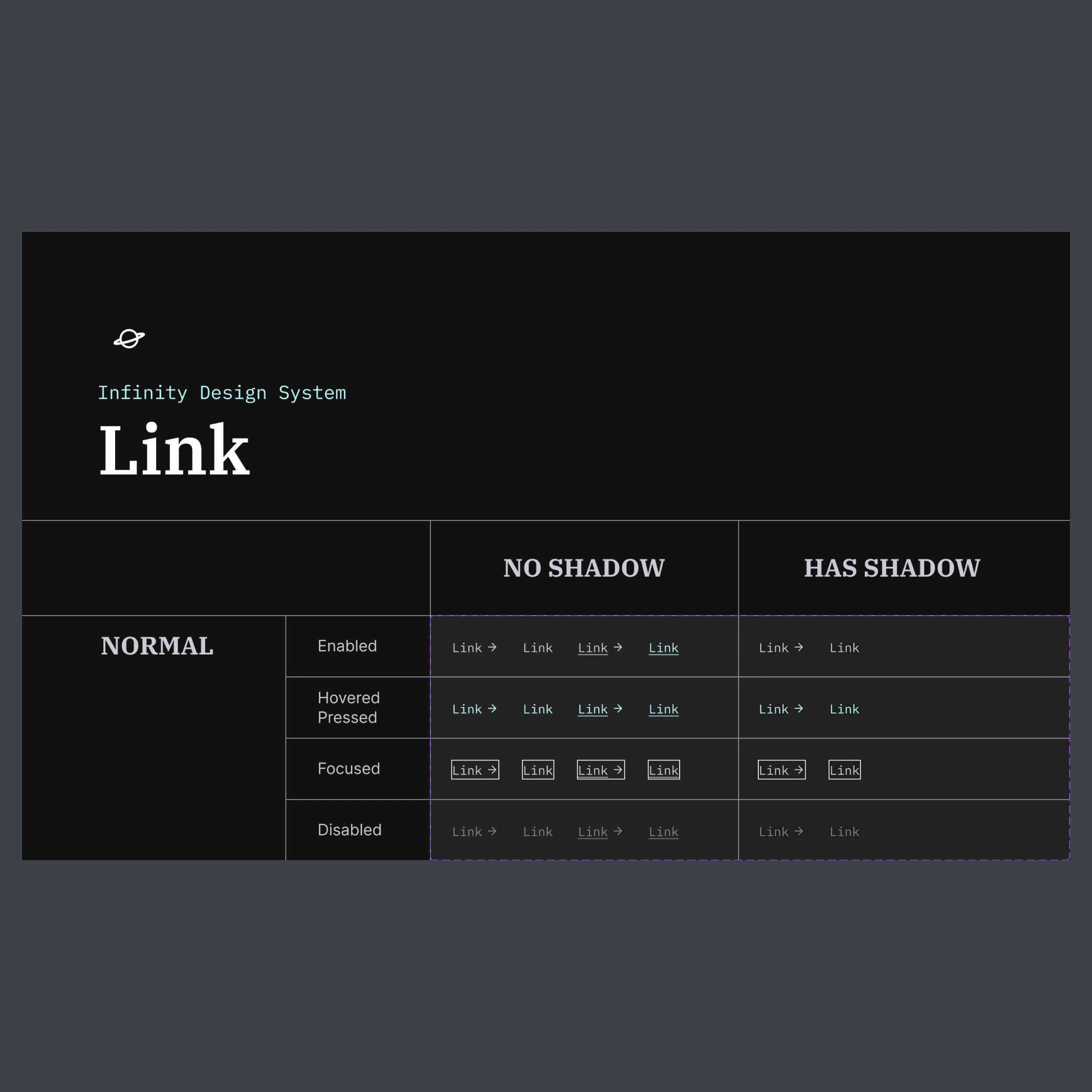
Shuddle link component

Shuddle World

Shuddle Visit

Shuddle Ride
Just to save you time and scrolling, here are the 2 branding product's comparison:
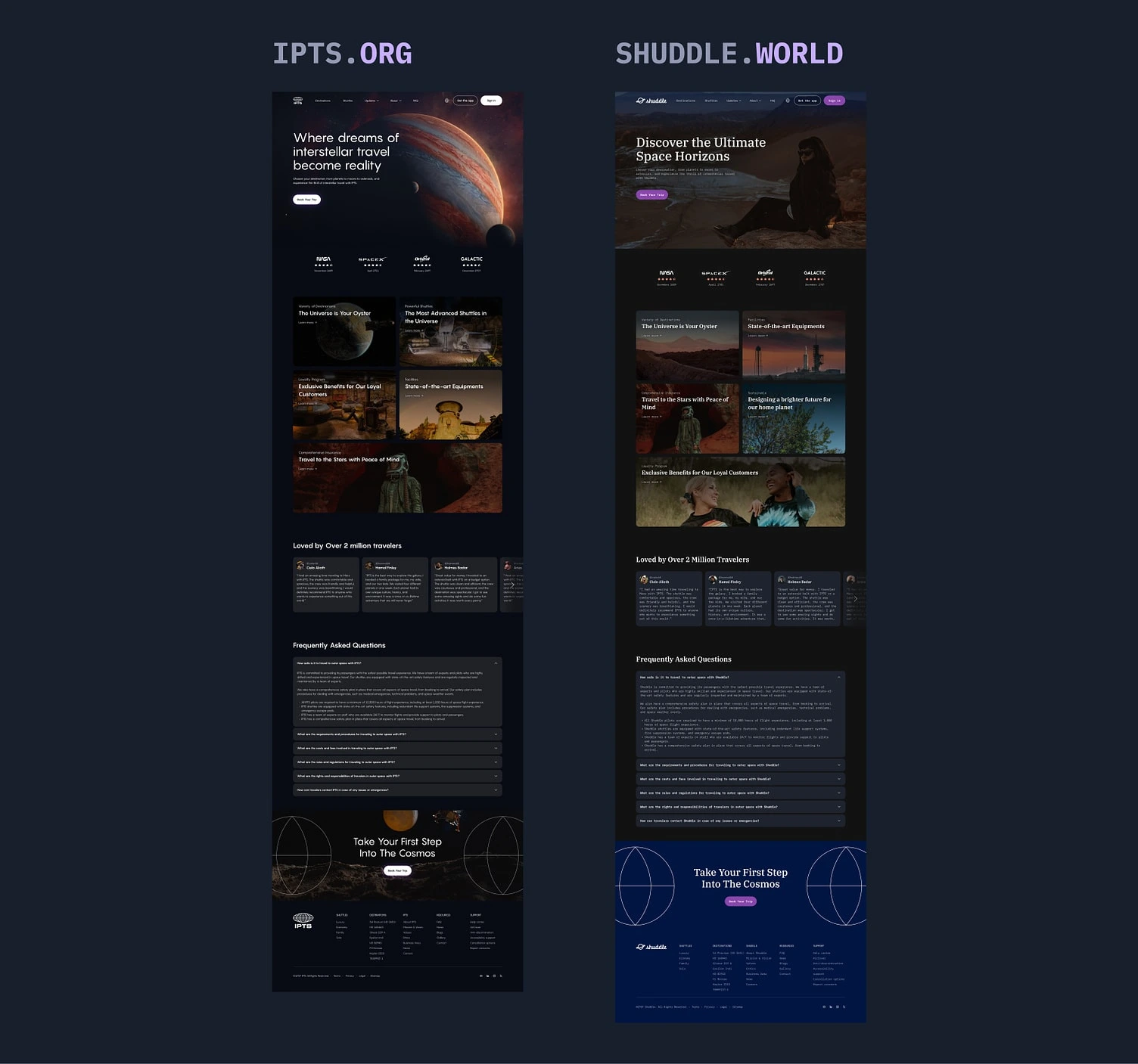
IPTS.org vs Shuddle World
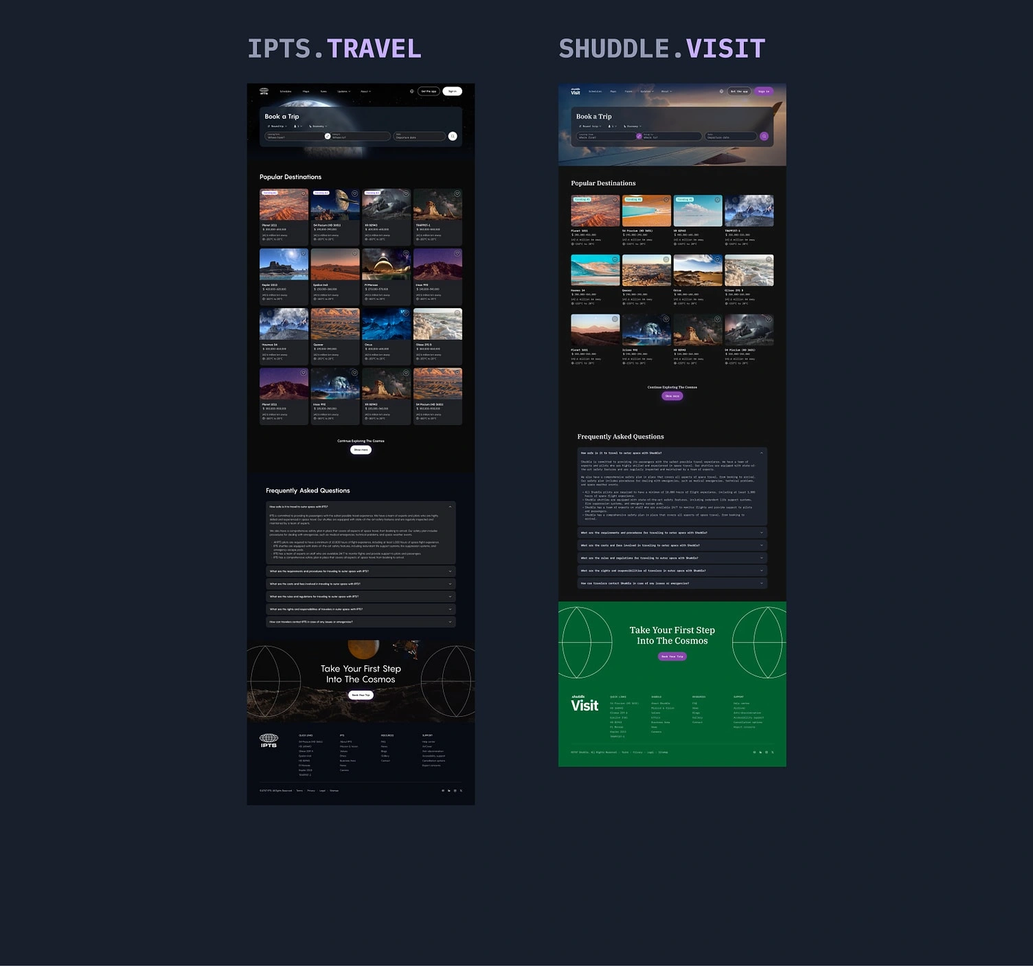
IPTS Travel vs Shuddle Visit
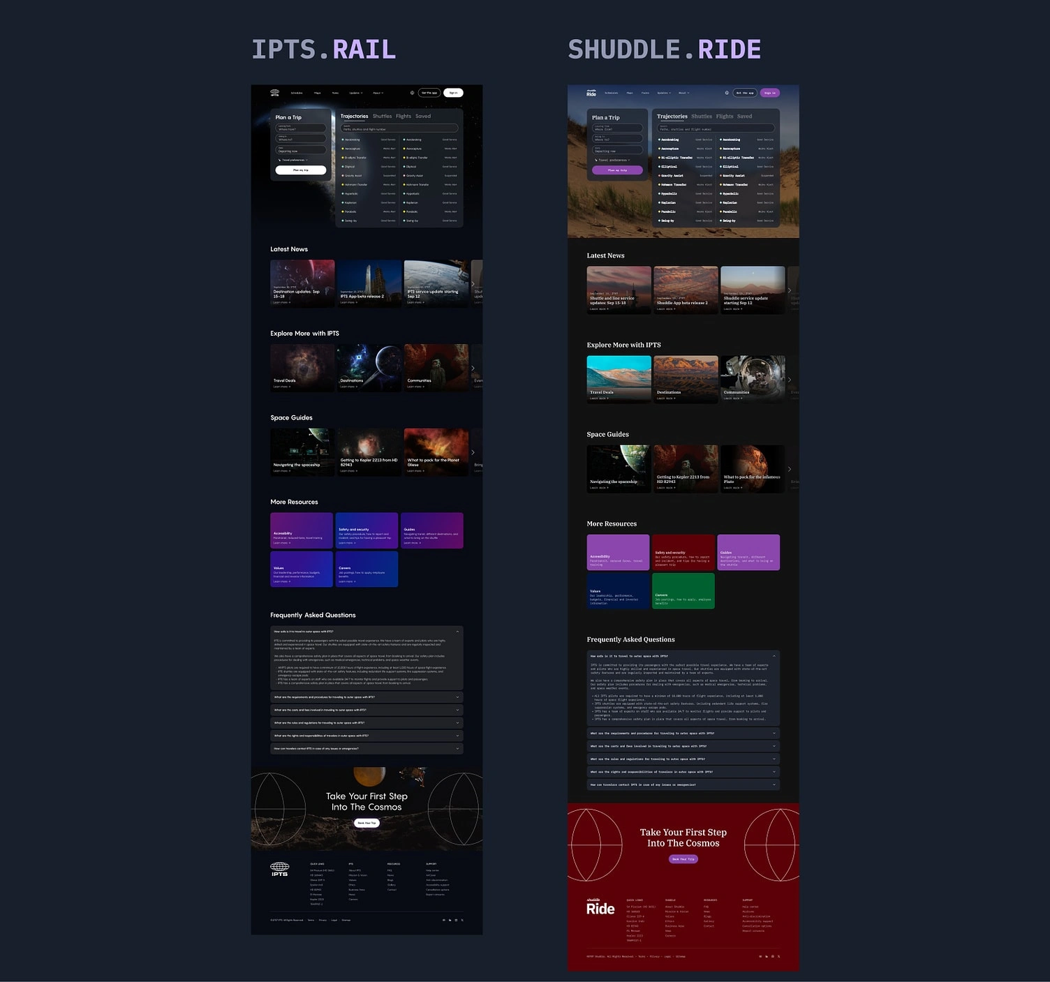
IPTS Rail vs Shuddle Ride
Takeaways
This project was definitely an opportunity for me to learn and grow as a designer. I faced many challenges, made LOTS of mistakes, but I also gained valuable insights on the overall workflow of building a scalable design system.
Here are some key takeaways from this project:
Design systems should be focused on solving real user problems and achieving business goals, not just creating beautiful and consistent products. I learned this the hard way during this project. I was so focused on the visual design of the components that I forgot to consider their interactivity. This caused me to have to spend more time redesigning the components to account for all of their interactivity states and scenarios.
Design systems are built on components, so it's essential to understand their anatomy. This includes their structure, states, and behavior. By mastering component anatomy, we can create design systems that are visually appealing, functional, scalable, adaptable to changing needs and expectations.
Documentation (and chronicling) is not an afterthought, but a vital part of the design process. It helps us keep tabs on design decisions, communicate updates to the team, and make sure everyone's on the same page.
Bonus: Documentation can feel like a drag, but really, don't procrastinate until the last minute! Schedule some time to write it up and review it carefully to make sure it's clear and concise. After all, you want to get the most out of your design component, right?
Thank you for your time, I hope you enjoyed the journey!
Please don't hesitate to provide any feedback, comment, or reach out to me directly 👋
Learn more about what I do on my website or if you just love visual designs, there's much more to see on my Behance showcase 🤓
Like this project
Posted Nov 11, 2023
Venturing into design systems with a space brand called IPTS, who rebranded to Shuddle. A final project with Dribbble. Summer 2023.
Likes
0
Views
22

