Sweet Creations
Sweet Creations Brand Design
The "Sweet Creations" logo was designed to evoke a playful and appetising feel for a dessert-focused brand.
The client gave me creativity freedom expect for the choice of colours that they must have been shades of fucsia and pink.
I begin by researching their market, target audience, and competition.
The logo design involves careful consideration of typography, color schemes, and symbolic elements to reflect the brand’s unique identity.
The bold, rounded typography emphasizes warmth and approachability, while the pink color palette reinforces the sweet, indulgent nature of the brand.
This design strikes a balance between fun and professional, creating a memorable visual identity that resonates with customers.
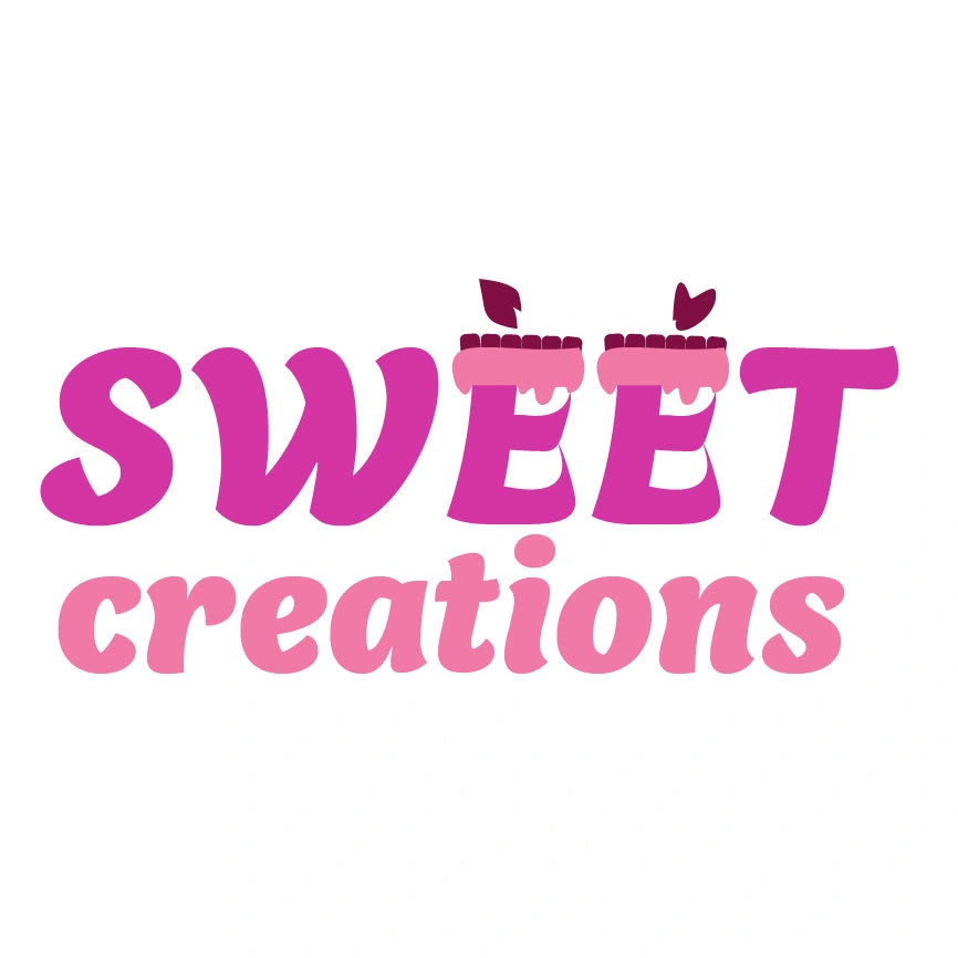
Logo
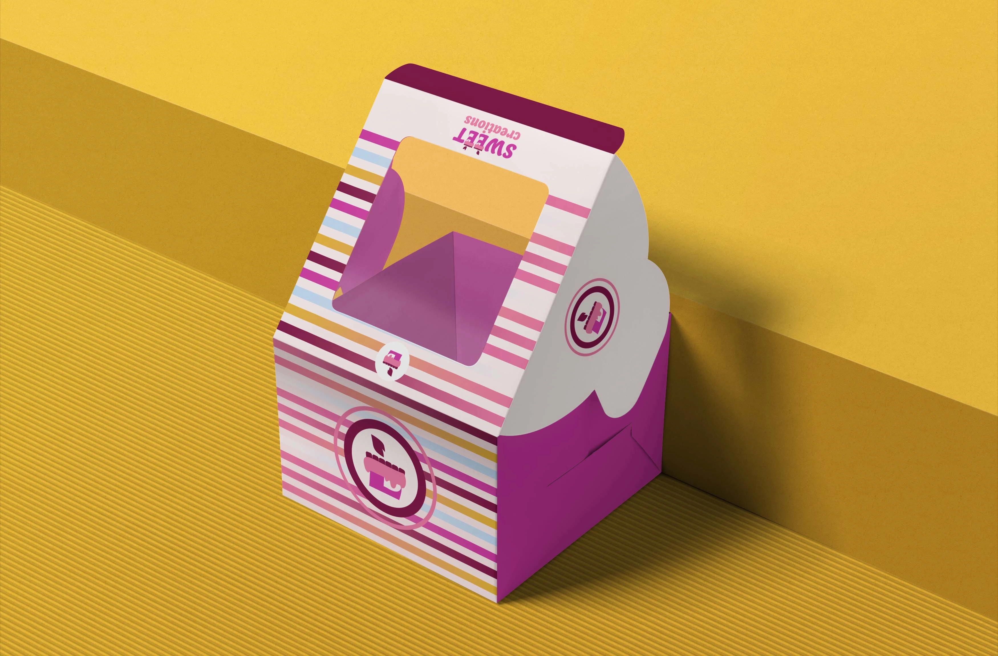
Branded box
Logomark
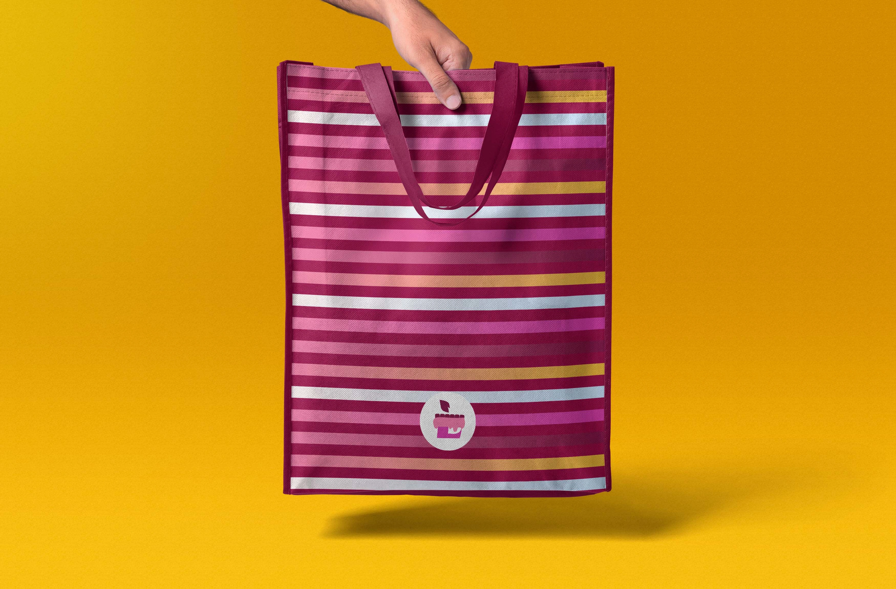
Tote bag
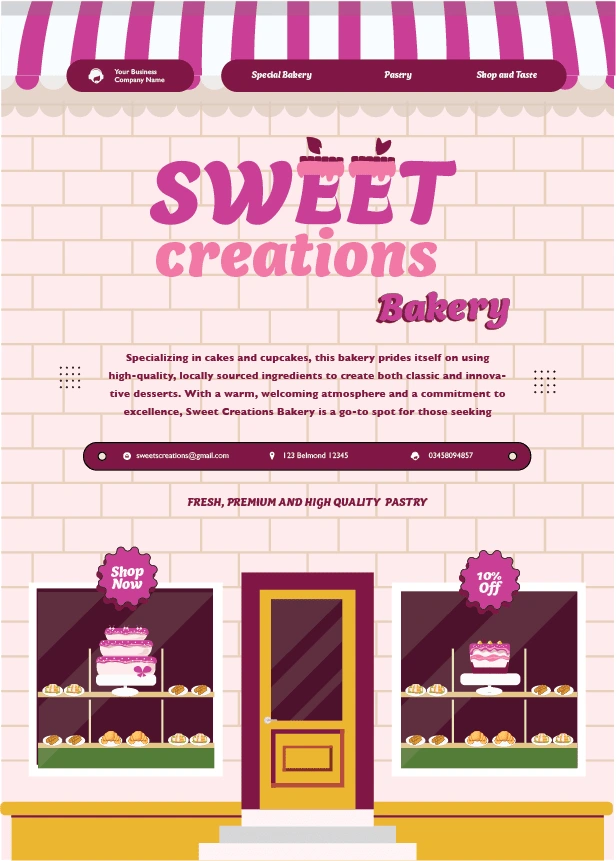
Flyer
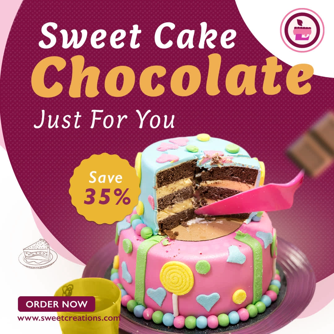
Instagram Post
Like this project
Posted Nov 4, 2024
The "Sweet Creations" logo was designed to evoke a playful and appetizing feel for a dessert-focused brand.
Likes
0
Views
6
