Packaging Design for “Key to the Heart"
Irina Golub
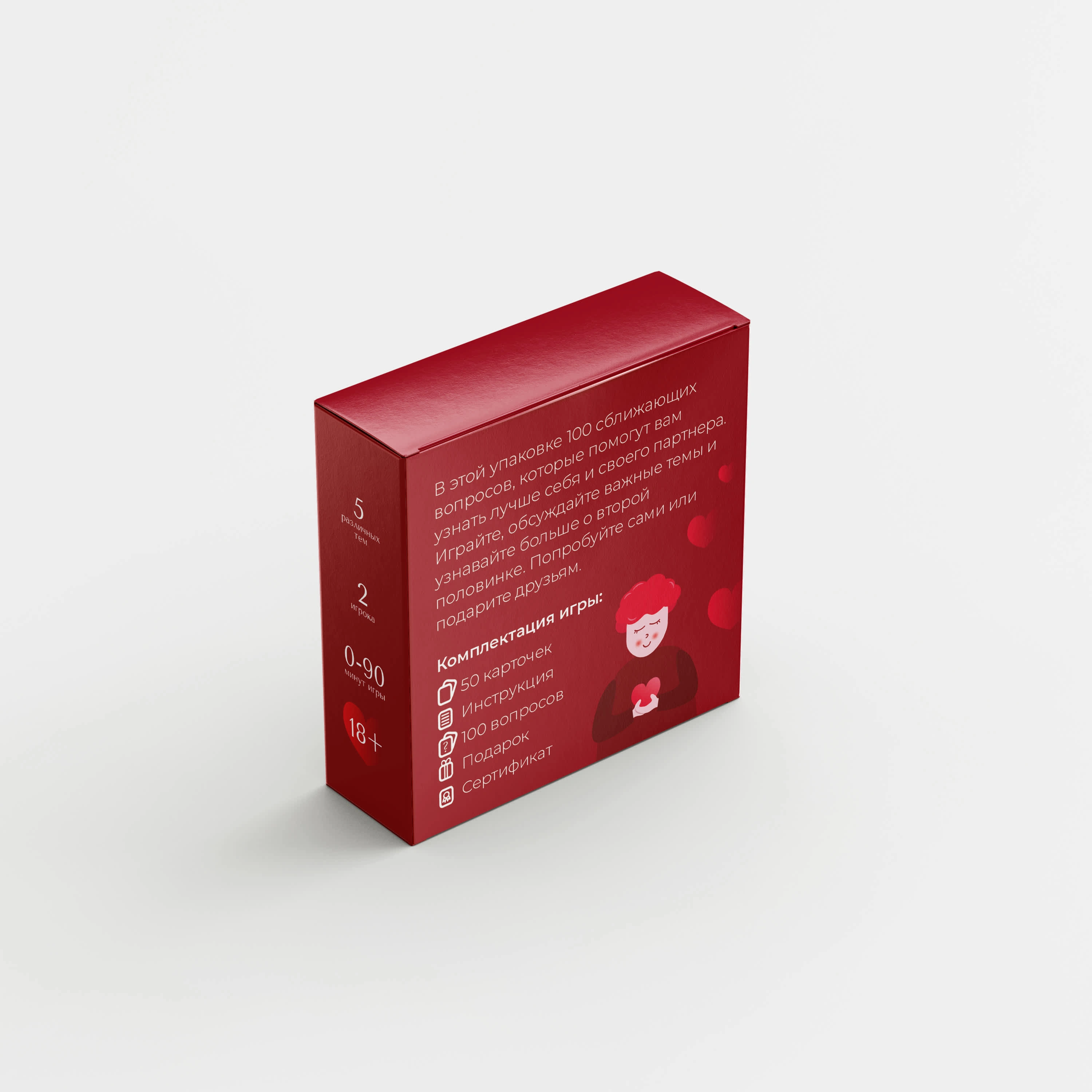
The goal of the project was to create an attractive and memorable packaging design for the “Key to the Heart” game that reflects the essence of love and intimacy. The main objectives included creating a distinctive look, achieving emotional appeal through warm colors and charming illustrations, and ensuring clarity and simplicity in conveying information. The design solutions featured a vibrant red color scheme, elegant typography, and a minimalist illustration of a woman holding a heart. As a result, the packaging is emotionally engaging, user-friendly, and memorable.
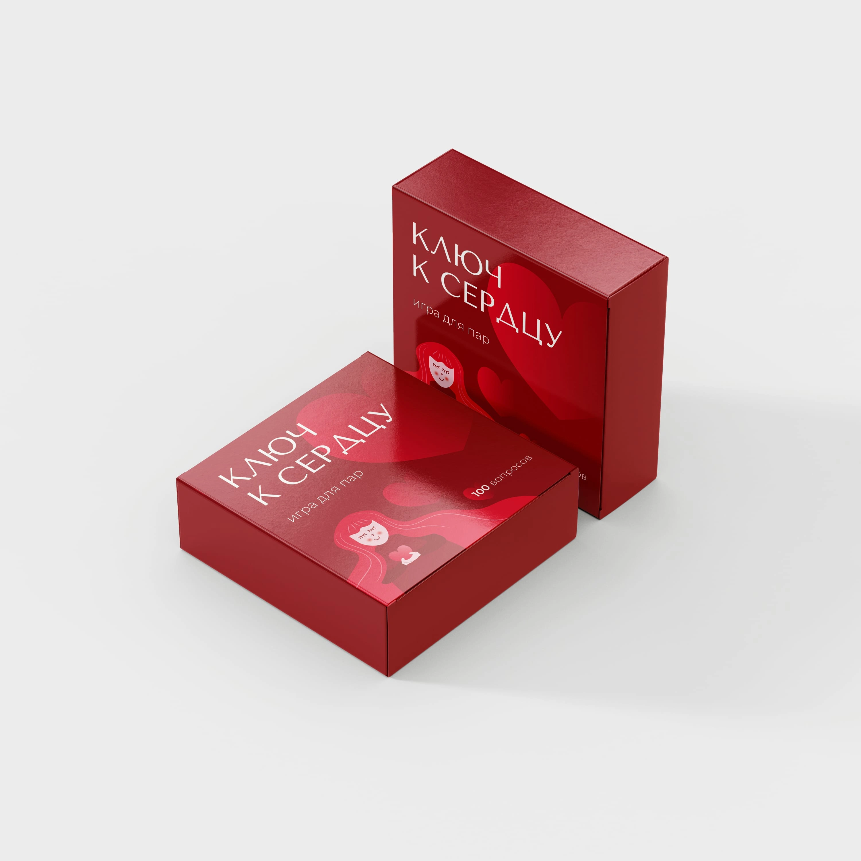
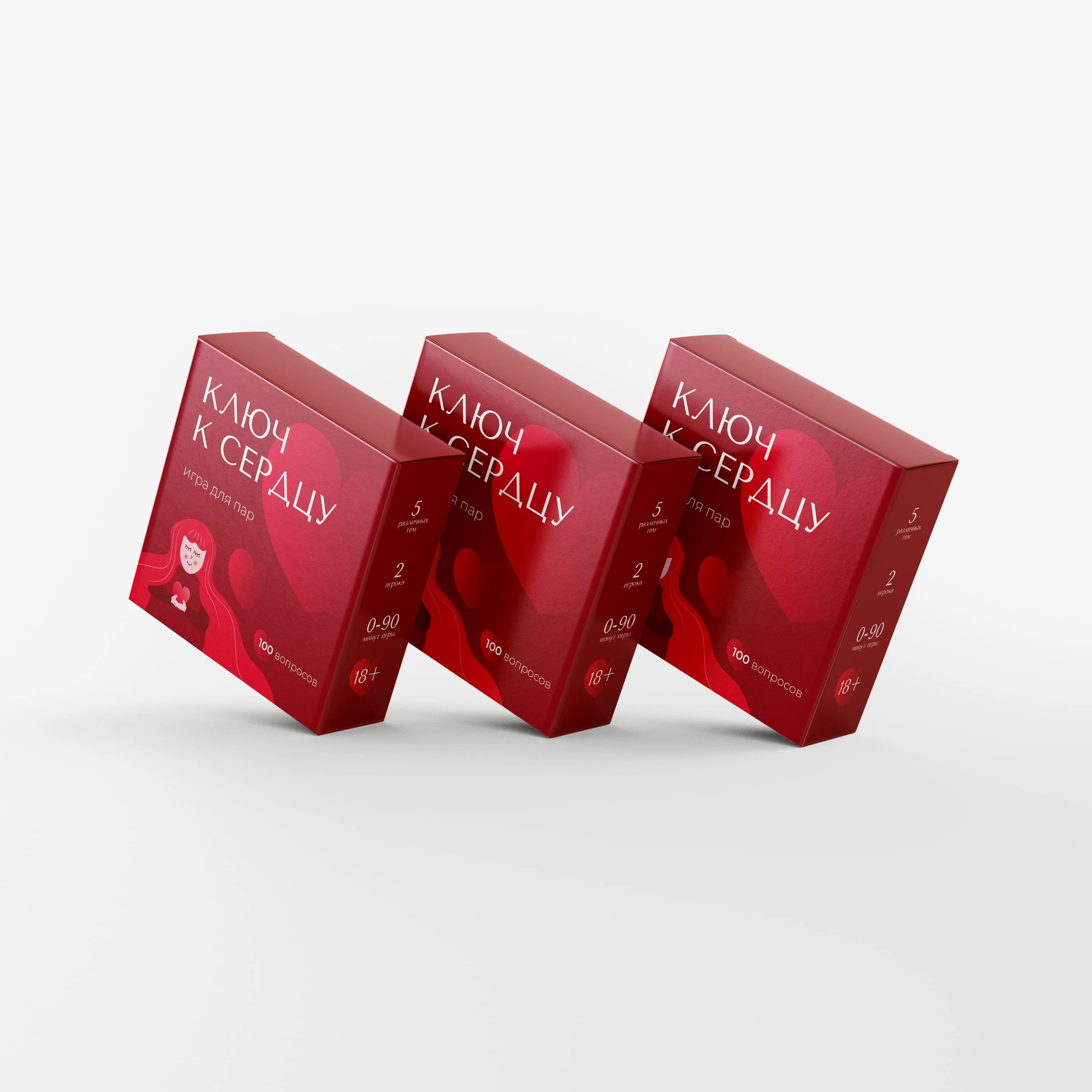
The final packaging features a vibrant red color scheme, symbolizing love and passion, with subtle heart motifs reinforcing the romantic theme. The typography is elegant yet playful, ensuring readability while maintaining a lighthearted tone. A minimalist yet endearing illustration of a smiling female figure holding a heart adds a touch of charm and personality.
Like this project
Posted Feb 16, 2025
“Key to the Heart” is an engaging and thought-provoking card game designed specifically for couples.
Likes
1
Views
4