Paytm Money Bonds

Ayushi Sharma
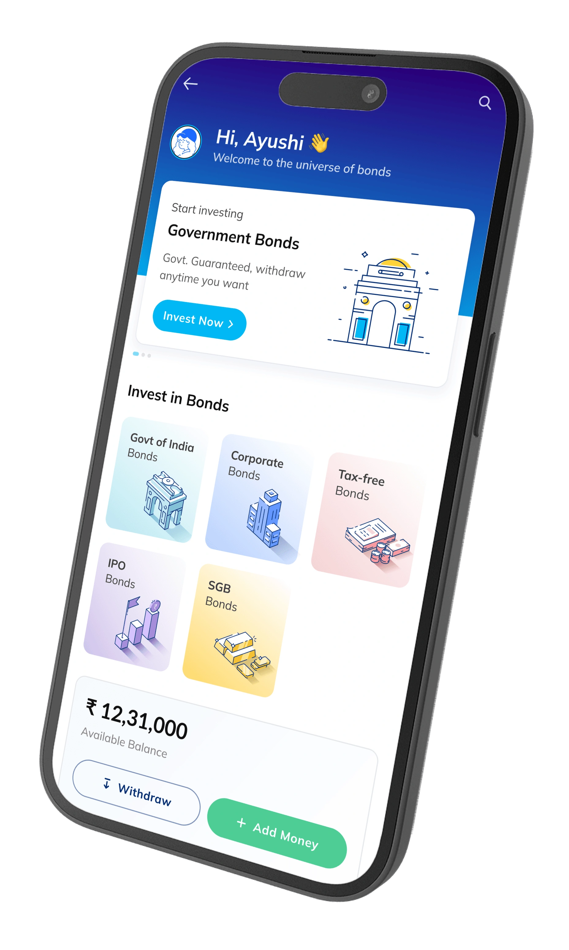
Designing financial access for millions
Role
Lead Visual Designer
Team
1 UX Designer
2 Developer
1 PM
Timeline
16 Months
Jan '22 - May '23
Backstage
Paytm Money (India's largest fintech) had 340M+ users but a massive gap: 78% of retail investors avoided bonds because they didn't understand them.
By early 2022, Paytm identified bonds as a major growth opportunity. The market was huge. The execution was missing. Most of my work involved optimizing existing behaviors (investing is easy, how to make it faster). This project required creating new behaviors (bonds seem scary, we need to make them feel safe).
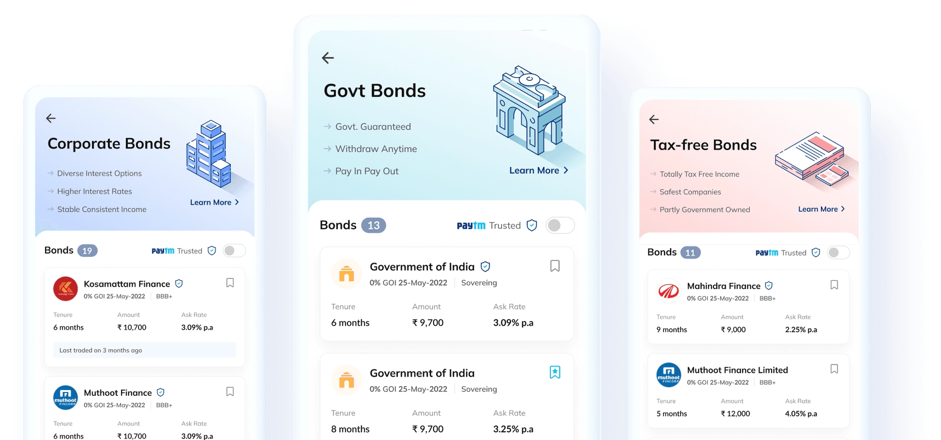
I was brought in as founding designer. My responsibility: design all screens for MVP 1 and lead the UX strategy. This meant owning the entire user journey from discovery to investment, setting the pattern language that the product designers would follow.
My contribution
Conducted 12 user interviews to identify barriers
Built comprehensive design system
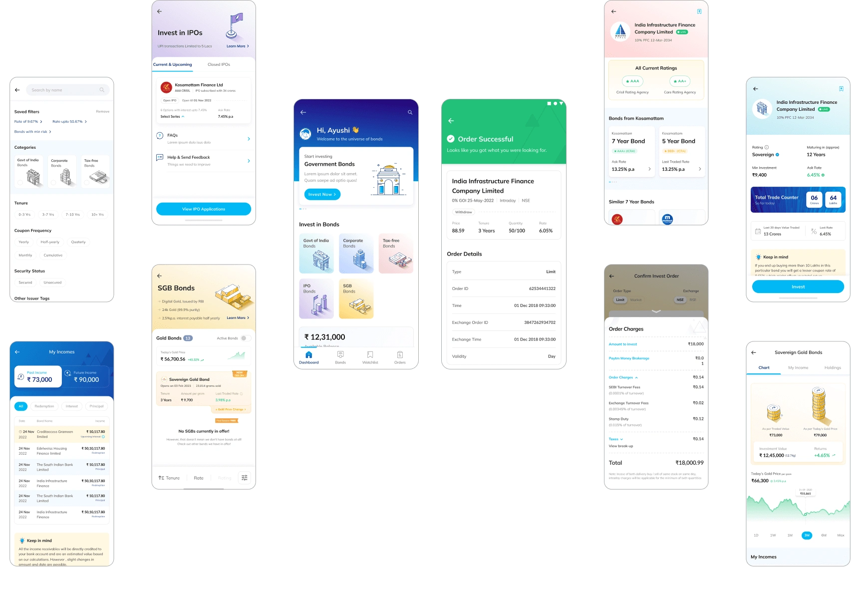
Designed all screens across onboarding, listing, details, portfolio
Created design specifications enabling faster development
Key metrics
DAU Impact:
68% of new Paytm Money users tried Bonds
Conversion Rate:
8% from home screen → invest screen (Avg CTR = <2%)
What was the problem identified?
Retail investors avoid bonds. Because bonds feel incomprehensible. From 12 user interviews, I found out:
78% find bond apps confusing
89% overwhelmed by terminology (yield, coupon rate, maturity)
67% avoid bonds due to low trust in unfamiliar products
Market opportunity: 39M retail investors in India don't invest in bonds.
Estimated untapped market: ₹2 Trillion+ (apx. $22.2 billion)
Key features checklist
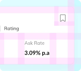
Smart Listing Interface
Show 5 key metrics up front, expand for details. Users get answers in 3 seconds.

Watchlist & Comparison
Compare 2-3 bonds side-by-side with smart highlights. Users make faster decisions without switching apps.
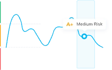
Details & Education
Tabbed interface with videos, articles, FAQs. Result: 78% onboarding completion.
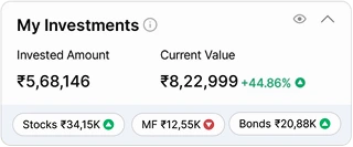
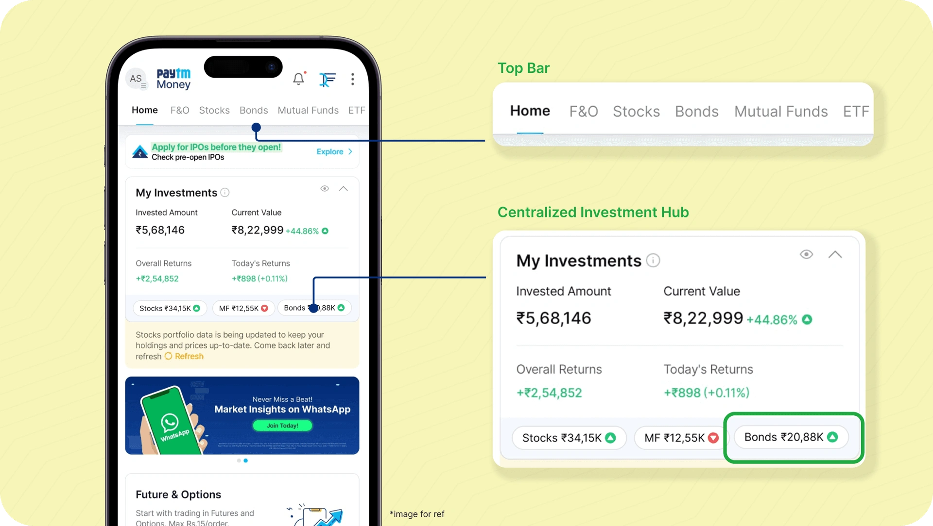
Centralized Portfolio Hub
Unified dashboard showing all investments. Bonds integrated alongside stocks/MF, not isolated. Increases adoption.
Built for scale. Design system enabling faster production
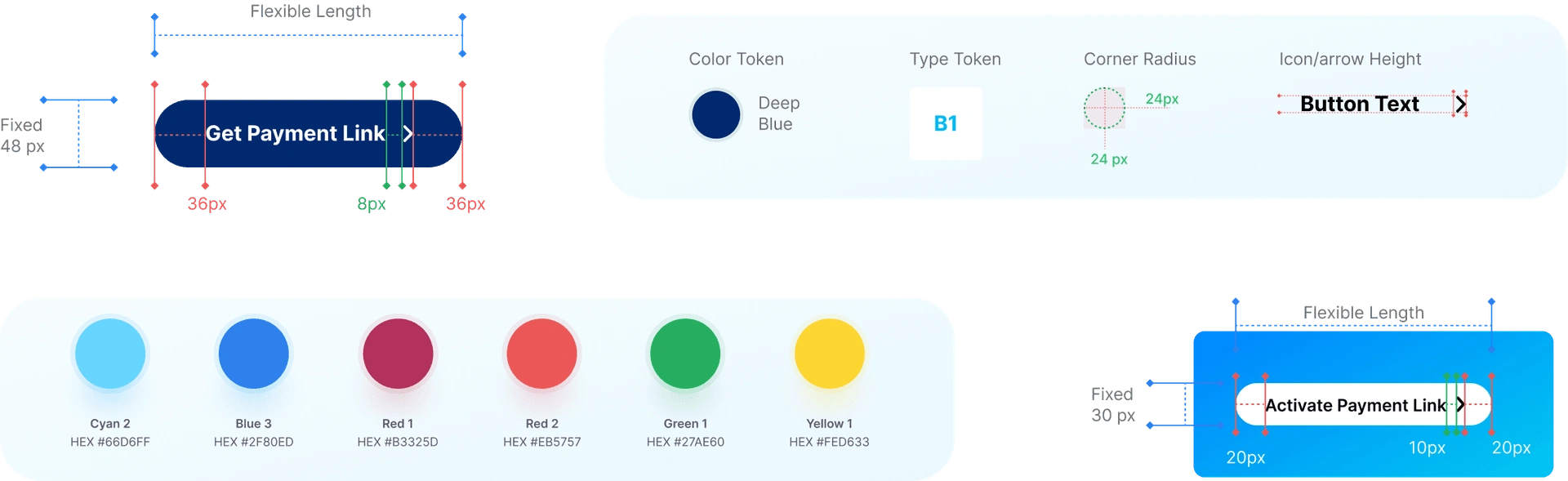
We built a system that scaled 40+ screens and enabled 70% faster design:
Colors: 6 semantic colors + rating badges (AAA-BBB)
Typography: Mulish for text, Lato for numbers (Later, change to Inter)
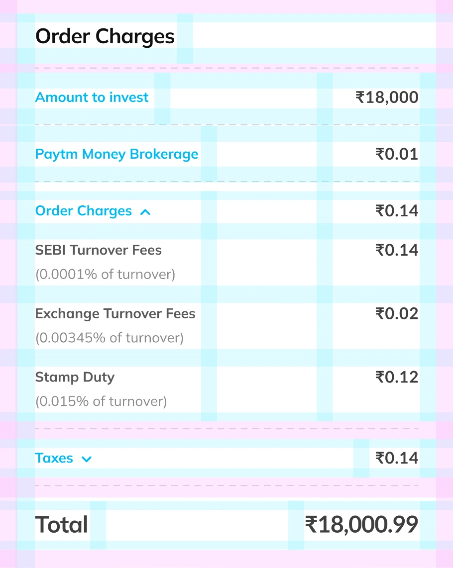
Spacing: 10px grid (consistency, breathing room)
Icon system for financial clarity
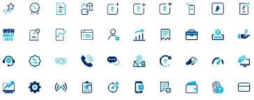
Created 40+ custom icons specific to bonds domain.
These icons do more than look good. They:
✓ Reduce cognitive load
✓ Create visual consistency
✓ Improve scannability (icons found faster than text)
Icon library follows design system:
2px stroke, consistent radius, color coordination with semantic meanings.



Feature 1/4
Smart listing interface
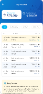
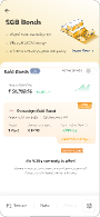
Designed the bond listing interface with a watchlist feature, allowing viewers to compare their desired listings easily and make informed investment decisions quickly.
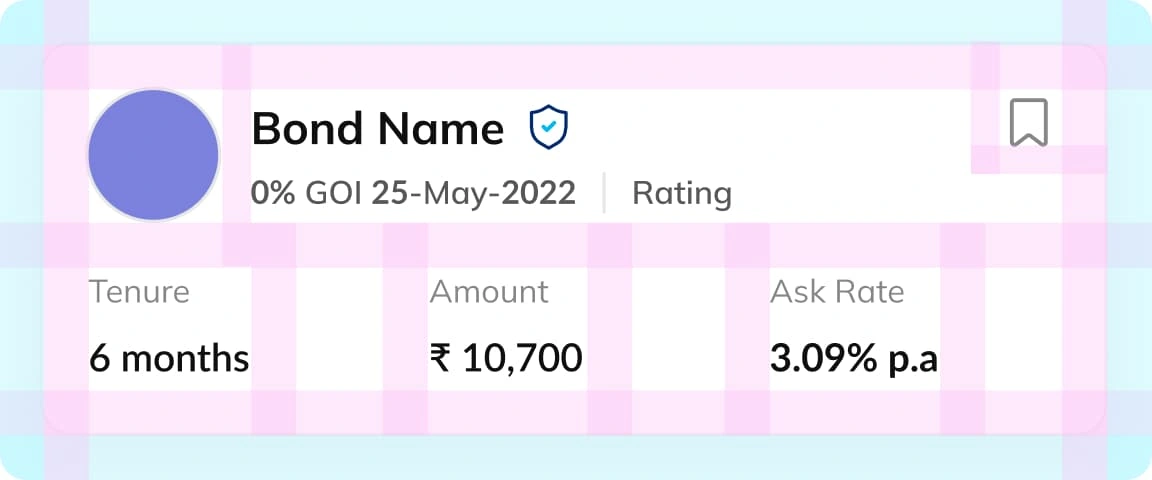
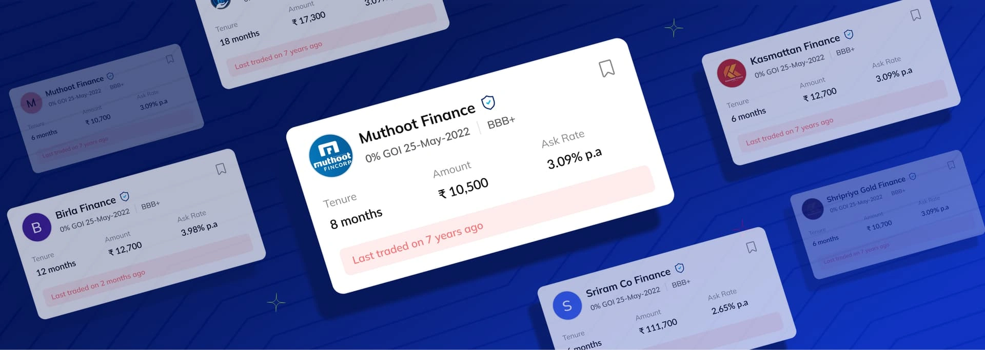
The cards were designed with clear visual hierarchy:
Company name largest (trust first), followed by three key numbers users ask upfront: tenure (how long?), amount available (how much?), ask rate (what's the price?). Rating, coupon percentage, and maturity date are secondary (important but not decision-blockers for beginners). A save icon lets users bookmark bonds for comparison without friction. This hierarchy means users find their answer in 2 seconds instead of 30.
Feature 2/4
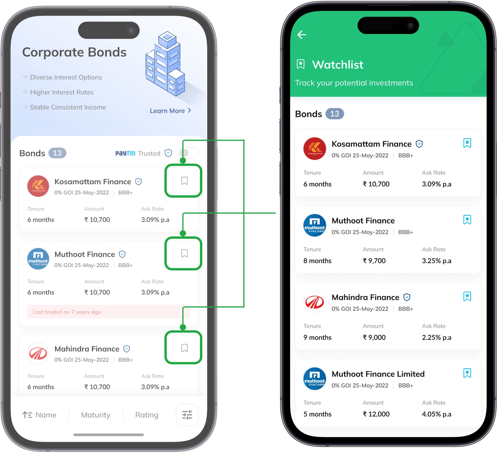
Watchlist & comparison
Add bonds to watchlist → Compare 2-3 bonds with side-by-side metrics. Highlights show best yield, safest option, and best timing.
Feature 3/4
Centralized portfolio hub
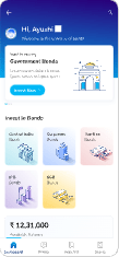
Stocks, MF, gold, bonds scattered across app. No unified view of total portfolio. Solution: Single dashboard showing all investments: total value, breakdown by asset class, quick stats for each.
Feature 4/4
Comprehensive details & education
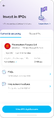
Detail pages overwhelmed users with jargon and no context. Users had questions about unfamiliar terms so we designed a tabbed interface that segments information by user need, that could be details tab for bond specs, Company Info, financials, tax Informations, blog articles and beginner guides.
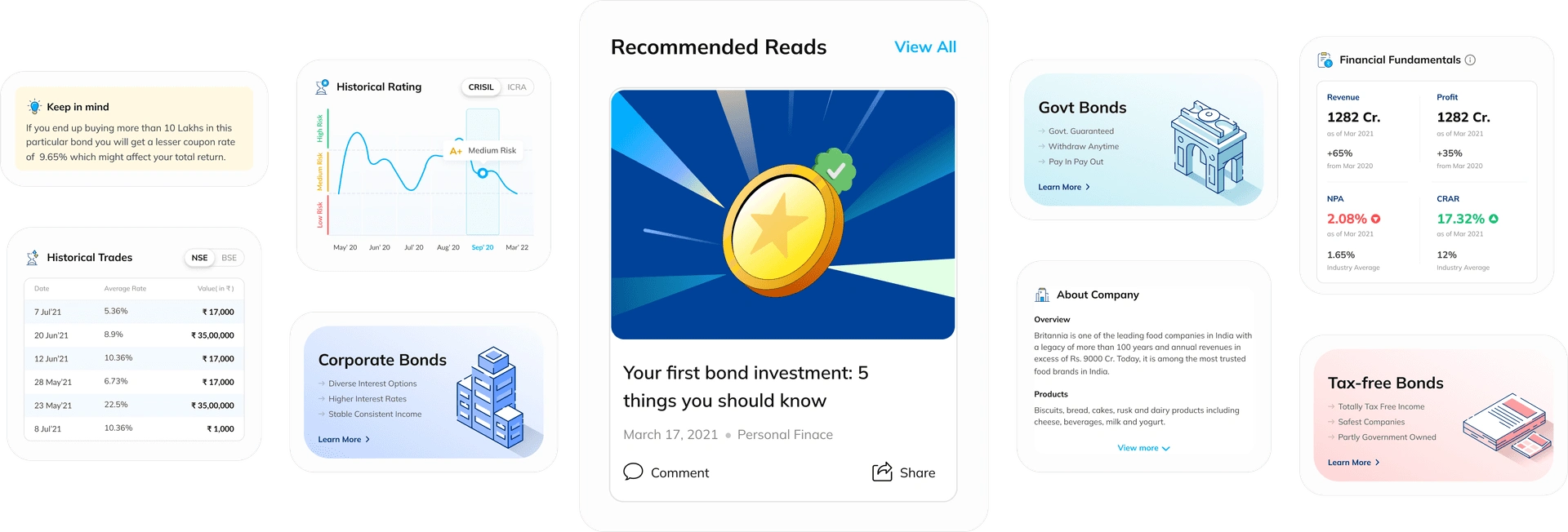
Beginners can read and understand before investing; advanced users find all metrics they need. No jargon without explanation. Result: 78% onboarding completion (high for financial products) and users feeling informed and confident.
What this project taught me?
This project was about trust. This project taught me that the best design problems aren't about making things prettier or faster. They're about removing barriers to human understanding.
That framework designing to remove psychological barriers, not just technical ones. This is what I want to keep building on.
Trust beats trends every time. That's the lesson.
Like this project
Posted May 19, 2026
Designed a user-friendly bond investment app for Paytm, increasing user engagement.
Likes
0
Views
1