Vie Trần (Brand identity design)

Billie Eillish


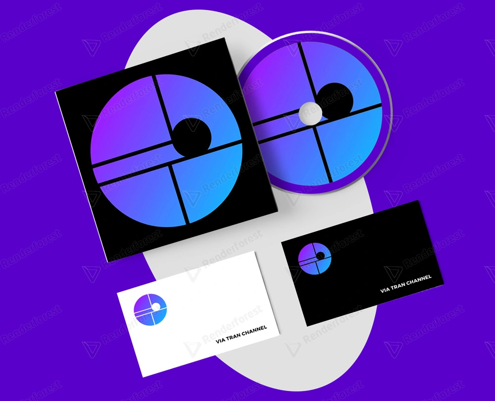
The brand identity of Vie Tran (music channel with lyrics) is designed with a circular frame, inspired by a CD. Use a gradient background color, which goes from purple to navy for a modern, youthful feel. Because Vie Channel is a gentle music channel, so blue was chosen, giving a sense of relaxation; Purple shows creativity and gives a calming effect on the mind and nerves.
In the brand identity of Vie Tran, there are many separate images combined. Musical note visuals with a single dot, no curves or curves, give branding the necessary simplicity. The two lines that form a V shape represent the letter V in "Vie" (brand name), L in Lyric (lyrics). Two lines form a T-shape, representing the word "Tran". On the other hand, the two horizontal lines running parallel look like the staff.
Like this project
Posted Apr 18, 2021
Likes
0
Views
13
Clients
v7 herostudio