The Art of Horror
Publishing Design Spring 2024
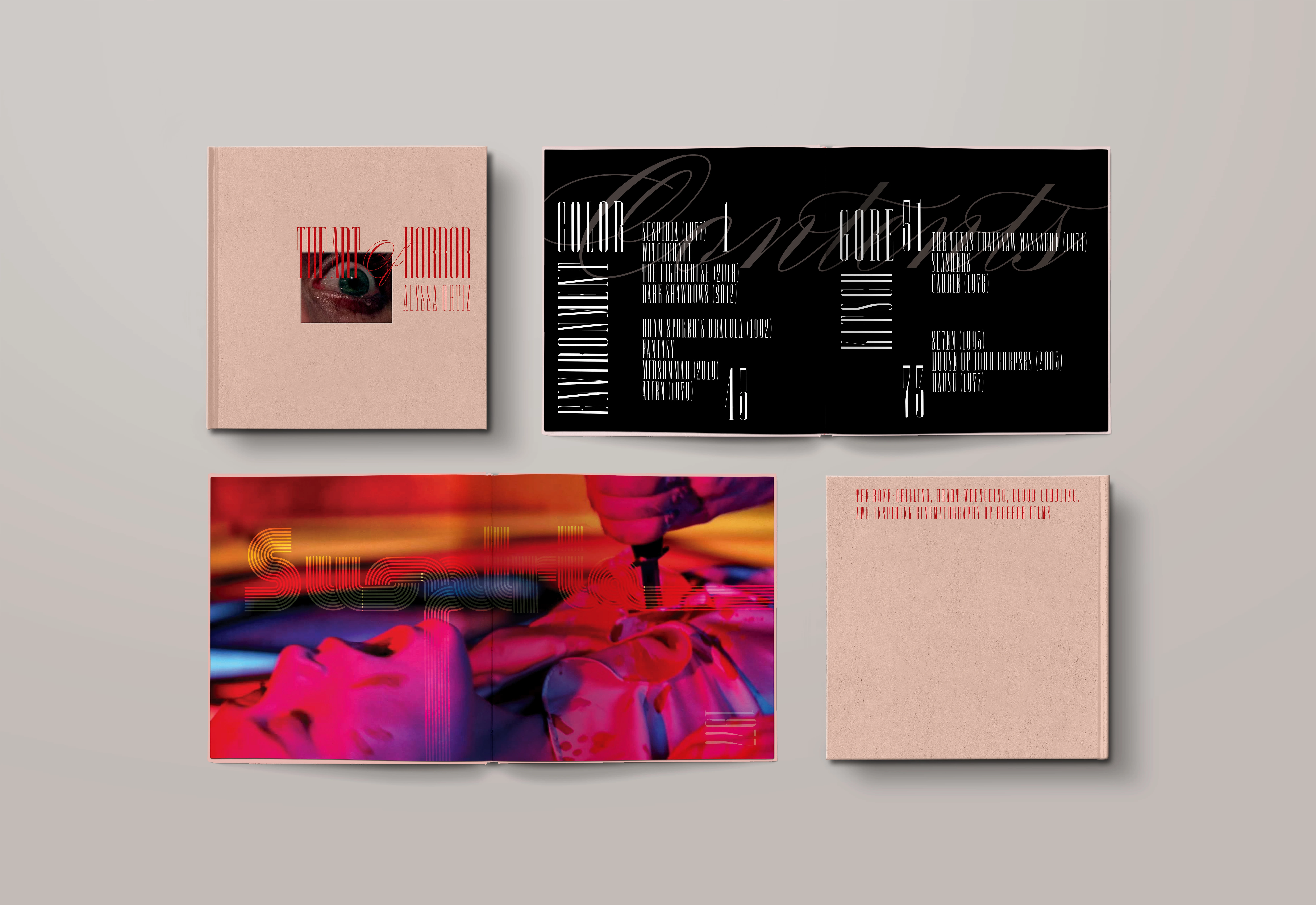
The Art of Horror is a large scale publishing design project that outlines stunning and impactful cinematography throughout the horror genre. Meant to serve as an elegant coffee table book, I used the form as inspiration to create a sophisticated system , often juxtaposing the kitschy and grotesque nature of the films included.
Why I Chose The Art of Horror
I am an avid movie watcher, a lover of beautiful films, and a self proclaimed horror buff. With a decent amount of films, (old and new) under my belt, I decided to combine my love of horror with my love of publishing design, ensuring that I would be creating something I am passionate about. Admittedly, horror films can be graphic, and not everyone‘s cup of tea. Because of this, I wanted to challenge myself to create a book about horror films that feels elegant and tasteful, often contrasting the subject matter.

Curation
Given the time constraint, I chose to include movies that I had already seen and were familiar with. Additionally, I kept in mind pulling from different time periods and sub-genres to diversify the content. The end selection ranged from the year 1922 to 2019, and the sub-genres included vampyrical folklore, to classic slasher, to the occult and back again. Once I had selected a large compilation of films, I paired them down based on what felt most special and unique according to their visuals and cinematography. I then broke them down into the categories of Color, Environment, Gore, and Kitsch. My research also included sourcing articles for the book that objectively discussed the cinematography of the individual films.
Typography
The typography of this project is an area where I really wanted to lay into the idea of elegance, restraint, and sophistication, without losing my own style. I chose the ultra condensed serif, “Smoosh” and the flowing, ornate script “Compendium” to act as my header and decorative fonts respectively. The combination of which communicated a timeless refinement that I was craving for this project. For the introductory spreads of each film, I deviated from my system, and chose type treatments to suit the films individually, not only for the sake of representing the film, but to offer respite from the repeating system.

Color
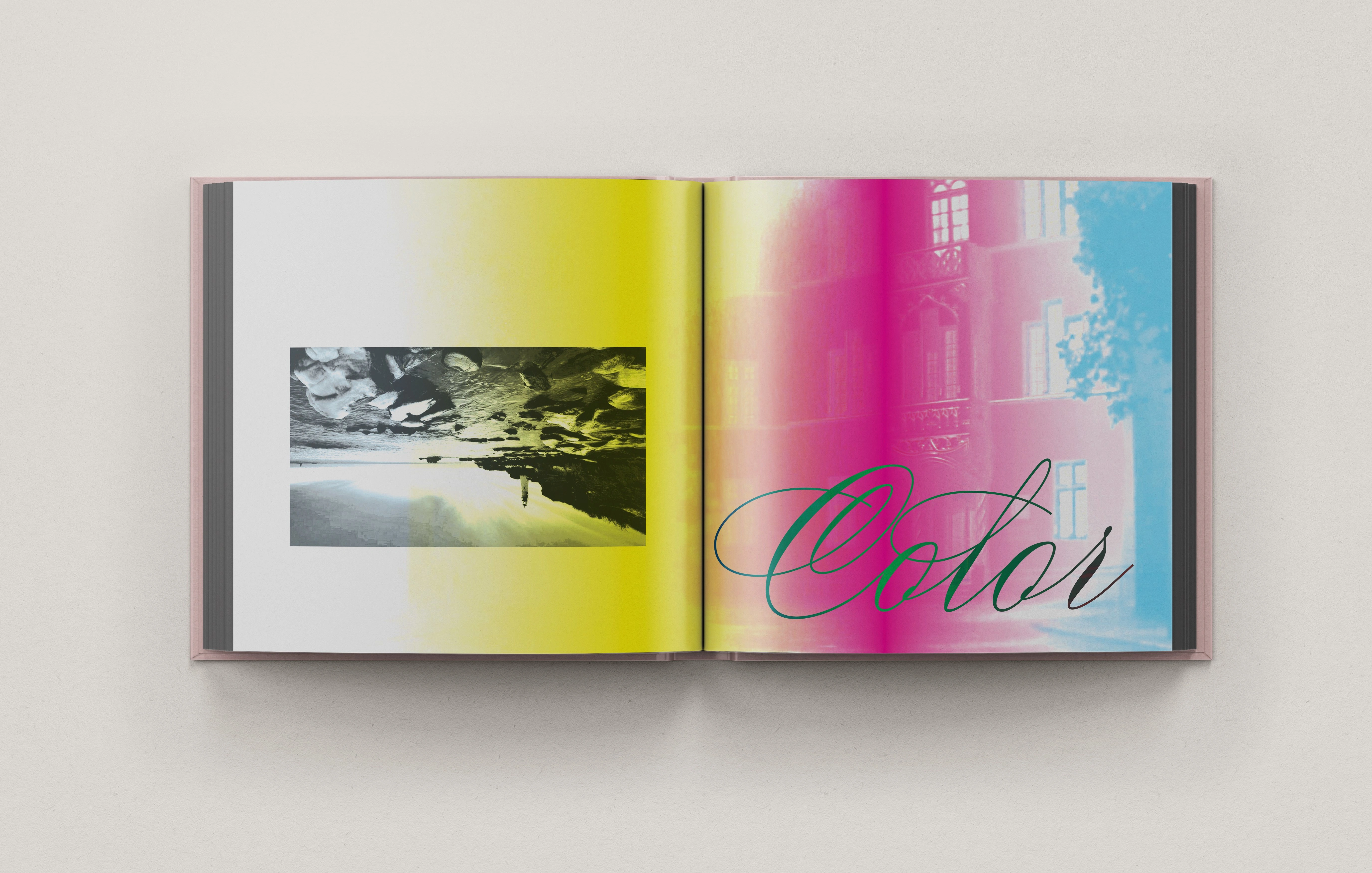
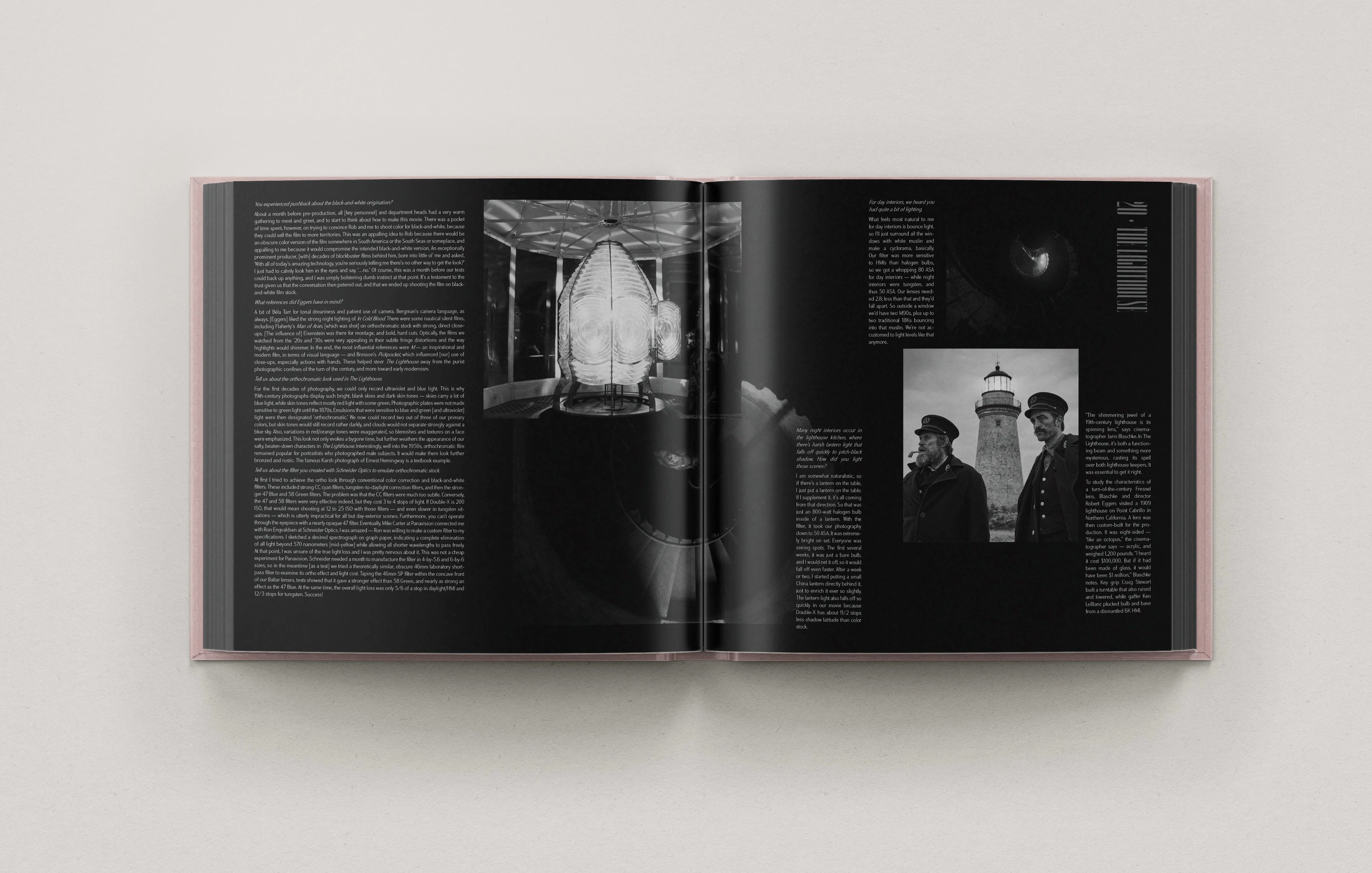
Not only is color its own chapter in The Art of Horror, but it played a large role in the pacing of the book. I utilized the color activity within the films to offer elements of surprise throughout. For example, a film like Carrie, in which our main character is doused in blood at prom, begged to appear in crimson spreads. Moreover, a film like The Lighthouse, filmed in stark black and white, was treated just as starkly.
Layout
Layout may just be my favorite element of publishing design, and it is here that I always try to push the boundaries, break some rules, and hopefully come out with some refreshing and unconventional spreads. I set myself up with a six column grid and from there, I can decide when to use it and when to break it. One of the most important things to me when designing anything, including layout is contrast. I try to keep contrast at the front of my brain, utilizing different sized imagery and text blocks, incorporating my decorative type in unexpected ways and placing my elements to create a geometric flow, much like a puzzle.
Photo Treatments
For the majority of the book, I did not treat the images in the interest of maintaining their cinematic draw. However, for my more decorative spreads as well as for ornamentation here and there, I played with colorization and opacity settings to develop a more interesting design system as well as to add contrast. I looked at many of the more decorative spreads as an illustration, using and manipulating scenes from the films to create an entirely new image.

Conclusion
I put my heart and soul into making the project come into fruition without compromising my initial vision. A lot of hours were spent stressing about this project, but even more were spent loving every minute of creating something that I have never seen before. I believe that this project is a true amalgamation of my love for design and the act of constantly pushing myself to make something unique and special. I feel that I was able to successfully show growth in my design skills while working with a subject that I love.
Like this project
Posted Aug 1, 2024
Publishing Design


