Hubilo - Landing page Redesign
Hubilo is an event management company in the USA, whose CEO is Vaibhav Jain. Hubilo is a leading virtual event solution company focused on fostering greater human connection through the reimagination of events.
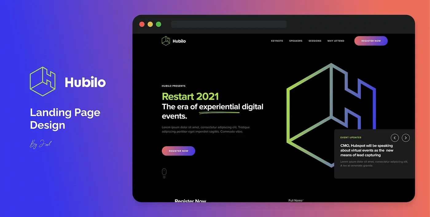
Cover Image
Step 1: 🎨 Color Exploration
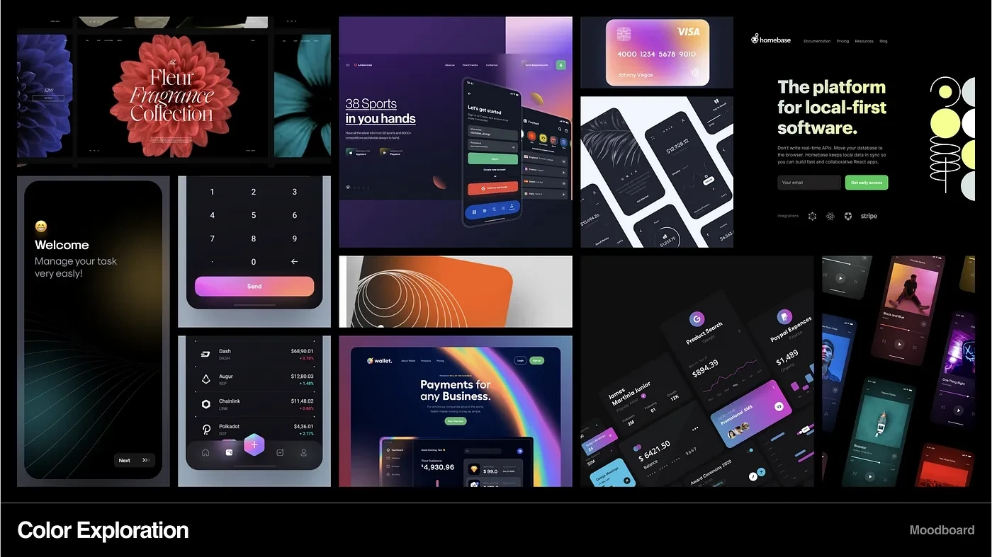
The landing page was to be in a dark mode so for inspiration of color usage on dark themes and gradients I started exploring Dribbble, Pinterest, etc. Vibrant colors with a dark background were the aim. Check out the mood board below to see what things I found.
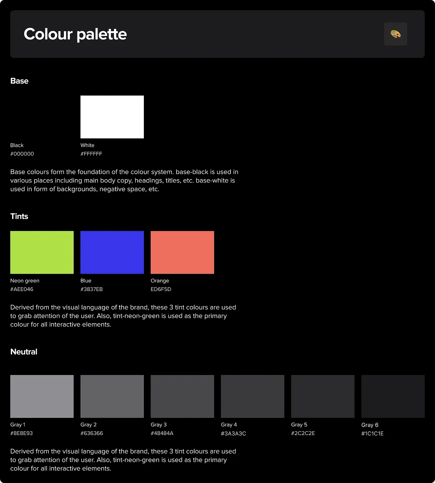
Final Colours
Step 2: 📝 Typography
After communicating and understanding the brand, I wanted a Bold, San-Serif Typeface resembling the brand style and its logo. After the exploration, 4 options were created with a heading, paragraph, and button shown as a card to illustrate the beauty of the typeface. Finally, Proxima Nova was picked.
The next step was to create the typography style that will be used for maintaining the hierarchical balance within the page. These styles also make it easy for the user to run through the sections.
The styles included 6 headlines ranging from 54px to 16px and 3 body styles primary(16px), secondary(14px) and overline(12px).
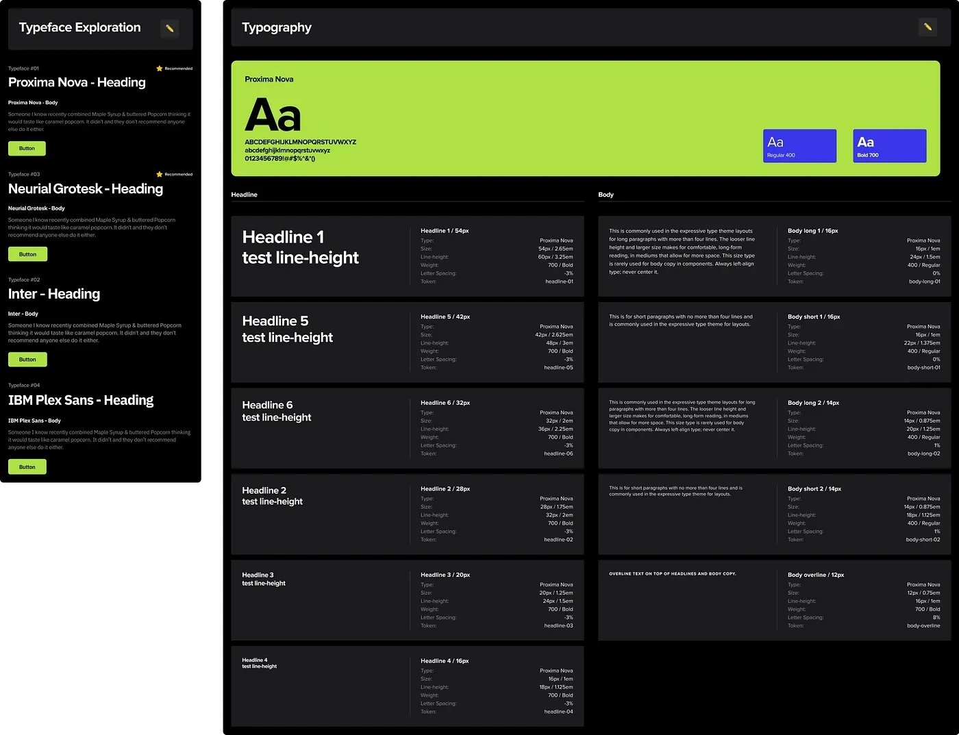
Typography Guide
Step 3: 👾 Wireframing
Wireframes are the basic idea layouts or can be described as similar to the outer framework of a building. These wireframes will not contain UI components, colors, or details, but will only contain the sections, cards, features, etc to elaborate the functionality. The placement of each section, components, images, etc is decided in this phase.
The Hero Section here was the launch of the company event with a hero image as the company logo followed by some stats to showcase the magnitude of the event and a teaser video. The stats were kept in simple text form with bold numbers rather than charts or graphs for a quick read.
The next section was of featured speakers in a carousel format with their names and details below their image. How can you attend an event without knowing the timings? So an important section was to show the event details and respective time slots. This allows the users to manage their time accordingly.
Two dedicated sections were designed for additional videos and blog cards on the working of Hubilo as a virtual event manager. The videos were not designed in a grid format as they could overload the page with information and would also escalate its size. Lastly, the footer was kept as minimal as possible with plenty of negative space making it effortless to browse through the links.
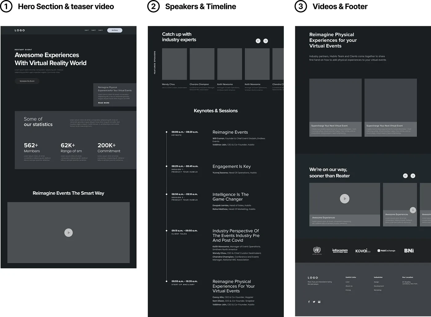
Wireframes
Step 4: 🌈 Final Design
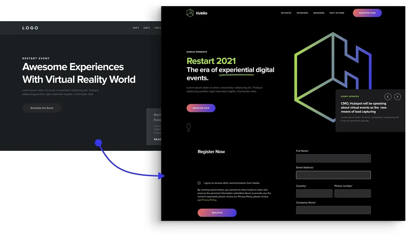
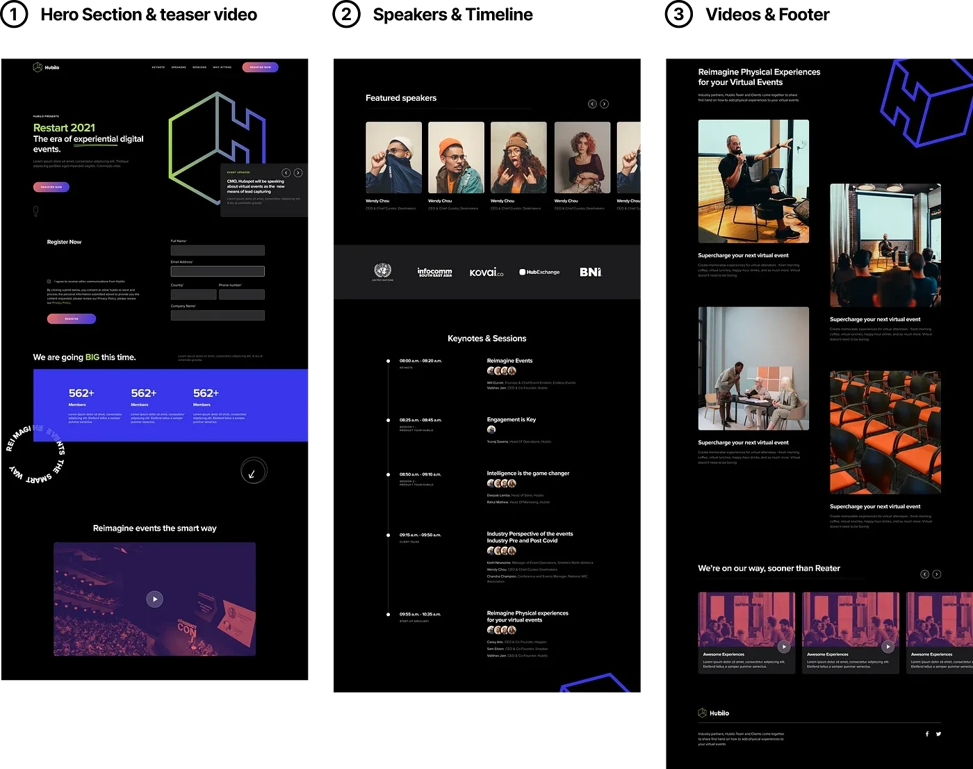
Arriving at the hero section the first thing that grabs the attention of users is a Huge “H” in the gradient, the second is the event name highlighted in neon green and the third is the text below. This immediately summons up that Restart 2021 is an event by Hubilo.
I also created a gradient with orange and blue for the buttons. The registration form was added afterward and was kept just below the hero section so that users can quickly register themselves to be a part of the event.
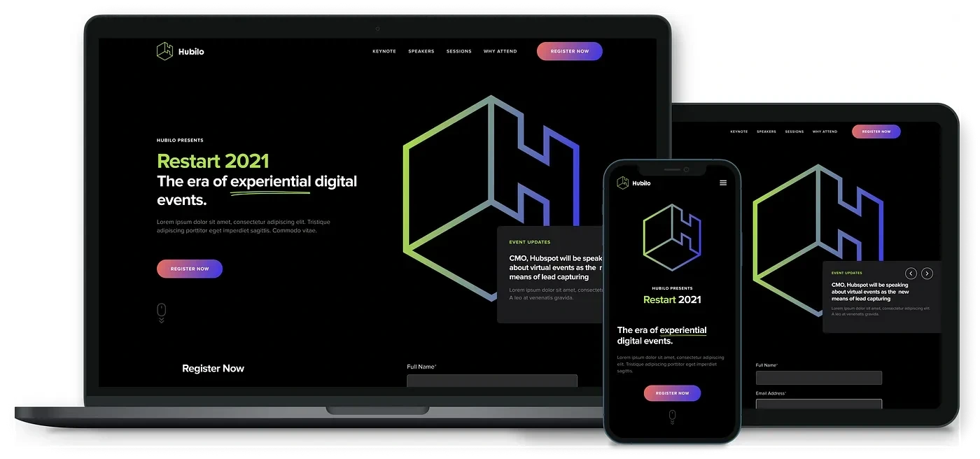
The webpage design was made responsive which can be seen on both desktop and mobile as shown in the image below.
The final design of the landing page for Hubilo Restart 2021 can be seen below in 3 divisions.
Like this project
Posted Mar 20, 2024
✨ Revamping Hubilo Restart landing page in Figma. A systematic approach for improving user experience and user engagement.


