Lexora Law Branding Exploration
Stas Gligor
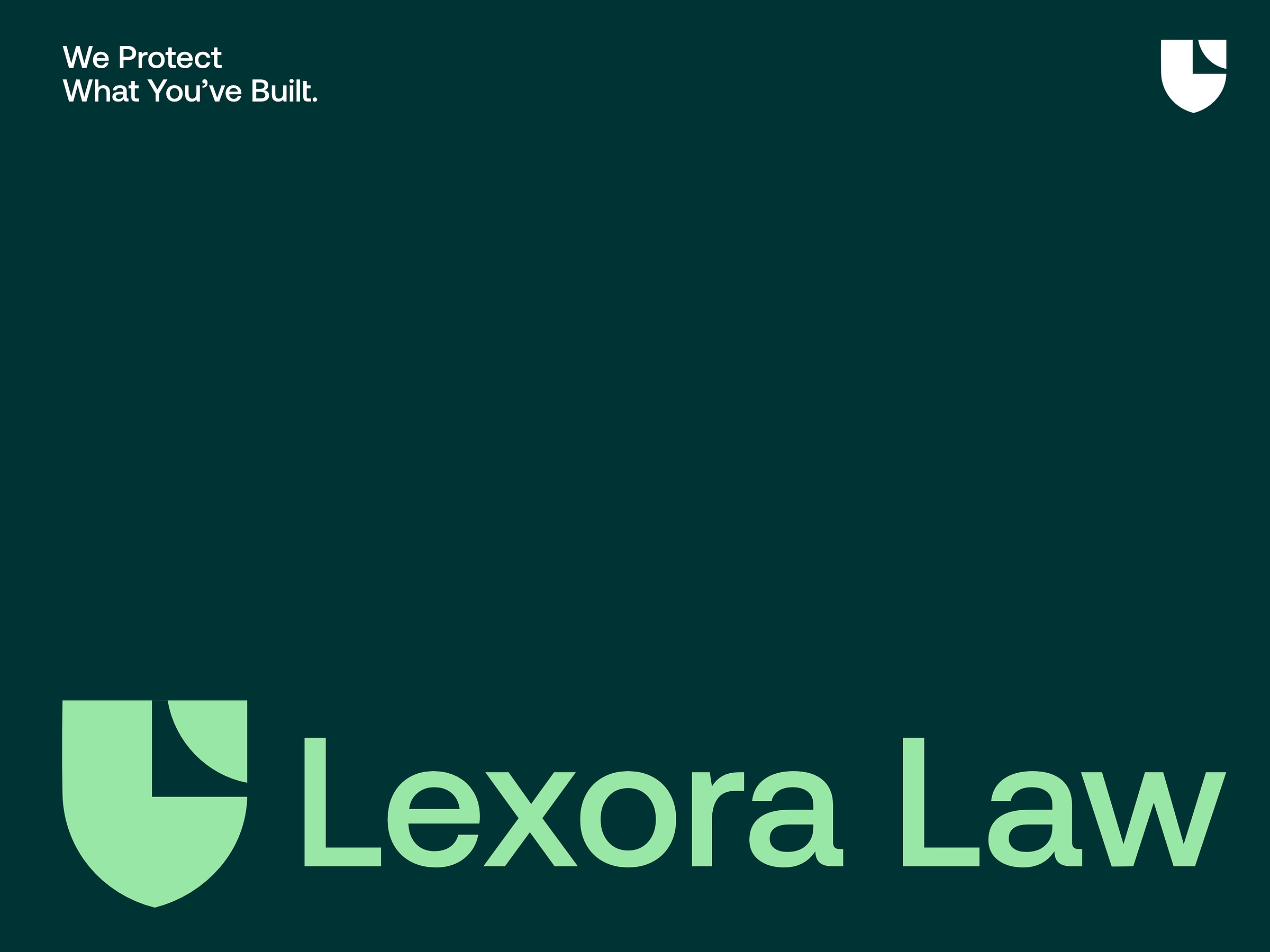
An unused logo concept explored as part of a personal branding study for Lexora Law, a fictional corporate law practice created for portfolio purposes. The direction wasn’t selected, but the idea behind the mark remained worth sharing.
The symbol is built around a refined shield form, subtly integrating the letter L through negative space into a single geometric structure. A curved cut introduces a sense of clarity, direction, and controlled movement — reflecting law as a strategic system rather than a purely traditional service.
Instead of relying on common legal symbolism, the focus was on creating something minimal, confident, and modern. A mark that feels structured and authoritative, yet precise and adaptable.
A portfolio exploration focused on protection, clarity, and forward-thinking legal identity.
Like this project
Posted Mar 30, 2026
Developed an unused branding logo for Lexora Law, highlighting clarity and modern identity.
Likes
1
Views
4