Nib — Invoicing Landing Page (Concept)

Ariz Karim


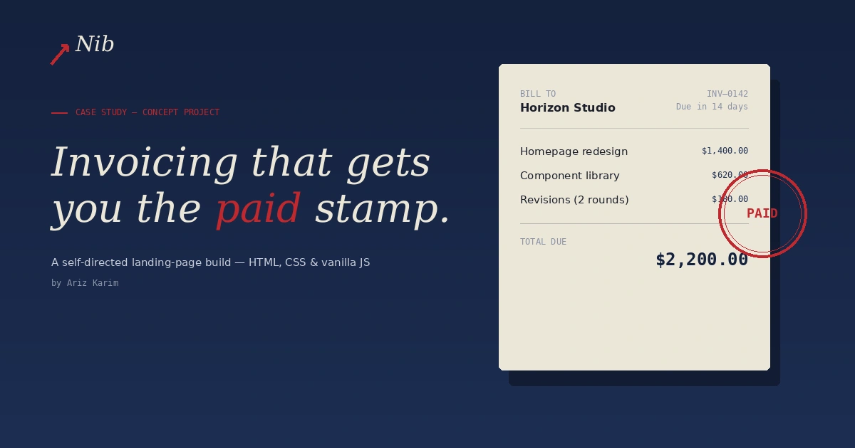
A self-directed concept project — not client work. Built to practice landing-page architecture, design systems, and vanilla JavaScript interaction patterns.
The brief I set myself
Design and build a SaaS marketing landing page for a fictional freelance-invoicing product, "Nib," avoiding the templated look most AI-assisted landing pages default to (cream backgrounds, generic gradients, stock testimonial cards).
Design approach
Instead of a generic SaaS palette, I built an "ink and ledger" visual system: deep ink-navy backgrounds, warm paper-toned cards, and a rubber-stamp red accent — all drawn directly from the product's own subject matter (invoices, paper trails, getting stamped "paid"). The hero section is an animated invoice mockup that fills in line-by-line and stamps itself "PAID," so the signature visual moment is also a literal demonstration of what the product does.
Typography pairs Instrument Serif (headlines) with IBM Plex Sans and IBM Plex Mono (body copy and data/amounts), reinforcing the ledger/document feel.
Technical build
Fully responsive layout (tested at 375px, 768px, and 1440px)
FAQ accordion built with vanilla JavaScript — no library — using
scrollHeight to animate an accurate expand/collapse instead of snapping to autoScroll-triggered fade-in reveals using the IntersectionObserver API, unobserving each element after it animates to avoid unnecessary work
Functional mobile hamburger menu with proper
aria-expanded stateCSS-native smooth scrolling (
scroll-behavior + scroll-margin-top) instead of a JS scroll librarySingle-file HTML/CSS/JS, no build step, deployed on GitHub Pages
Note on the "trusted by" row
The logos shown are labeled placeholders for illustration — this is a concept project, not a real product with real customers.
Like this project
Posted Aug 2, 2026
Likes
0
Views
8