
Beautiful SCARS: Volume One
Book Design & Editorial Production
Book series design, art direction and print production
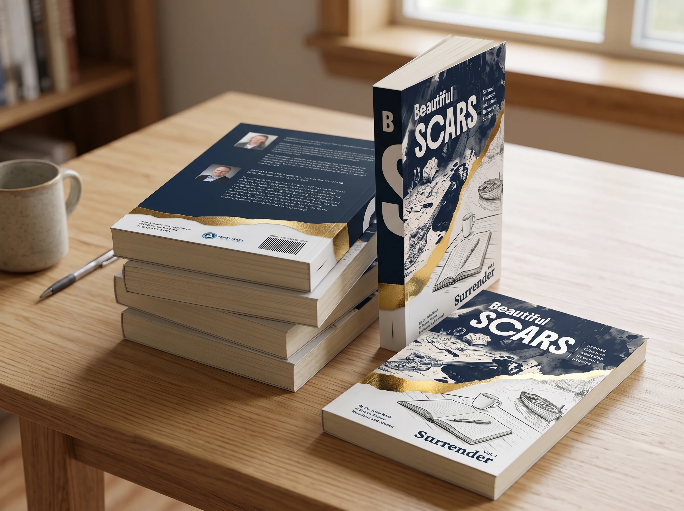
Project: First book of a 12-volume series (Beautiful SCARS: Second Chances Addiction Recovery Stories)
Client: Simon House Recovery Centre (Calgary, Canada), with executive leadership and creative director
Role: Lead book designer, art director, pre-press specialist
Format: 148-page paperback book (6" × 9"), 15 personal stories, master design system for 12 volumes
1. Project background and goals
Simon House supports clients working through addiction recovery. The organization decided to publish a collection of first-hand stories written by residents and alumni.
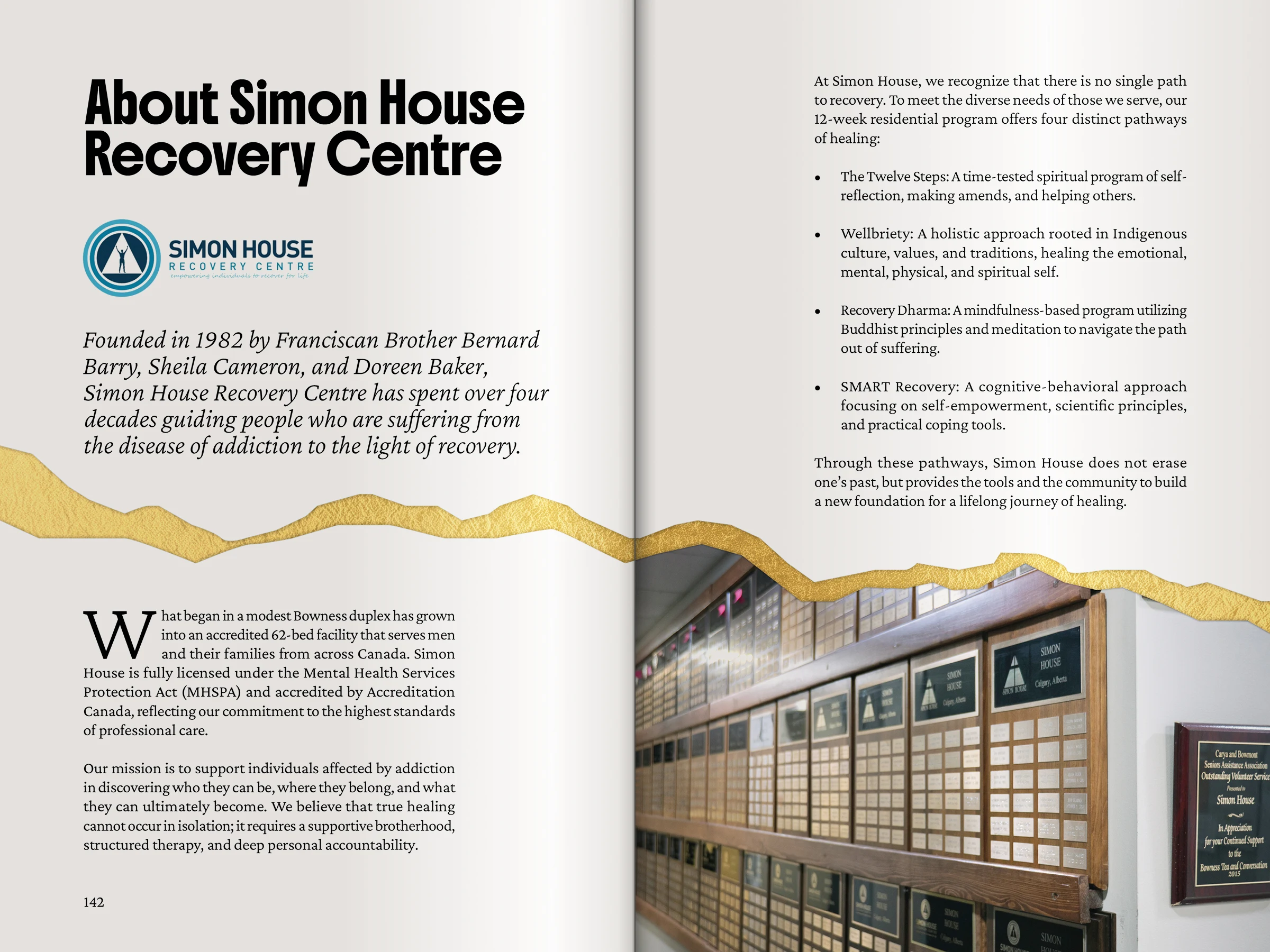
The book needed to treat these personal stories with dignity, avoiding the sterile look of a medical pamphlet. At the same time, the foundation shares this book with key sponsors and benefactors. A well-crafted physical book shows that the organization manages its projects with care and accountability. This first volume also had to establish the typographic hierarchy, grid rules, and production specs for the remaining 11 planned books.
2. Checking the materials before starting
Before starting layout work, I audited the text and assets against the foundation's original records.
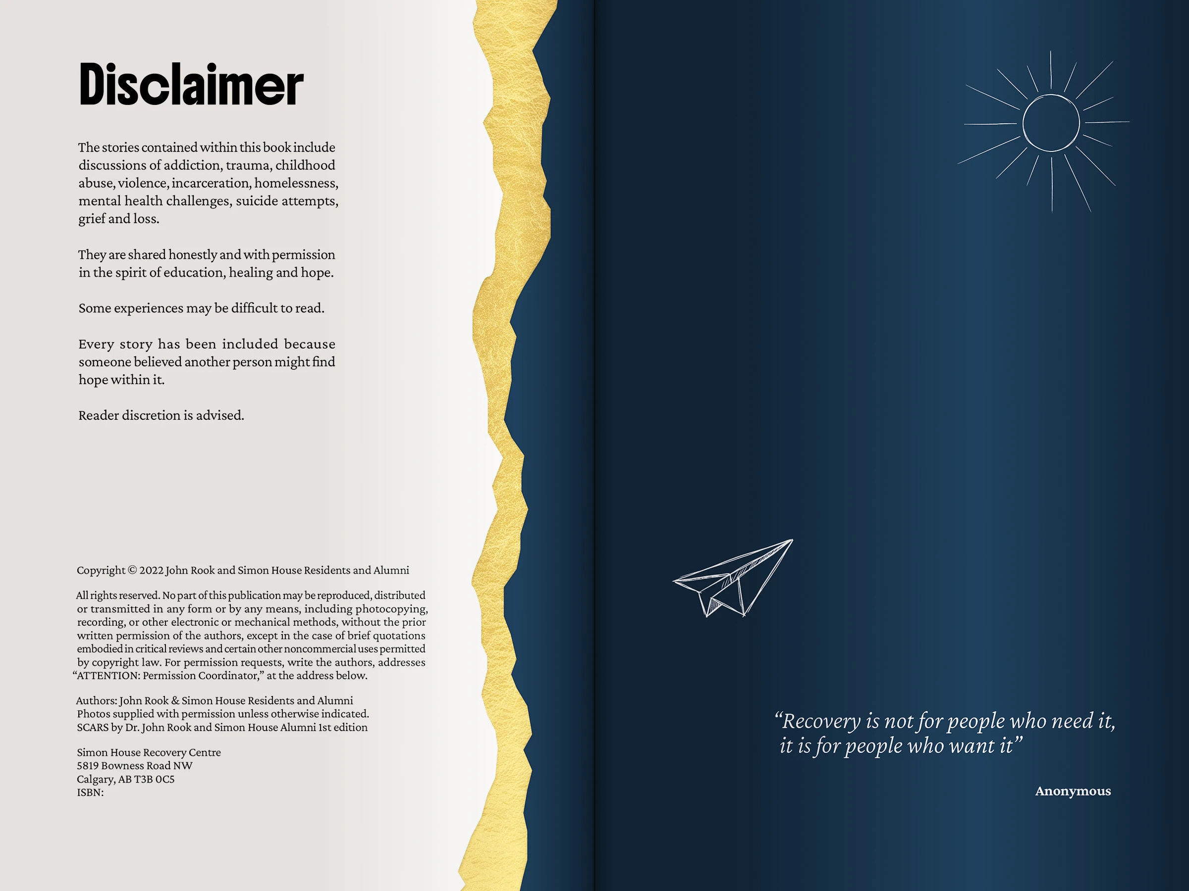
The supplied draft had been heavily cut by an outside editor, removing personal details and shrinking the book down to a 30-page summary. During my initial review of the materials, I caught this issue, explained why the original wording was critical to the book's purpose, and got the complete manuscript approved for production. I also found an incomplete chapter with missing visual assets and resolved it early, keeping the print schedule on track.
3. Visual idea and series design
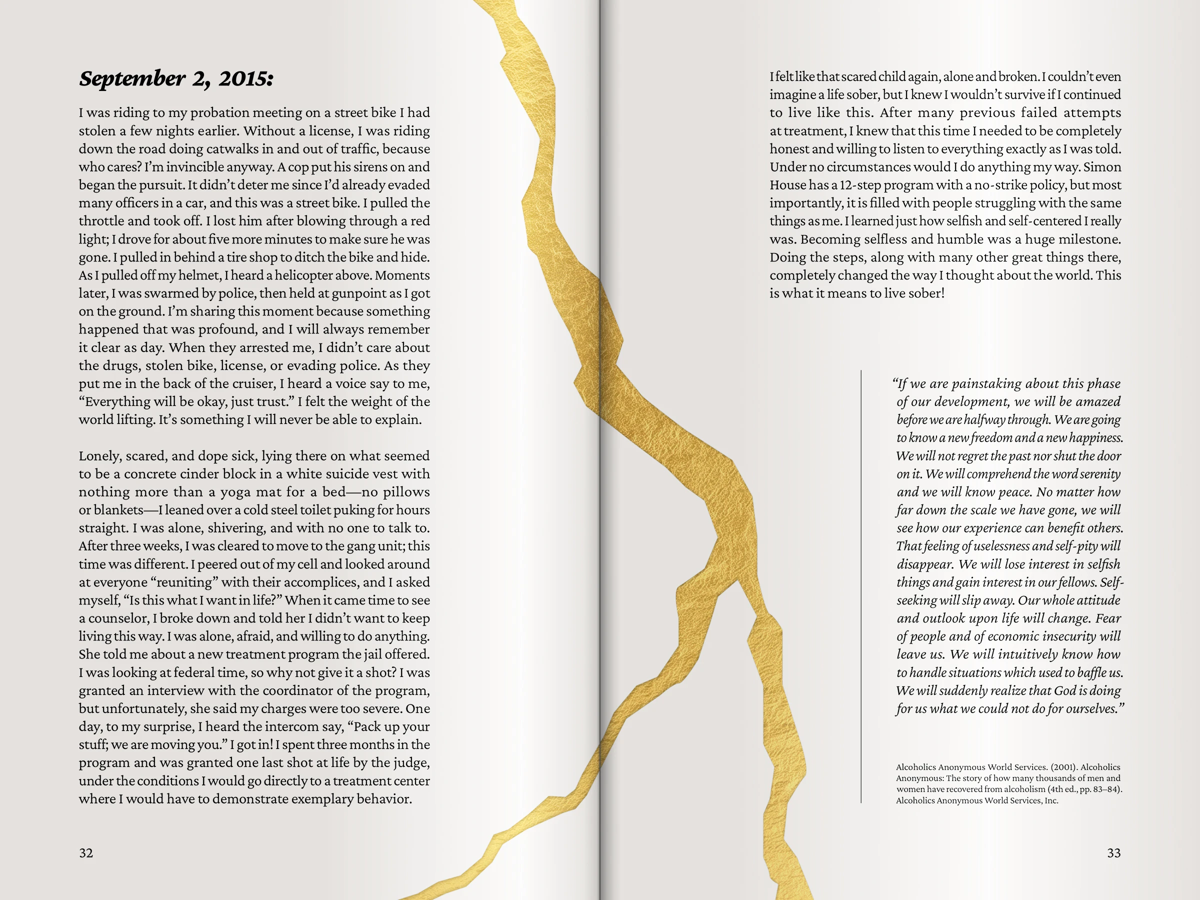
The visual concept is based on Kintsugi, the art of mending broken ceramics with gold lacquer. In this design, Simon House acts as that golden glue. The centre helps people piece their fractured lives back together, embracing their scars rather than hiding past pain, and finding dignity and beauty in their recovery. I deliberately left out decorative Asian motifs, focusing on the core meaning to fit the local Canadian context.
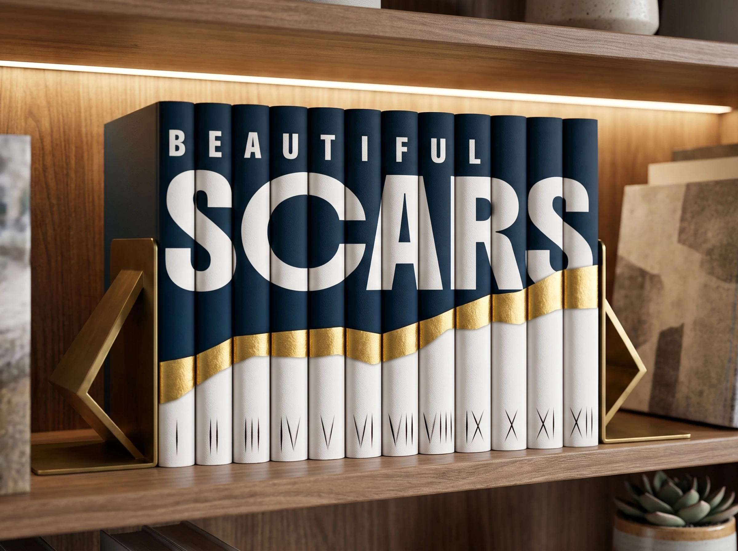
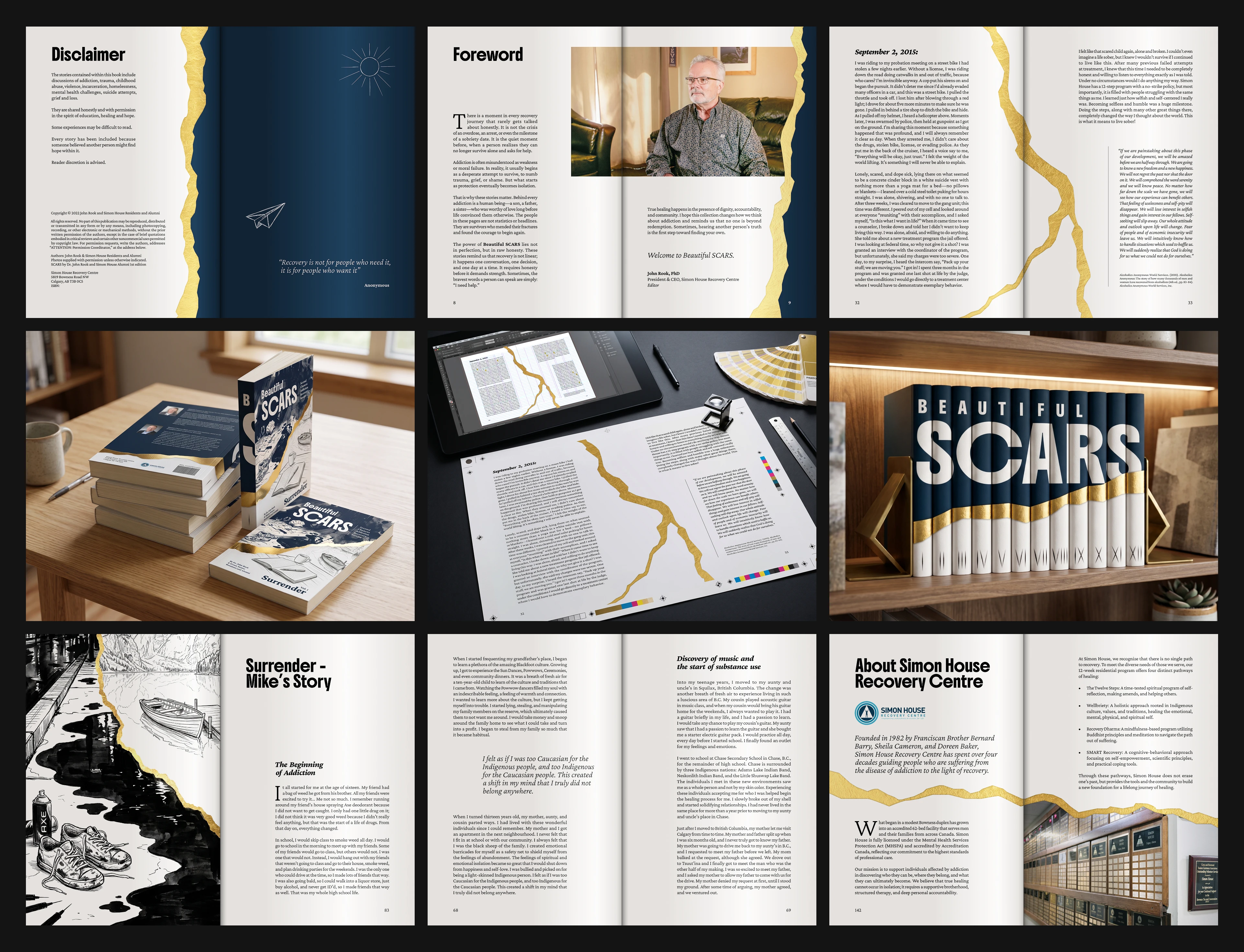
Instead of repeating the book title on every spine, all 12 volumes together form a single image across a bookshelf. Side by side, the spines spell BEAUTIFUL SCARS under a rising gold line. Gifting the first book to donors creates an open collection, encouraging them to stay involved through all 12 volumes.
4. Adding a donation page and Canadian publishing rules
The original manuscript lacked any direct request for reader support. I designed a dedicated "How You Can Help" spread with practical ways to contribute, including monthly pledges, stock gifts, and supplies from their wishlist.
I aligned the publication with The Canadian Style. I set up the official Treaty 7 land acknowledgment on the copyright page, unified the punctuation, and balanced the text margins for comfortable reading.
5. Chapter illustrations (AI and hand-drawn)
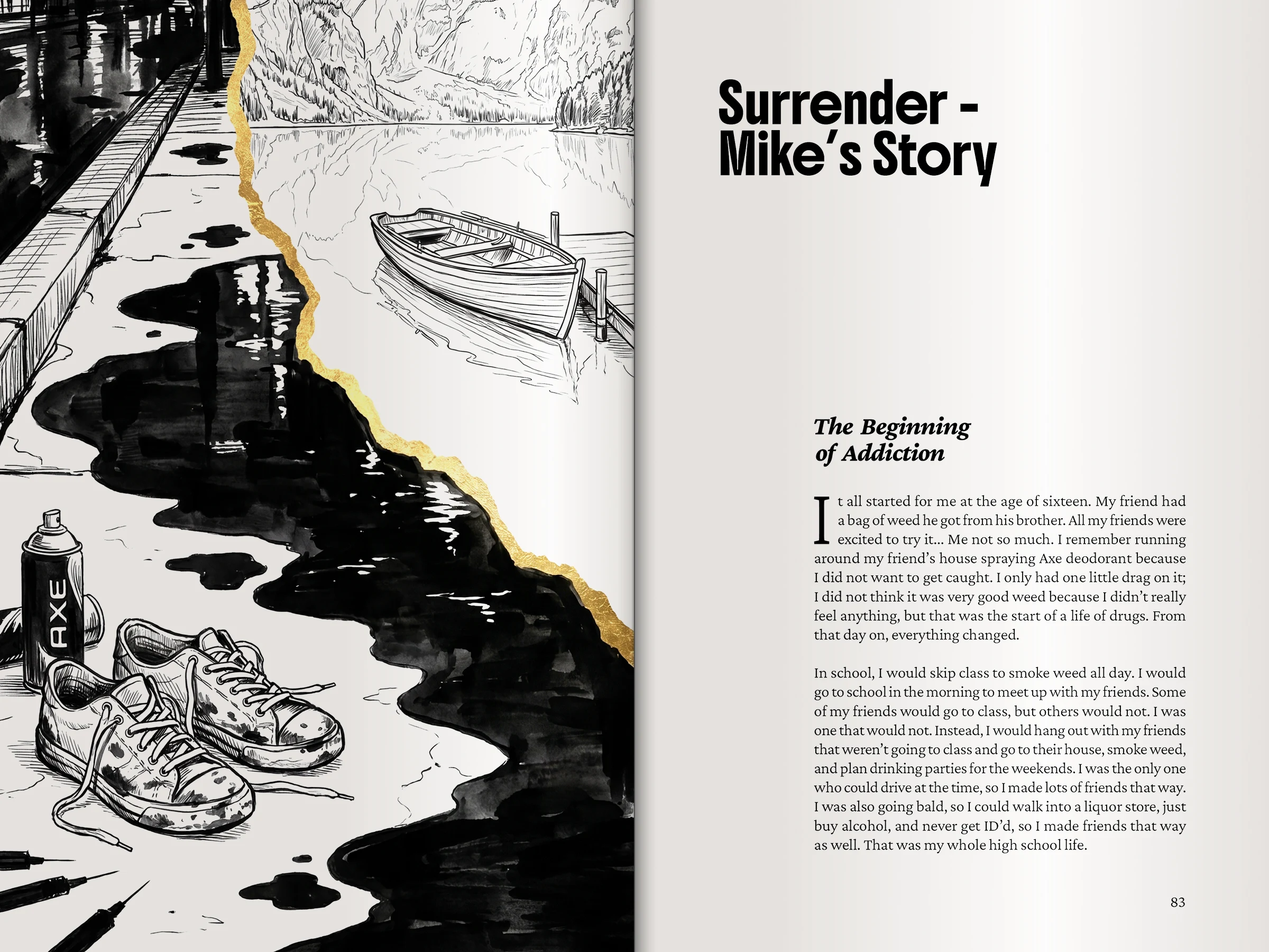
With a modest budget and a strict requirement to keep clients anonymous, I created 15 full-page chapter openers myself.
Each opener is split by a jagged gold seam. One half uses dark, scratchy ink work to represent the struggle of addiction. The other half opens into clean, calm line drawings on warm paper, showing recovery and stability. I generated base compositions using AI prompts, then retouched and painted them by hand in Photoshop and Illustrator. I cleaned up artifacts, redrew textures, and balanced contrast to deliver original editorial artwork within the project budget.
6. Print setup and material choices
The book had to look high-end without stretching the nonprofit printing budget.
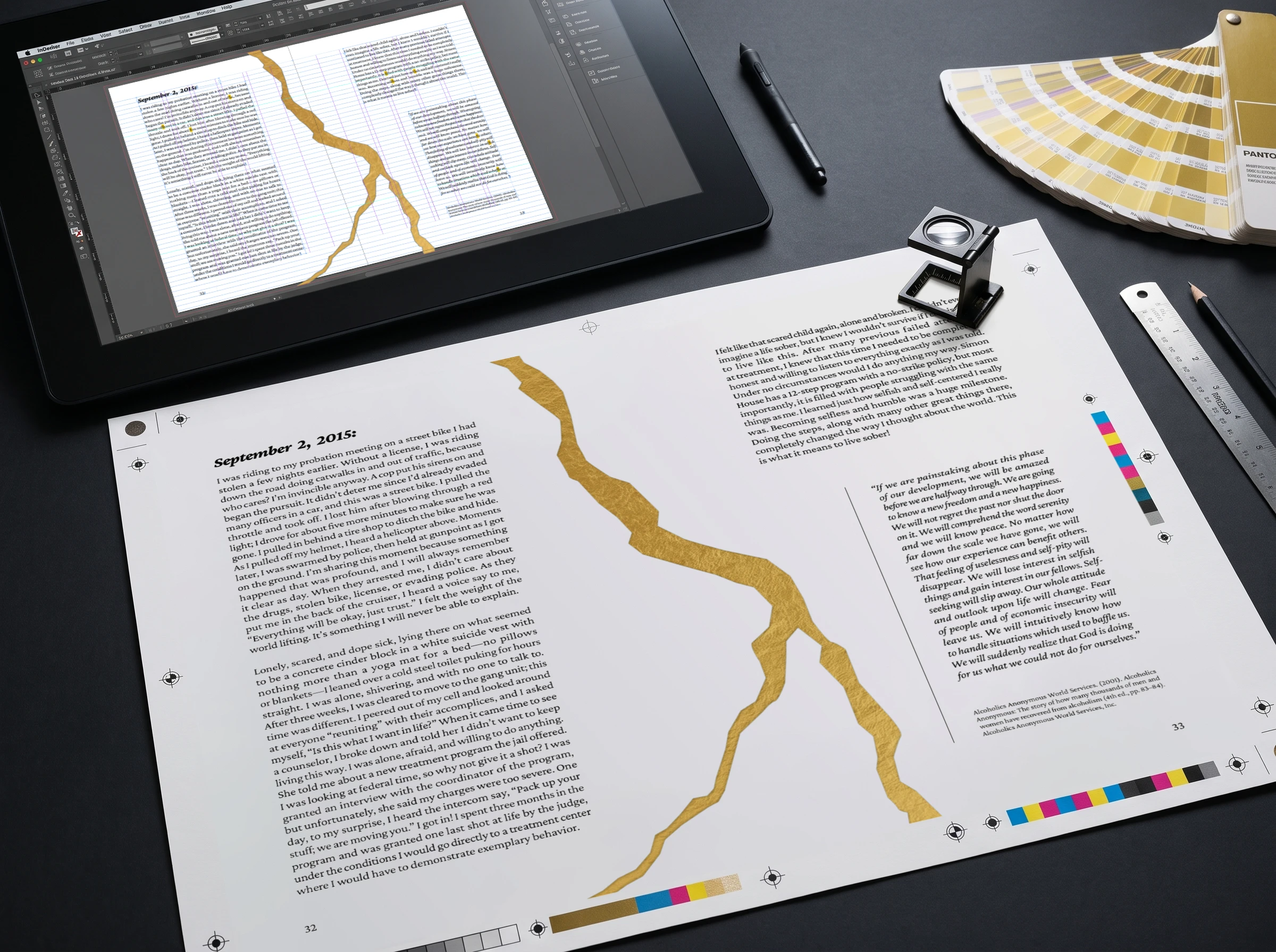
The cover features real gold foil stamping over a soft-touch matte lamination. Foil stamping across all 148 interior pages was outside the budget, so I simulated the gold seams inside using warm CMYK gradients backed by a deep rich black base. The interior was printed on 70 lb uncoated paper, which absorbs ink quickly, so I set strict Total Area Coverage (TAC) limits to stop ink transfer and bleed-through, and widened the inner margins so text stayed clear of the glued binding.
7. Final results
The master InDesign template, paragraph styles, and production specs are locked in, allowing the client to produce future volumes with minimal setup. The commercial printer signed off on the certified PDF/X files immediately, with zero prepress revisions or delays. The leadership team welcomed the publication as their core print asset for donor meetings, validating the upfront editorial audit and the long-term series structure.
1 like · 1 view · Oct 31, 2026
Engineered the design system for a 12-volume book series and laid out the 148-page flagship volume, featuring Kintsugi art direction and prepress.

