Cardland: Fintech and Credit Card Website Design

Abdul Awal


Overview
Cardland is a website template for credit card issuers, card comparison sites and digital banking startups. I designed it in Figma, then built production versions in Webflow and Framer. It is a dark-theme, multi-page site with three ready-made landing pages and CMS collections for cards, blog posts and blog categories.
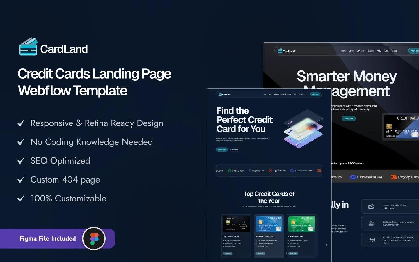
Cardland homepage
The Challenge
Card marketing is a comparison sale. A visitor rarely applies for the first card they see. They weigh annual fees, APR, rewards and eligibility across several options, and most issuer sites make that hard by spreading the details across long, text-heavy pages. The result is drop-off before the application form.
Fintech brands also need to look credible fast. A cluttered layout reads as risky when someone is about to share financial details.
The Approach
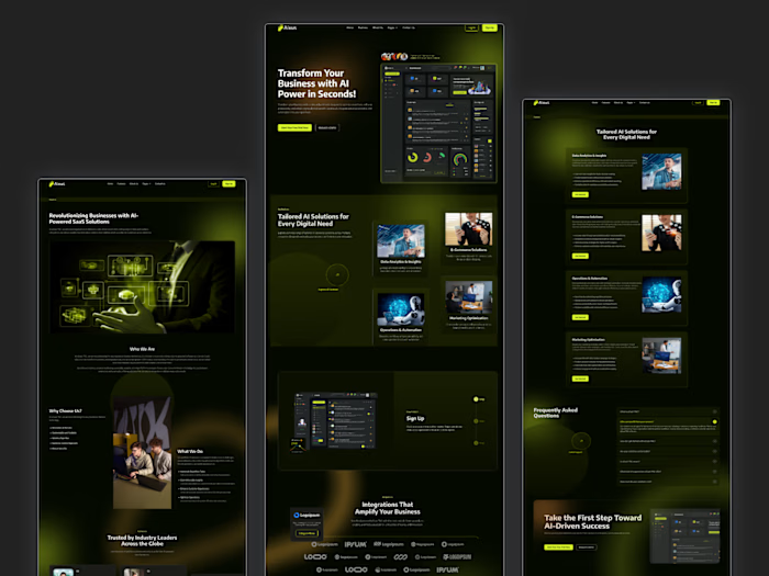
I tuned the layout for one job: moving a visitor from browsing cards to submitting an application. The dark theme gives the card artwork and key numbers strong contrast, and a single bright accent color is reserved for calls to action, so the next step is always obvious.
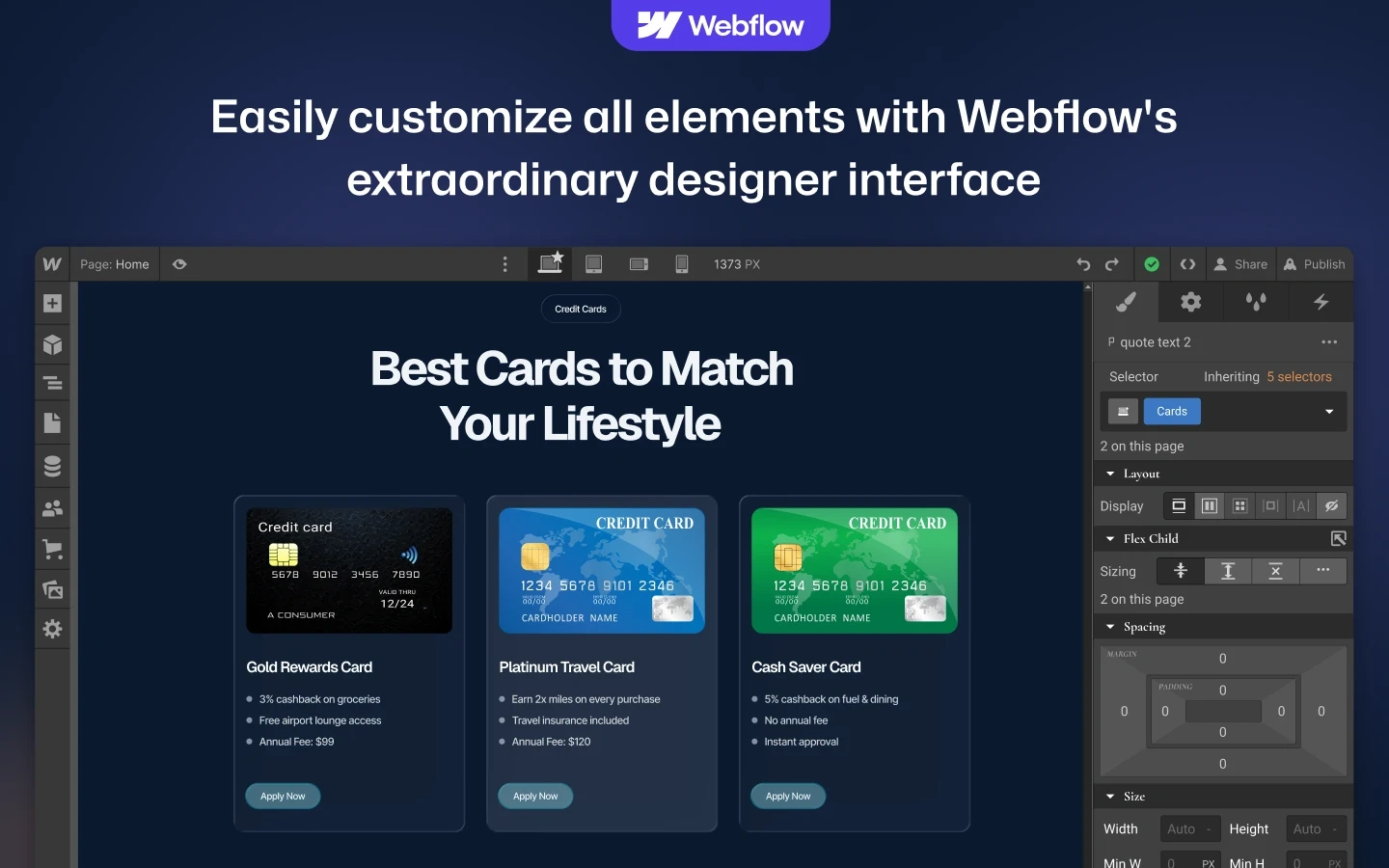
Card details are structured, not written as prose. Fees, rewards and benefits sit in consistent blocks so visitors can compare cards side by side without reading paragraphs. Trust elements such as security notes and clear terms sit close to the apply buttons, where hesitation actually happens.
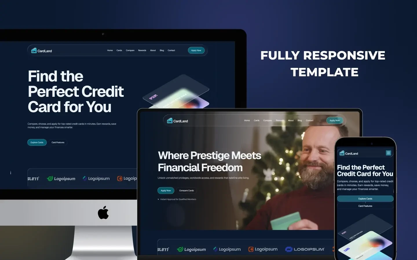
Cardland card comparison sections
Key Features
Conversion-led dark hero: one headline, the featured card and a clear apply action above the fold.
Card and reward comparison: consistent blocks for fees, rewards and eligibility across every card.
Three landing pages: separate layouts for different campaigns or card types, all on one design system.
CMS-driven card catalog: each card is a CMS item with its own detail page, so new products publish from the Editor.
Blog with categories: for financial education content that builds organic search traffic.
Responsive build: tested across desktop, tablet and mobile.
Cardland landing page layouts
Pages
Cardland includes Home (Landing Page 01), Landing Page 02, Landing Page 03, a Credit Cards listing, Features, Pricing, About, Blog and Contact. CMS templates cover card details, blog posts and blog categories, plus utility pages for the style guide, instructions, license and change log.
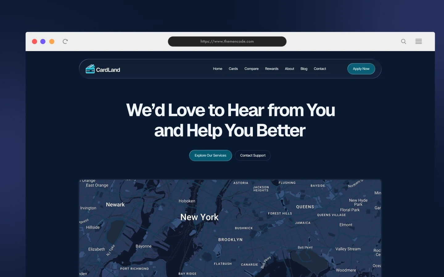
Cardland inner pages
Build Notes
The Webflow version uses global classes and variables, so a bank can apply its brand colors and type in one pass. The Framer version mirrors the same structure with reusable components. Demo rates and terms are placeholders, since lending copy must be replaced with approved figures before launch.
Links
Webflow live preview: cardland-tnc.webflow.io
Framer live preview: cardland.framer.website
Like this project
Posted Sep 26, 2026
Credit card buyers compare before they apply, but most issuer sites hide fees and rewards behind long pages. I designed and built Cardland in Webflow and Framer as a dark, conversion-led fintech site with side-by-side card comparison and 3 ready landing pages.