Amazon Sales Data Visualization Project

Trisha Nagar

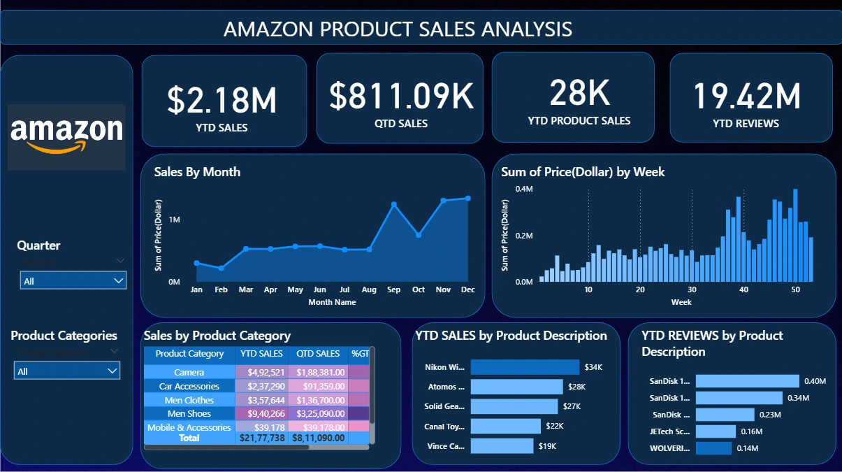
Amazon-Sales-Analysis
Analysed Amazon Sales data and built an interactive Power BI dashboard to visualize trends across Product Categories, Prices, Quantities Sold, and Product Description with insights at Monthly, Quarterly, and Weekly levels.
Objectives - -> Analyze sales and reviews across different product categories. -> Study the effect of price ranges and product features on popularity. -> Observe time-based trends (monthly, quarterly, weekly). -> Enhance dataset quality through feature engineering and DAX querying for better insights. -> Present findings through a Power BI dashboard with KPIs and interactive visuals.
The raw dataset includes: Product Category Product Description Price (Dollar) Number of Reviews Shipment Details Order Date
Dashboard Overview - KPI's - -> YTD Sales (Year-to-Date Sales) -> QTD Sales (Quarter-to-Date Sales) -> YTD Product Sales -> YTD Reviews Charts and Visuals - -> YTD Sales by Month Line chart showing monthly sales trends throughout the year. -> YTD Sales by Week Column chart showing weekly sales performance. -> Sales by Product Category Table/Heatmap comparing categories by total YTD sales. -> Top 5 Products by YTD Sales Bar chart displaying highest-selling products. -> Top 5 Products by YTD Reviews.
Like this project
Posted Sep 13, 2026
Developed a Power BI dashboard to analyze Amazon sales data.