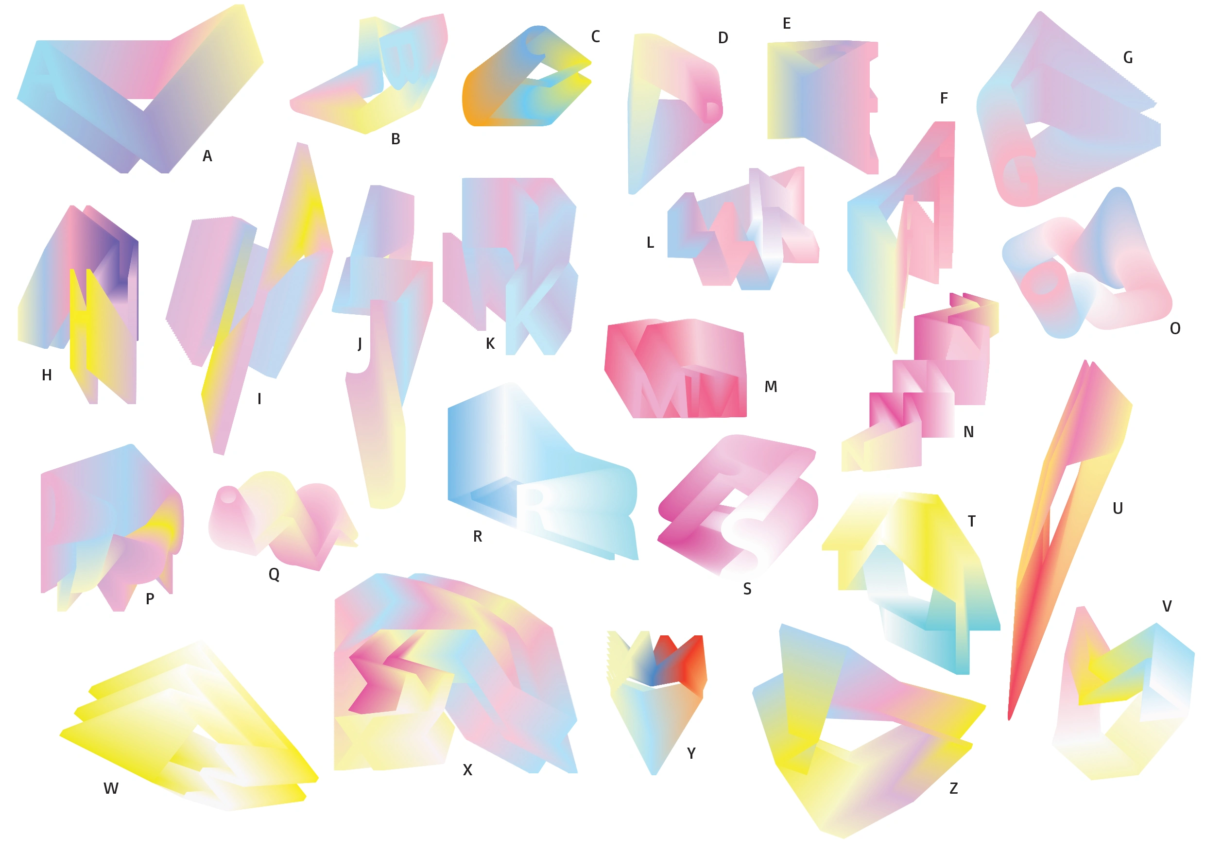
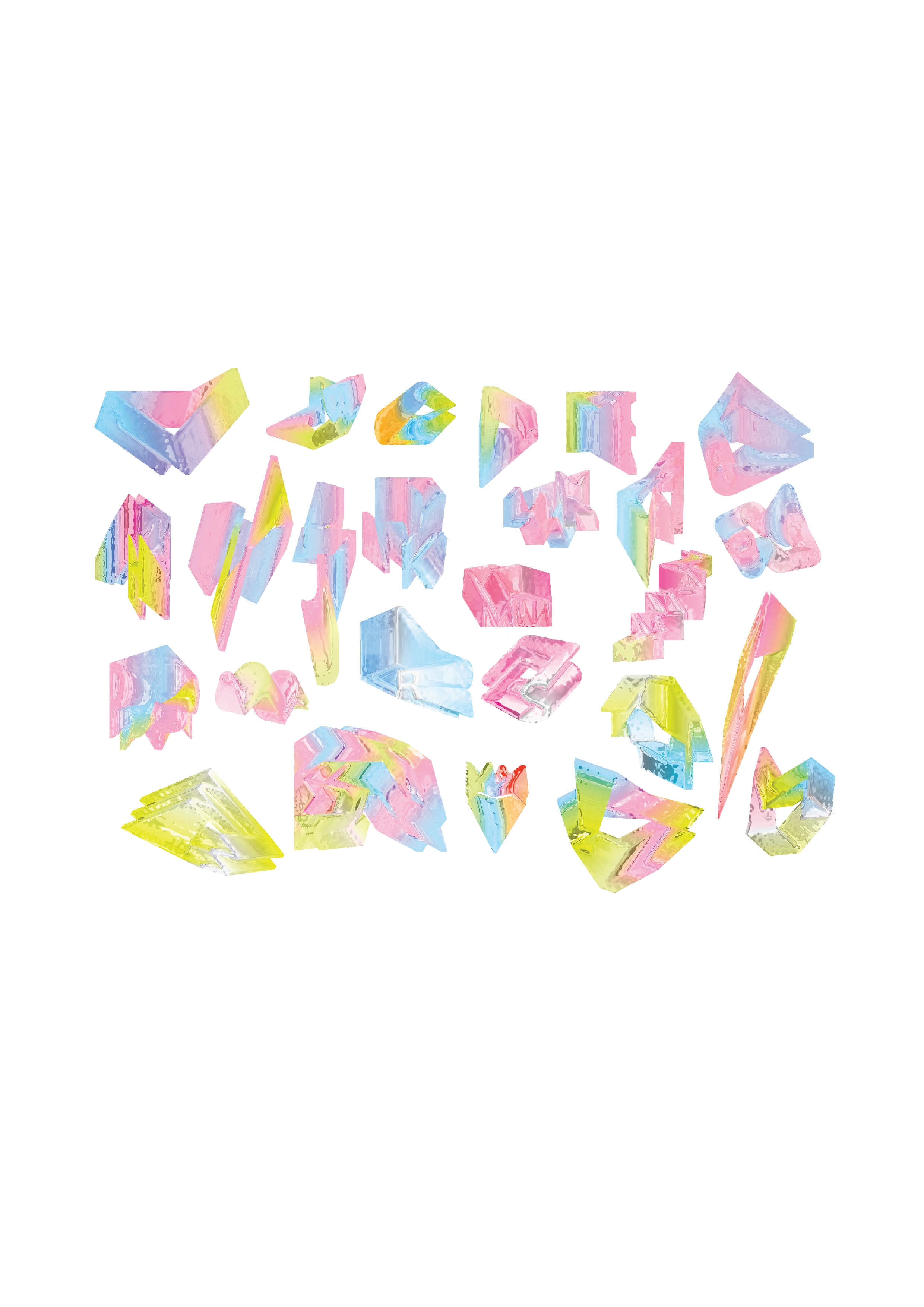
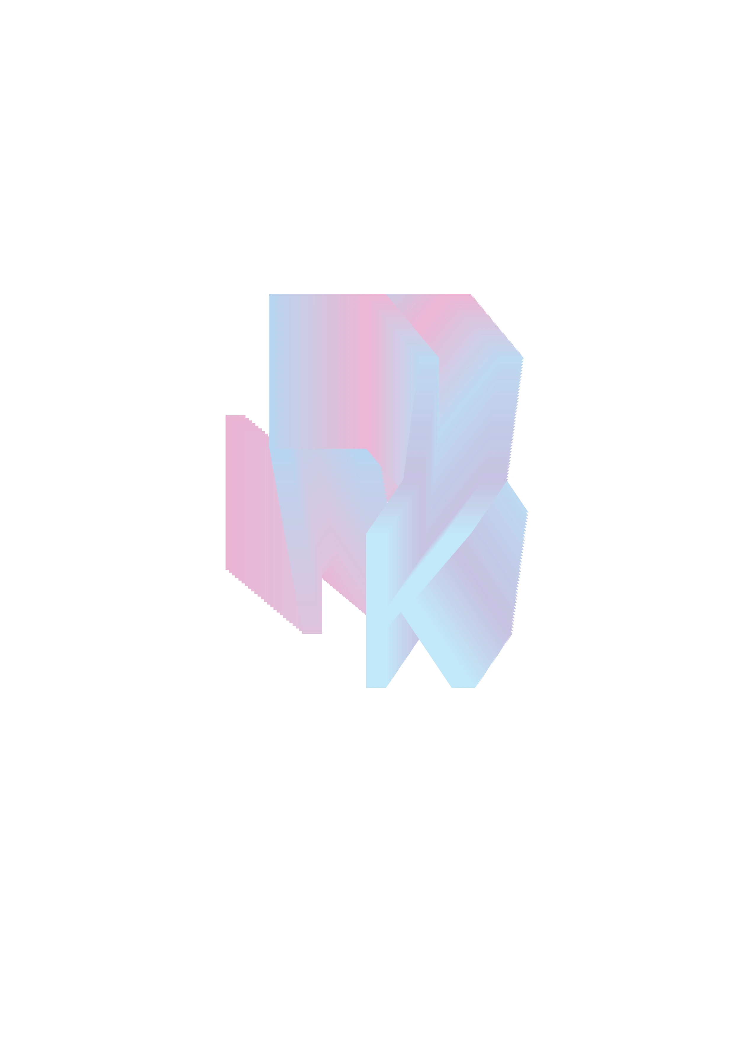
Fragmenta
K ku
Fragmenta
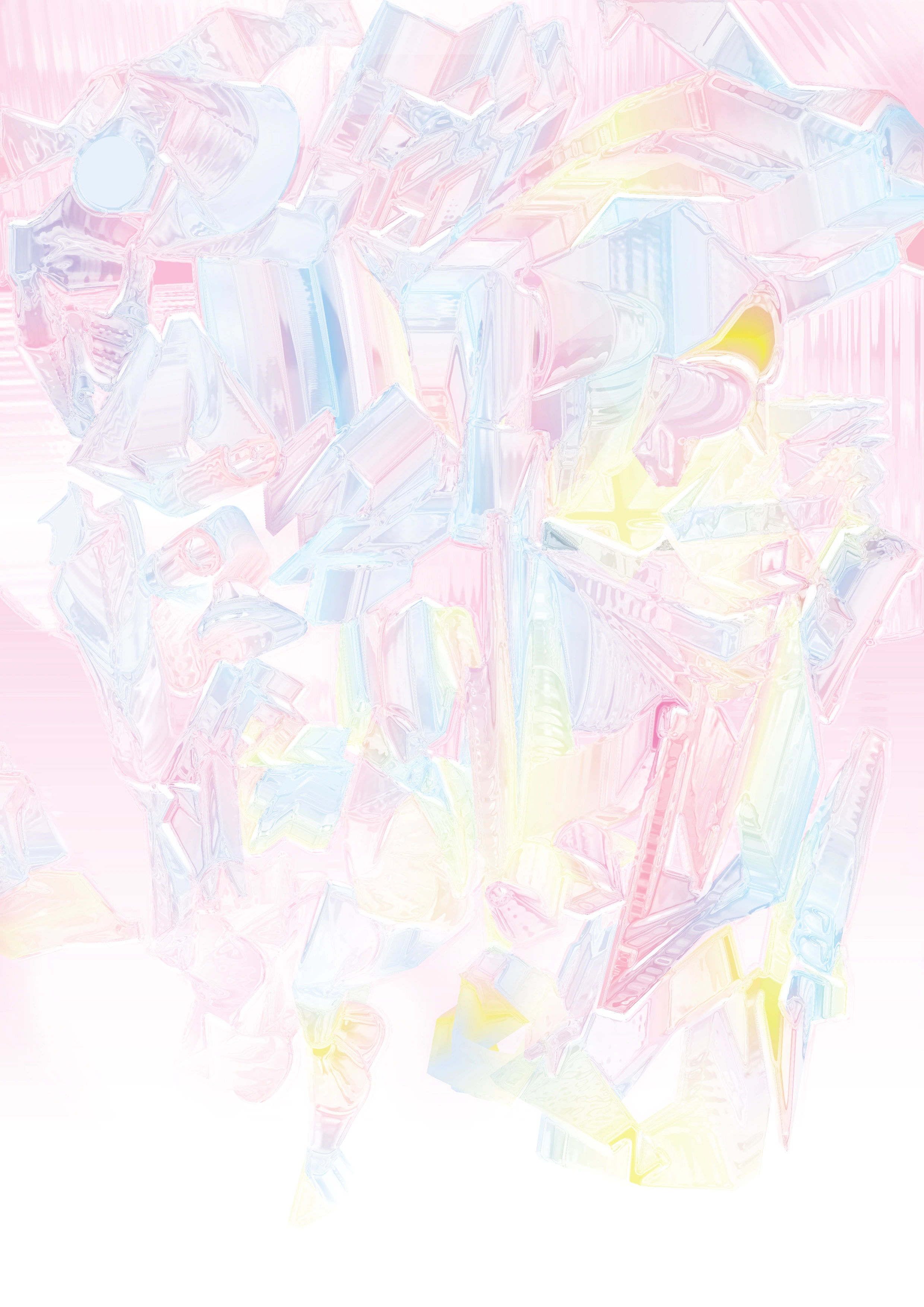
To represent misunderstanding, we often judged something or someone by a lack of the understanding of it. I take part of different language’s elements and make it an abstract pattern.
To present the cultural and word misunderstanding by showing different language in an abstract way. Sometimes we just see the part of something and then infer their own set of statements thus occur misunderstandings. It is that one must not only see a part of something but must take in the entirety of a situation in order to understand it truly and completely.
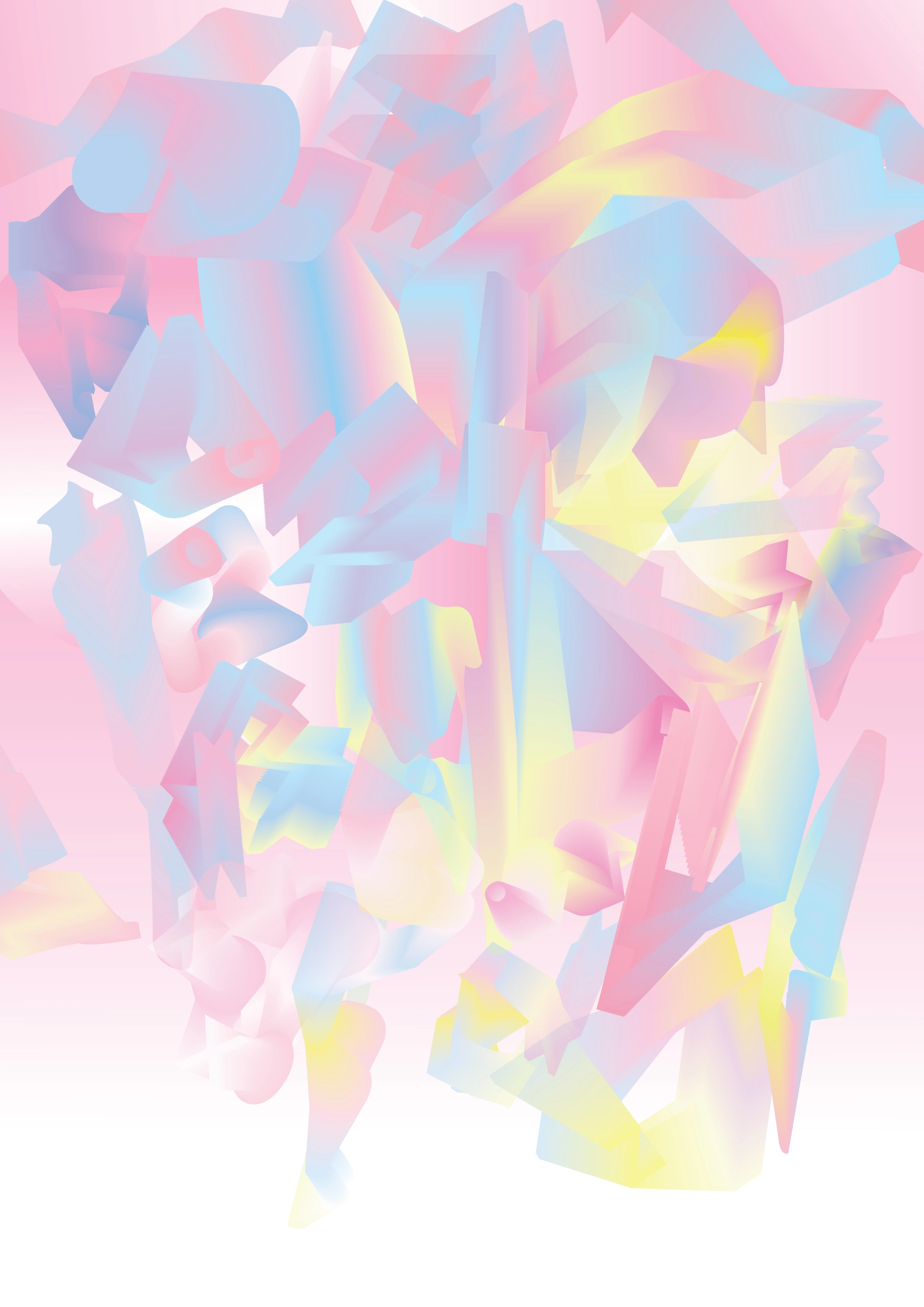
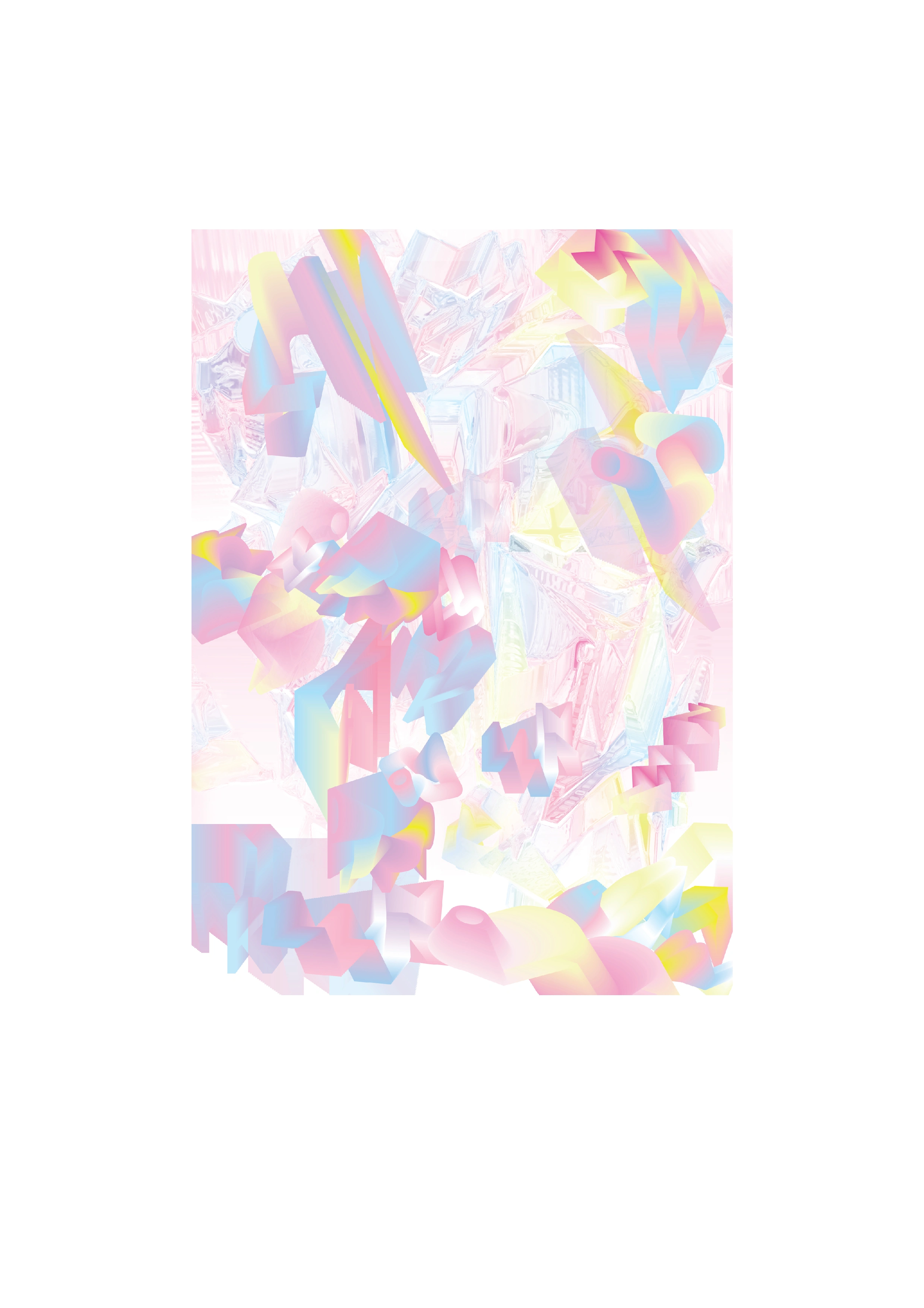
Fragmenta comes from the word "Fragment", combined with a Latin-inspired tone. It carries a sense of refined design while conceptually aligning with the theme of misunderstanding that arises from seeing only fragments of language.
This typeface is designed with an abstract, organic, and flexible form. Each letter is intentionally rendered in a way that makes it difficult to immediately identify, serving as a visual exploration of perspective and misinterpretation.
For instance, the letter A may be perceived as a V or even a W by some viewers. However, it is, in fact, an A. Through this approach, the typeface invites viewers to reconsider their assumptions about letterforms and the nature of language itself. As one engages more deeply with the structure and creative process behind the design, the true form and meaning gradually become clear.
This typeface is not merely a visual reconstruction of language—it is an inquiry into the boundaries between understanding and misunderstanding.
Like this project
Posted May 9, 2025
This abstract typeface distorts familiar forms, challenging perception and inviting viewers to explore the space between recognition and misinterpretation.