Design Psychology of the Pizza Hut Logo
John Hua

Case Study: The Design Psychology of the Pizza Hut Logo
The design psychology of the Pizza Hut logo offers a rare and revealing case study in how visual identity can transcend mere aesthetics to become an emotional, cultural, and psychological anchor that persists across generations, markets, and shifting consumer expectations.
At its core, the Pizza Hut logo is not simply a mark representing a food brand, but a symbolic condensation of place, memory, indulgence, and social ritual, achieved through deliberate choices in color, shape, typography, and continuity.
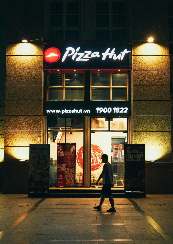
From its earliest incarnations, the logo’s defining feature — the iconic red roof — has functioned as far more than a decorative graphic element; it has served as a semiotic bridge between physical architecture and brand identity, embedding the brand into the mental landscapes of consumers by associating it with shelter, gathering, and shared experience.
Unlike many competitors that foreground the product itself through imagery of slices, flames, or ingredients, Pizza Hut’s logo foregrounds environment, implicitly communicating that the brand is about being somewhere, not just eating something.
This distinction is critical in understanding its psychological power, as humans are evolutionarily attuned to places of refuge and social congregation, and the roof, as a…
Like this project
Posted Dec 20, 2025
Explored the design psychology behind the Pizza Hut logo as a cultural and psychological anchor.