
INDEPENDENT PRACTICE
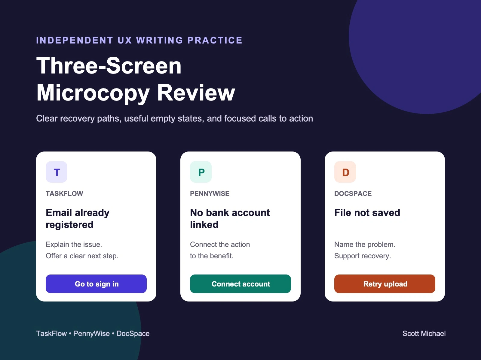
This project reviews three fictional product scenarios from TaskFlow, PennyWise, and DocSpace. It is independent practice, not client work.
GOAL
Make each message clear, scannable, and useful in the moment.
TASKFLOW: ACCOUNT CREATION
Scenario: An email is already connected to an account.
Heading: This email is already registered
Message: Sign in with this email to continue. Forgot your password? Reset it from the sign-in screen.
Button: Go to sign in
Why this works: The message explains what happened, gives the next step, and points to password recovery without making the button do two jobs.
PENNYWISE: FINANCE EMPTY STATE
Scenario: The user has not connected a bank account.
Heading: No bank account linked
Message: Connect a bank account to view your transactions.
Button: Connect account
Why this works: The message connects the empty state to a clear benefit. The button matches the action described in the message.
DOCSPACE: FAILED UPLOAD
Scenario: A connection problem stops a file from uploading.
Heading: File not saved
Message: Your connection was interrupted. Check your connection, then try the upload again.
Button: Retry upload
Why this works: The message explains the problem without blame, avoids promises the product cannot guarantee, and gives the user a practical recovery step.
WHAT I CHANGED
Corrected grammar and simplified sentence structure.
Matched each button to the action in the message.
Removed vague reassurance and unnecessary apology.
Kept each screen focused on one clear next step.
0 likes · 2 views · Oct 30, 2026
Independent UX writing practice reviewing account, empty, and upload states for three fictional products. Not client work.
