Built with Framer
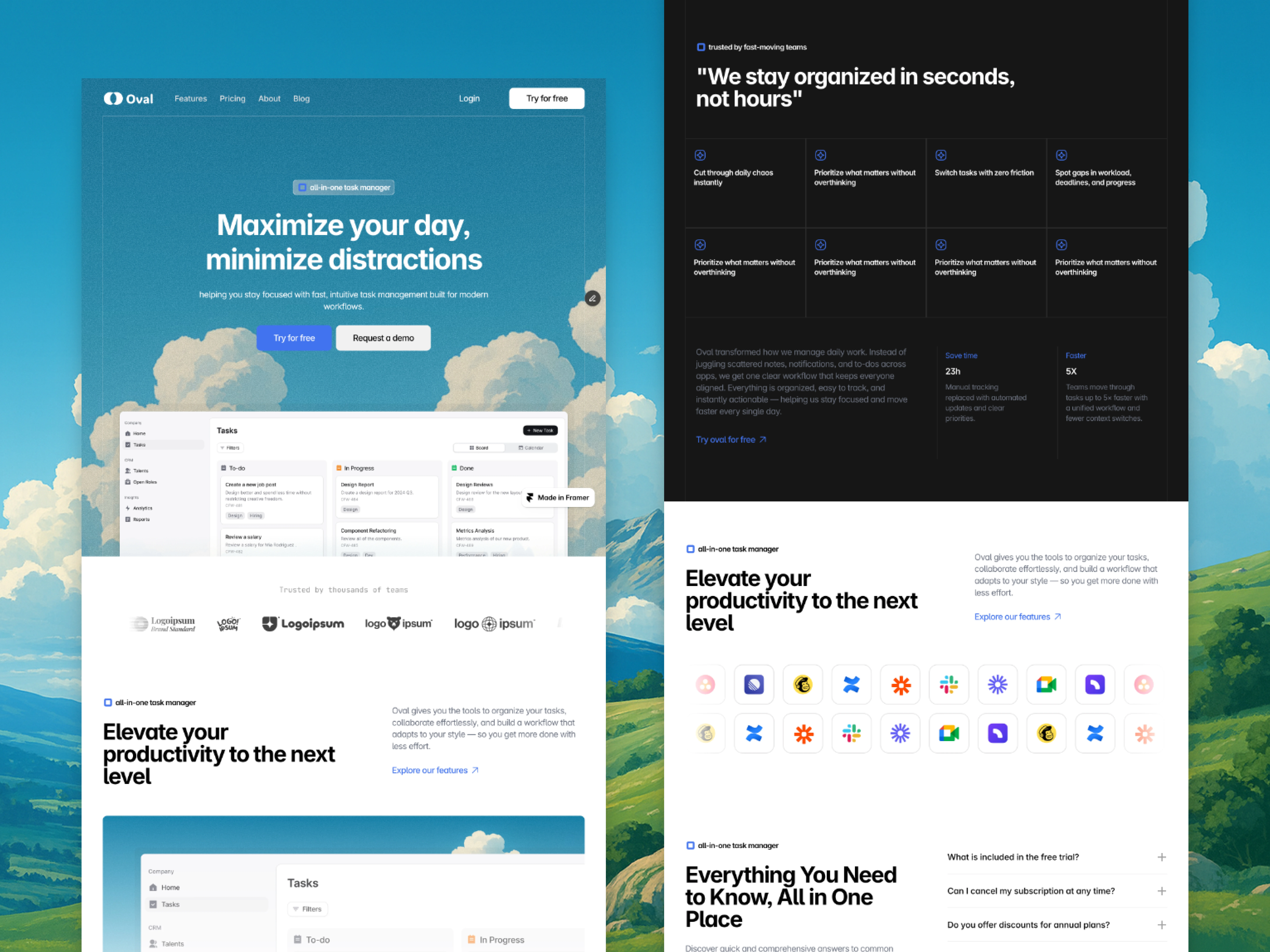
Framer Oval Geometric Minimalist Landing Page

Framer Oval Geometric Minimalist Landing Page
Service
Landing page design in Figma and development in Framer.
Timeline
5 days
Highlights of the build
Reusable components
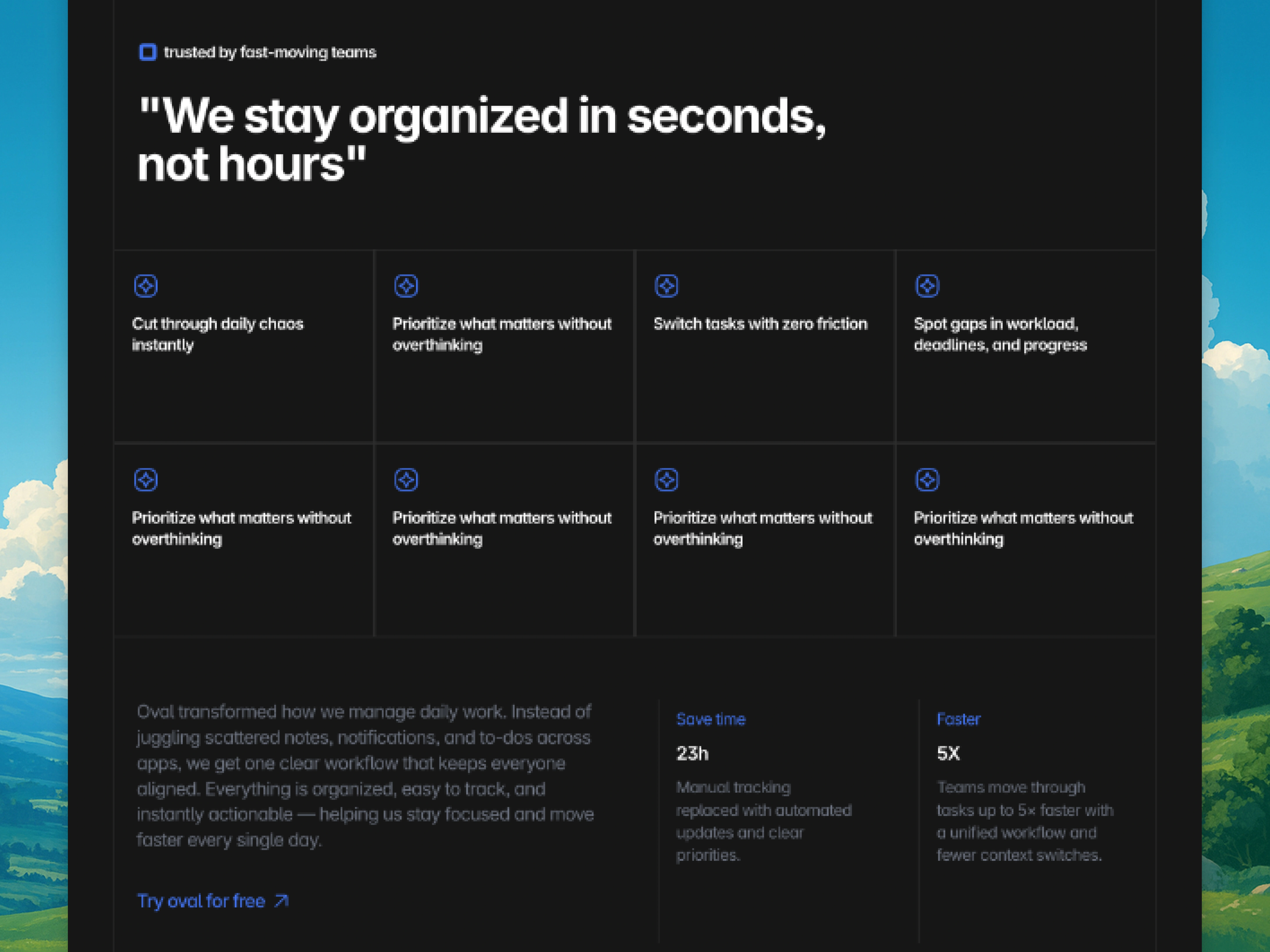
I built components for the hero area, feature blocks, buttons, cards, and sections so that everything remained consistent and easy to update. This helped me maintain visual consistency and reduce repetitive work.
Integrating real product screenshots
I imported high quality screenshots from the Oval app and placed them carefully to feel like natural extensions of the page. Framer’s image handling made this process smooth and accurate.
Smooth, gentle interactions
I avoided flashy animations. Instead, I used soft fade ins, subtle transitions, and natural movement so that nothing felt harsh or sudden. These details reinforced the calm nature of the brand.
Responsive behaviour
Framer’s responsive system allowed me to customise layouts for mobile views without breaking the visual tone. I maintained the same spacious feeling on smaller devices, avoiding compressed or cluttered layouts.
Final optimisations
I refined spacing, alignment, and performance to ensure the site loaded quickly and felt smooth across all devices. The final build feels exactly like the Figma design, which was one of the main goals of this project.
Building in Framer helped me keep full control over the final experience, making sure every detail of Oval’s personality carried through from design to real interaction.


Like this project
Posted Jan 20, 2026
A high-quality Framer landing page featuring minimalist geometry. Built for speed, precision and performance.
Likes
1
Views
4


