Brand creation with AI: from idea to visual identity |2024

Daria Zorina
Brand Designer
Logo Designer
AI Content Creator
ChatGPT
Runway AI
Stable Diffusion
Disclaimer : The real client cases are under NDA, so to demonstrate the style of branding work with AI, I created a fictional project and spent two days on it to showcase methods and approaches to brand creation.
Initial data
We have a hypothetical client and their business: Farm Chicken Products.
This brand communicates values of sustainability and animal welfare, emphasizing that their products are produced with minimal impact on the environment. The core values of the brand are:
Health and environmental care
Farm quality
Freedom and naturalness (antibiotic-free, free-range chickens)

Add your farm logo here, and voilà—instant branding magic for your rustic chicken empire! 🐔✨ Now you’ve got the perfect visual for any down-to-earth farm-to-table story. LOL
The brand’s tone is friendly and family-oriented, with a focus on eco-consciousness. The product line includes:
- Fresh chicken products: breasts, fillets, legs.
- Semi-prepared products: nuggets, chicken patties.
- Ready-to-eat meals.
- Organic eggs.
The Challenge
In this niche, many brands communicate the same message, leading to a lack of differentiation and making it difficult to justify a premium positioning
The Goal
To make the brand stand out among competitors and get people talking about it.
Our objectives were:
1. Differentiate from competitors through creative positioning and viral strategies.
2. Create a premium brand image while maintaining the narrative of naturalness, free-range practices, and so on.
Thus, the first step was to develop the strategy and proceed with rebranding.
Part One: Branding, Big Idea, and Slogan
The brand already has a name – Happy Chicken, and while it’s a good start, it needs more of a punch, right?
Clients often come to us saying, "We need to change the logo." But the logo is just the cherry on top, like a religious symbol that embodies a deeper meaning. You can’t create a logo without first understanding what the brand stands for.
We need a Big Idea. The idea must be viral and communicate premium quality, and let’s not forget that people love humor. Sure, we could bring in cute cats, since they always go viral, but that would be too easy – just likes and shares. And honestly, why bring in cats when we have chickens?
With AI, we’re no longer limited by the complexities of execution like before. Any idea is now possible.
So, how can we show free-range chickens beyond the usual idyllic farm scenes?
In the age of AI, branding ideas can easily start with visualisation. What image do users associate with the brand? This can now be easily achieved with a single click, so that's where you should start.
1. Chickens traveling and posing in front of world-famous landmarks.

Free-range as travel
2. Chickens doing whatever they want – hiking mountains with backpacks, having picnics in the park, sunbathing at the beach... you get the idea.

Free-range chickens can look like this: they roam wherever they want
3. We could also introduce the "healthy lifestyle chickens" concept, aligning with the antibiotic-free message.

The absence of antibiotics as the chickens taking care of their health
Yes, all of this could go viral. But we need to go further: Our chickens should be so premium, so special, that other chickens would envy them. They are influencers in their own right. So, we decided to make luxury chickens — showing them living the good life, because when they were alive... they could afford it all.

Our chickens are like influencers, living lives that would make any other chicken envious. This concept combines humor, an unexpected visual approach, and that touch of premium appeal, capturing attention through creativity and wit
The idea of life... Yes, there’s a risk of alienating some of the more hypocritical audience who don’t like to associate meat with living animals. But we’re targeting the younger, more conscious crowd. Yes, we care about animals, and that’s why only the meat of happy chickens ends up on your table. The theme of death is present, but we balance it carefully without crossing the line. And this approach has much stronger viral potential.
Slogan
So, let’s make our chickens enviable, luxurious, and emotional. There’s plenty of content ideas, but now we need to wrap it all up in a slogan. After brainstorming dozens of options with GPT, inspiration struck — "Don’t worry, she was happy"... and what a great nod to pop culture.
The next logical step was to turn this slogan into a song. We needed a brand song and a music video, something that could play on the landing page (with a QR code leading to it from the packaging).
Brand Song
So, it made perfect sense: the song should remind you of the iconic “Don’t Worry, Be Happy”. Of course, without going full-on plagiarism, but with a clear "nod". Spoiler alert: we ended up choosing the most distant version from the original.
With AI, any brand can afford its own unique song, but for some reason, few think about it yet. It’s honestly one of the best ways to create memorable branding – a slogan set to a melody.
The lyrics? I adapted the meaning of the original using GPT, telling the story of our happy chickens.
We decided to focus on how our chickens live in complete comfort, enjoying a luxurious life, and for other chickens, they’re like Instagram stars.
With the lyrics ready, it was time to work on the melody. I analyzed the original song with GPT, identifying the key features: relaxed vocals, layered harmonies, and that laid-back vibe. By the tenth iteration, AI started spitting out melodies so close that they could almost be considered plagiarism. Of course, it was cool but risky, so we went with the most distant version.
A little tweaking in audio editors later, and the song was ready. Now, we could move on to designing the logo, producing the ad clips, the brand video, and of course, social media content.
Logo Creation
Now that we have a clear understanding of what the brand conveys, it’s time to add the final touch – the logo. Naturally, it’s created with the help of AI. The logo needs to be compact and versatile, so it looks great on packaging, as a social media avatar, and on all the other platforms.
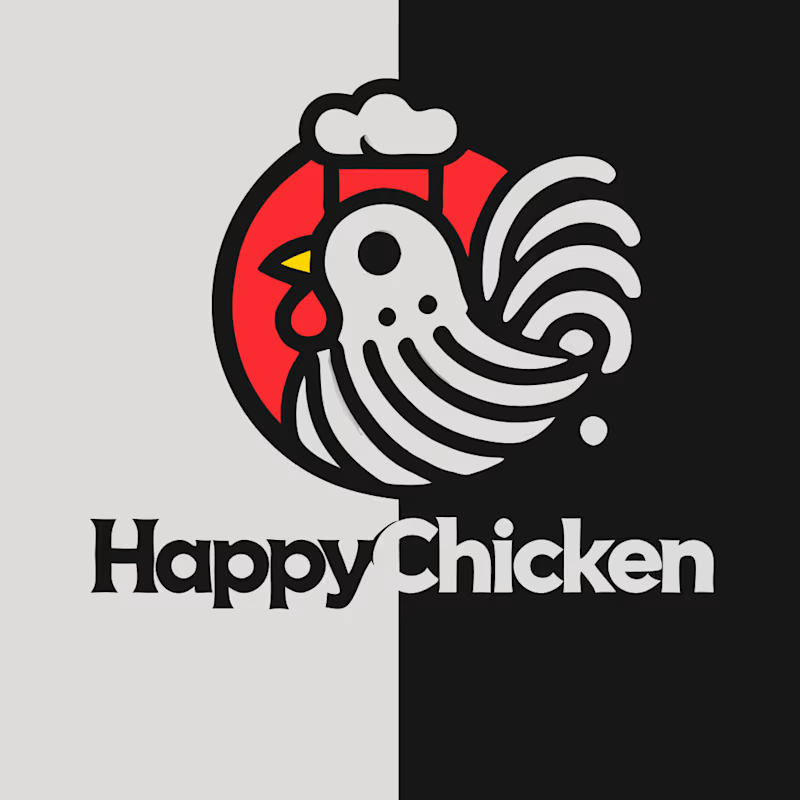
ChatGPT, having received the input, suggested this option. 😊
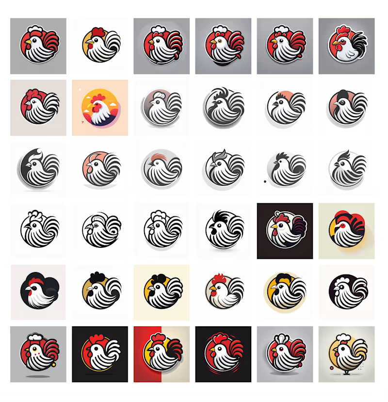
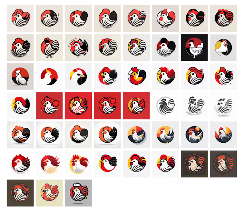
The decision was made to keep things simple. We just needed a happy chicken. We generated a flood of options, but quantity doesn’t always mean quality. After narrowing down the semi-finalists, we identified the strongest candidates for further refinement. We vectored these designs and applied a calm, premium color palette to test how they’d translate visually.
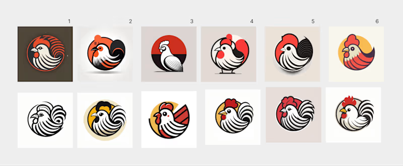
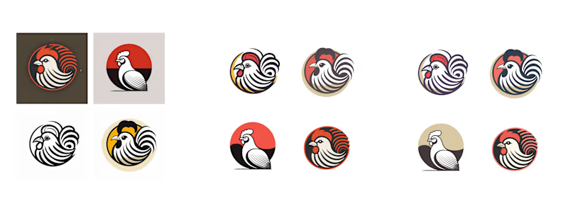
As we progressed, I pushed for a design that deviated from the typical “happy chicken portrait” concept. Why? This particular logo resonated more with what we’re aiming to convey. The chicken appeared proud and slightly haughty, a departure from traditional farm logos, which I saw as a major advantage.
Color Palette: Muted tones. The brighter the brand, the simpler the logo – that’s an unwritten rule. The palette also conveyed a sense of balance and calm, amplifying the premium positioning.
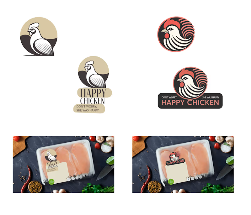
First – my personal favorite, while second is GPT’s preferred option, though I stayed with the first until the end. However, I trust my expertise more
Time to play with associations: I ran a virtual target audience poll to gauge how the chicken was perceived and how strong the associations were. I included my own take: the logo’s circular form, with light and dark sides, subtly references yin and yang, representing the balance of life and death. However, these deep layers of meaning won’t be noticed at first glance, which adds a hidden, edgy vibe that’s not for everyone – and that’s exactly what we want.
Final Result: The logo was adapted for various formats. Packaging remains a significant task, but testing the logo on it – even in draft form – was essential. The chosen design fits well with the premium and provocative concept. The entire process took around 3 hours.
Next, it’s time to move on to the video clips and the brand anthem.
Video Production
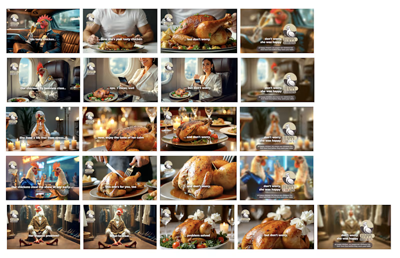
We started by creating short content aimed at virality, featuring luxury chickens as the main stars. However, it quickly became clear that these could be developed into full-fledged ads, resulting in a series of 10-12 second commercials. Each one was complemented by a “post-life” scene and a witty tagline, pushing the boundaries of humor.
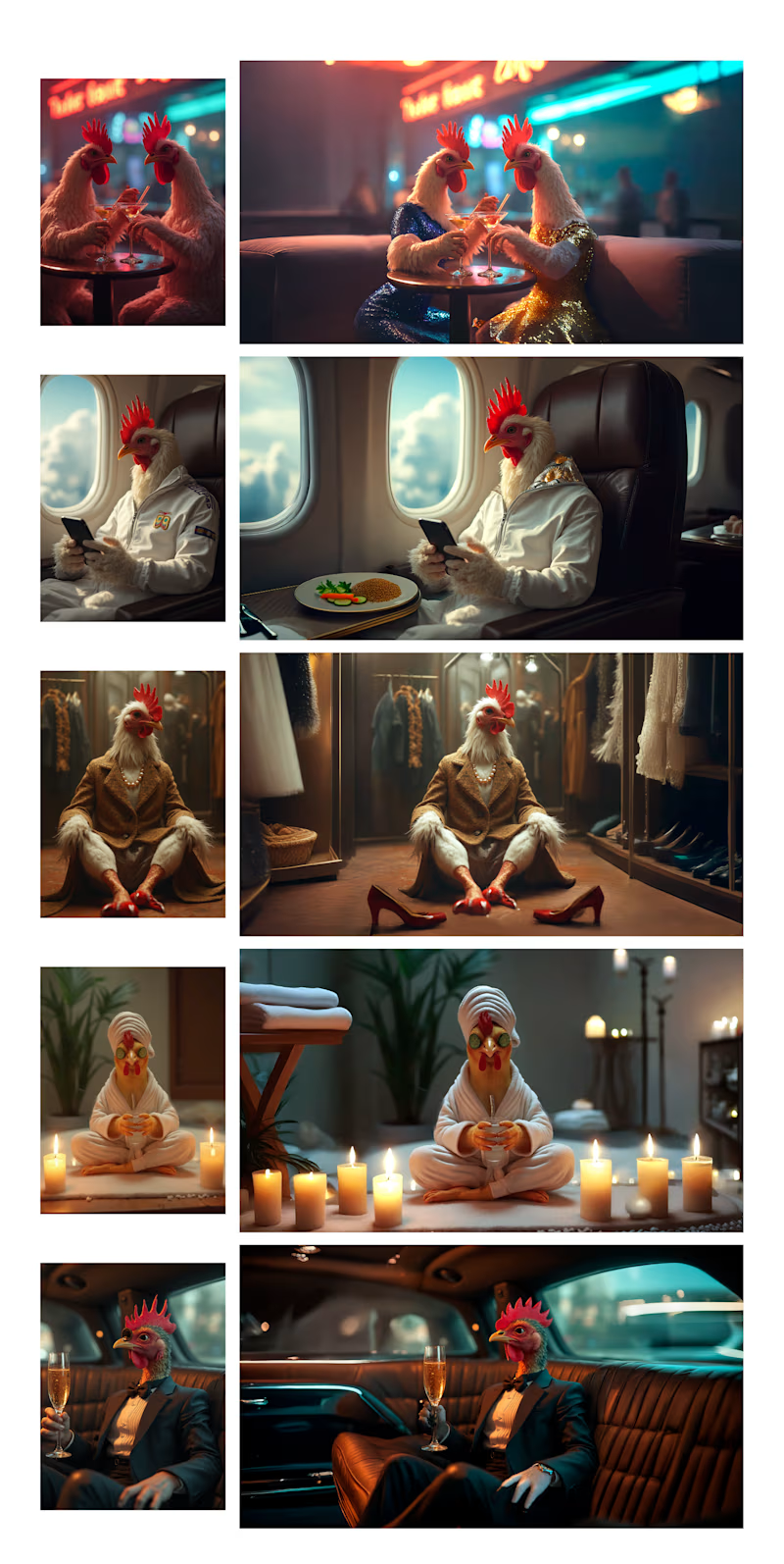
From Social Media Viral content
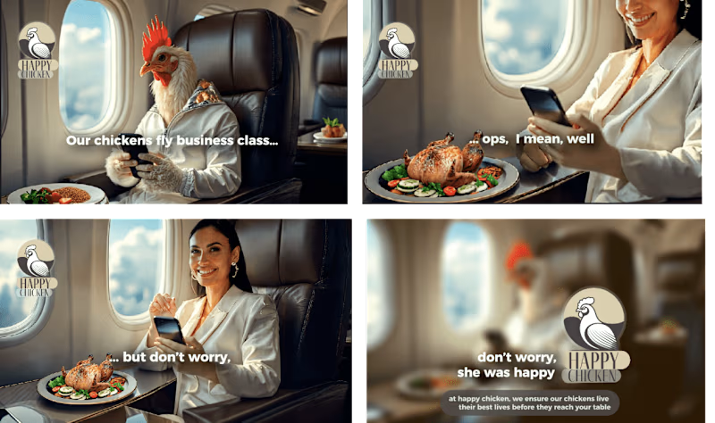
to short adv videos
It was also decided to visualize the brand song, especially since part of the content from the ads already shortened production time.
Initially, the first part of the clip was planned to be in a purely pastoral style, with a focus on a QR code on the packaging leading to a landing page, emphasizing free-range realism. But there wasn’t enough dynamic flow. Who would wait for the best part at the end?
Thus, the clip was reworked: now, from the very first frames, snippets of the ads started flashing. Lip-syncing with the farmer was added in a few places.
For the longer videos, a signature LUT with 50% brightness was used. In the shorter ads, it only appeared at the end.
The production of the main clip took about 5 hours, including generation, tweaking the farmer’s consistency, and using Runway ML to finalize all missing scenes.
AI Fails
Since the video has already been showcased in the “Songs” section, here I will present the video that I couldn’t finish due to the amusing glitches from the AI during generation
Brand strategy outline for social media positioning:
Can a “chicken” account be interesting to users and useful for business? Absolutely!
For this hypothetical Instagram account, we will define the type of content and templates we’ll use.
Approach:
1. Highlights — For useful information.
2. Reels and posts — For entertainment, recipes, and real behind-the-scenes farm footage.
Highlights:
1. Happy Life — Real footage of the farm chickens enjoying their “happy” free-range life. Videos and photos of them walking, eating, and relaxing. This directly links to the slogan "Don't worry, she was happy."
2. Our Story — Farm history, brand philosophy, why our chickens live in the best conditions, and introductions to the farmers. A behind-the-scenes look at the production.
3. Find Us — Store locations where Happy Chicken products can be found, using maps with geotags and tags like “Here they love our chickens!”
4. Real Stories — The journey of each chicken from farm to table, demonstrating their happy life, with real, positive stories that enhance the brand's concept.
5. Behind the Scenes — Behind-the-scenes stories from the advertisement production, memes, funny production moments (although controversial, it's good to have it in mind).
6. Delicious Ideas — Recipe collections.
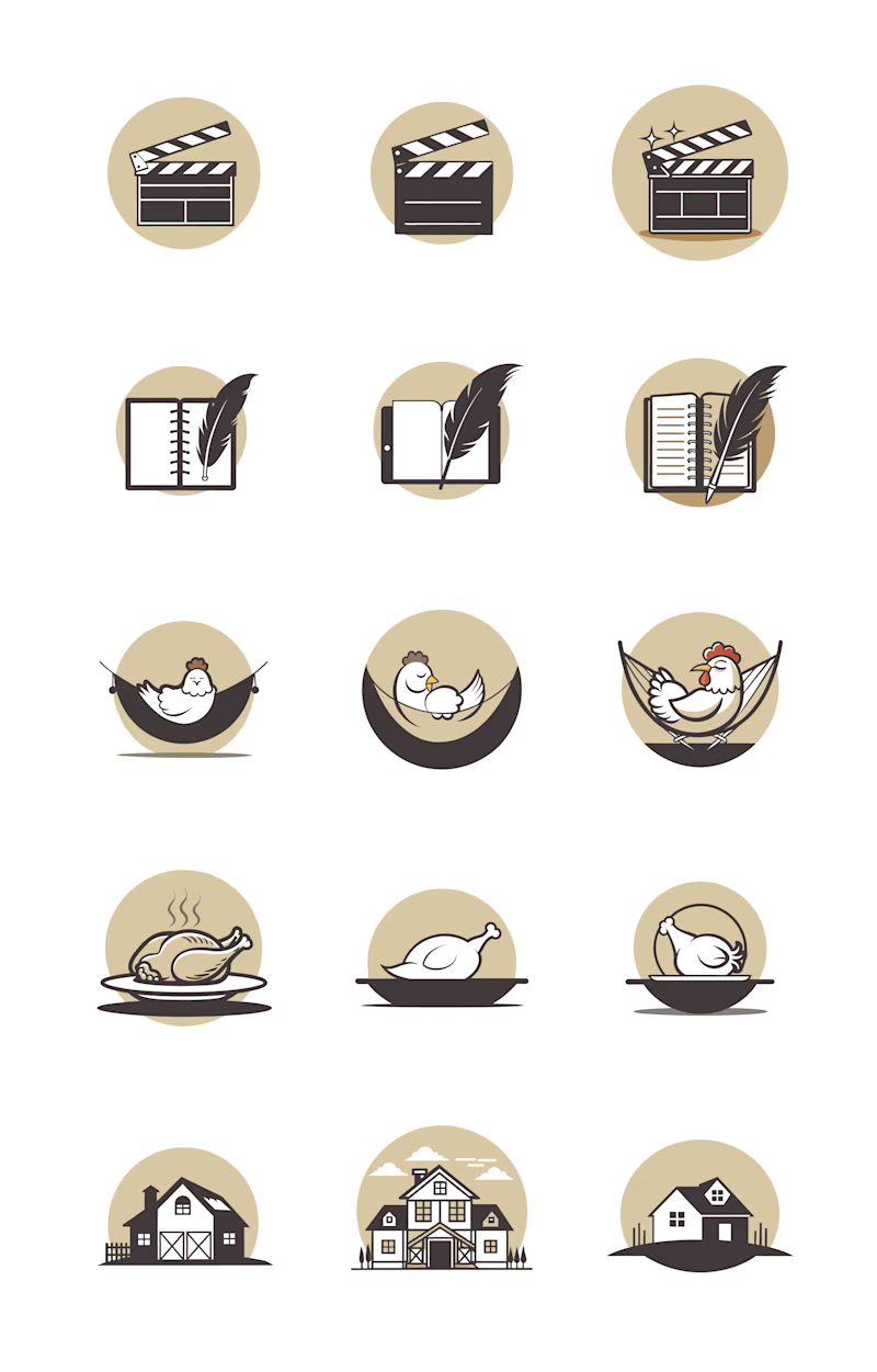
Vector icons with AI

In general, it's worth working on the illustrations, but in a basic approximation it could look something like this
Feed content strategy:
1. Entertainment content (50%):
- Fun sketches with chickens playing on the luxury idea: chickens clubbing, flying business class, and more, in a humorous style. The goal is virality, but each series should carry the message of a happy, healthy, and adventurous chicken life.
2. Real footage (30-35%):
- Photos and videos from the farm showing how the chickens are cared for. Posts to inspire with proof that our chickens are genuinely happy. Add a bit of nostalgia or cuteness to make the brand feel grounded. This section requires a separate design template for easy editing on Canva or CapCut, with color grading (LUT), font overlays, and examples of what and what not to film.
3. Recipes (10-15%):
- Simple and tasty chicken recipes. Even here, the content should reflect the brand, perhaps with the quirky concept of “the chicken's last will” — something like, “This is how our chicken would’ve wanted to be prepared.”
4. Product overview (5-10%):
- Optional, but if product-centric posts are needed, focus on sustainability and quality.
This plan will make social media a powerful marketing tool instead of just a checkmark.
Instead of a conclusion
This is not the full scope of branding work that remains. Much more needs to be done: packaging, social media design, brand guides, and potentially even a landing page.
The aim here was to showcase the integration of AI into branding processes: from discovering what the brand communicates to finalizing its visual identity.
AI speeds up the process, making it cheaper and more flexible. No longer must ideas be budget-constrained. In the right hands, AI can replace a whole production team. This was achieved in just two days by myself for demonstration purposes.
The structure of branding work hasn’t changed. AI cannot yet replace human creativity, especially in positioning and strategy. So if standing out from competitors matters to you, my 15 years of experience, including working on billion-dollar projects, is at your service.


