Custom Flyer Design for Qincade

TJ Spires


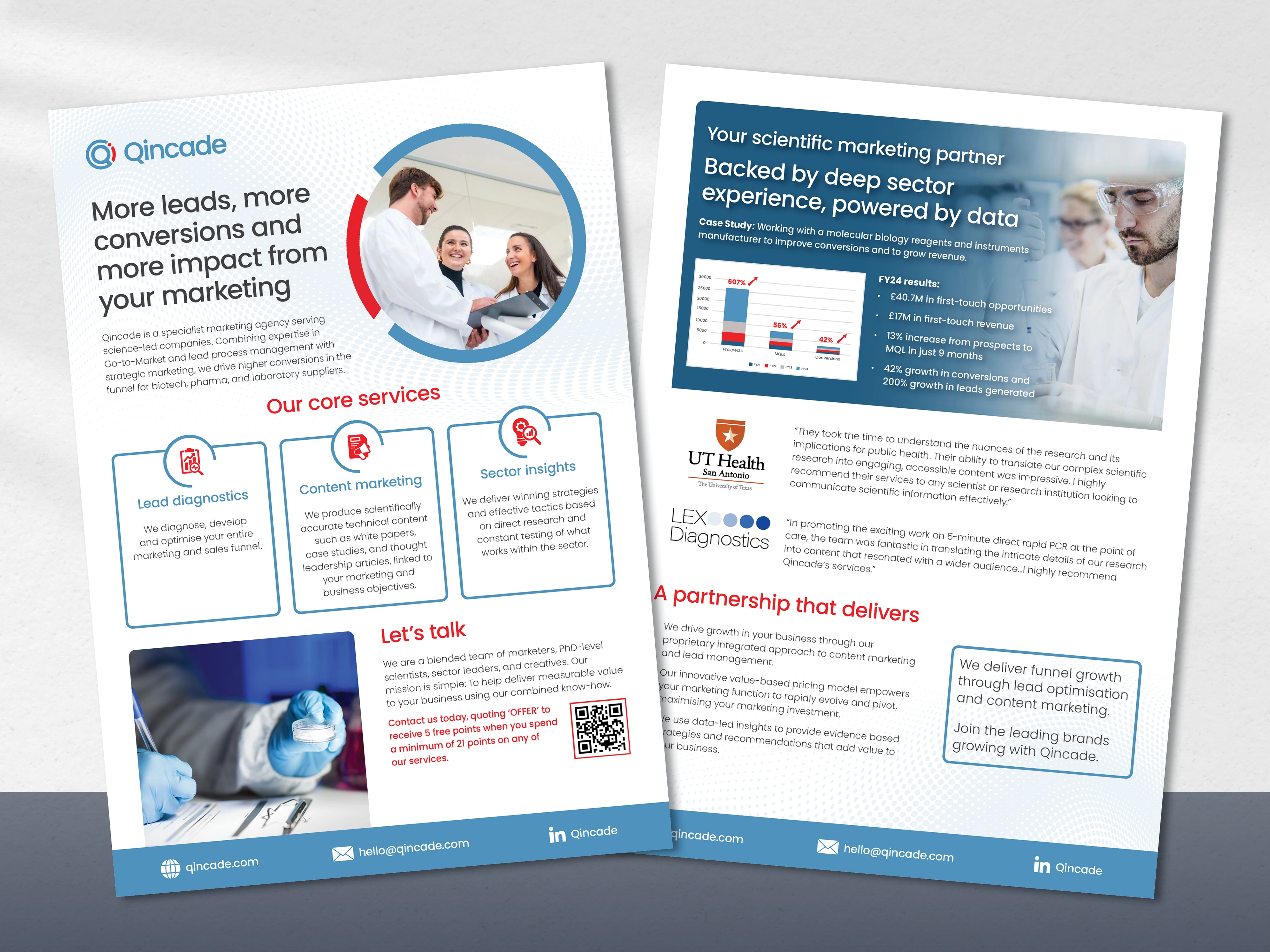
This client requested a refreshed flyer design that felt custom—not templated—while aligning with their established brand. Inspired by Qincade’s bold, circular logo, I reimagined the layout to reflect their style, incorporating subtle arcs, half-circle motifs, and bold sector highlights. The updated format better supports their messaging, elevates professionalism, and strengthens brand consistency across both pages.
Like this project
Posted Nov 3, 2025
Custom flyer design for Qincade—brand-aligned with bold circular motifs, elevated layout, and strong, consistent visual identity across both pages.