Brown Mama Bear
Babra Chege
So...Why This Project?
Brown Mama Bear is an iOS pregnancy app focused on highlighting health statistics and news--so much more than the pretty "oh your baby is this size of a pumpkin seed" embryo illustrations that can be found across other apps and pregnancy sites. Its primary purpose is to be a resource tool for expecting Black women and highlight pregnancy care information, solutions, and alternatives. Secondly it's a community-like platform to empower mothers to advocate for themselves and to support other moms during their journey to motherhood. I "made this project" but this project was made for me!
Set the stage for your work, and provide some key details about this project. Introduce collaborators, and provide any context that will be helpful to keep in mind (ex. brand, company, or project owners).
My Role:
One-[wo]man team here, people...Research, user flows and stories, sketching, wireframing, visual design, prototyping...you name it and I was in the room.
Timeframe
August 2021 - April 2022
The Problem
Throughout this project, I sought to explore how to help expecting mothers feel more knowledgeable during their pregnancy journey. Being a Black mom myself, I specifically focused on Black women due to alarming racial differences in maternal mortality rates, such as. I executed a user-centered approach and process to create a design solution that can enhance the pregnancy experience for Black mothers.
Early Intervention Awareness
How might we increase awareness of pregnancy-related risks and complications amongst Black moms?
Social Community and Advocacy
How might we encourage moms to be advocates of their body and feel confident voicing their comments and concerns with healthcare providers?
How might we support and service moms that desire to have a nontraditional pregnancy experience?
User Research
Research Strategy
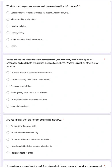
In this phase, I wanted to understand two things...1) was there a need for the app and if so 2) who would the target audience be. In order to find this out, my first step was running an an online survey. The screener survey included all of the expecting Black moms that I had known personally, and also a few that I connected with on social media.
Screener Survey Insights
Starting my research with a Google Forms screener survey, I gathered some useful information such as:
How users seek healthcare information
What other pregnancy apps do users utilize
Are users aware of alternative healthcare options like doulas and midwives
The survey results from the 20 participants provided me more insight on the types of questions I wanted to ask during the next phase of interviews.
👩🏿💻💭 My biggest finding in the screener survey was noting that many participants lacked information on nontraditional pregnancy routes and options. This was important to note because at least I was able to confirm that I was on the right path of defining my audience and their needs.
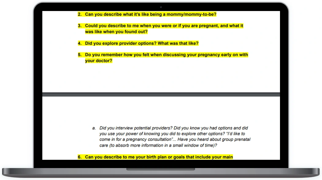
Research Interview Guide
I created an interview guide that allowed me to follow a structured interviewing process, ensuring that I recorded my interviews in a consistent manner. With this guide (displayed below), I conducted 5 user interviews, recording audio via a portable voice recorder and then scribing my findings on a Google Doc.
Questions included:
Can you describe how you came about with your birth plan and preferences?
How did you learn about what is and isn't normal during pregnancy, delivery, and postpartum?
What are your general goals that you're trying to solve when using pregnancy-related apps and websites?
User Research Participants
5 total participants
40 minutes sessions
Mixed population that included women that were/have: Currently expecting their first child Currently expecting a child (not their first rodeo)Recently given birth within the past 3 months
Career statuses included a reporters, full-time mail clerk, a call-center customer service rep, and an entrepreneur
Marital statuses were single, in a committed relationship, and married
Define
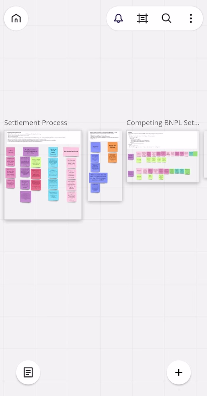
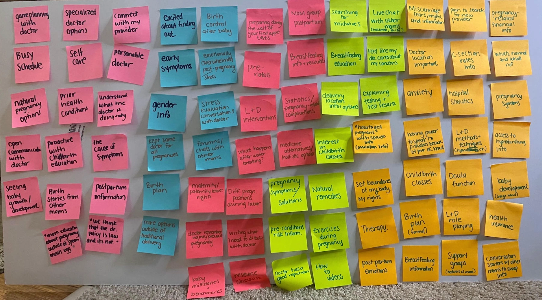
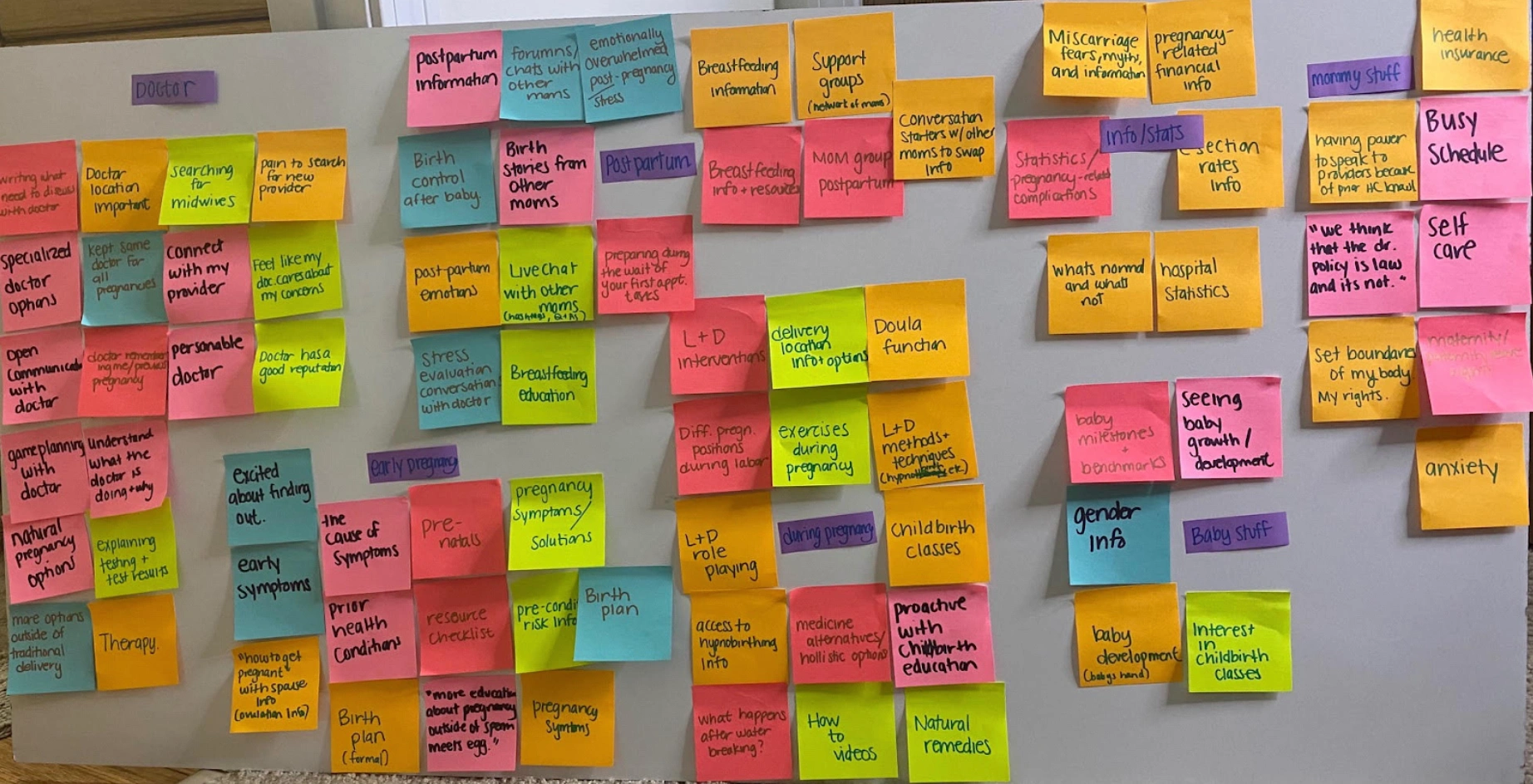
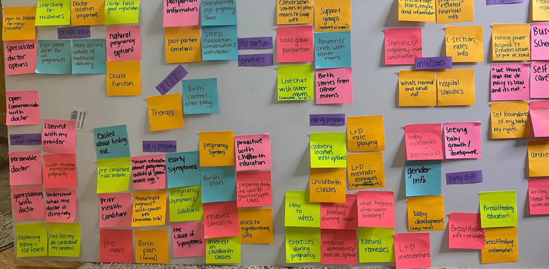
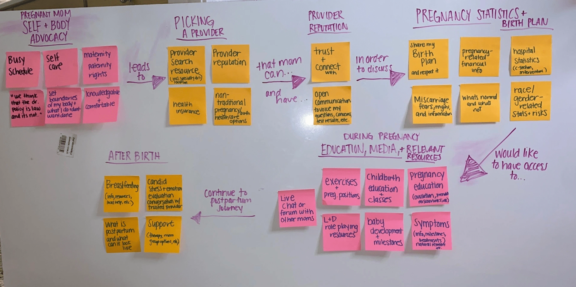
I used an affinity mapping method--a visual idea data space--to find patterns in my observations. Grouping and categorizing the data, a few themes came to light, such as :
Early pregnancy care and education
Connecting and building trust with healthcare providers
Statistics and learning more about better health
Postpartum support, information, and care
👩🏿💻💭My affinity map gave a clearer understanding of major insights, user needs, pain points, and gaps. The connections between the themes and the major insights helped me zero in into specific design directions. In my mind, I had this perfect glossary-like design prioritizing a search function, but from the affinity mapping, I learned users wanted a much more personable and warm, informative tool.
Affinity Map Users
The groups and feedback from the interviews helped me identify users and their needs early on. I came up with two users and their priorities and pains.
First Time Moms:
Proactive about pregnancy and childbirth education
Eager to explore and learn about natural options, but unsure where to start and overwhelmed with information
Not 100% confident when conversing with healthcare providers because they're not sure what questions to ask or how to voice their concerns
Experienced Moms:
Interested in postpartum education, based on their experience from a previous pregnancy
More attentive towards the effect that the pregnancy will have on their career and family life
Connecting with other moms is important to see how they're balancing work and life
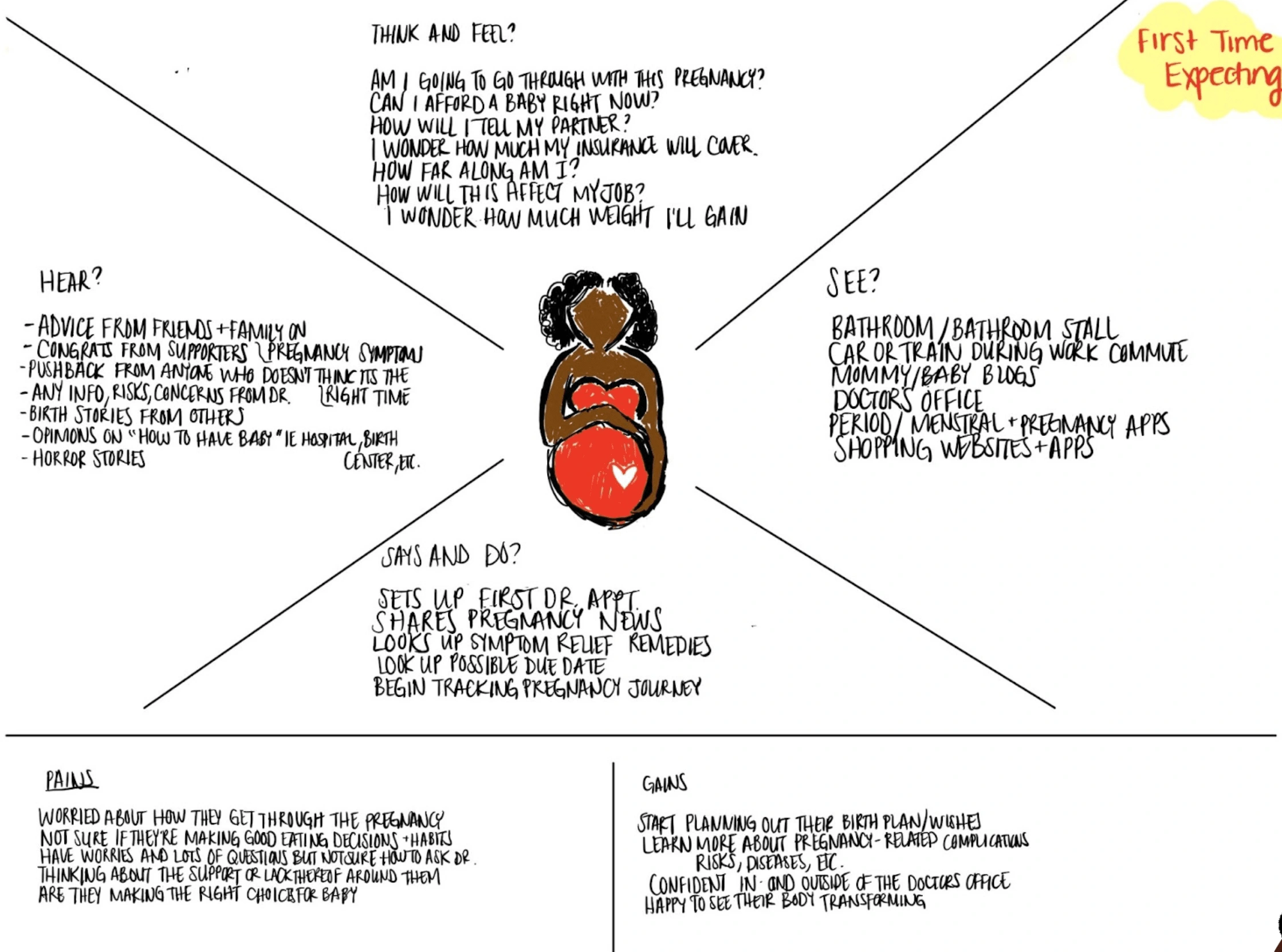
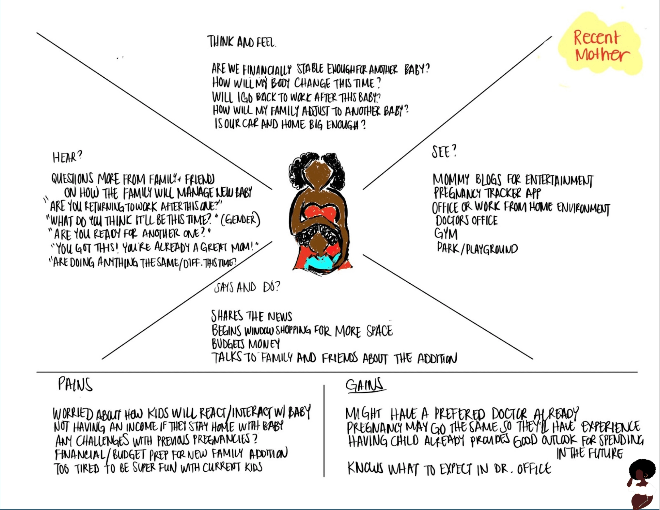
Empathy Maps
Consequently, my affinity maps informed my empathy mapping. My four categories--think, feel, say and do--along with pain areas and pleasure points for each user, really brought my users to life. Empathy mapping turned insights into action and I was able to connect with my users' emotions and dive into personas.
User Personas
I concentrated on 2 main types of users:
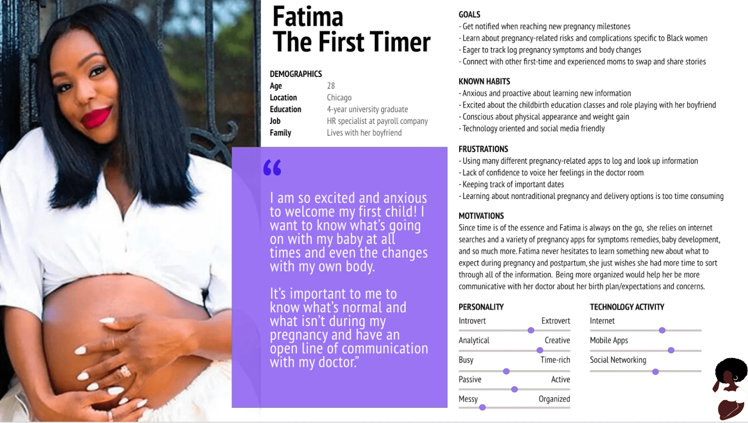
Fatima The First Timer - expecting moms that don't know where and how to find pregnancy information and those
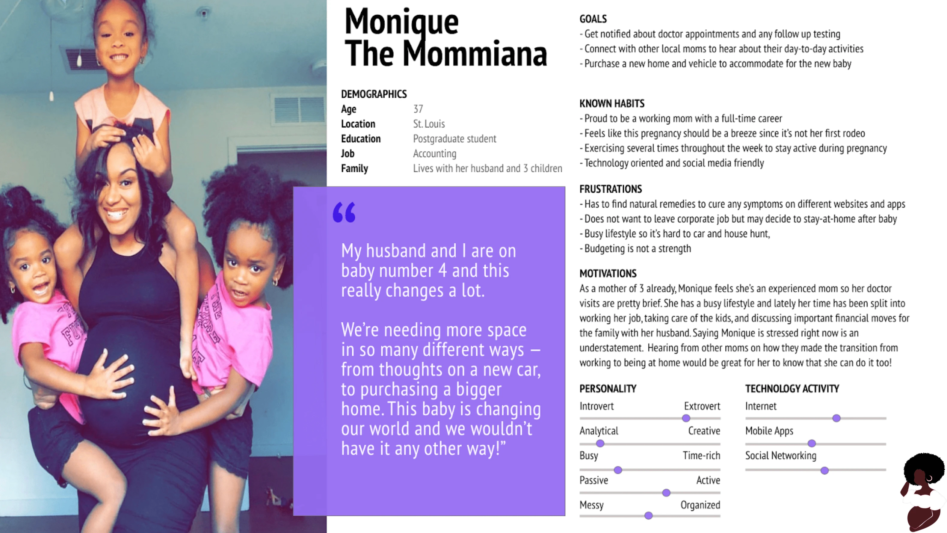
Monique the Mommiana - an experienced mom looking for specific information
👩🏿💻💭Focusing on the behavior patterns of my two model users was essential to having a solid foundation in the experiences of real users. The details of both users' goals, known habits, frustrations, motivations, and personality details helped me make the transition between app requirements and design.
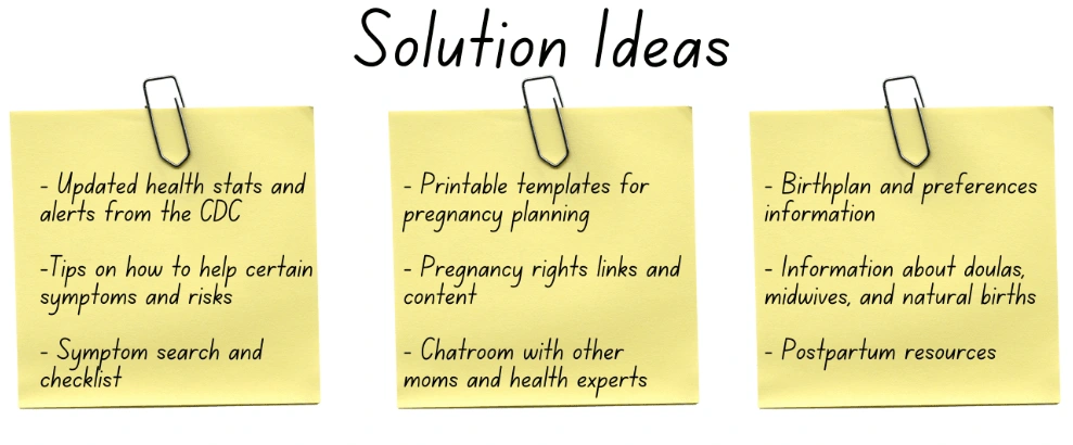
User Must Haves
Access to symptoms and statistics information
Shareable content that includes helpful guides and templates
Suggested pregnancy or postpartum content from healthcare experts and experienced moms
User Pain Points
Managing another pregnancy app
Users don't know what they don't know so they're unsure what information to search for
Too much content can be overwhelming
Minimum Viable Product
There are pregnancy app behemoths such as What to Expect, Glow, and Ovia Health, that already do many pregnancy tracking tasks incredibly well. Most tasks include predicting symptoms, baby and body development, and community and expert discussion content. So what's Brown Mama Bear's uniqueness?
👩🏿💻💭With the research and insights that I gathered thus-far, I knew that Brown Mama Bear needed to cater to the specific group of Black moms, showing unique, relatable, helpful and trusted content. Predicting that my target users were all at different stages of their pregnancy, I knew that personalization would be important. All of the people I interviewed currently use one of the three app giants mentioned above. And they were happy to continue doing so--that is until something can beat what they offer. I've identified that Brown Mama Bear must include the following features before all else in order to be functional and useful for my targeted users:
The incorporation of a search function for symptoms and statistics
Pushing content that is relative to Black maternal health
Community forums of other Black moms and expert opinions (not yet included in current app design)
User Flow & Wireframes
User Flows
I now had an idea of what users needed, wanted, and what they didn't find to be a priority. From here, I began creating my two user flows of steps and interactions a user needs to take to complete a specific task on the app.
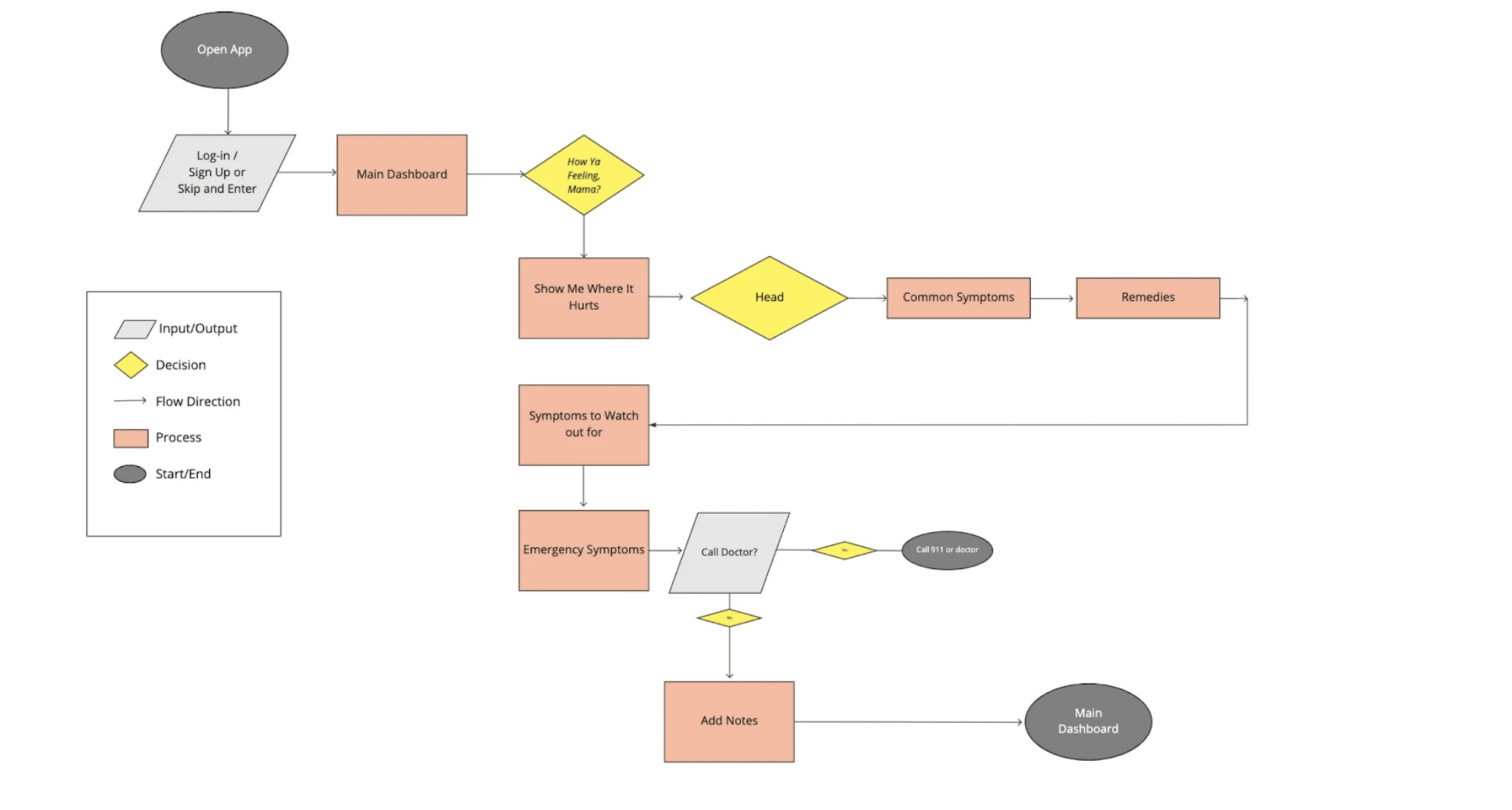
User Flow #1 - Searching for a specific pregnancy symptoms
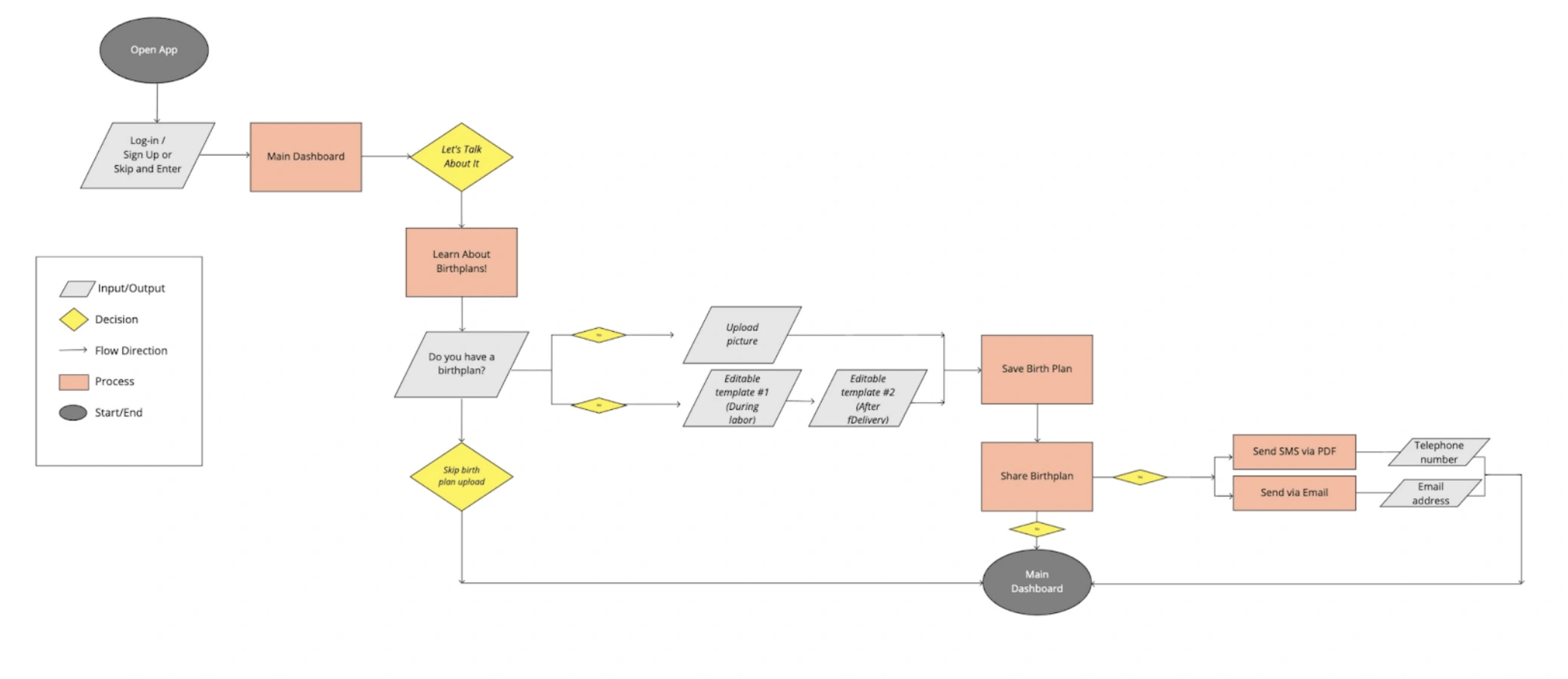
User Flow #2 - Find and share printable templates with a friend
👩🏿💻💭 Although the user flows should have helped me to focus on the user experience and not the design details, I didn't take my own advice. Something I wish I did more of during this phase was trimming down to focus on my MVP and keeping the users' needs more top of mind--not just the vision of the app I saw in my head. If I had focused on the must-have items more, I think it would have helped better shape my information architecture in a timely manner.
Wireframes
The wireframing process was where things became more tangible. After a lot of sketching, rubbing out and re-drawing I came out with an idea of how I wanted to structure the app and its features, keeping the MVP and user interactions in mind.
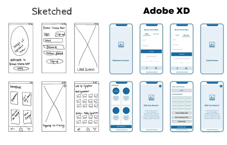
Lo-Fi and Mid-Fi Sketches and Wireframing
👩🏿💻💭As you can see, I digitally sketched rough wireframes before Lo-Fi graphic wireframes. Bold texts, less color, more white spaces.
I got hung up on wireframing because I jumped the gun and skipped to High-Fi way too early on. This created extra work for myself as I winded up working backwards to make sure that I was taking a user-centered approach to my design process. I was creating what I thought was best for the app and what looked the best and because of this "me me me show" I had over 4 iterations of wireframes.
If I could go back, I would put more focus on telling the story and steps of how the user gets from point A to point C [completion]. And because I got hung up on the design part, and missed a few functionality marks, it definitely showed during my usability testing.
Usability Testing
I conducted two usability testing--one during the wireframing phase and one during the final prototype creation.
The testing sessions helped me to understand the kinds of problems the users were running into when interacting with Brown Mama Bear, as well as how satisfied the users were with the product overall.
For each usability testing round, I recruited 5 target user participants and performed 5 moderated tests, remotely. Participants were provided a prototype to interact with, while I observed them during the tasks. I also asked follow up questions at the end of each session.
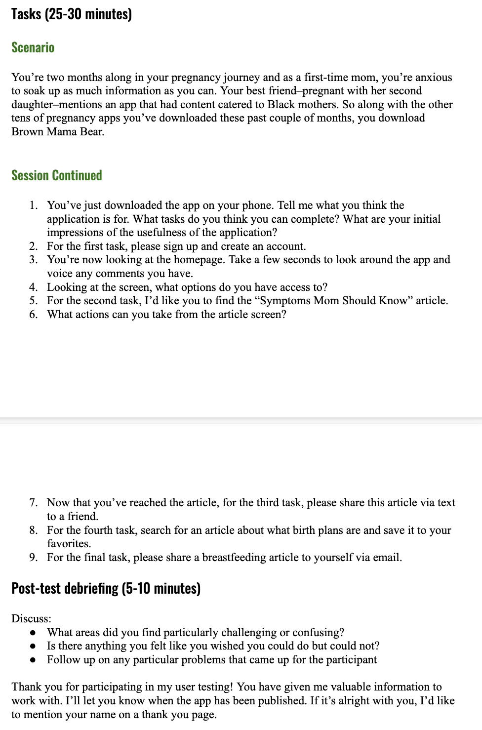
Usability testing sessions and tasks
Usability Testing Round #1
Overall, users showed appreciation towards the layout of the app and its core features. However, there was a somewhat consensus regarding the need to simplify what the content is and the way the content is accessed. It made me realize the need to create a better and more informative onboarding process. Upon downloading the app, at the sign-on screen, users were confused on what the app provided access to.
👩🏿💻💭 You don't know what the app does?? I made grass illustrations with bear prints! This was almost like a punch to the gut for me, with this being my first ever usability testing. Here I am thinking I created the world's best pregnancy app for moms that look like me, and users weren't even sure what they were signing up for on screen one. Talk about a reality check.
Here's more into the findings and recommendations:
Finding 1. No feedback on creating an account during onboarding process
Recommendation 1. Incorporate a few screens that showcase the key features of the app and why users need to create an account
Finding 2. No content labels create confusion on the apps features, functions, and options
Recommendation 2.Condense content thumbnail images to provide users with clearly labeled items for a more approachable platform
Finding 3.Buttons and hyperlinks are not familiar to users or uniformed across the app
Recommendation 3.To more firmly reinforce the ease of navigation and the options that users have throughout the app, actionable buttons should be bold, clear, and properly labeled
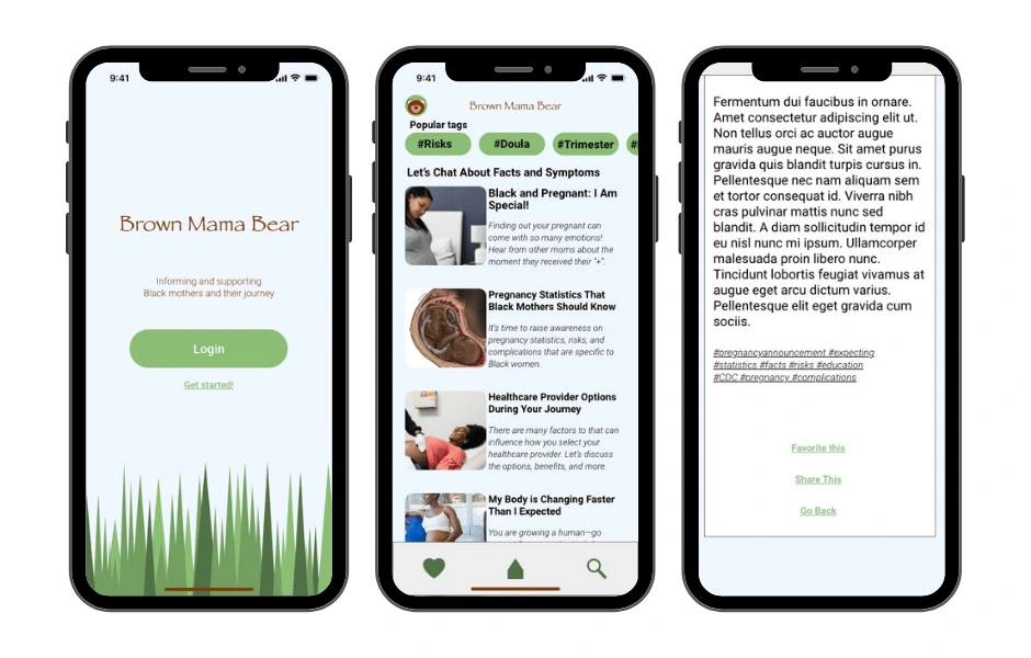
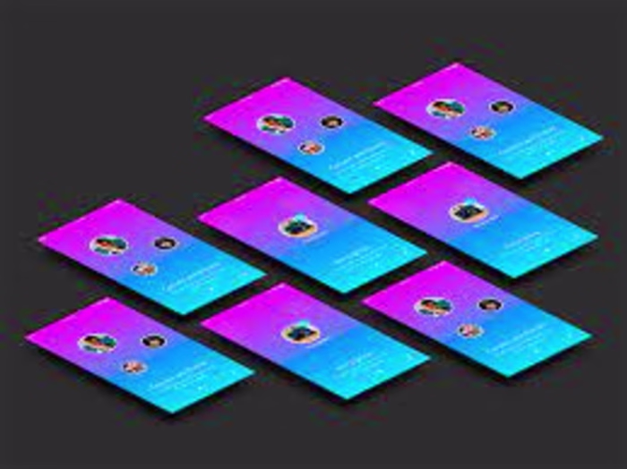
User Interface Design (Hi-Fi)
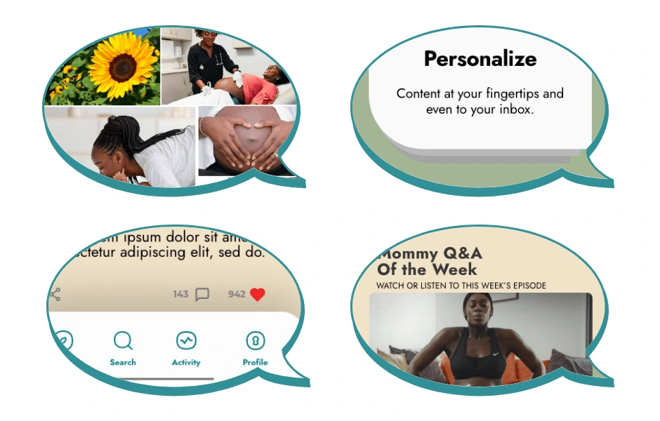
👩🏿💻💭After my first round of usability testing, I needed to dive back into what the users were saying that they needed out of the app. I reflected on the imagery inspiration from my style guide and the must-haves stated by users--personalization and information. From here, Brown Mama Bear's colors, theme and layout took a complete 180 turn...and it was a turn that I was proud of.
Prototype
The decision to change the colors of the app was inspired by the desire convey warm, natural colors that were welcoming to users. So, I included shades of brown like chocolates and nudes, and complementary green and teal colors. I wanted users to feel like Brown Mama Bear was created with them in mind. Because it was...(after the 4th iteration of wireframing of course). I also wanted the content to look like my target audience as well. After a retest with the iterated prototype with 5 new participants, I was content about the overall findings and feedback and closed the chapter on Brown Mama Bear.
👩🏿💻💭 Just kidding, I reopened the book and made some final edits after all of my testing was completed. Below you can see changes in the font sizes, removal white space in the header, and I also played around with colors and additional features. Okay, chapter closed.
Outcome and Learnings
Retrospective
Overall, I really enjoyed building the process of designing this app. I chose the idea of Brown Mama Bear for my capstone project because I am passionate about Black maternal health...I am Black. I am a mother. And my pregnancy experience matters and so do other Black moms.
I found this project to be a spring board for building my foundation for UX Design. I was able to master skills in information architecture, sketching and wireframing, prototyping and testing, and so much more. The entire process of creating a UI/UX design revealed that it demands a high level of not just design work, but critical thinking to solve an issue and creating solutions all based on a user-centered approach. I repeat...user-centered approach.
I particularly appreciated the interview and testing phases and hearing directly from users. It helped me put aside my bias of, "this is the greatest app in the world and it's already perfect," and hear from users that are actually utilizing it. Indeed, the outcomes are far from flawless, and I still have numerous flaws and limitations, including several functions that need to be tweaked. But turning something that I'm passionate about into my UX design capstone project was challenging, yet very rewarding at the same time.
The End.
And on that note, if you made it to this point, thank you so much for reading my first UI/UX Design case study, Brown Mama Bear, and here's 5 cool points for you! I'd love to hear your feedback, so please don't hesitate to drop a note on my contact page!
Like this project
Posted Jul 20, 2022
This project began from my passion with motherhood and all of the things I wish I knew about Black maternal health, before and after receiving my pregnancy test
Likes
0
Views
19