Fastest Case Study EVER! (<100 hours + without using ai)

0
Web Designer
UX Designer
Framer Developer

Claude

Figma

Obsidian
Superlist Android App Case Study
--
A small, dull, yet essential intro
So, you’ve tried to immerse not only your toes but your entire being in the vast ocean of productivity tools & apps. And let’s be real ─ they’re all just okay-ish. Not because they fail to do the job, oh no, they do their job, and that, too, pretty well. But in this fast-paced, technologically advanced era, just doing the job isn’t good enough to stand out.
A tool has to do more and go far beyond serving what it was initially intended to do, and that too collaboratively, while also keeping the whole thing intact and functioning. The bar has never been higher to capture the market. The tool should aim to solve not just the original problem but also meet other needs that people may have. This is the reason why some apps are trying their best to become more versatile rather than specialized in order to stand out in the market, and rightfully so. They are trying their best to appeal to large masses rather than limiting themselves to a specific use case.
Superlist is yet another app that emerges as a promising all-in-one, one-stop-shop solution for tasks, notes, and calendars in the market. That is free for the most part, which makes it stand out in the market and not part of a “just okay-ish” group.
How this Case study is broadly structured? Why?
This case study includes problems that I identified in the Superlist App, which are classified into 3 types of arbitrary buckets or groups. And then prioritized based on their level of importance. Dividers will separate each bucket.
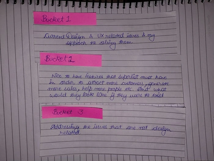
Bucket 1. Current Design & UX related issues and how I approached to solve them.
Bucket 2. Additional features that Superlist must have in order to attract more customers, generate more sales, help more people etc. And what would they look like if they were to exist?
Bucket 3. Addressing the issues that are non-design related.
This is because, this is not a usual case study. Don’t worry; it’s not an unusual one, either. It’s just not the type of case study one typically expects to read. It is different from the case studies that exist out there.
You might be tempted to ask, “What’s so different/unique about this case study?”
Usually, Case Studies try to address and solve one humungous problem. Instead of focusing on one big problem, I am trying to address & solve a variety of different ones. Focusing on the overall user experience while taking all the little intricacies and nuances into consideration is what will be my main aim with this case study. This case study was made within the span of 100 hours after the official public release of v1.1 (Feb 28, 2024).
I set an arbitrary number and took it as a personal challenge, an opportunity to test my abilities by coming up with as many good solutions as possible and pushing myself all within the span of 100 hours while not sacrificing the quality of the case study.
As previously mentioned, I am not trying to solve 1 big problem but rather a variety of different ones. So, by keeping that in mind, here is how the structure of this case study will look: 1st problem → solution, 2nd problem → solution, and so on and so forth. Remember, I am not trying to claim that my solution is the best solution that exists. I am just trying my best to solve the problem in what I think is the best possible way to address and solve it. There is no perfect solution; there are many solutions to tackle the same problem. I am just here to present mine. Also, I would highly encourage you all to read this case study sequentially like a waterfall and not hurry and go straight to the very end. And if you do, that’s totally okay, too.
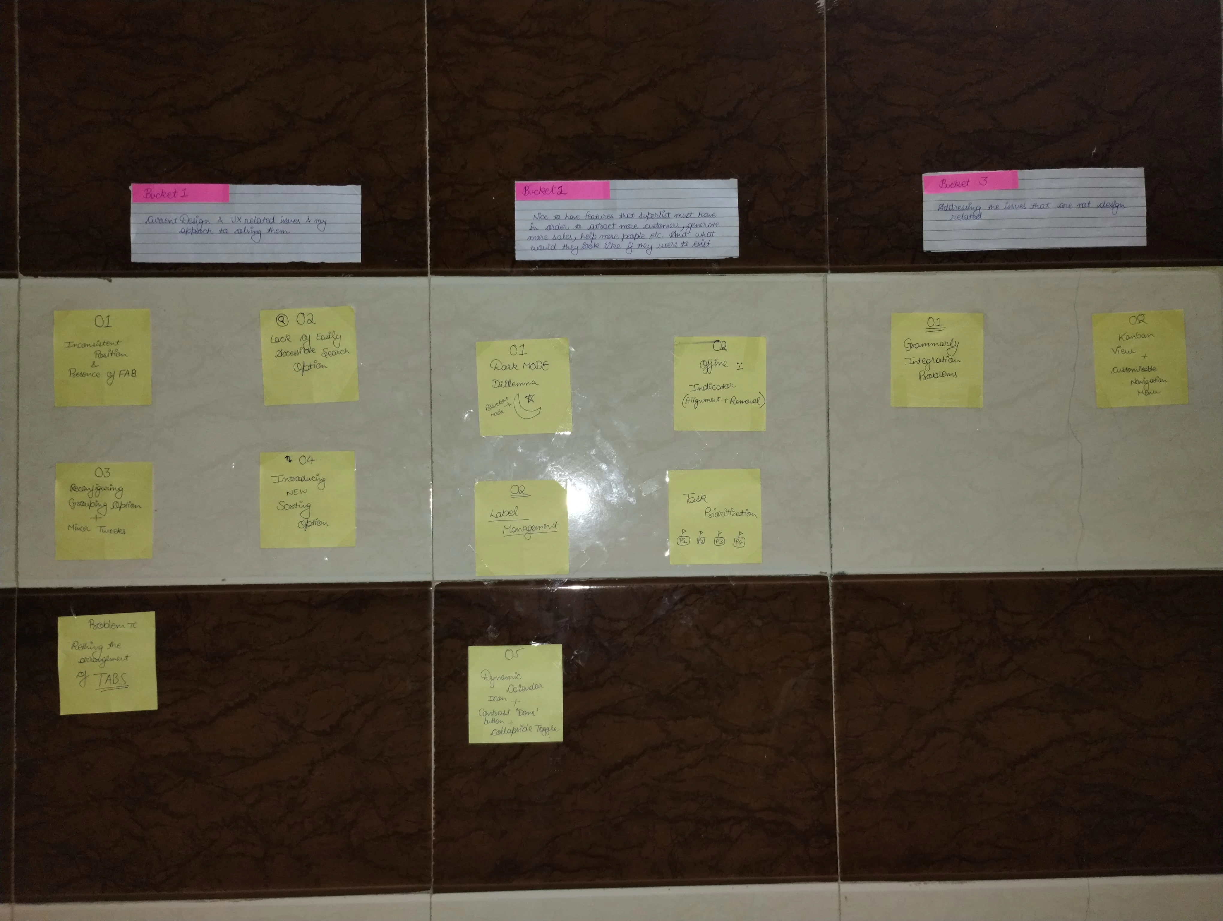
Problem 1: Inconsistent Position & Presence of FAB
The absence of a consistent Floating Action Button (FAB) on some screens for adding tasks and notes in the Superlist app results in users needing to take additional steps, which creates a cumbersome user experience. This inconsistency in FAB presence and positioning introduces unnecessary complexity and hinders user productivity, leading to inefficiency and frustration.
My Solution: If users were to use an app that promised to act as my note-taking and task manager tool, it would be vital for them to get their ideas down from their heads onto the app as soon as possible with as little hassle as possible. (Referencing: Capture ─ One of the most important tenets of GTD System) Playing “Tap-Tap” or “Find the FAB by clickety-click” introduces a layer of friction, which is bad for the overall user experience. My suggestion would be to rearrange bottom tabs and only keep the most important ones within the thumb’s reach, with FAB being one of them for intuitive task addition i.e. to get ideas/tasks out of the head quickly to Superlist.
✔️ Problem 1: Inconsistent Position & Presence of FAB
Problem 2: Lack of Easily Accessible Search Option
More the tasks, more will be the list, this is the story of a todo app in gist. More the lists, harder it will be to find task, which are currently hidden behind “All tasks” tab mask. Having a search bar present at all times is our only way out, I don’t think there’s any doubt. We need to make search option more apparent, so that there’s no way Superlist gets any dent.
This is my proposed solution; I think it’s the only resolution.
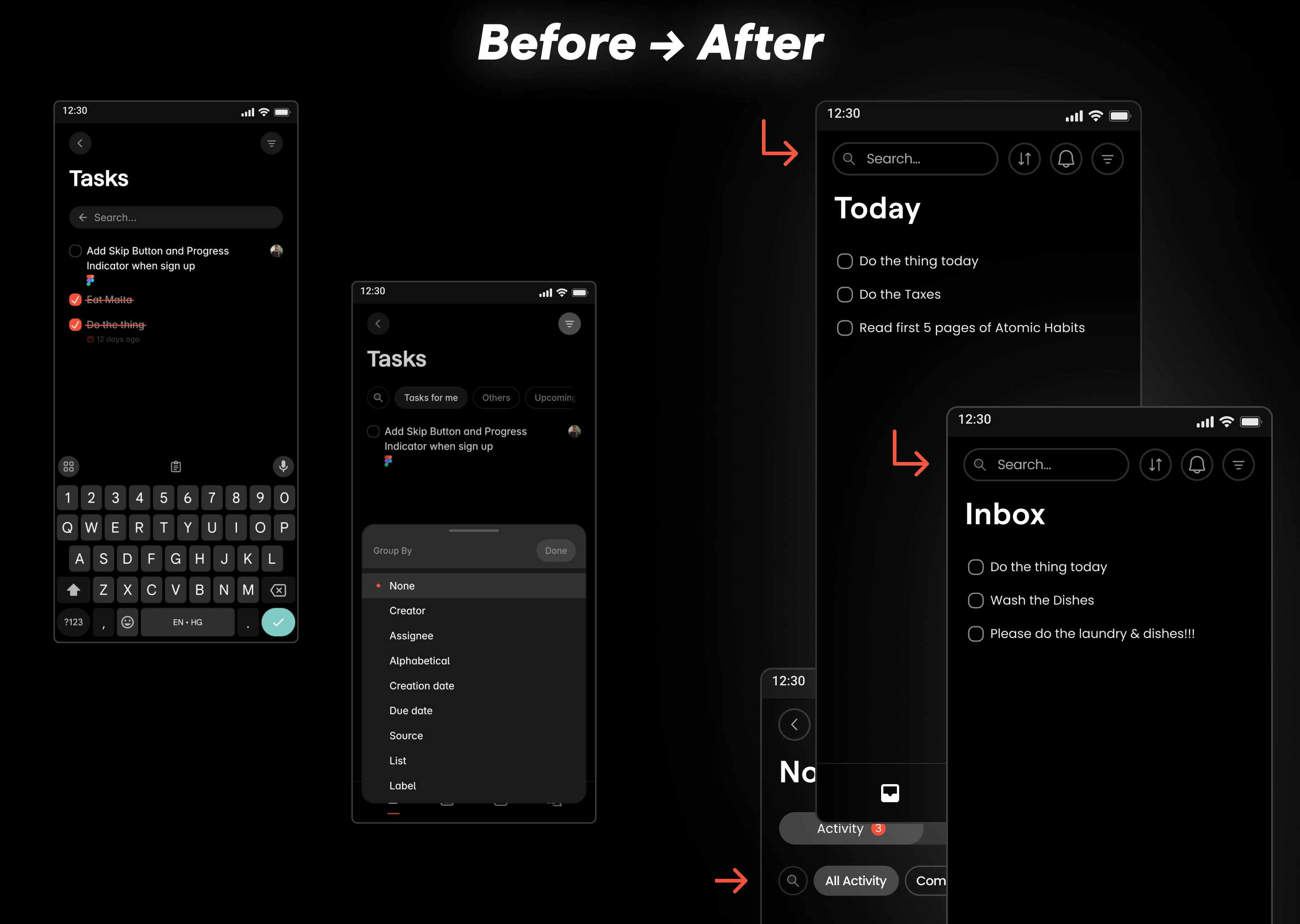
✔️ Problem 2: Lack of Easily Accessible Search Option
Problem 3: Reconfiguring Grouping Option + Other Minor Tweaks
The grouping feature in Superlist had issues with assigning tasks to personal lists, displaying options only usable on PC (the Figma icon), and a default selection of “None” with an orange dot, leading to confusion. Also, the presence of irrelevant elements like the user’s avatar icon in their non-shared list on personal team was inefficient use of space disrupted visual hierarchy and user experience.
So, I got rid of the Figma icon (which is only clickable on PC for obvious reasons) and the user’s avatar image because it disrupted user experience and visual hierarchy and assigning task to yourself served no purpose on non-shared list in personal team.
Other minor tweaks:
Fixed “Done” button which had contrast issues.
I removed the default “None” option and introduced a new cross icon to unselect the chosen option.
I also added “Cancel” button next to “Done” button to close the opened “Group By” modal.
I also added dynamic calendar icon that shows today’s date on the bottom navigation menu, being more functional and user friendly.
Added Color based Task Prioritization
I added colors to cute little rectangles indicating the priority levels of the task by 4 different priority levels, Priority 1 being tasks that are of utmost importance, that you need to get done no matter what a.k.a. “The ‘will do’ task” are indicated by red color. Yellow color rectangles are “must do” tasks. That is important but not that urgent (Using the Eisenhower matrix analogy). Blue-colored checkboxes indicate “should do” tasks. And Priority 4, which is last but not least, is also the default priority for all tasks.
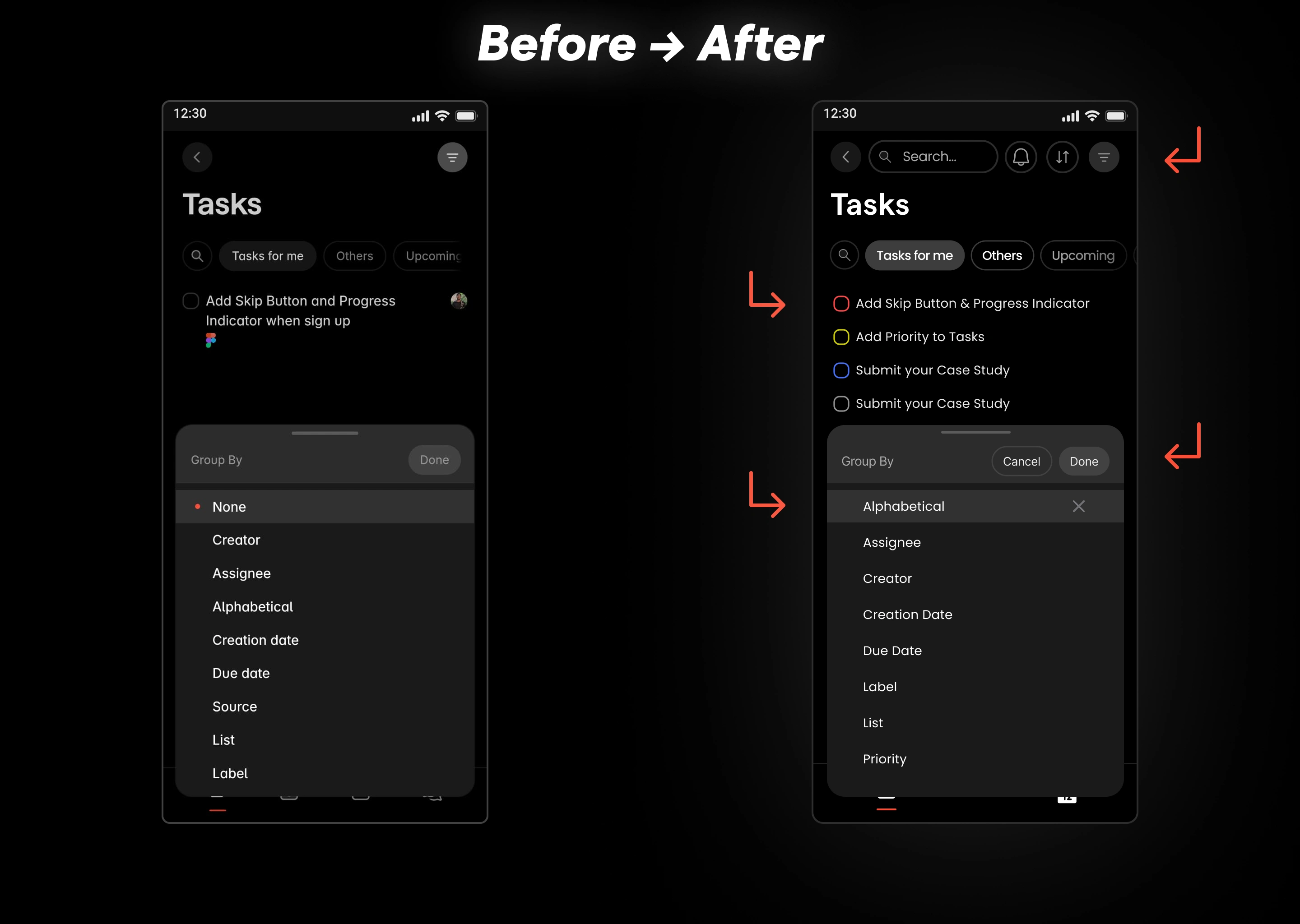
✔️ Problem 3: Reconfiguring Grouping Option + Minor Tweaks
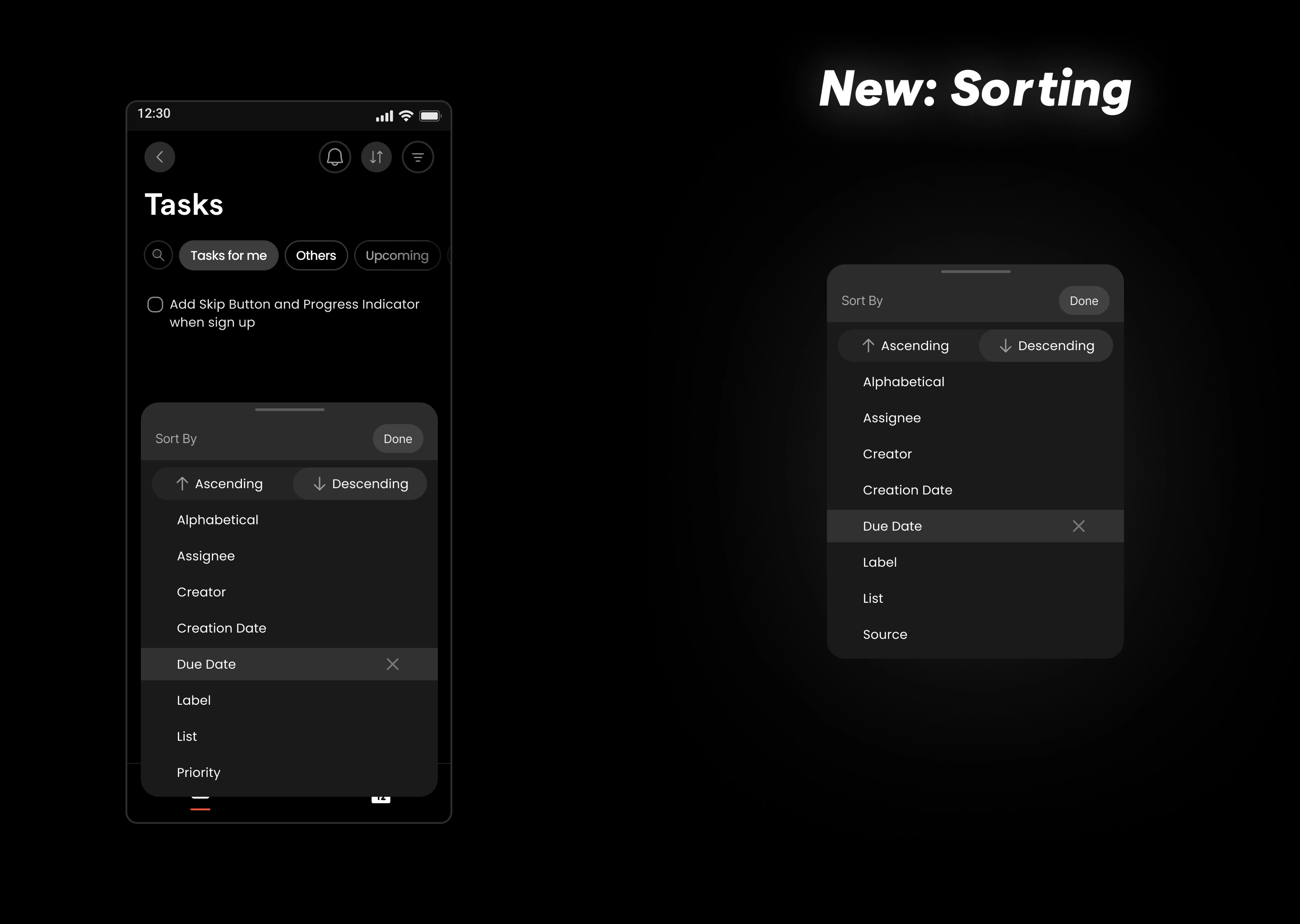
Problem 3.1: Introducing NEW Sorting Option
There is no option currently present that can filter, and sort tasks/notes based on any specific or particular criteria. Sure, there is an option available to group/segment them based on various different criteria such as creator, assignee, creation date, due date, list, labels, etc.
So, I did a thing and made an option to arrange them, i.e., sort them, so they are easier to find in the ALL-TASKS (Ascending/Descending). (Sorting basically means arranging them in any particular order). I also added a sort and group based on priority options. Adding this sort of functionality requires logical code with functional implementation. However, it is one of the most necessary features a to-do list app must inculcate in their software. If it were to exist, this is how its UI would look from a UX perspective (Taking into consideration the pre-existing Superlist design and without breaking the layout at all.)
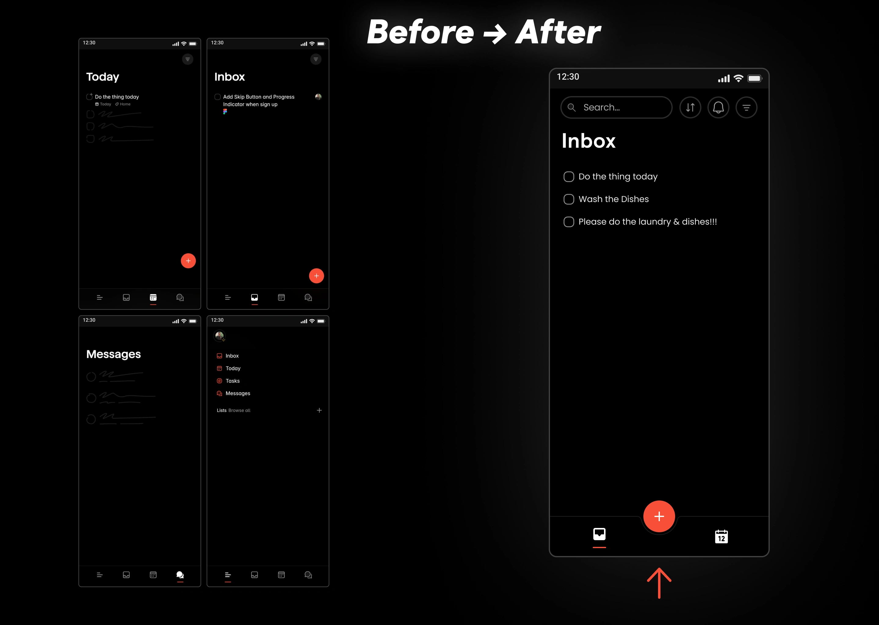
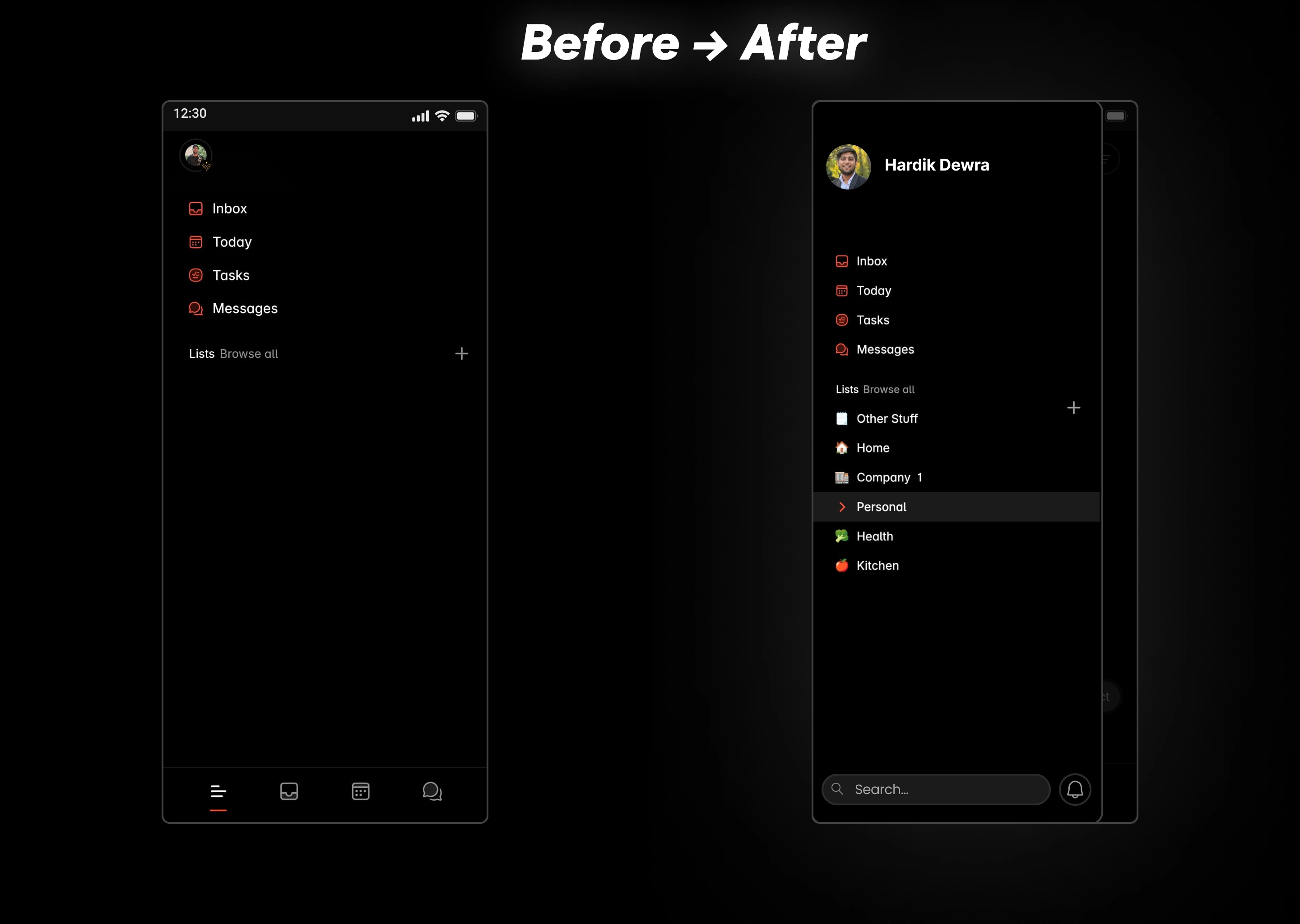
Problem (π) 3.14: Rethinking the Arrangement of Tabs
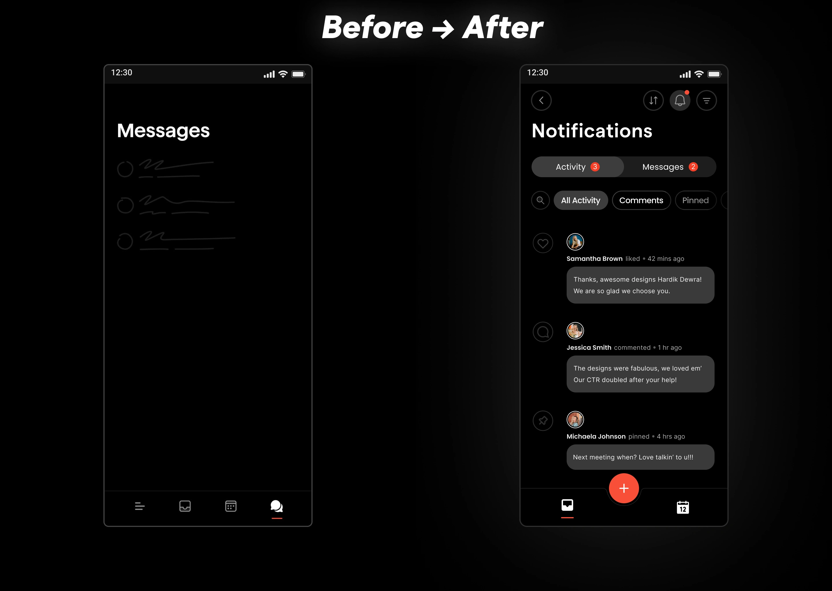
Before, the app’s navigation bar had four tabs: Messages, Today, Inbox, and All Lists. It was a bit confusing because All Lists seemed to overlap with the other tabs. This wasn’t the main issue at all; the problem was some of those tabs led to pages where there was no presence of the FAB button, and rightfully so. Because it’s only logical to assume, “Why would the messages tab have an FAB button to add tasks, right?” To simplify, I moved Messages to a notifications button with a bell icon, indicated by an orange dot for new messages. This button now leads to an All-Activity tab for interactions like reactions or comments, making navigation more straightforward and more streamlined.
Showing only the inbox and today tab, along with the FAB button. Which are most easily accessible, within thumb’s reach and doesn’t confuse the user. Simply speaking, messages go to the notifications page after clicking the bell icon, which clearly shows the Superlist-themed orange dot on the arrival of any new message or notification.
✔️ Problem 4: Dark Mode Dilemma
And well, the list tab goes here… in the side. When user swipes it appears for easy quick access and switching to list as quickly as possible without the hassle of clicking and tapping.
✔️ Problem 4: Dark Mode Dilemma
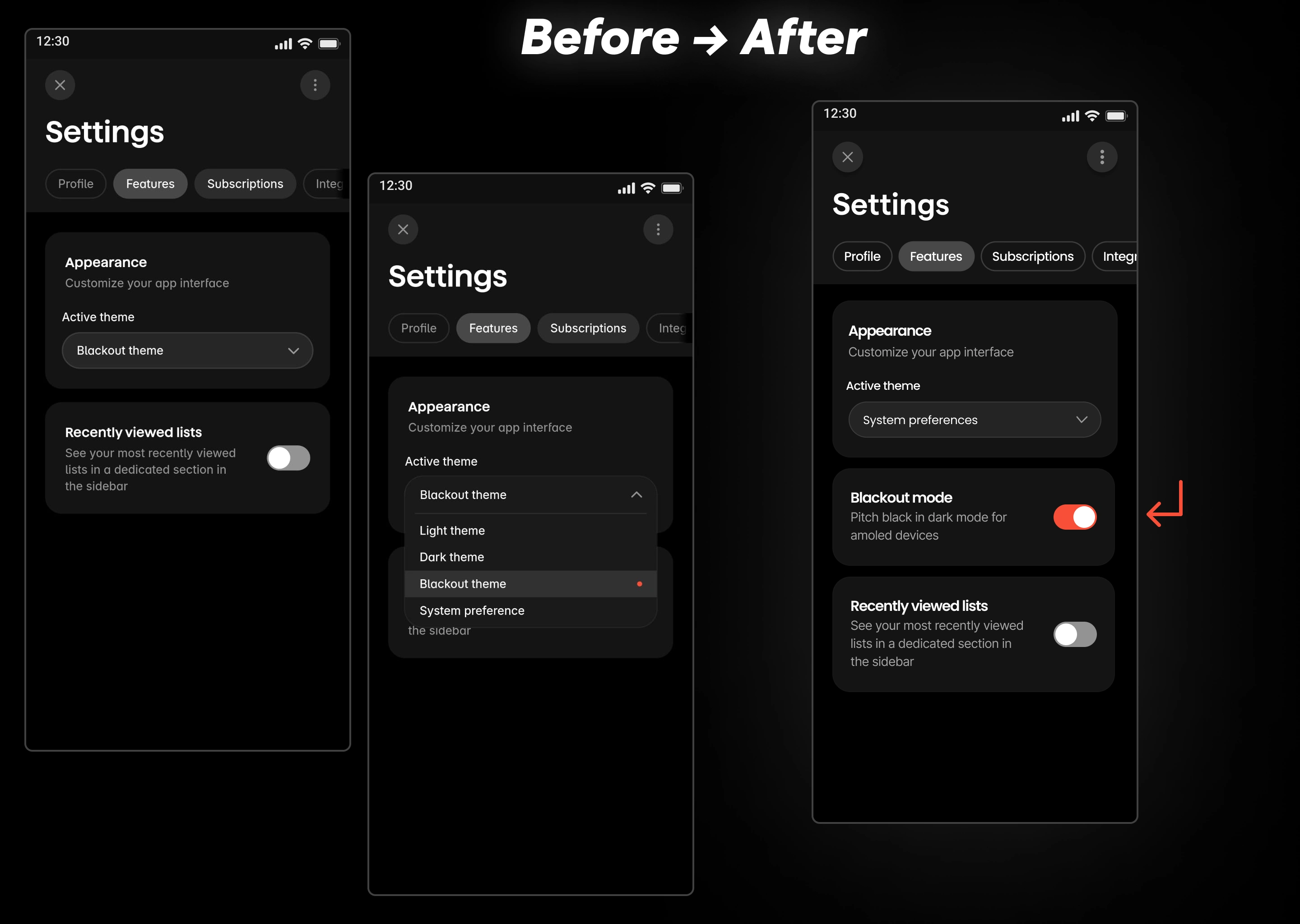
Problem 4: Dark Mode Dilemma
In the Superlist app, you can choose and pick from 3 base themes present and choose how the app looks according to your own preferences. There are 4 options present inside the dropdown menu for the user to select. They are Light Mode, Dark Mode, and Blackout Mode & a mode that automatically selects the theme based on system preferences. The problem arises if you pick based on system preferences and change your system theme to a dark one, then it goes to dark mode. It doesn’t go to the Blackout mode but just the regular dark. Not that this is a problem. I can choose and select Blackout mode manually from the dropdown menu whenever I want. But selecting manually would mean that every time my phone switches the theme, I have to change it manually. However, this is quite frustrating for a user who wants blackout mode as their dark mode but doesn’t want an additional layer of friction.
So, I did a thing: tada ✨ (made a toggle that let’s user select blackout mode as the default dark mode)
✔️ Problem 4: Dark Mode Dilemma
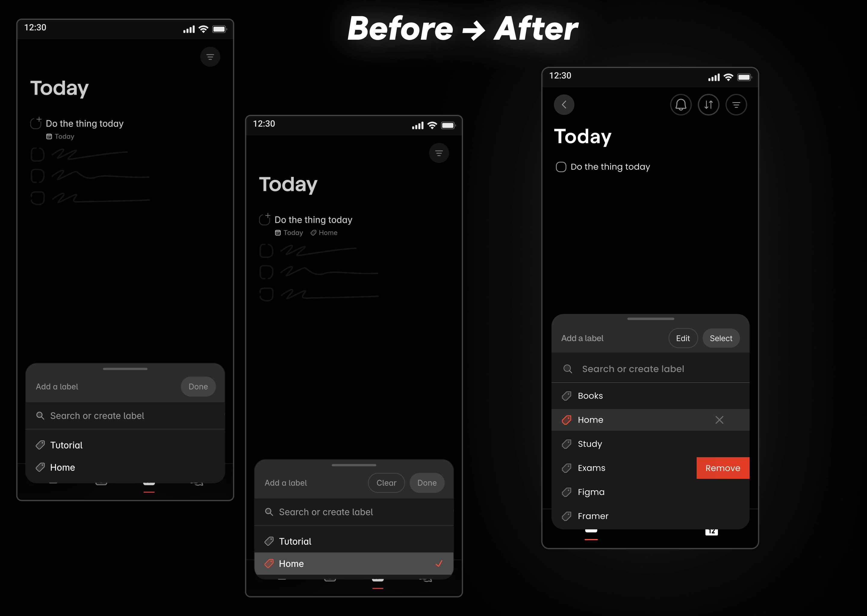
Problem 5: Label Management + Today Page’s tasks issues
Previously, there wasn’t an option to delete the label. So, I made one. Swiping and clicking on the label to delete the label so that you or the user don’t accidentally delete it. I also added an option to edit label by clicking “Edit” button which was “Clear” button previously next to done button which was previously not possible. Remember, deleting the label is different from removing the label. For removing the label i.e. unselect the label from current task, I made a little cross mark similar to the one previously in “Group By” and “Sort By” modal to remain consistent across screens and not confuse the user. I also added the ability to search through the labels, just in case, users start creating many labels, which they eventually will, because, I know Superlist is gonna win the market after reading my case study, hiring me and applying what I wrote in this case study. Which in turn will want users to use this application as their daily driver. Not to mention also onboard a lot more new users from competitors. ;P
Also, I got rid of the little automatically pre-assigned “today” label at the bottom of the task, next to the manually assigned “Home” Label. Because it was redundant to display a task with “Today” label on “Today” Page where it’s self-evident that all of the tasks present on this page are supposed to be done by today or are due today. Think about it. Well, now you think about it, it’s just silly, lol. It’s understandable and justifiable, considering it has not even been a month since the launch of this wonderful application on all platforms. It’s still fresh out in the market.
✔️ Problem 5: Label Management
Although this was previously supposed to be a design case study but the scope of this case study goes far beyond and extends the horizons of mere interfaces, screens, frames & pixels. Just like I said earlier, doing the job ain’t good enough; you have to go one step further. Following my own advice, I would like to go further and address some constructive criticism and problems I am currently facing. I hope it will be taken in good faith and in the improvement of the Superlist application altogether.
Problem ABC: Addressing the Grammarly Integration Problem
Another problem that I identified was with a very popular browser extension called Grammarly which is extremely useful in while using a note taking app. This might not be a design problem in Superlist but it affected my — user experience, nonetheless. For enhanced note-taking, Superlist needs to allow users to be able to use the Grammarly extension because, at the moment, it has some compatibility issues and doesn’t seem to work. Here’s a cool visual I made in Figma to demonstrate user’s (mine) tini-tiny bit of frustration for not being able to use Superlist as their primary note-taking application), lol.

✔️ Problem 7: Grammarly Integration Problems
That’s it. These were all the problems that I purposefully picked to inculcate in my case study, which was made within the span of 100 hours. There were also problems that my eyes observed, but I didn’t purposefully pick them because of the arbitrary time constraints that I set for myself.
My Process of Writing This Case Study?
“100 iterations, not 100 hours in case study lol.” ─Hardik Dewra
“10,000 iterations, not 10,000 hours” ─Naval Ravikant
More precisely?
Open Superlist App ─> Find Problems ─> Note down problems & Take Screenshots accordingly in the app ─> Open Figma ─> Start doing reps ─> more reps ─> Some more reps ─> Done designing? Ah… yes? ─> “NO, MAKE IT POP!” ─> Good start ─> Categorize problems into 3 groups/buckets ─> Open word document ─> Create rough outline ─> Write first shitty draft ─> Reorder sentences ─> Reorder paragraphs + sections ─> Rewrite stuff ─> Some more edits ─> Good enough third draft ─> *Fuck* Only 10 hours remaining out of 100, avengers assemble ─> *Panicking + Anxious sweating* ─> It izz what it izz mentality ─> Fuck it; we roll mentality ─> hehe ─> final draft on medium ─> write the thing that you are just reading right now, you, yes what you are reading right now ─> oh, almost forgot to incentivize you for cta ─> add CTA ─> The end
Hey you, yes you, did you like what you just read? Congrats, you don’t have the attention span of a goldfish or an alarm clock. Want to work with me? Email me here to contact and work with me if you like my case study ─> thehardikdewra@gmail.com
Like this project
0
Posted Jan 3, 2025
Took Superlist's Android app. Spent <100 hours dissecting every pixel. Rebuilt the entire UX. Proof? Got a 50-page teardown with working solutions. I BUILD FAST
Likes
0
Views
2
Tags
Web Designer
UX Designer
Framer Developer
Claude
Figma
Obsidian


Compilation of 9 (Quality) Hero Sections

Global Acoustics Interior Landing Page & other sub-pages