

Hamro Idea historical homepage connects positioning, services, selected-work examples, process and contact. Full original Figma frame; design content is sample data.
The project and my part in it
Hamro Idea needed a website that could explain a software studio’s offer. I worked across positioning, information architecture, responsive UI and frontend implementation.
I began with what a prospective client needs to understand: whether the studio can help, what the work involves and which example makes that promise believable.
What shaped the design
Client vocabulary may differ from internal service names.
Repeated page patterns need distinct service explanations.
Layouts must tolerate real copy lengths and image proportions.
THE DESIGN CHALLENGE
How can a software studio make its offer understandable and give a prospect a reason to believe it?
The journey moves from the service offer into relevant work and, when someone is ready, a direct inquiry. About and article pages give visitors another way to learn more.
01 / Explain the service in the client’s terms
Explain the service in the client’s terms
The homepage introduces the offer, and the services page gives it more detail. I organized that explanation around the problem a service addresses and the work it includes.
Keeping those questions close helps a prospective client choose a relevant path without having to understand the studio’s internal vocabulary first.
Open image ↗
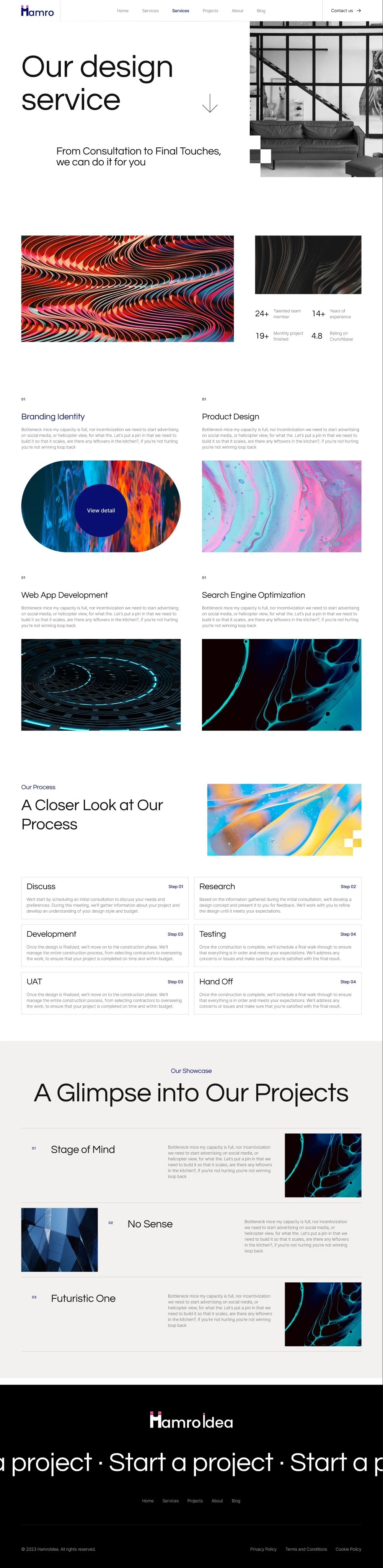
Hamro Idea historical services page organizes the studio offer into design and development disciplines. Full original Figma frame; design content is sample data.
Shared sections make the website coherent, while each service still needs its own explanation.
02 / Put the work near the promise
Put the work near the promise
The project index supports a quick scan. A project-detail page then gives one example room for explanation, and About introduces the studio behind it.
I treated those pages as different parts of the evaluation. The sample imagery and business copy in the historical designs show the intended placement of proof, not verified company results.
Open image ↗
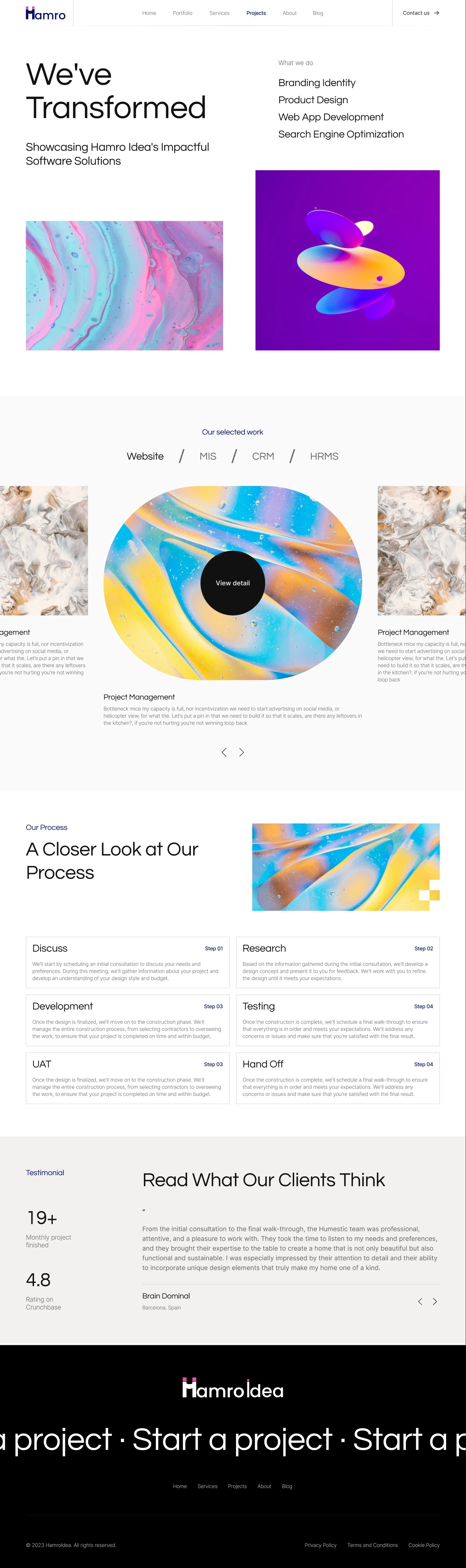
Hamro Idea historical project index introduces work through a repeatable project-card structure. Complete original Figma frame; design content is sample data.
Open image ↗

Hamro Idea historical project-detail layout presents a sample software project in greater depth. Complete original Figma frame; design content is sample data.
Open image ↗
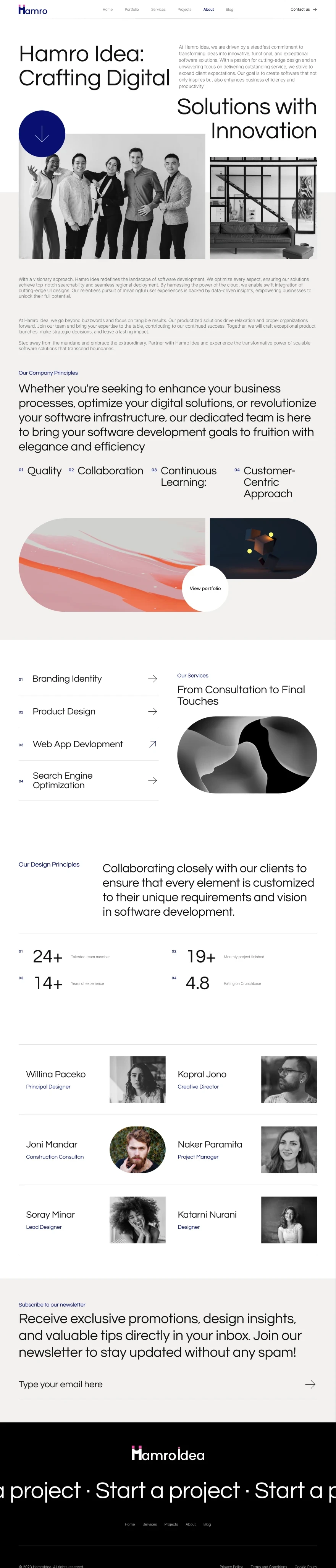
Hamro Idea historical About page presents studio positioning, team imagery and working principles. Full original Figma frame; design content is sample data.
A project gallery helps discovery; a useful detail page has to explain the contribution.
03 / Give interested readers somewhere to go deeper
Give interested readers somewhere to go deeper
The article index offers a short preview before asking someone to open a longer page. The article layout then needs a comfortable reading hierarchy and a route to related material.
This gives someone who is still learning about the studio another useful path before contacting it. The article text in these historical designs is demonstration content.
Open image ↗
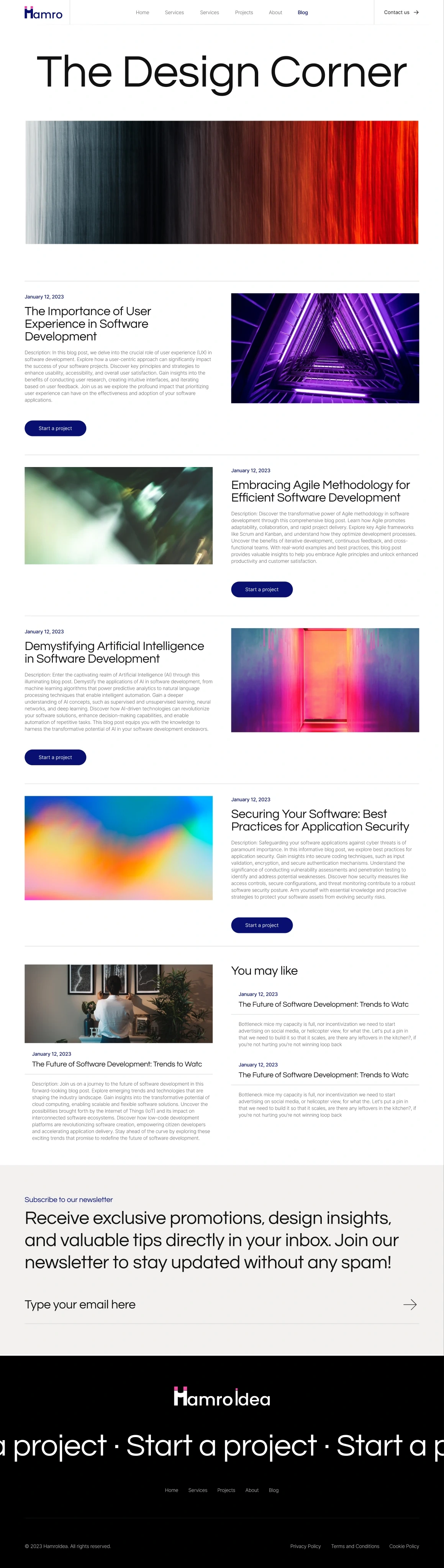
Hamro Idea historical blog index presents article previews and a route into longer design content. Complete original Figma frame; design content is sample data.
Open image ↗
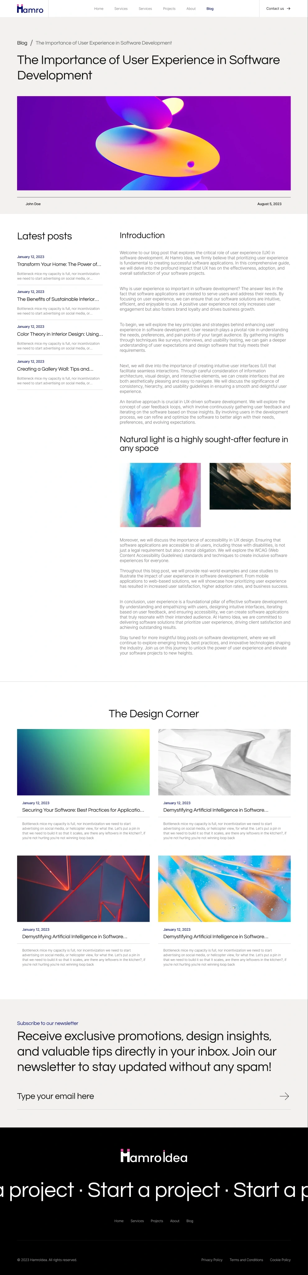
Hamro Idea historical article layout connects a long-form design explanation with related reading. Complete original Figma frame; design content is sample data.
Editorial content earns its place when it helps a visitor evaluate the offer.
04 / Make starting a conversation straightforward
Make starting a conversation straightforward
The contact page keeps the first request small with name, email and message. Navigation and the surrounding identity remain familiar after the visitor leaves the service or project pages.
The implementation still needs persistent labels, appropriate field semantics and clear validation, progress and success states. Those details let the simple layout work as a usable form.
Open image ↗
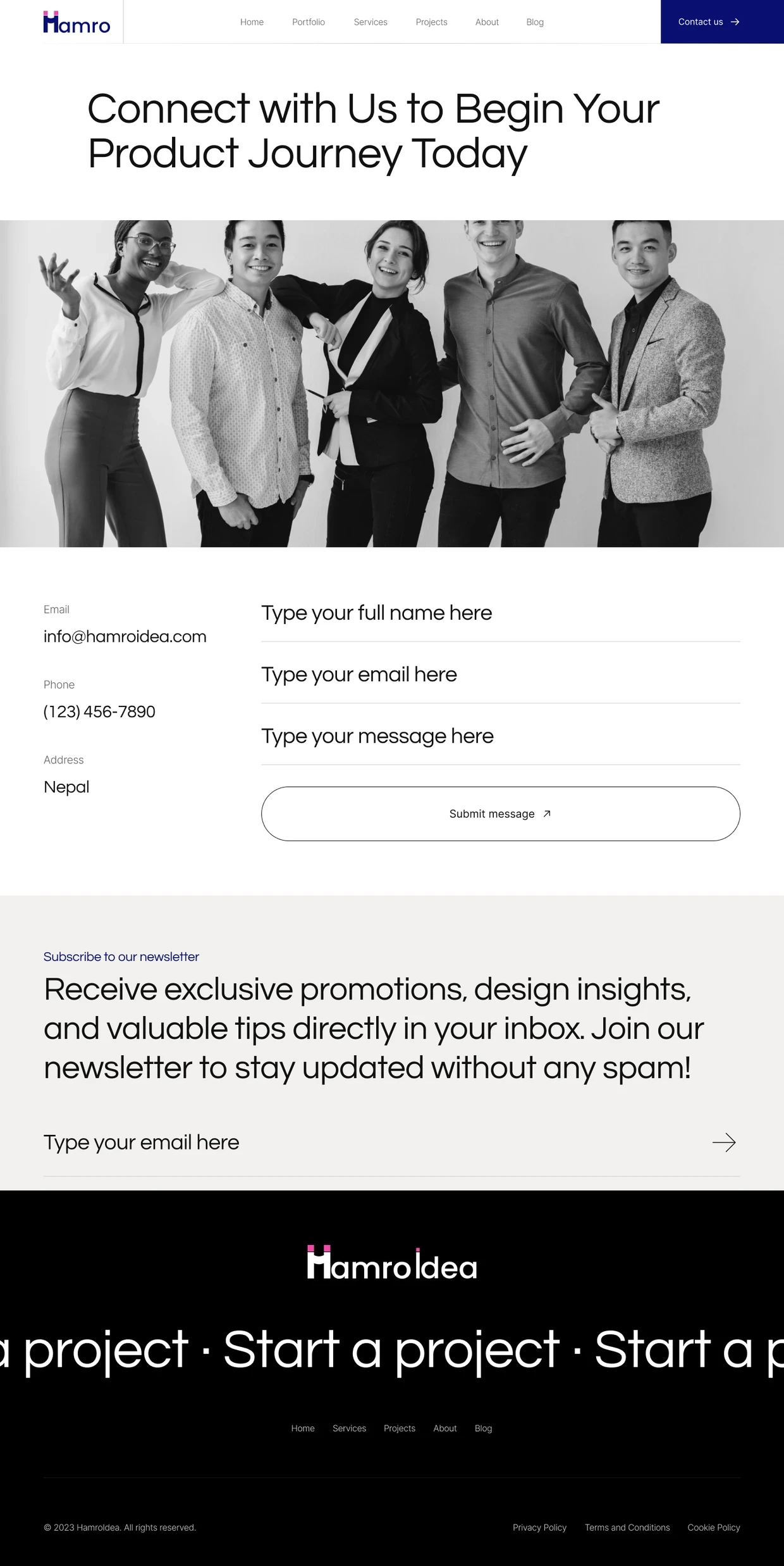
Hamro Idea full contact page combines the contact introduction, message form, newsletter and footer. Full original Figma frame; design content is sample data.
A short form reduces the first commitment, while good labels and feedback make that commitment understandable.
Open image ↗
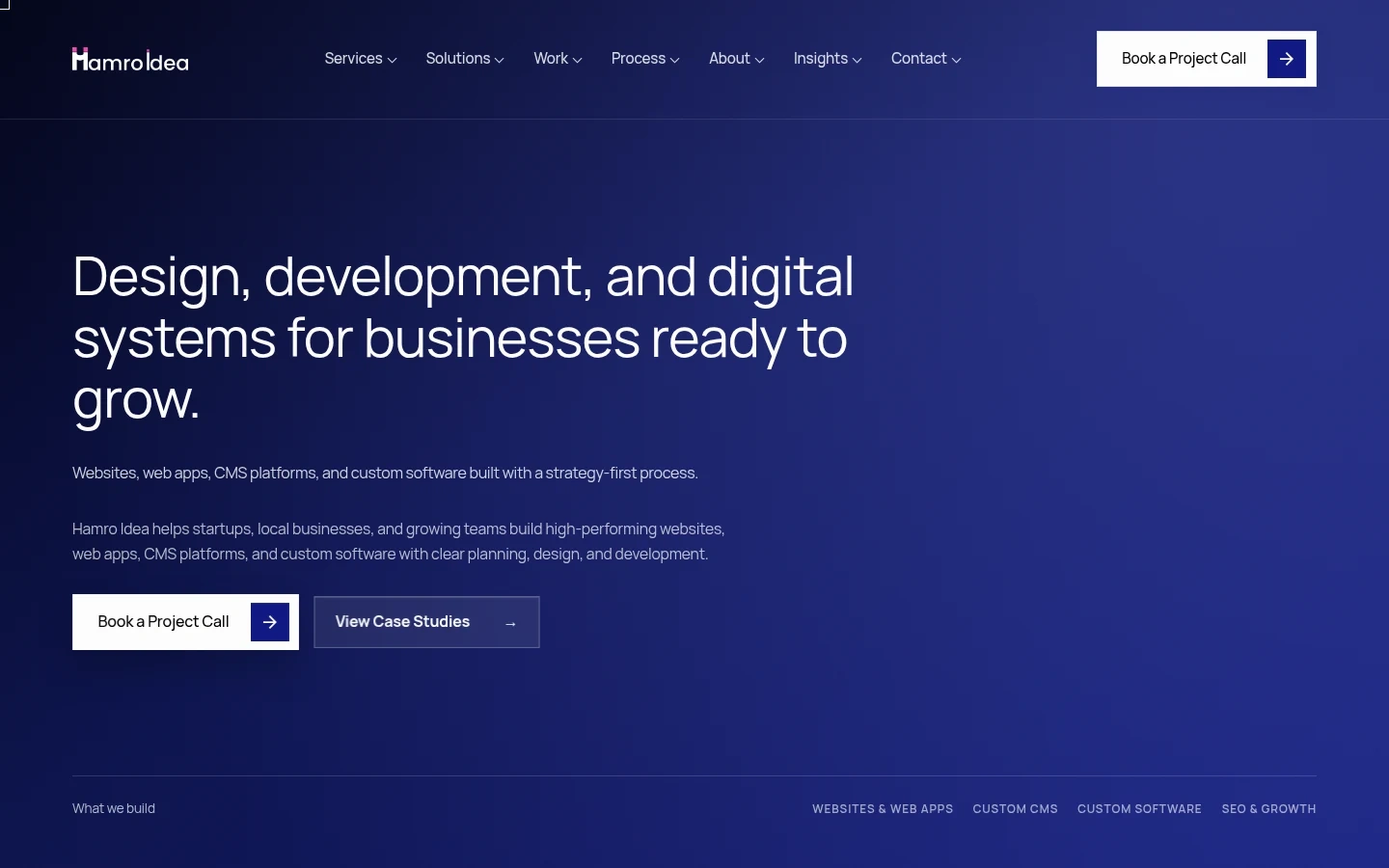
Current public Hamro Idea demo, independently captured on 5 November 2026. Earlier studio work is described separately in this case.
What I delivered
The work connects service pages, project examples, About, articles and contact within a reusable multi-page frontend.
Public material for this case is limited. This account stays focused on my contribution, its design decisions and the questions that deserve further validation.
Public demo, checked 5 November 2026. This current implementation is a separate reference from earlier studio work.
Outcomes and next steps
The case shows how design and code support the evaluation path. Search rankings and inquiry growth are not measured outcomes of this work.
What I would test next
Ask a prospect to choose a relevant service, locate supporting work and reach contact with enough context to describe their need.
Review the form using keyboard input, invalid email, submission failure and success; check persistent labels and meaningful feedback.
What I learned
Designing and building the pages together helped me treat content variation as part of the layout, not something to fix after delivery.
About the screens
Historical Figma designs contain sample copy and imagery; the current public demo is a separate dated reference. Company claims and form delivery are not certified by the designs.
Related work and reading
RELATED EXPLORATION
Website design and frontend thinking
RELATED EXPLORATION
Working with a designer in Nepal
RELATED EXPLORATION
Clearer service websites
Got a product in mind?
0 likes · 0 views · Nov 7, 2026
Hamro Idea studio website: positioning, information architecture, responsive UI and frontend implementation connecting services, projects and contact.

