Caela Space

Chinenye Ikebudu


Caela Space
Strategy, visual direction and content in a founders workspace .
Video Walkthrough
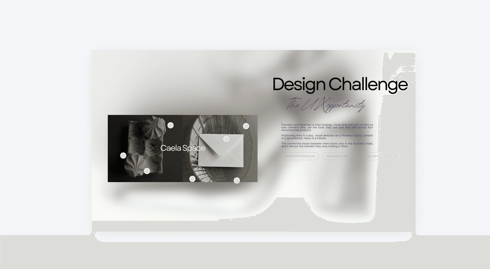
Founders place positioning in a doc. Visual direction on a board. Content in a spreadsheet. Caela puts them on one spine.
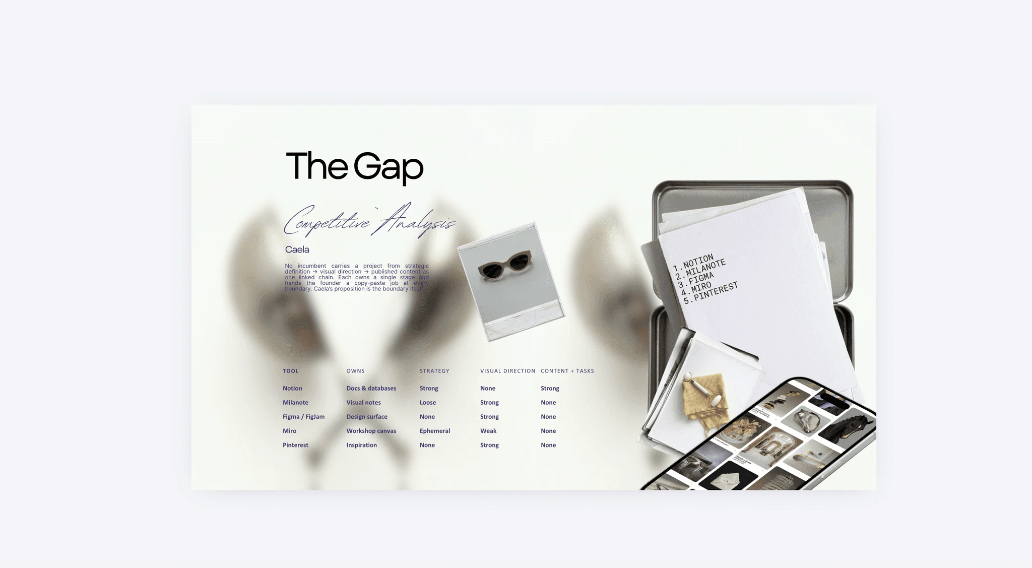
Three tools are strong on visual direction. All three score zero on content. Not one row crosses that boundary.
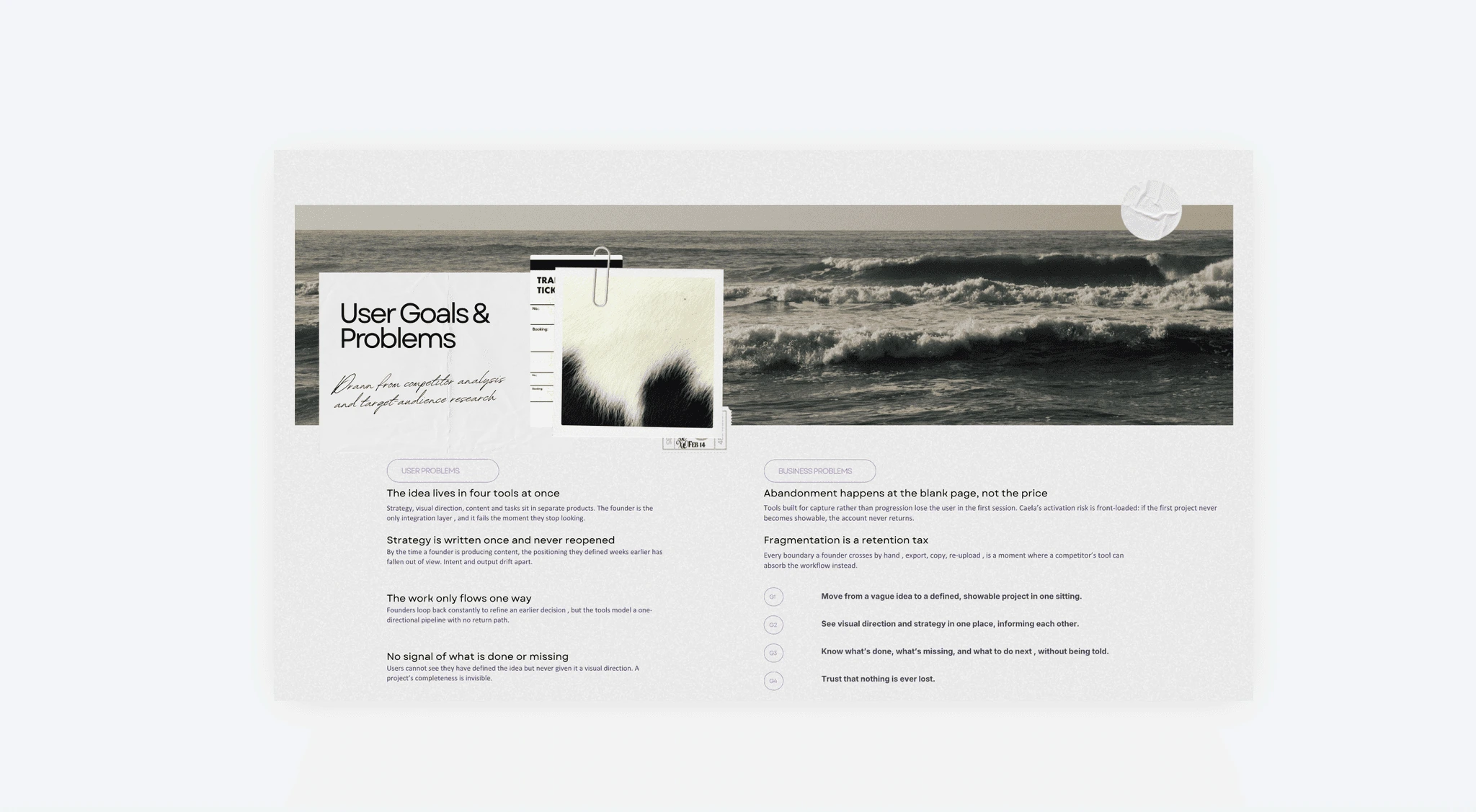
The gap was structural, this is where I checked whether founders actually felt it, and turned four complaints into four things the product had to do.
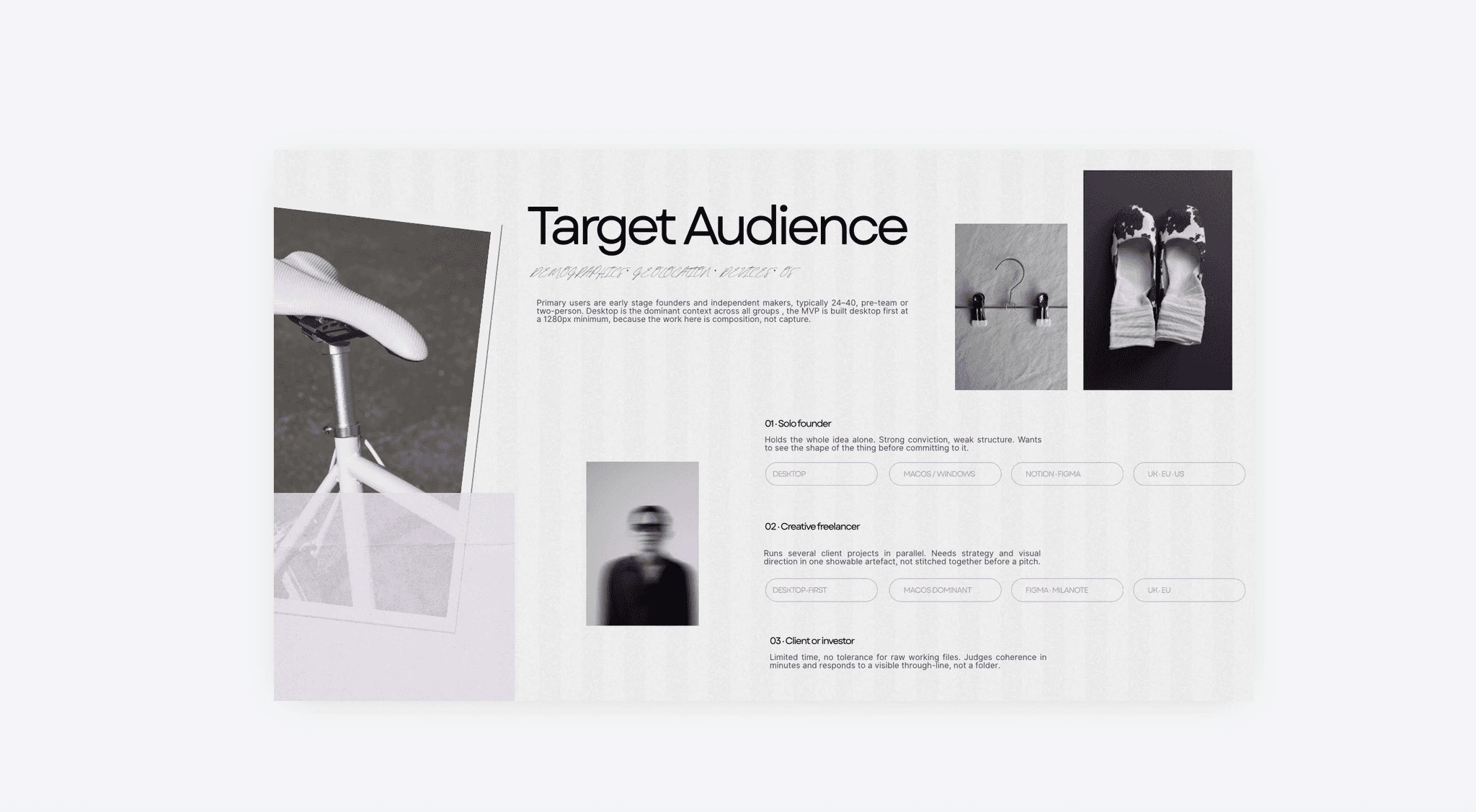
The founder wants to see the shape before committing. The investor wants a through line, not a folder. Same requirement, opposite ends.
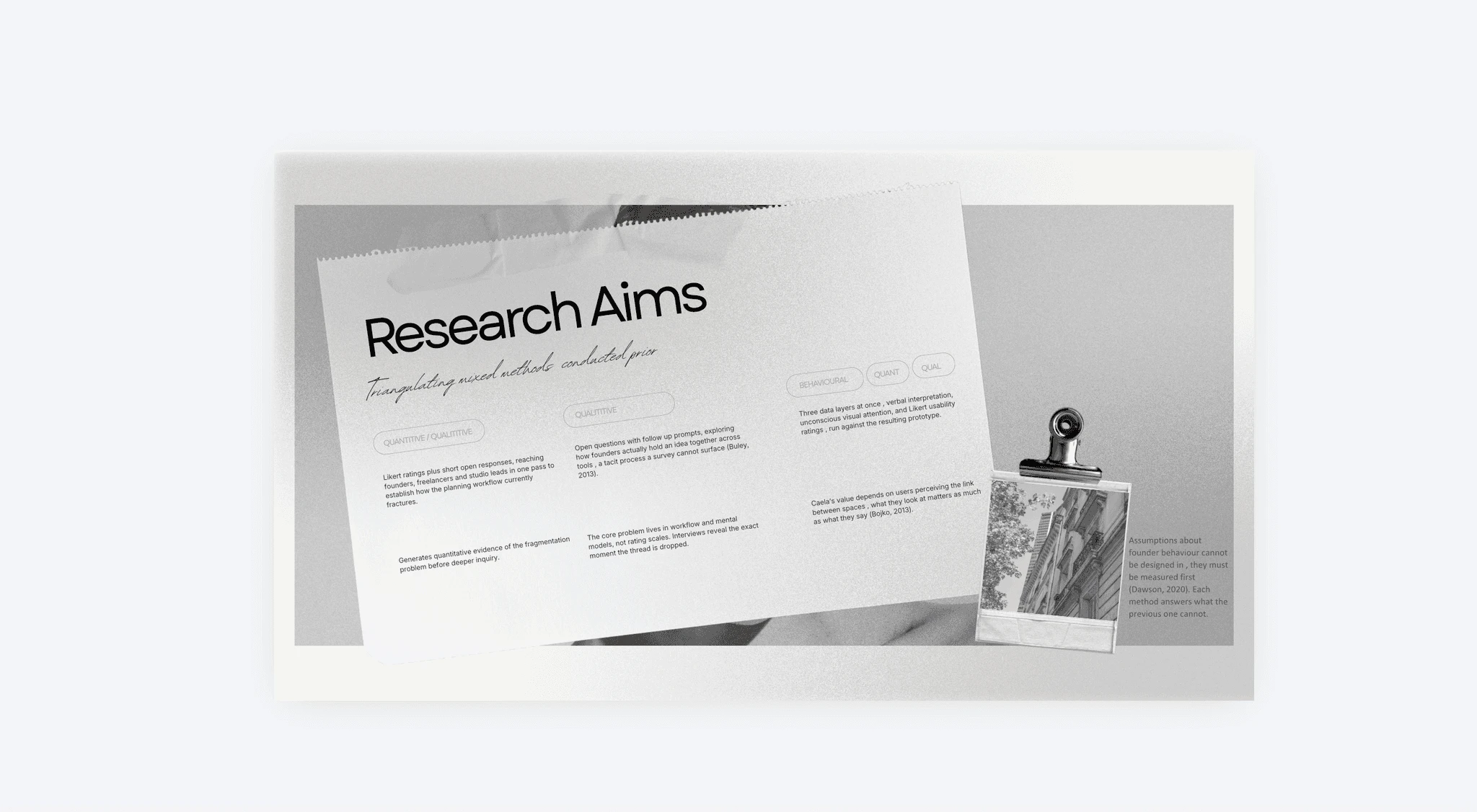
Rating scales can't reach a mental model and interviews can't reach attention, so the aims were stacked rather than picked.
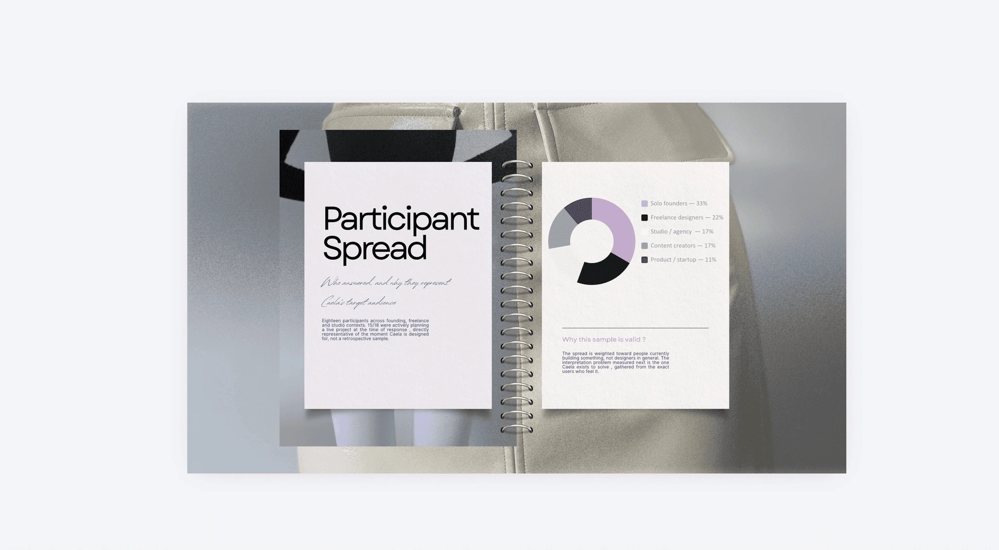
Weighted toward active projects, not designers in general , so the problem was measured in the moment Caela is designed for.
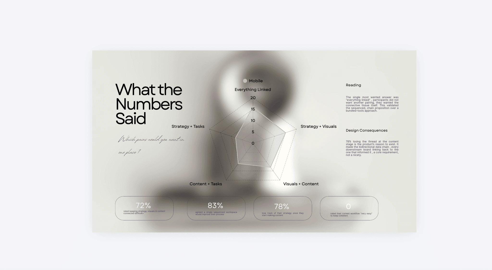
They didn't want a better pairing, they wanted the thread , which is why the spaces run in sequence rather than side by side.
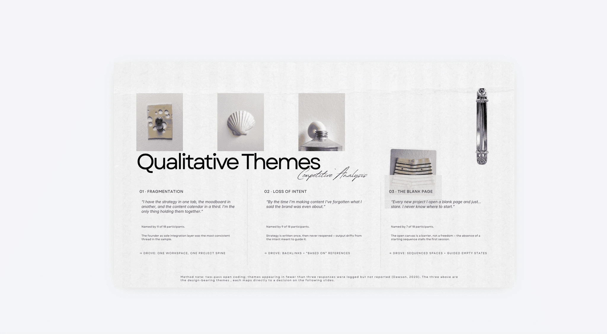
Three themes cleared the threshold , fragmentation, loss of intent, the blank page , and none of them entered the build without a count behind it.
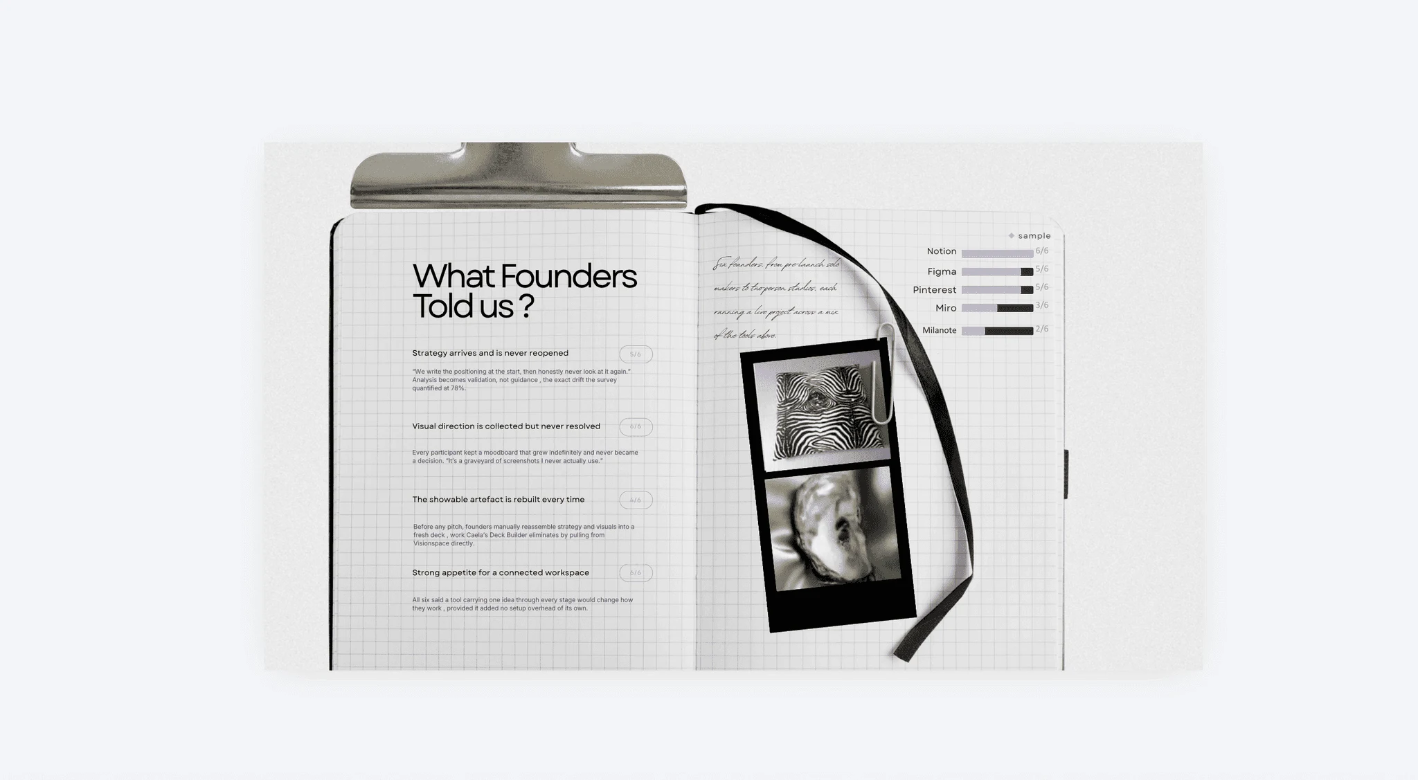
All six on Notion: 5/6 never reopen positioning, 6/6 hoard an unresolved moodboard, 4/6 rebuild the deck by hand.
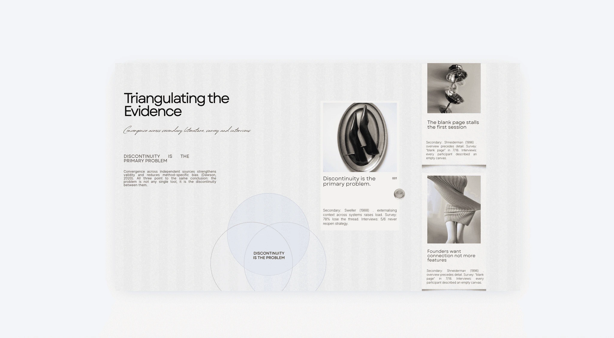
All three sources pointed at discontinuity, so the roadmap bought connection instead of more features.
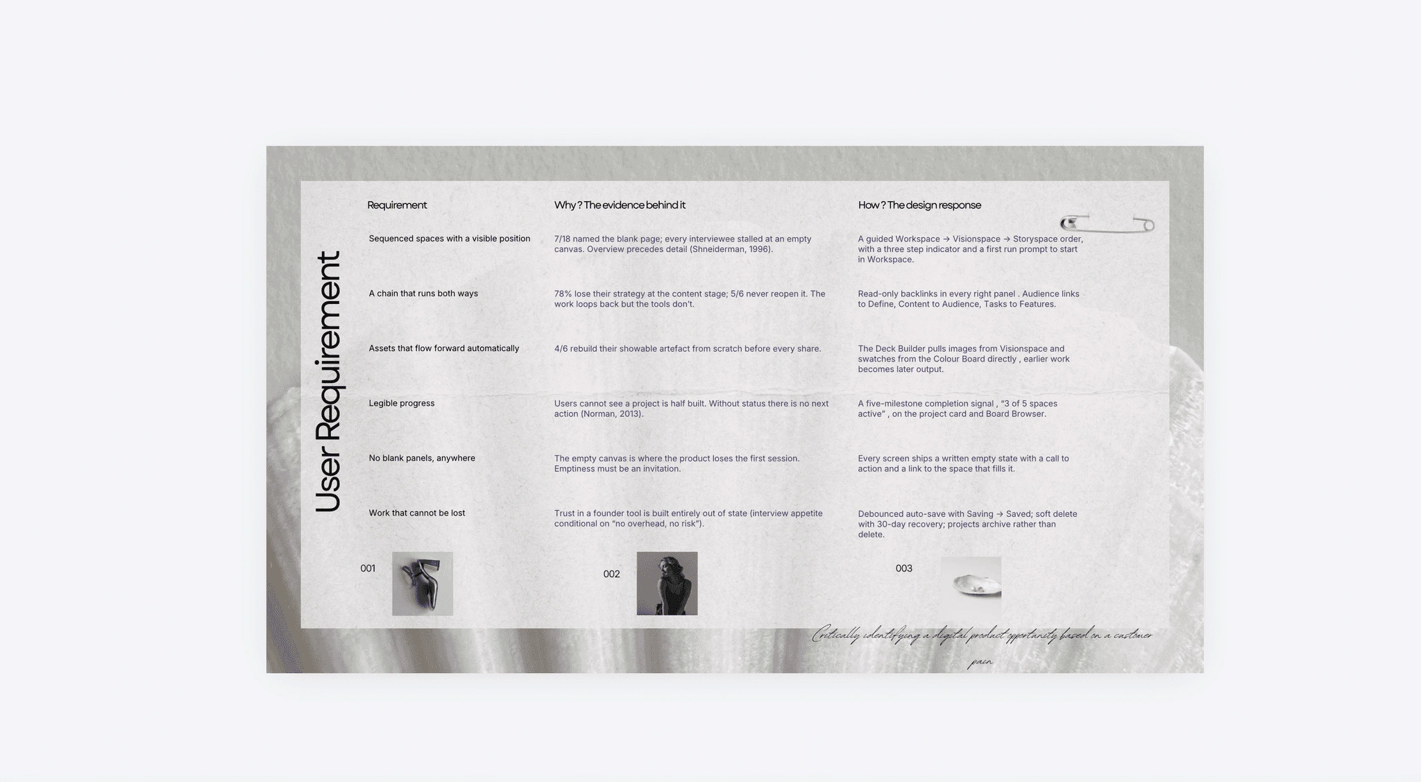
Every requirement carries its evidence , blank page, lost strategy, manual rebuild, invisible progress , so nothing reached the build on instinct.
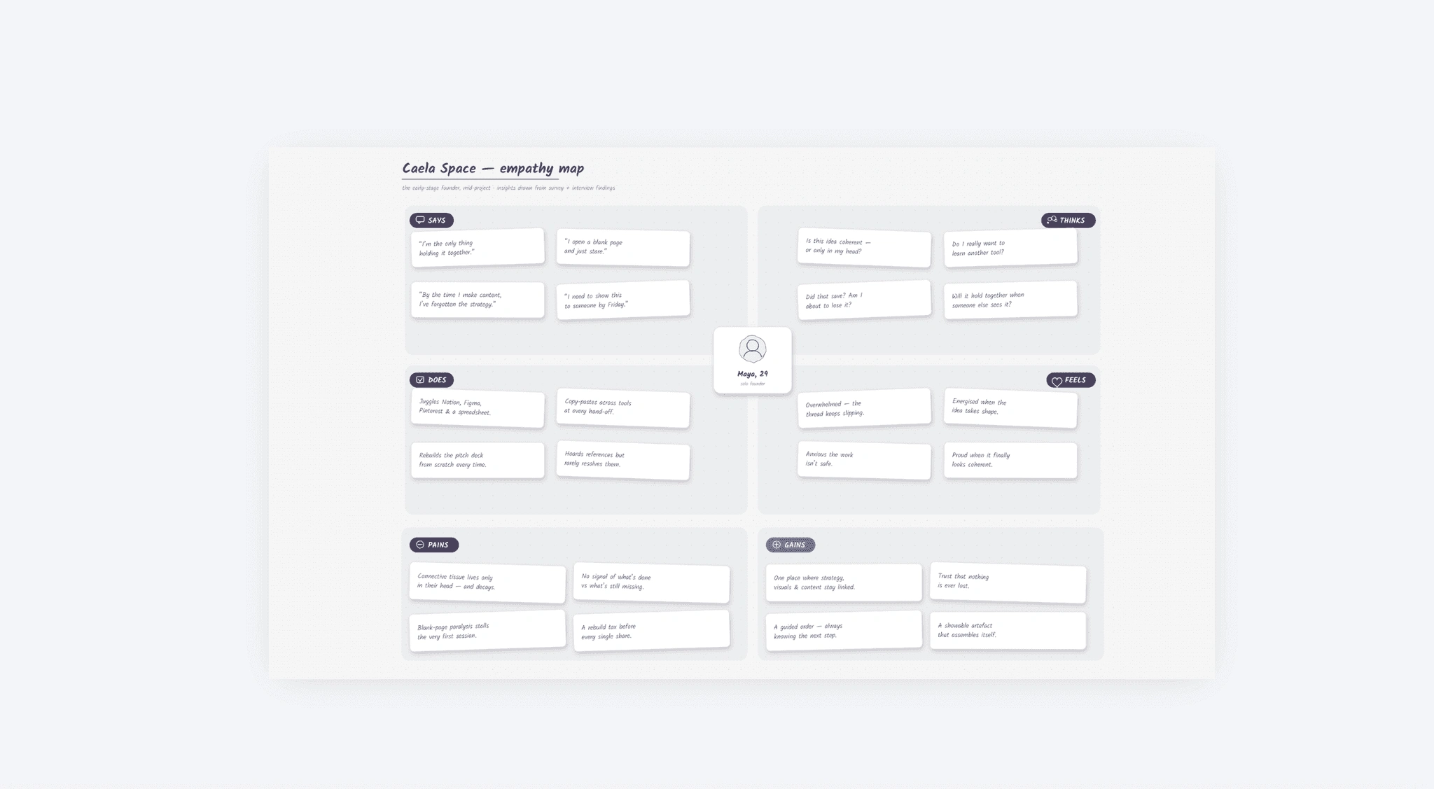
Consolidating 18 surveys and 6 interviews into one founder made the pattern visible.
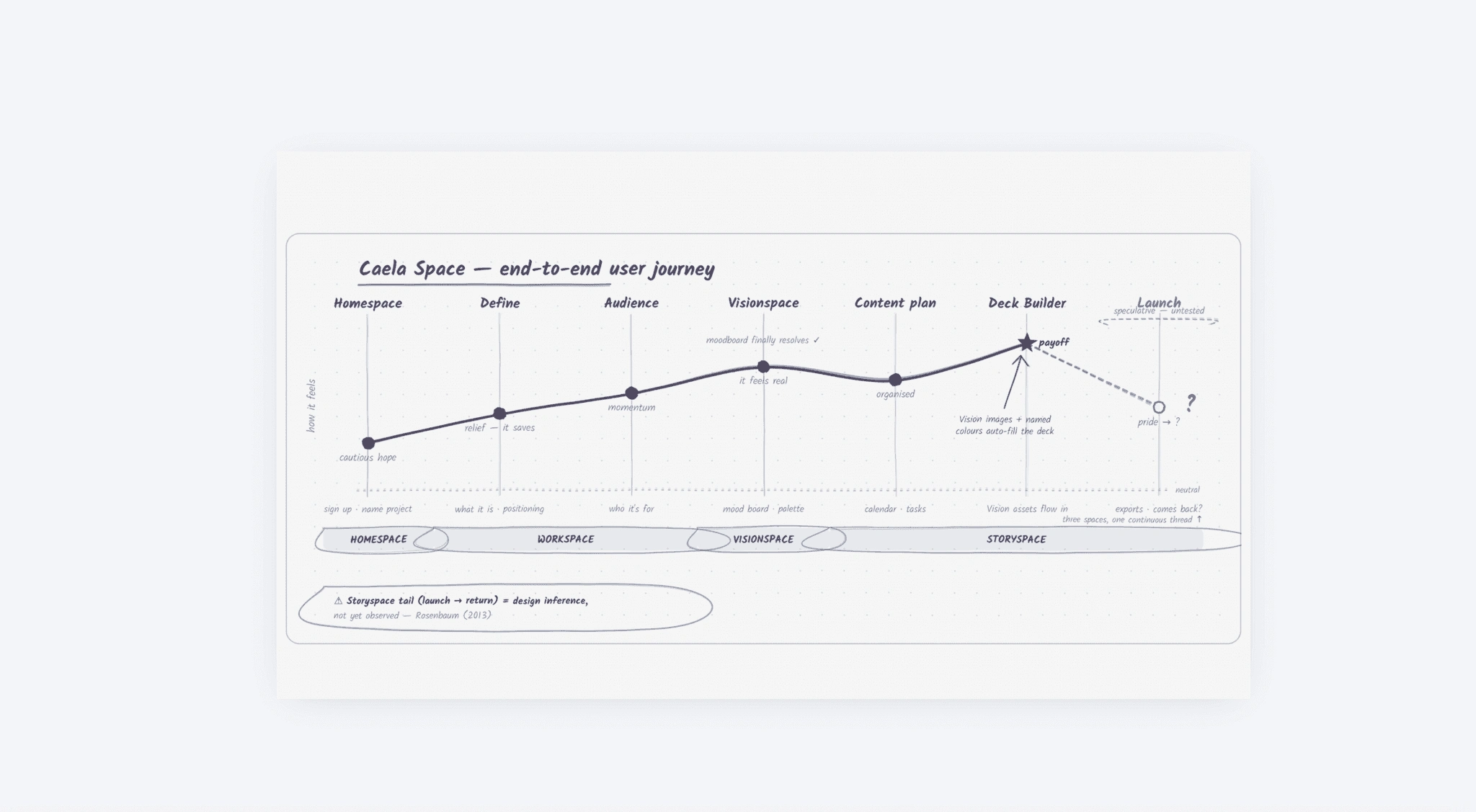
The curve peaks where Vision assets auto fill the deck. In testing, 3 of 5 didn't notice it happening.
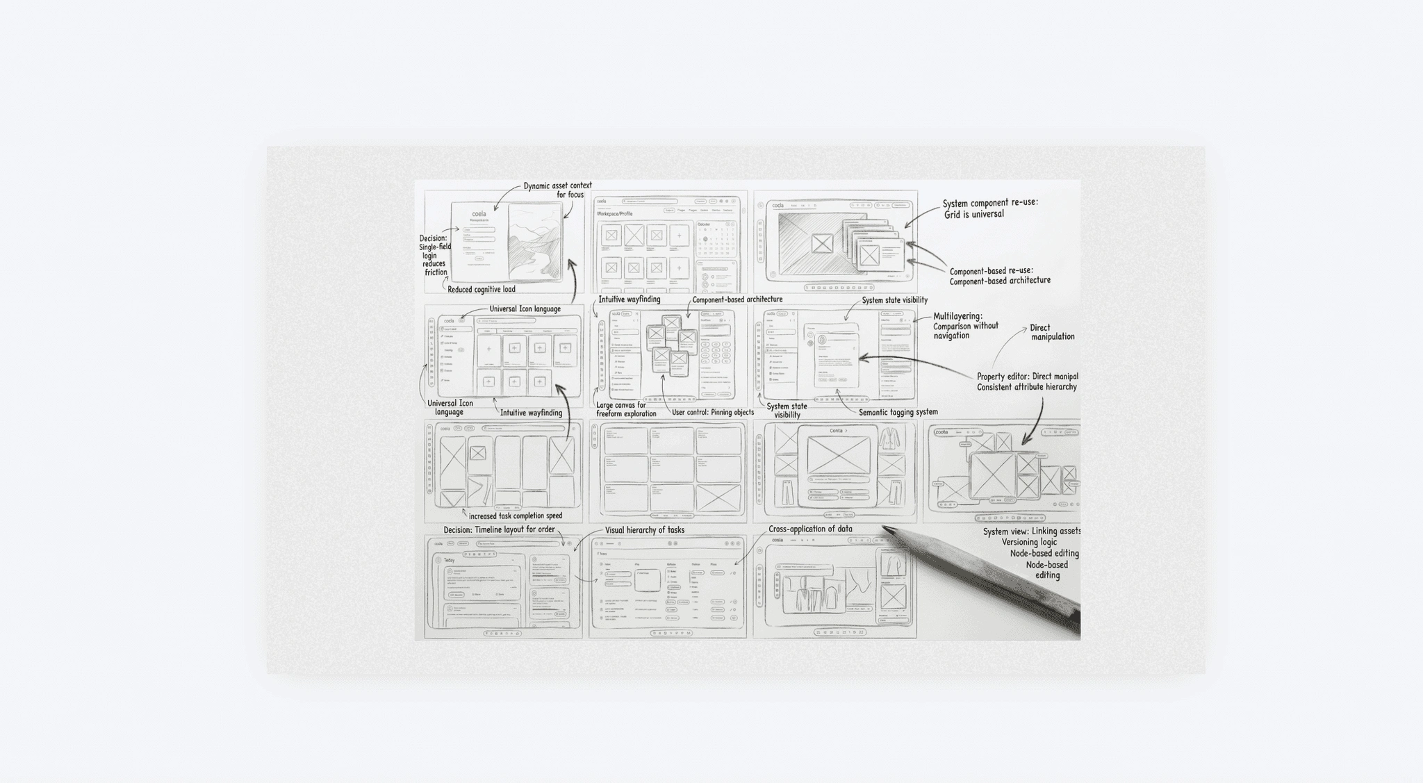
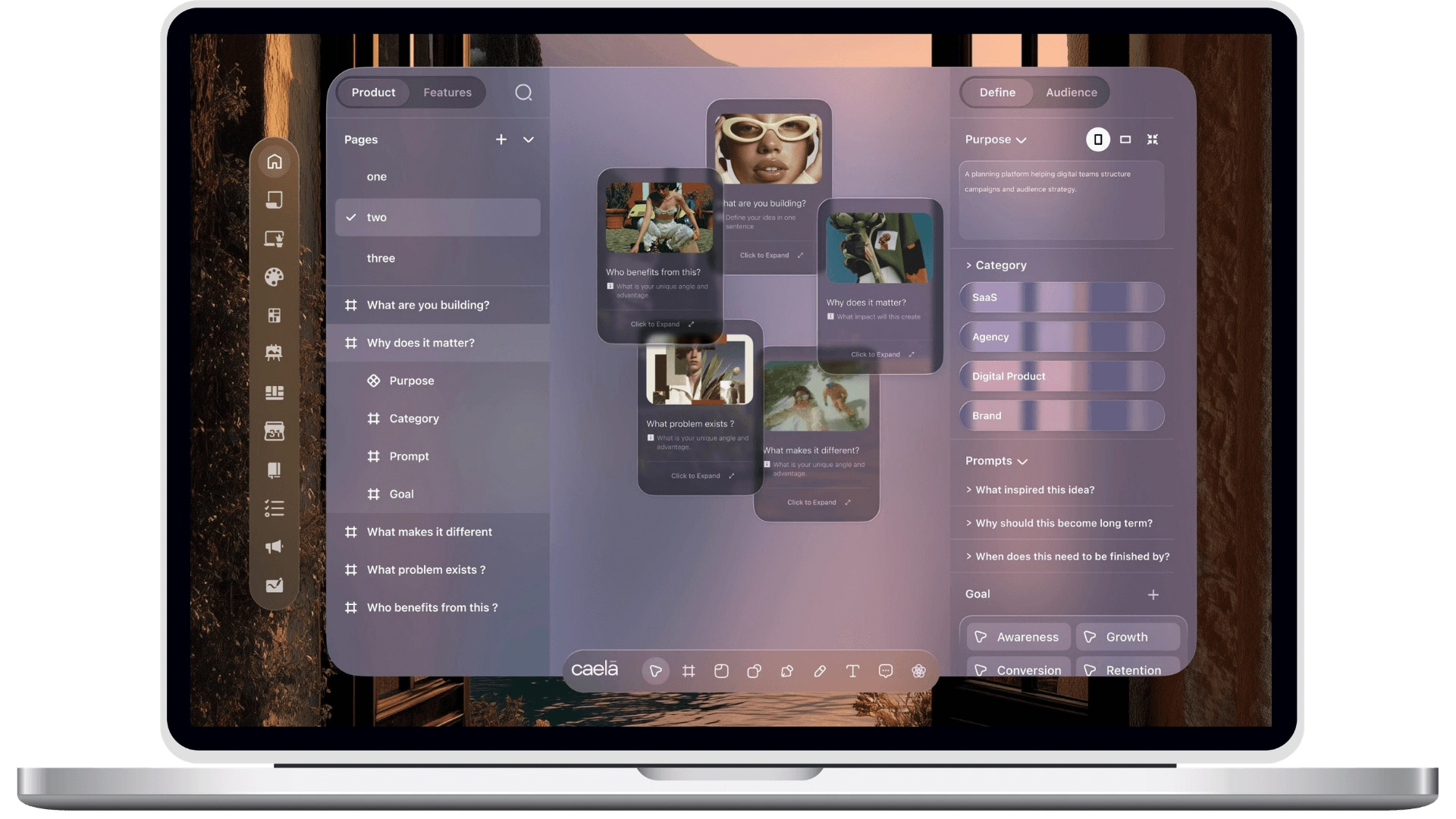
Every frame carries its decision in the margin: singlefield login for friction, universal grid for re-use, timeline layout for order.
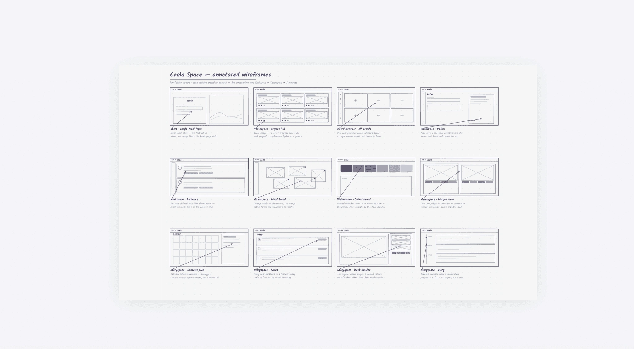
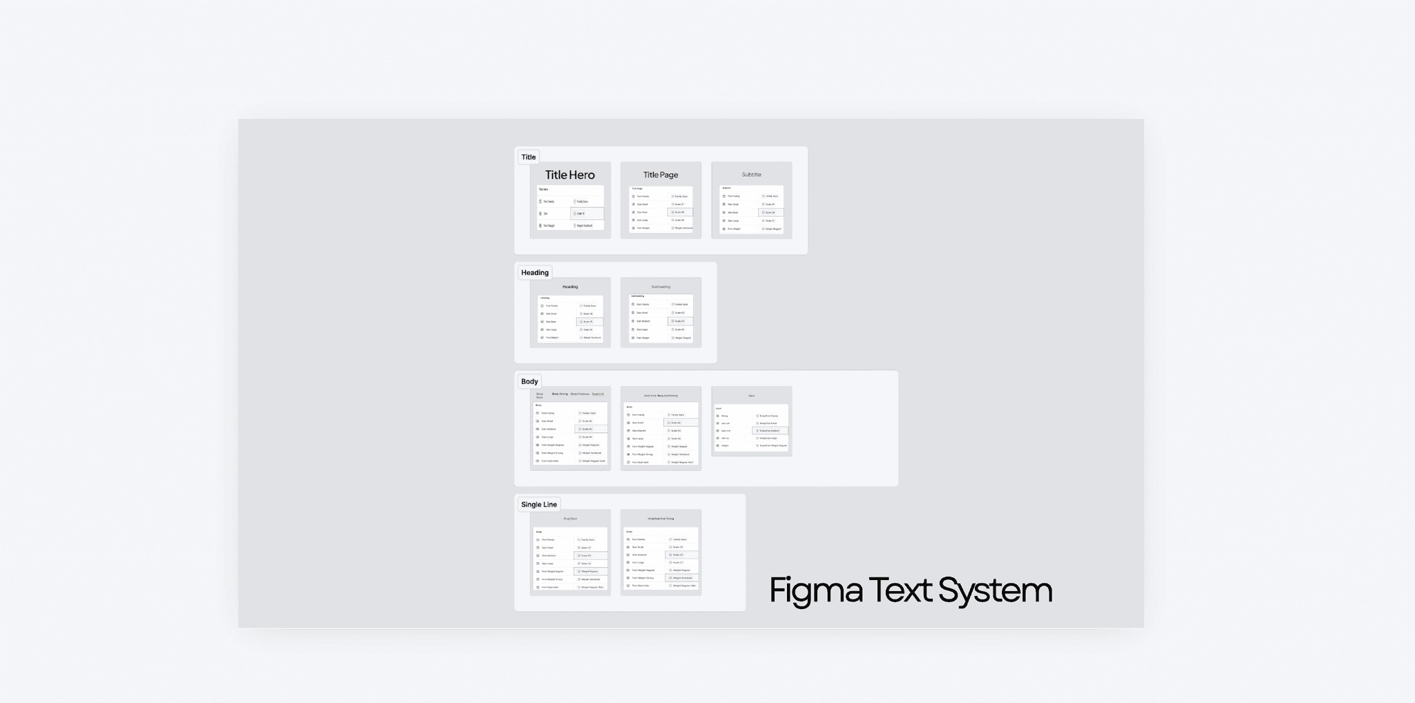
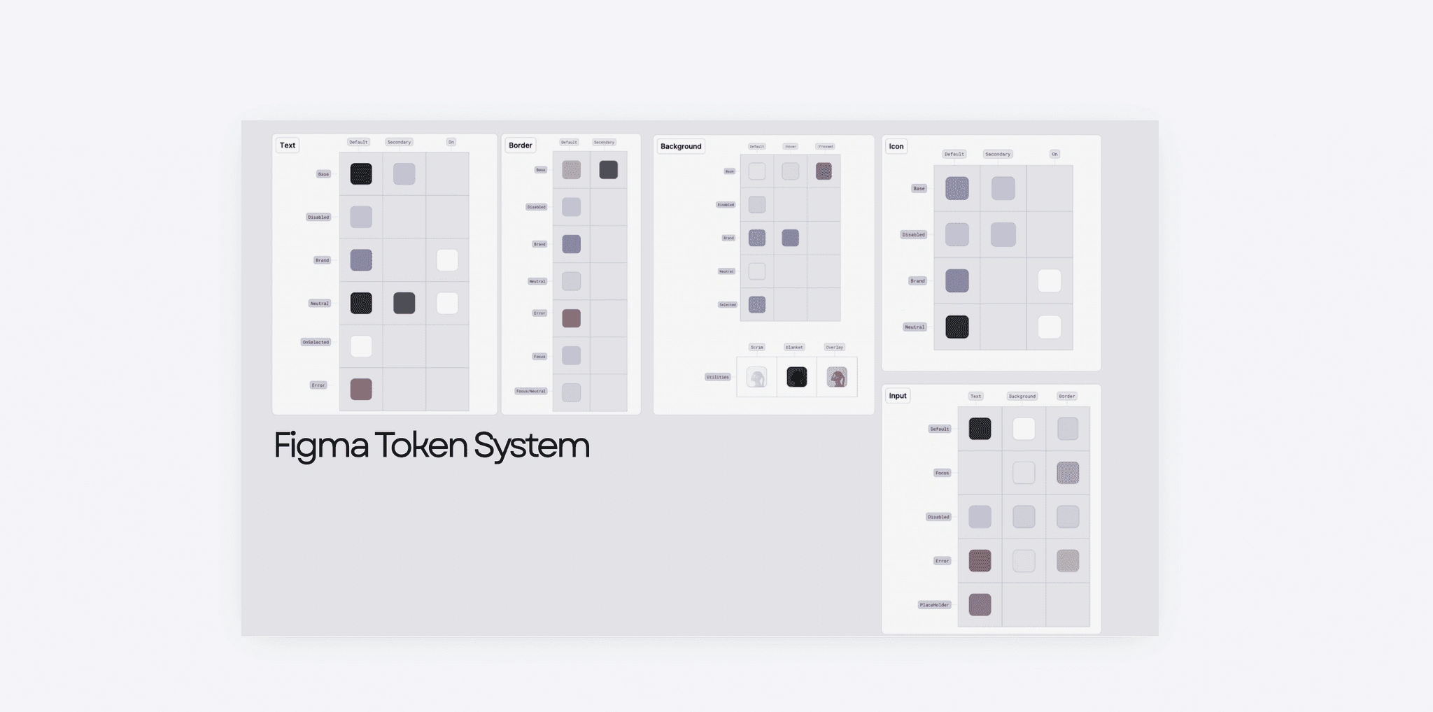
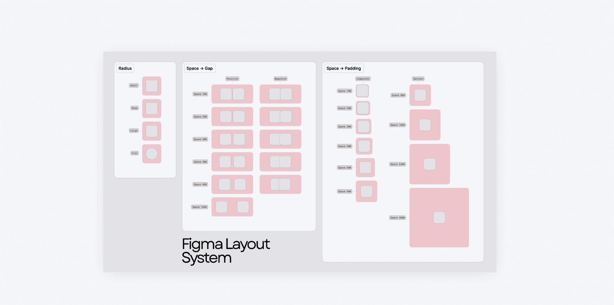
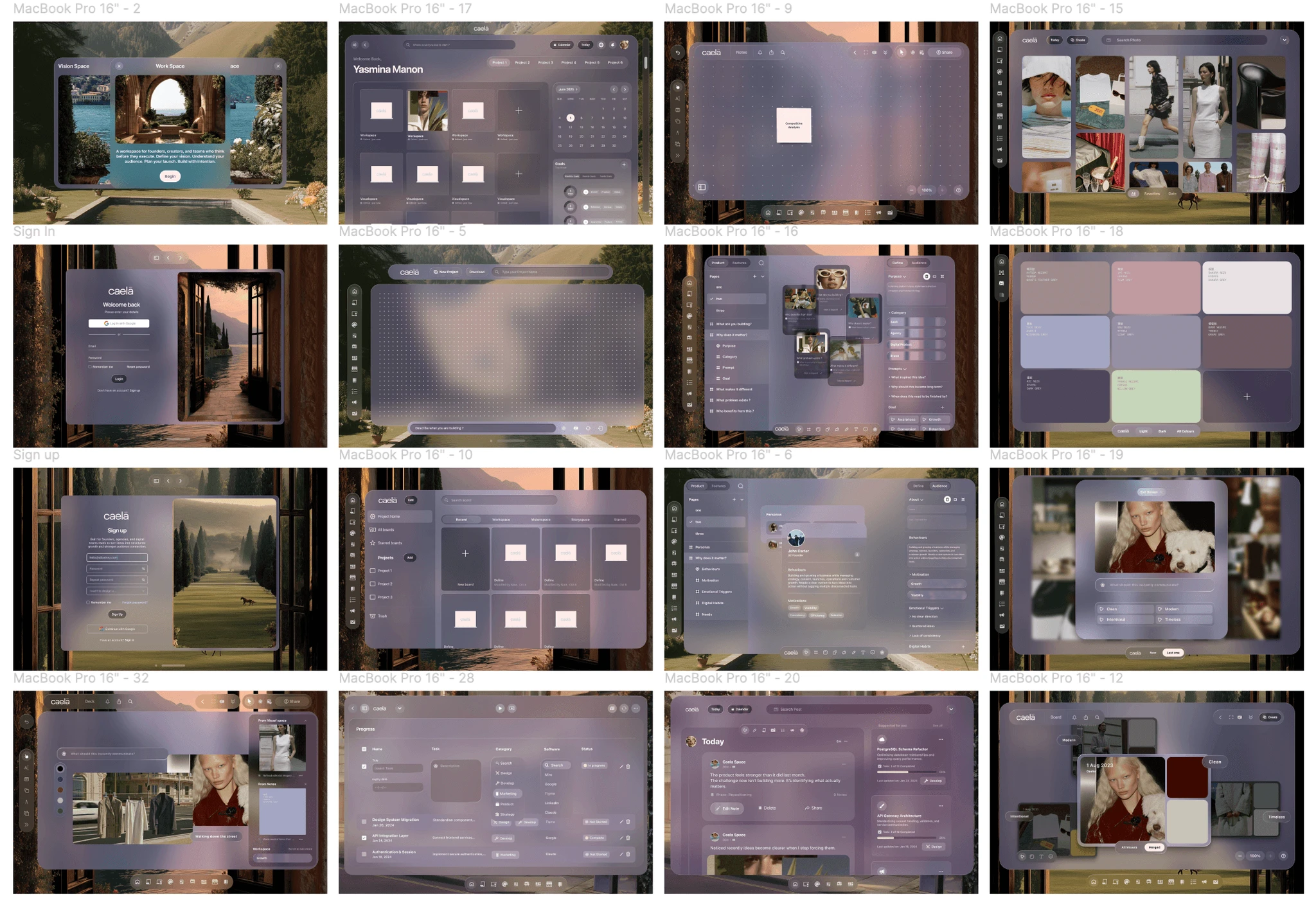
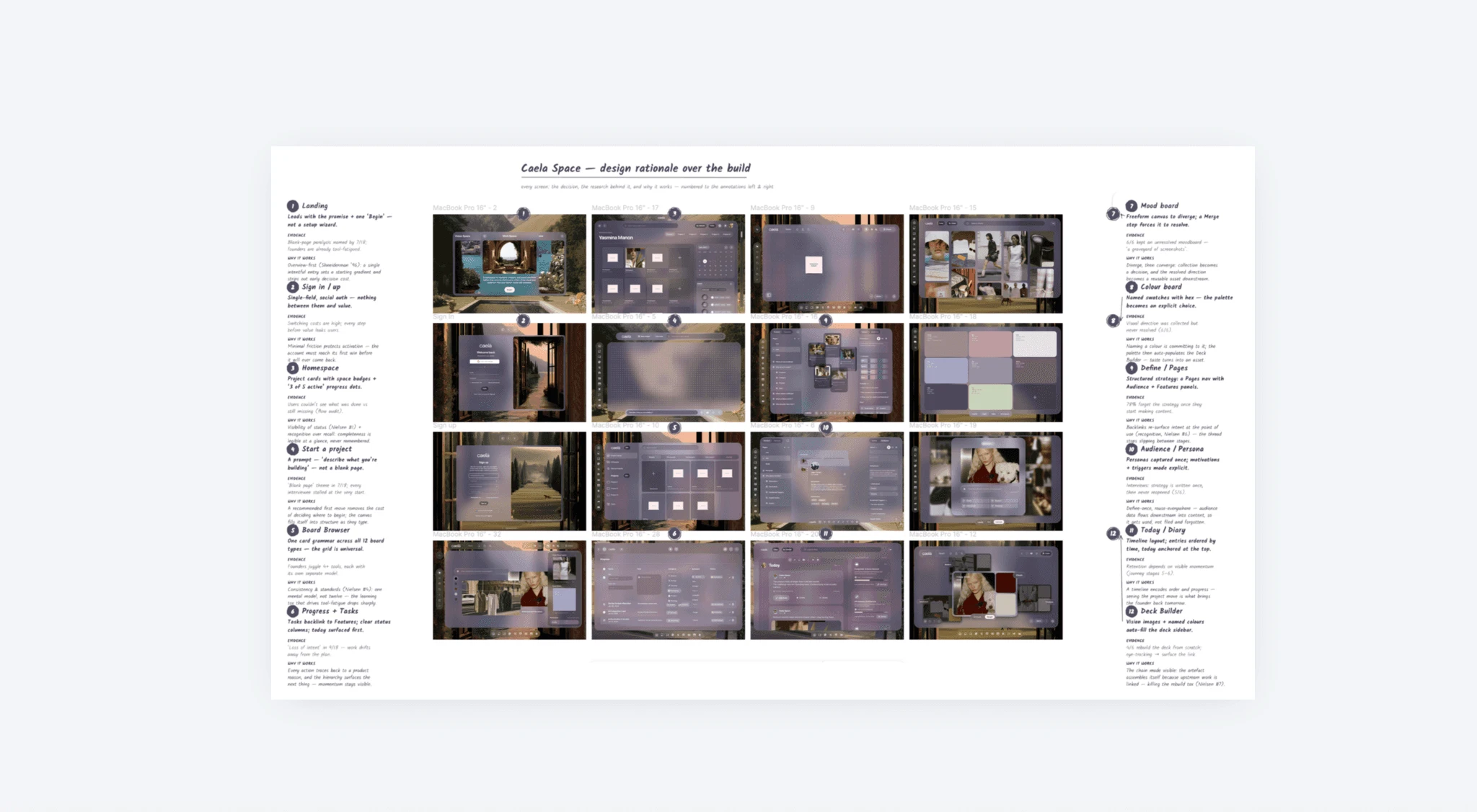
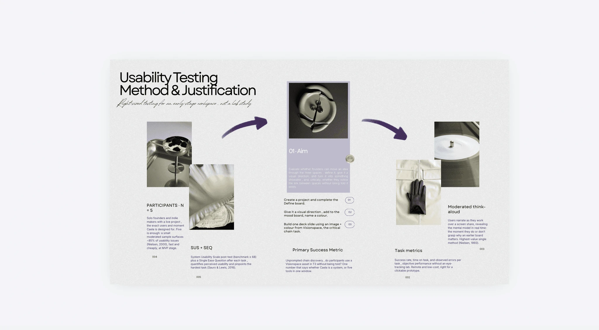
Three tasks, five founders, scored on SUS and ease , small enough for a prototype, big enough to find the breaks.
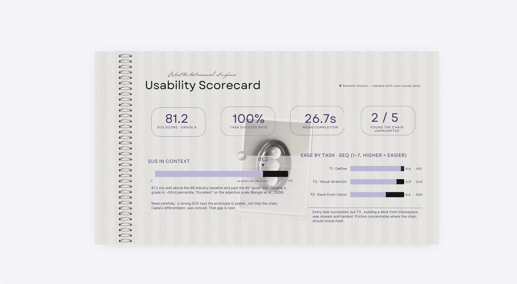
Grade A on usability, 100% completion, and a precise redesign target handed over by the numbers.
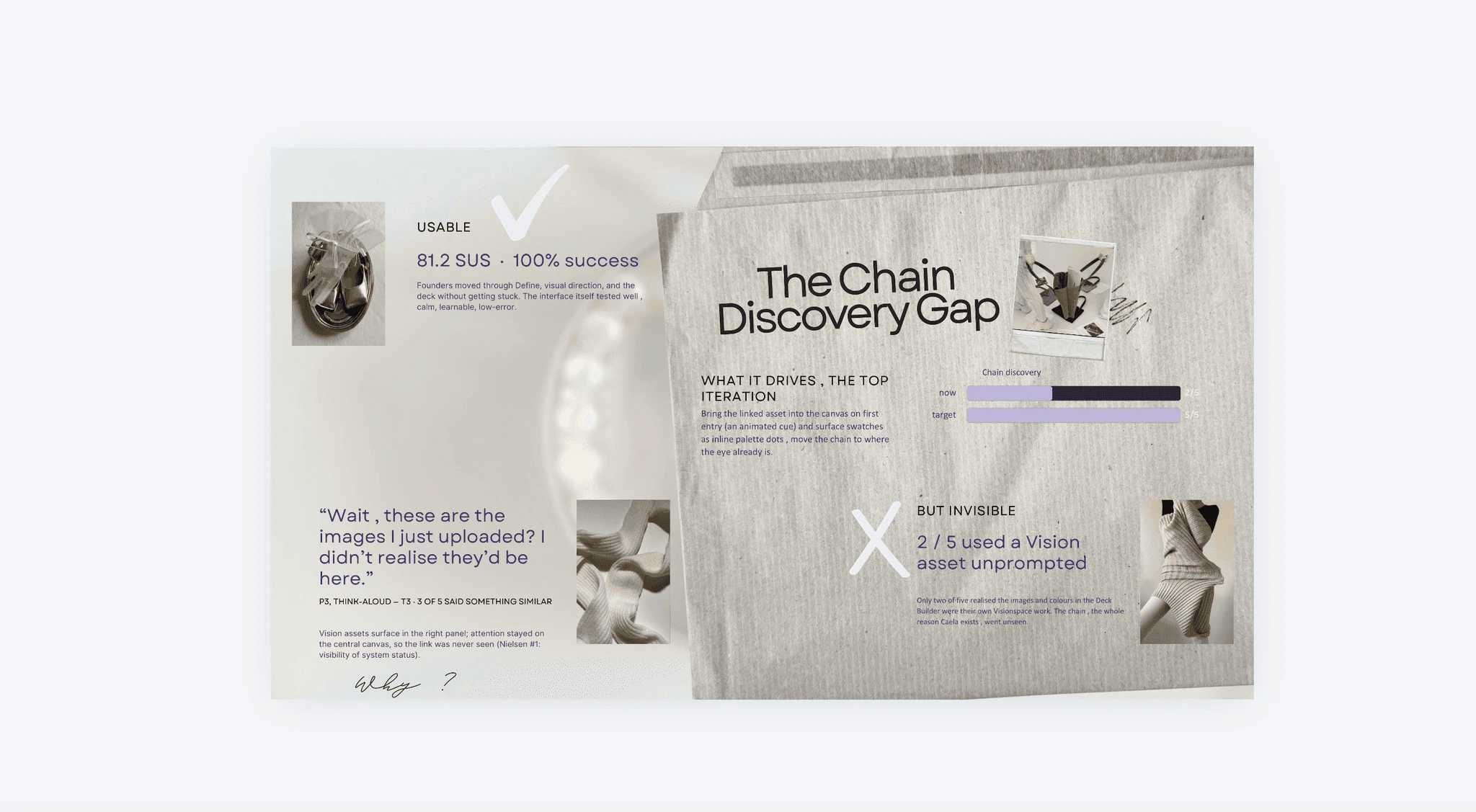
The assets sat in the right panel while attention stayed on the canvas, so the fix is placement, and the target is 5/5.
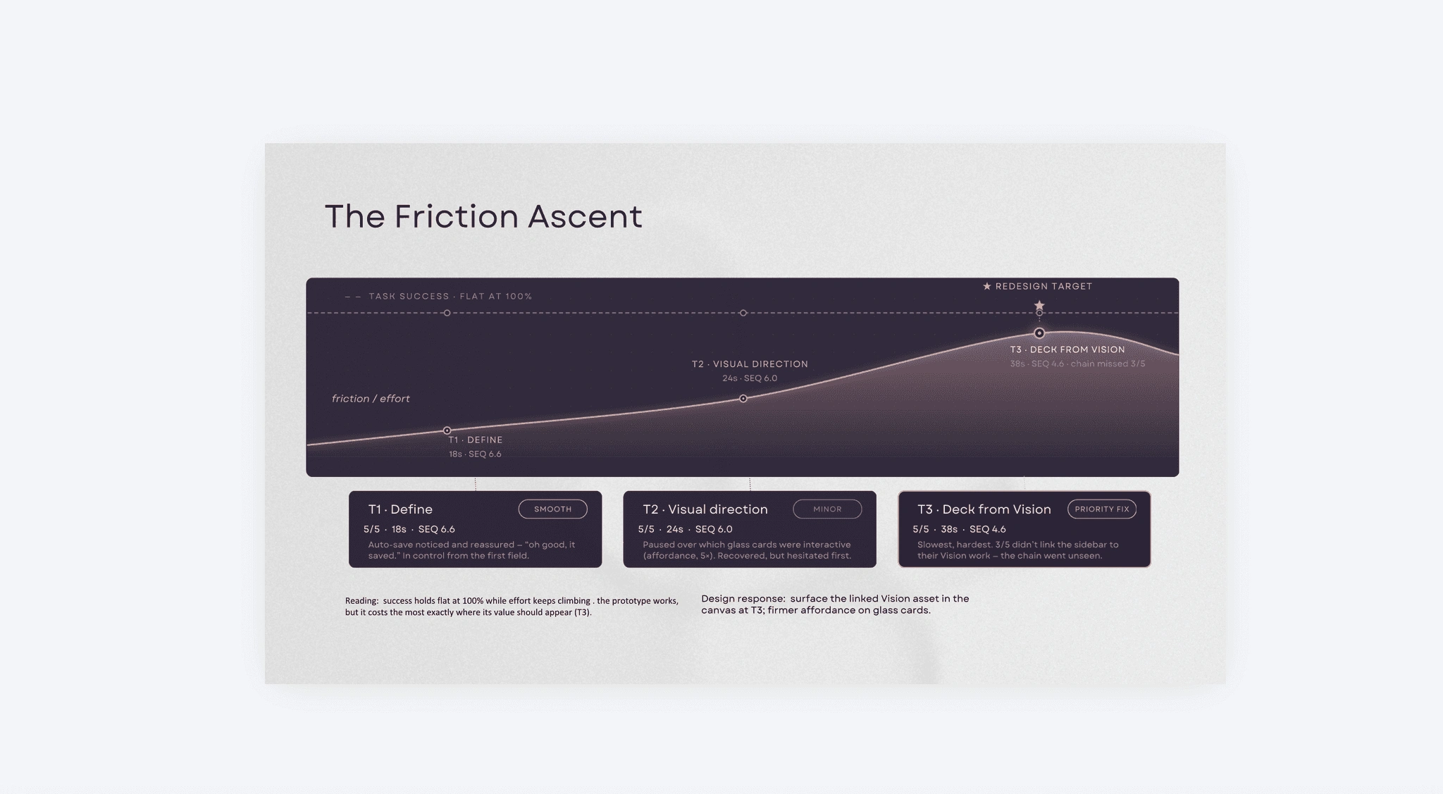
Success held flat while effort climbed , the clearest possible signal of where to spend the next iteration.
Video Walkthrough
©26
Year
2026
Figma,
Claude Design
Claude
Cursor
Introduction
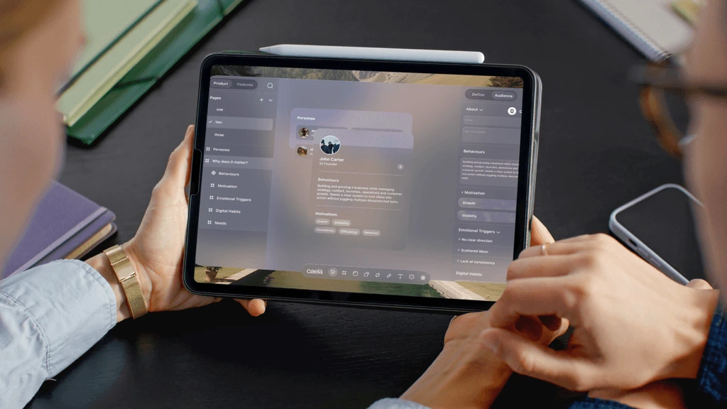
Caela Space is a sequenced workspace for early stage founders that carries one idea from strategic definition through visual direction to published content, replacing four disconnected tools with a single chain that runs both ways.
The Problem
Fragmented workflow: Positioning in a doc, visual direction on a board, content in a spreadsheet. The founder is the only integration layer.
Idea decay: Strategy gets written once and never reopened. The intent and the output drift apart.
The blank page: Every project opens as an empty canvas with no order to it, and the first session stalls before a single decision.
Outcome
chinenyé
©2026
0/6
0123456789
Participants
Six of six interviewees said a tool carrying one idea through every stage would change how they work, provided it added no setup of its own.
0.2%
0123456789
Usability Score
Task success: 5/5 participants completed all three prototype tasks, scoring 81.2/100 on the System Usability Scale , above the 68 baseline and past the 80 mark.
0.7s
0123456789
Mean Task Time
Across all three tasks and five participants. Idea to showable slide on a first encounter, with no walkthrough. Times held steady across the group, which points to an interface that is learnable rather than guessable.
Built Solo, research, IA, prototype, and usability testing.
Evidence
83%wantedonesequencedworkspace
78%losetheirstrategyoncetheystartmakingcontent
0of18ratedtheircurrentworkflow"veryeasy"tokeepcoherent


Reflection
chinenyé
©2026
As a Product designer who believes an idea should stay whole, not scattered.
The hard part wasn't the interface , it was resisting the urge to design before I'd earned the right to. Every screen I sketched before the research settled got thrown away.
Three connected spaces taught me to think in dependencies rather than pages: no board could change without rippling into two others. That's changed how much structure I put in before any style.
Testing was the sharpest lesson. The prototype scored well and still missed the point I'd built it around. A coherent system isn't automatically a legible one , two different jobs, and I design for the second one deliberately now.

Like this project
Posted Aug 13, 2026
Sequenced workspace for early-stage founders that carries one idea from strategic definition through visual direction to published content; prototype scored high usability.
Likes
1
Views
7