Built with Jitter
Vivienne Rôse E-commerce Platform Design

Nilkanth Devani


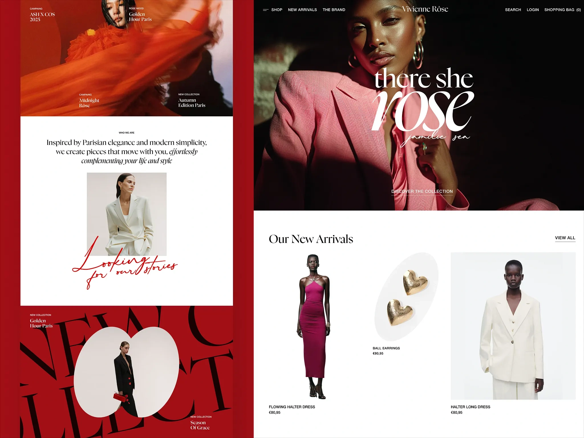
Meet Vivienne Rôse — a bold e-commerce concept for a women’s fashion brand that dares to stand apart while staying beautifully intuitive.
Vivienne Rôse is not just another clothing store online — it’s a daring digital stage for refined femininity. The design breaks away from typical fashion templates, embracing strong layouts, striking contrasts, and an editorial rhythm that feels more like a magazine than a shop.
Yet, beneath its bold visual language lies an experience that is seamless and intuitive. Clear navigation, clean product discovery, and a frictionless checkout make sure nothing stands between the user and her perfect piece. Every detail, from storytelling-driven collections to immersive product pages, was crafted to balance creativity with clarity.
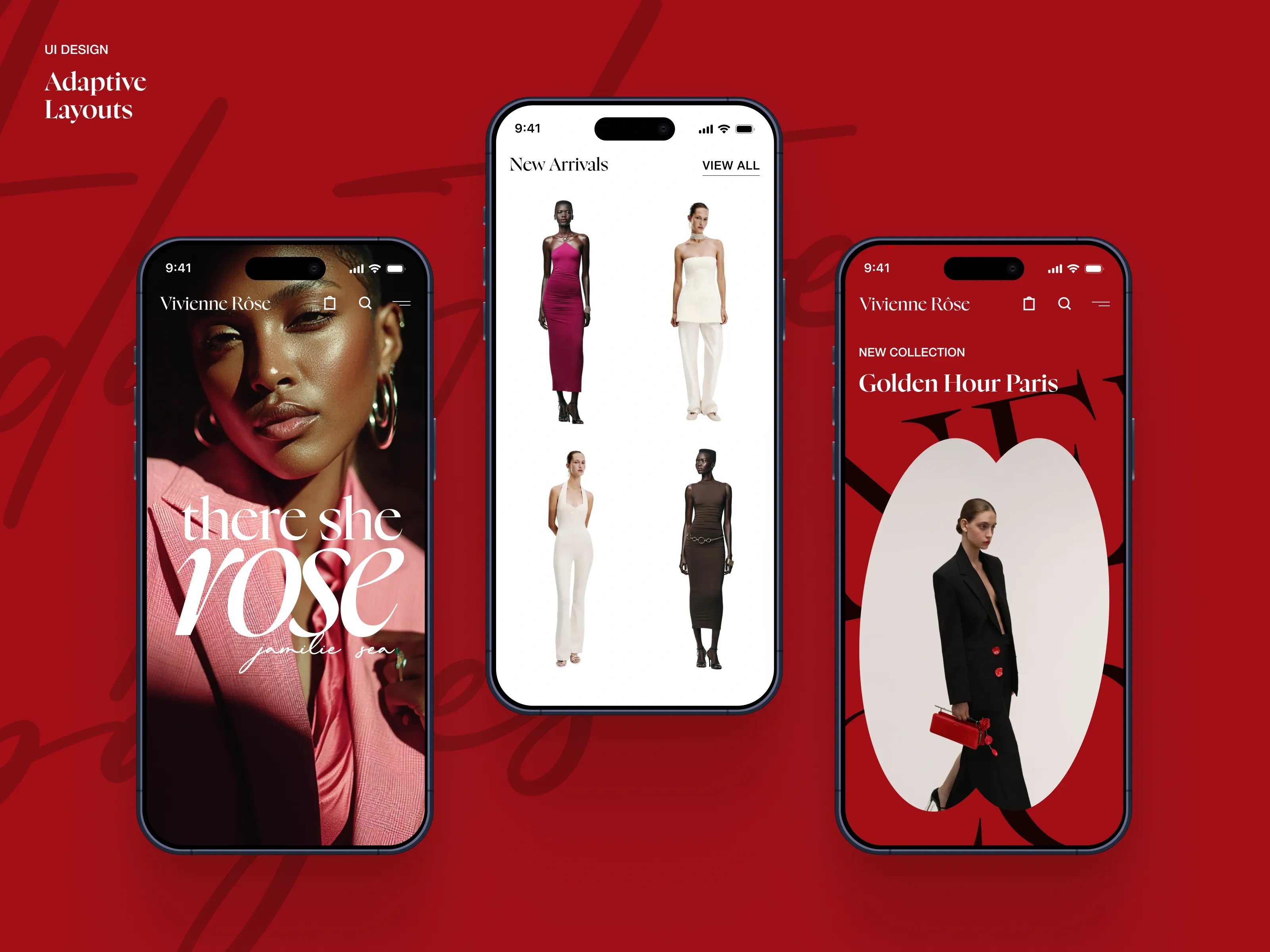
Fully Responsive Grid for Effortless Mobile Shopping
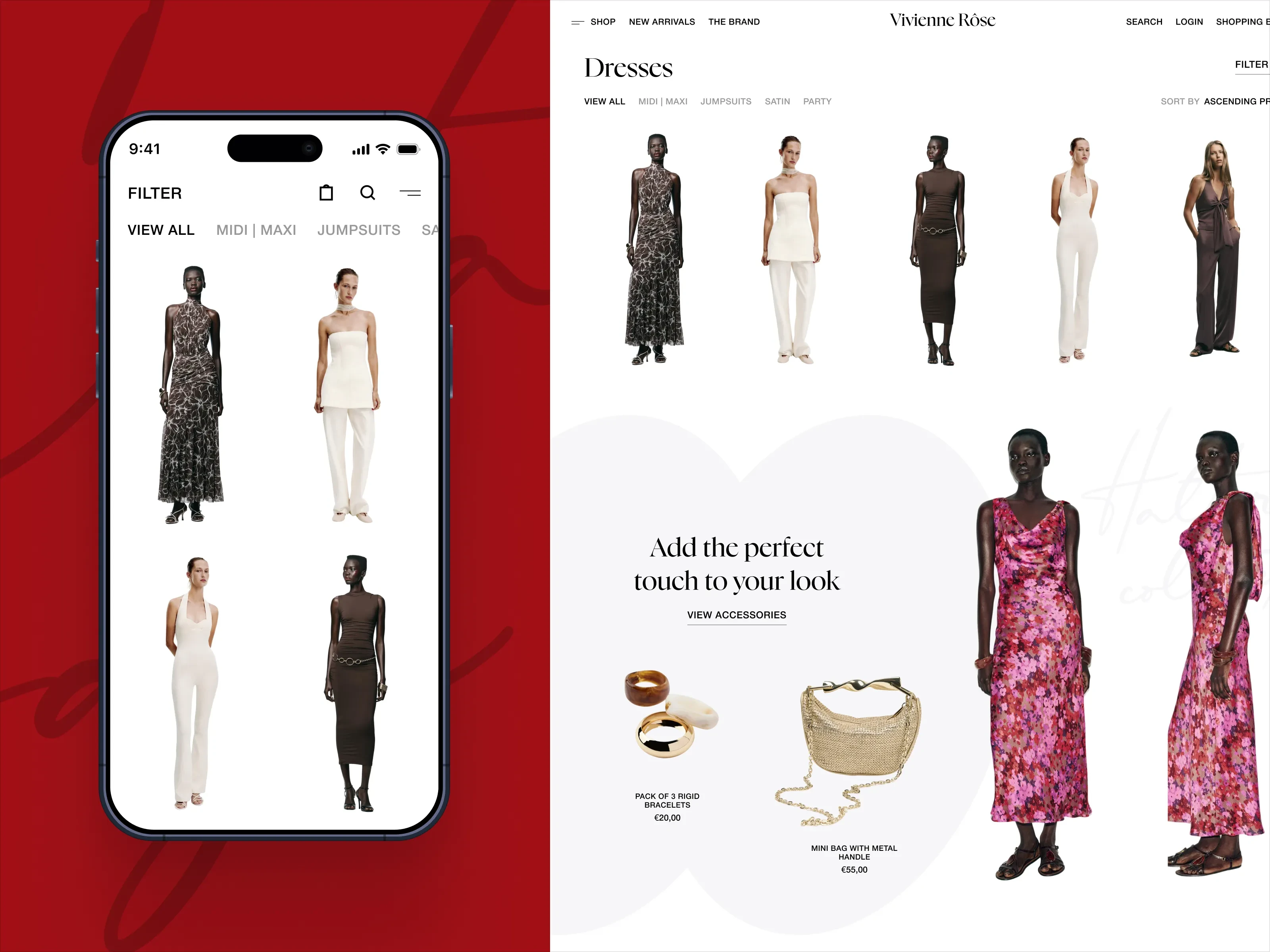
To ensure a seamless experience across all devices, we designed a fully responsive grid system that adapts gracefully to any screen size. Even with a complex editorial layout, the mobile version remains intuitive and elegant, preserving the brand’s refined aesthetic.
Shoppers can browse collections, explore product details, and complete purchases with ease — all optimized for touch interaction and fast loading. This adaptive design keeps the shopping journey smooth, accessible, and consistent, whether viewed on desktop, tablet, or smartphone.
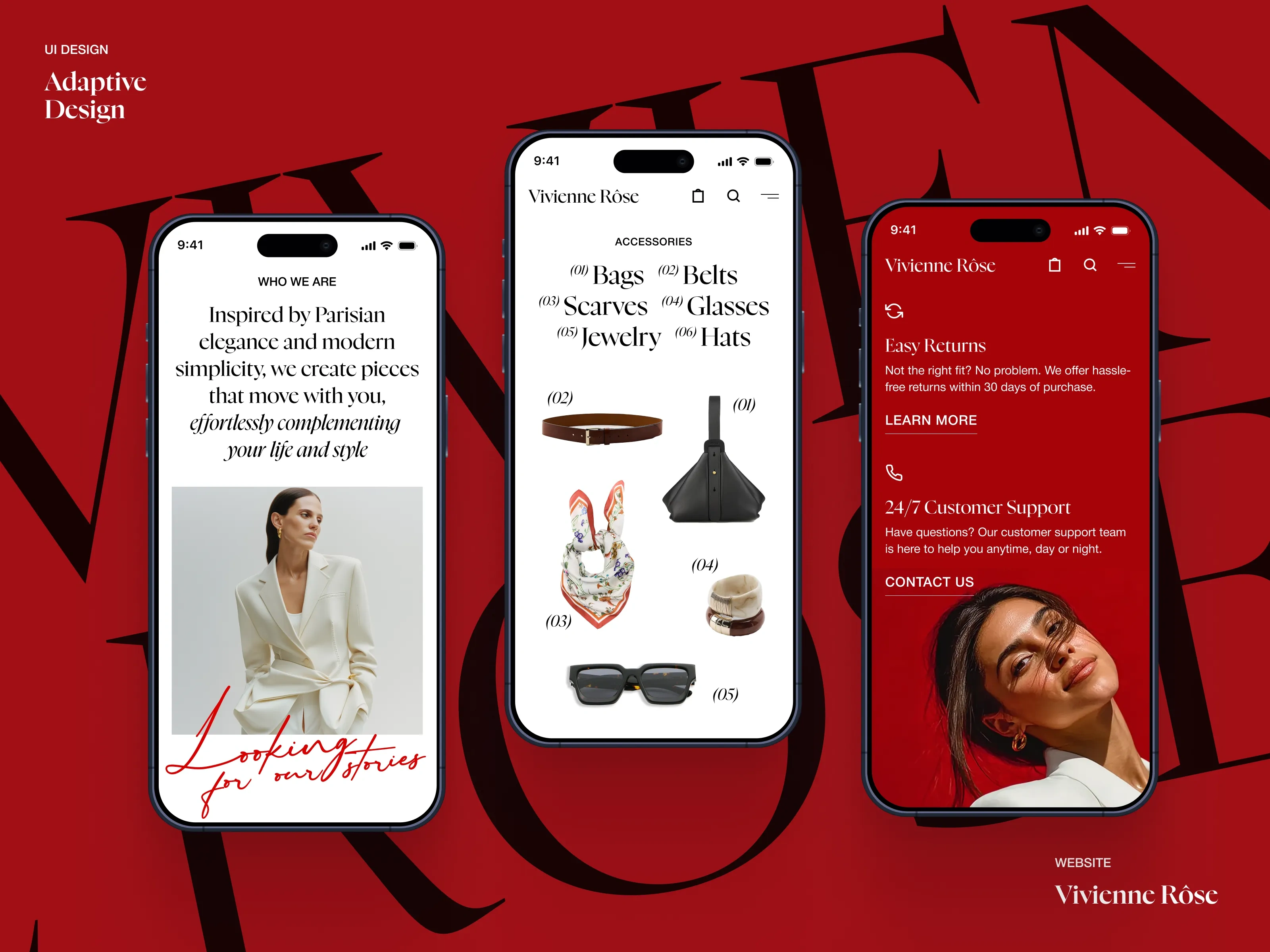
Fluid Elegance Across Every Screen
Adaptive layouts were a key focus of the Vivienne Rôse project. Despite using a complex editorial grid, we ensured that the entire experience remains seamless on any device. Each block — from hero imagery to product highlights — reflows naturally, keeping the design elegant without sacrificing usability.
This mobile-first approach allows the brand’s refined aesthetic to stay consistent, while guaranteeing a smooth and intuitive journey for modern, on-the-go users.
Elegant Shopping Made Simple
The catalog page highlights the brand’s collection in a clean, editorial layout that feels refined yet easy to navigate. Each product is given space to stand out, creating a calm shopping flow that keeps the focus on timeless style.
Designed with both elegance and usability in mind, the catalogue offers a smooth browsing experience that feels consistent and inspiring across every device.
Product Page for Refined Shopping
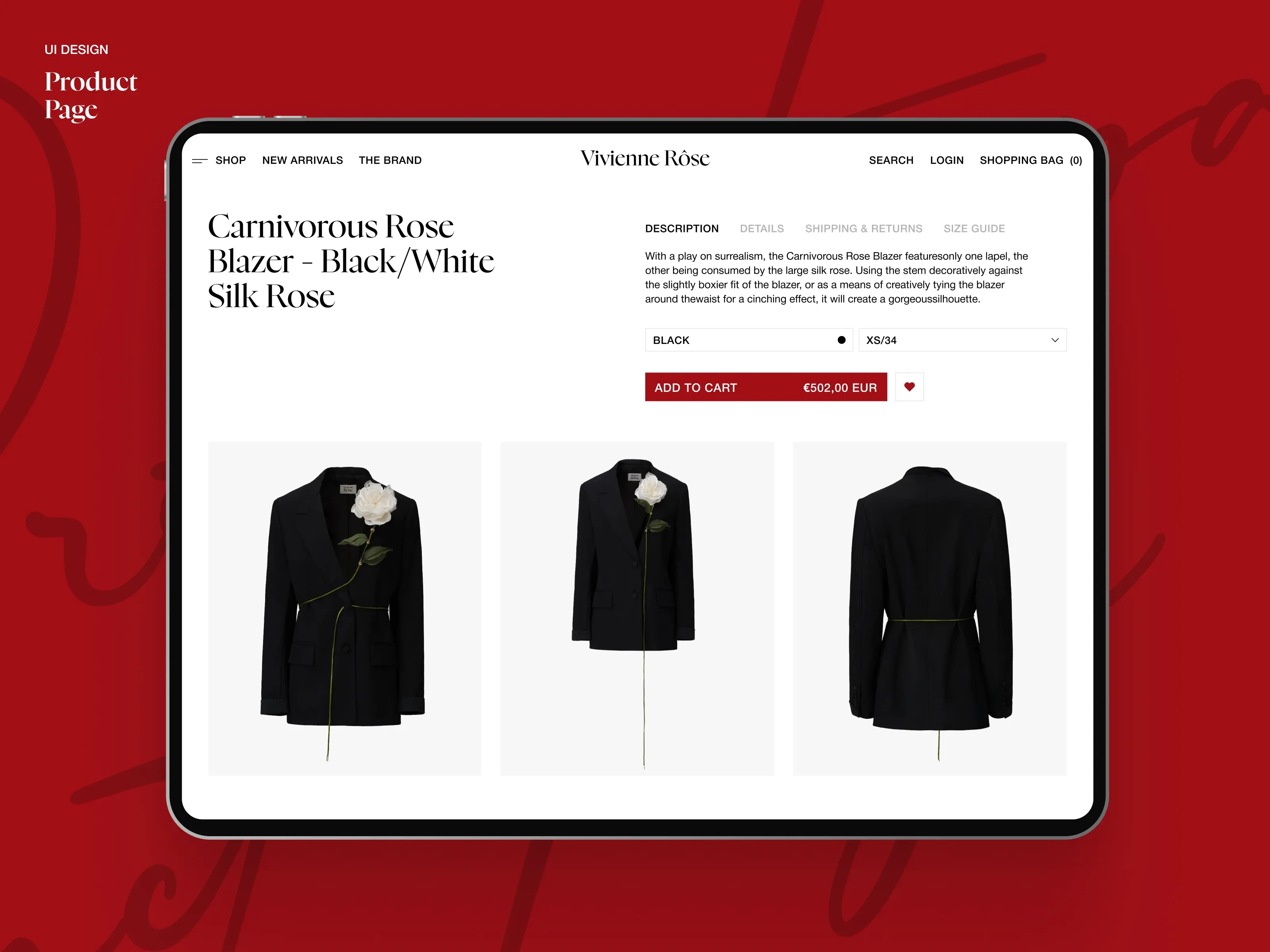
The product page is crafted as an elegant editorial showcase, giving each piece the spotlight it deserves. Large, high-quality visuals capture every angle of the garment, while minimal design and clean typography keep the focus on form and detail.
With a clear purchase flow and thoughtfully presented information, the page balances storytelling with usability — creating a shopping experience that feels elevated, inspiring, and true to the brand’s aesthetic.
Like this project
Posted Jul 28, 2026
Vivienne Rôse is not just another clothing store online. It’s a daring digital stage for refined femininity. The design breaks away from typical fashion design.
Likes
3
Views
11