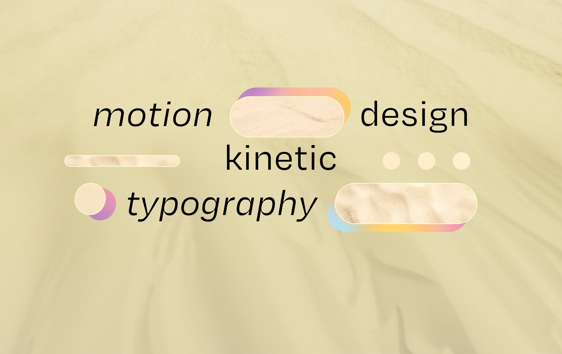
Kinetic Typography & Motion Design Video for SaaS Fintech
Mark Pavlyshyn
How do you force users to read 60 words about a complex SaaS?
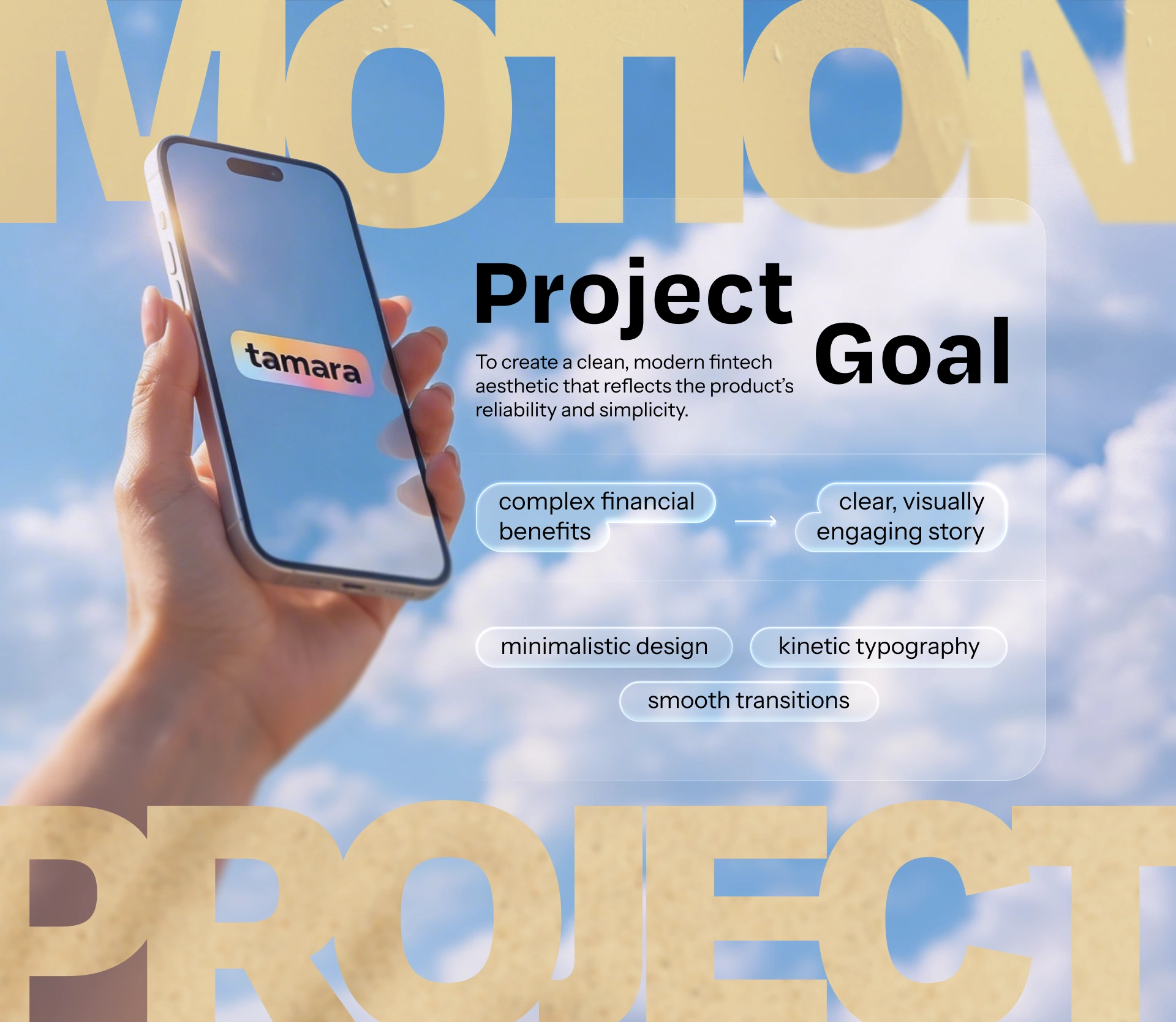
Tech startup marketers challenged me to build a promo video for their latest campaign. They possessed a powerful message but zero visual references.
The biggest pain in SaaS marketing is that people refuse to read instructions. If you overwhelm viewers with complex interfaces, they bounce within 3 seconds.
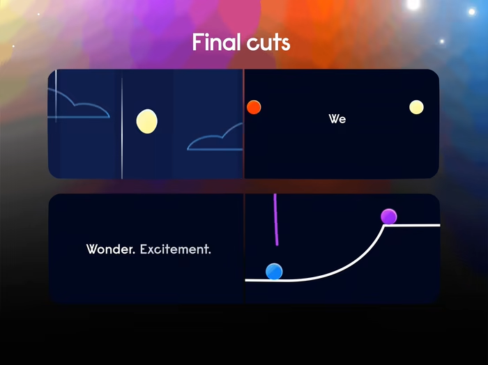
I took a radical approach: stripped away the noise and bet entirely on Kinetic Typography. The text became the main hero.
This case study proves that kinetic typography is the ultimate tool for B2B:
Typography is pure emotion. A dynamic 2D style must amplify the core meaning behind every word.
Transitions command focus. Seamless flow between phrases locks the viewer’s eyes onto the screen.
Adaptability is key. One asset must perform equally well in a professional LinkedIn feed and on Reels.
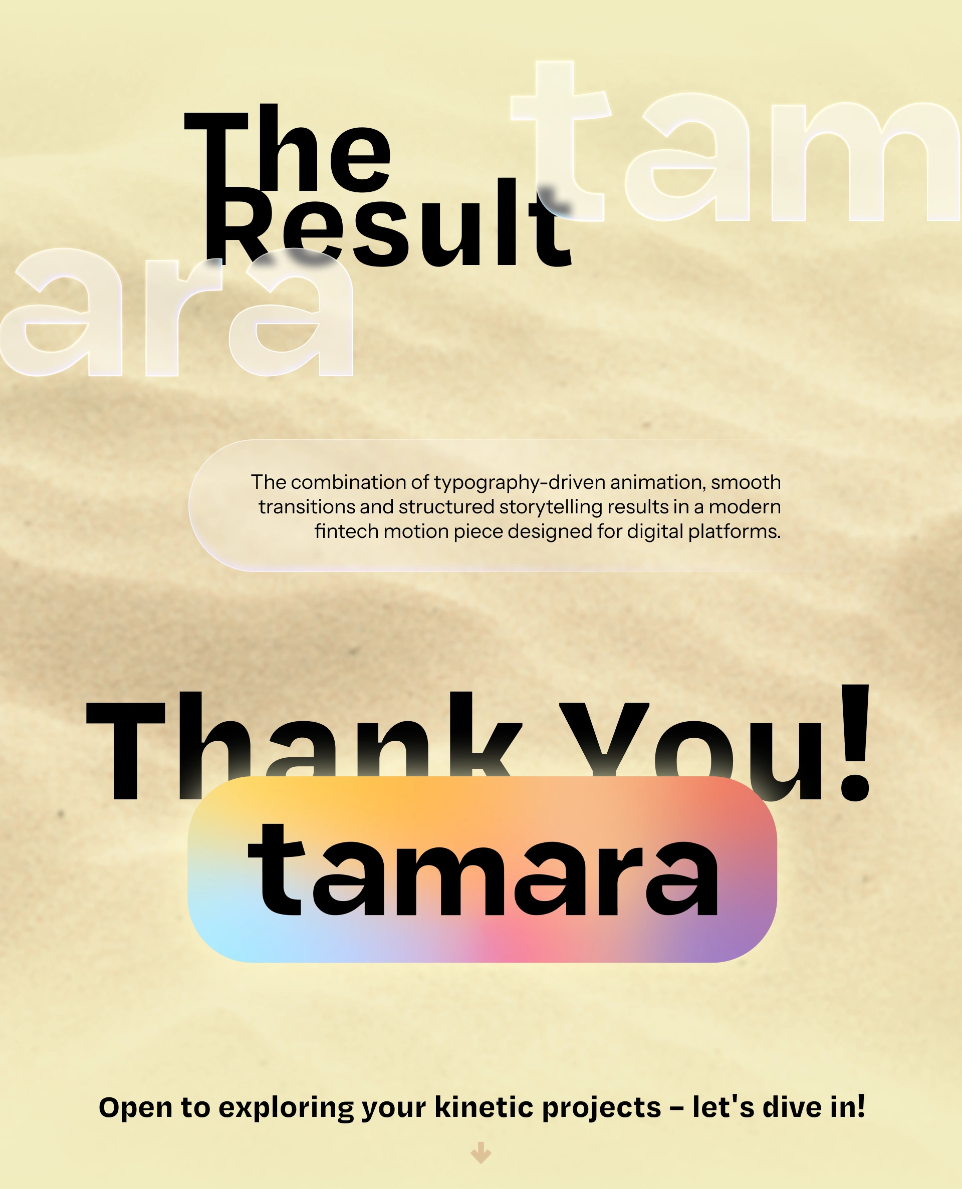
Today, this exact video successfully generates leads across their active ad campaigns.
Like this project
Posted Jul 2, 2026
How to make users read 60 words about a complex SaaS? Dropping the noise for sharp Kinetic Typography brought real leads. Motion Design is engineering attention