LNB

Jamie G

retail storeS + cafe
LNB
01
02
03
CHALLENGE
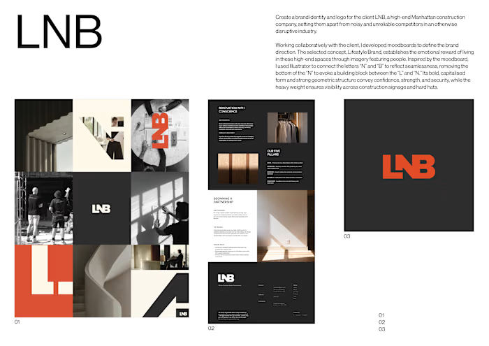
Create a brand identity and logo for the client LNB, a high-end Manhattan construction company, setting them apart from noisy and unreliable competitors in an otherwise disruptive industry.
APPROACH
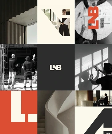
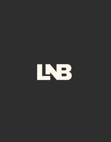
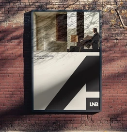
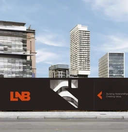
Working collaboratively with the client, I developed moodboards to define the brand direction. The selected concept, Lifestyle Brand, establishes the emotional reward of living in these high-end spaces through imagery featuring people. Inspired by the moodboard, I used Illustrator to connect the letters “N” and “B” to reflect seamlessness, removing the bottom of the “N” to evoke a building block between the “L” and “N.” Its bold, capitalised form and strong geometric structure convey confidence, strength, and security, while the heavy weight ensures visibility across construction signage and hard hats.Additionally, three photographic styles were developed. The first presents workers as refined and professional, removing loud traditional construction markers such as hard hats to position them as “invisible builders” responsible for seamless execution. The imagery is also presented in black and white to maintain a cohesive social media presence. The second style, Shadow Work, showcases the company’s attention to detail and craftsmanship by capturing unique shadows and light interacting with architectural details. The third style focuses on the emotional reward of relaxing in the finished high-end spaces, depicting people inhabiting and interacting with the environments through minimal, naturally lit compositions that reinforce lived experience as much as architectural form.The visual identity is supported by bold sans-serif typography chosen for clarity, confidence, and impact. The graphic device deconstructs the logo typography into building blocks, referencing structure and stability. Orange accents introduce warmth and create a signature brand colour, used in logo variations and throughout social media, increasing visibility within a restrained palette.
FINAL CONCEPT
Overall, the editorially inspired visual identity uses photographic and graphic elements to communicate the emotional reward of a luxurious lifestyle, repositioning LNB as a brand defined by precision, reliability, and genuine care, bringing mastery and warmth to a typically disruptive industry.
04
2025
LNB
CONSTRUCTED IDENTITY
SOCIAL FEED
PoSTER
Like this project
Posted Jul 2, 2026
Brand identity and logo for LNB, a Manhattan construction client, using editorial visuals and refined graphics to position the firm as precise, reliable and luxurious.
Likes
0
Views
2