Built with Framer
Pipeline.tech B2B GTM Outbound Agency Website Redesign
Approve request to show earnings
View

Aryan Tanwar
Verified


Project overview
Pipeline.tech helps established B2B companies build outbound pipeline through email, calling, LinkedIn, market research, campaign infrastructure, sales agents, and RevOps.
The company had a substantial service behind the website, but explaining every part of that service created a design challenge. Presenting everything at once would overwhelm a buyer. Simplifying it too aggressively would hide the depth of Pipeline.tech's work.
I redesigned the website to make the offer easier to understand without reducing it to another generic lead-generation agency pitch.
The project included website strategy, information architecture, copy hierarchy, visual direction, custom graphics, responsive design, motion, and the final Framer build.
The challenge
Pipeline.tech does not sell a single outbound channel or isolated campaign. Its offer combines several connected capabilities:
Market research and total addressable market mapping
Ideal customer profile scoring and data verification
Cold email, calling, and LinkedIn outreach
Campaign infrastructure and deliverability management
Reply qualification and lead routing
Sales agents and RevOps support
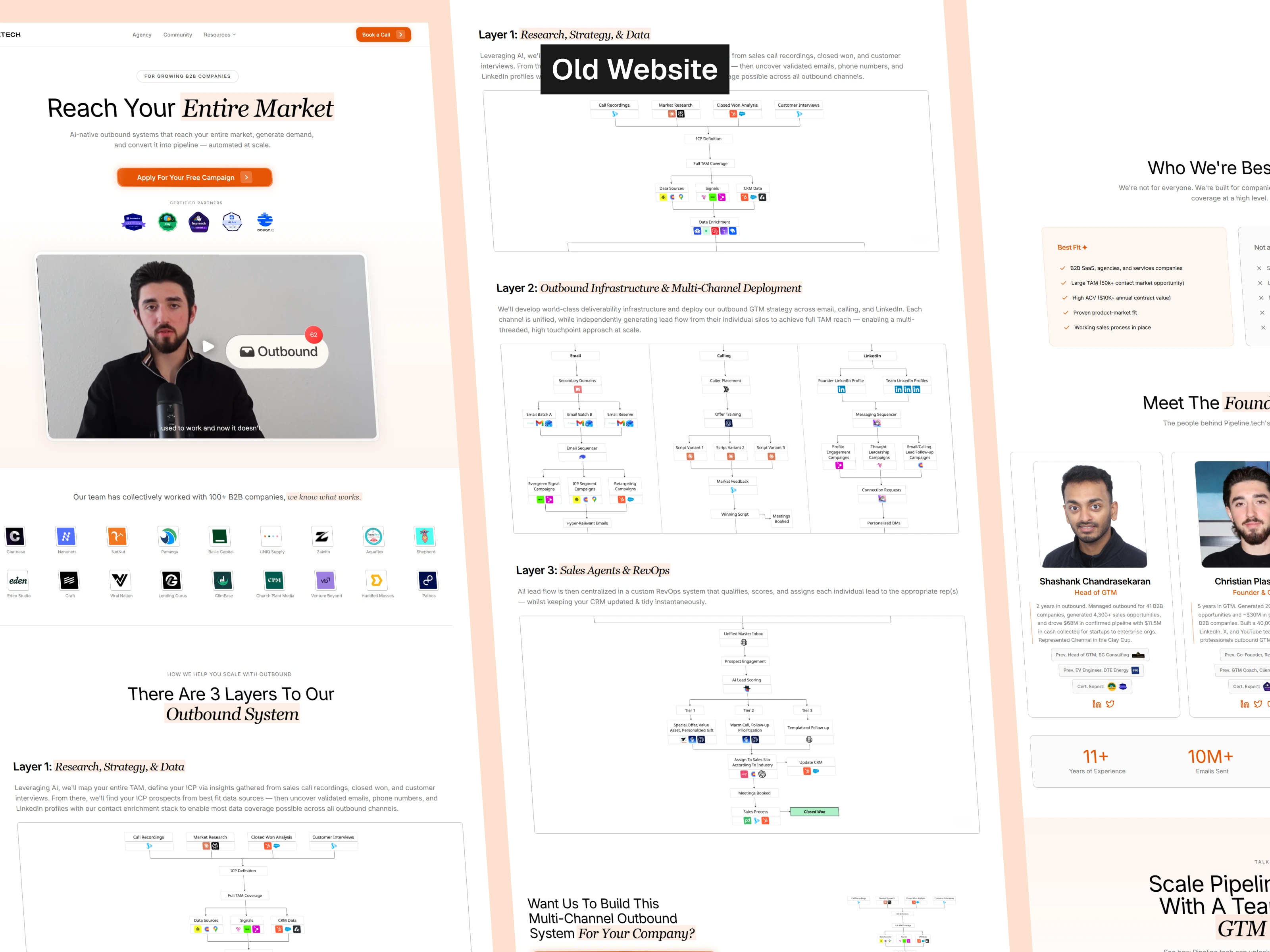
Old website
The old experience contained valuable information, but the relationship between these services was not immediately clear. A prospective client needed to understand who the service was for, what Pipeline.tech operated, how the individual parts worked together, and what evidence supported the offer.
The redesign therefore needed to solve three problems:
Explain a technically complex service in plain language.
Build credibility without relying on exaggerated marketing claims.
Create a distinctive visual identity that could scale across the website.
Turning the website into a buyer journey
Instead of treating the homepage as a collection of independent sections, I structured it like a sales presentation.
Each section answers the next question a prospective buyer is likely to have:
Is this service intended for a company like mine?
What outcome is Pipeline.tech offering?
What is preventing that outcome today?
How does the Pipeline.tech system work?
What evidence supports it?
Is my company a suitable fit?
What happens if I apply?
Problem → System → Proof → Fit → Team → Action
The structure helped preserve the sophistication of the service while making the page easier to follow for someone who had never worked with a GTM agency before.
Clarifying the offer in the hero
The hero needed to explain the core offer before the first scroll.
It identifies the audience as established B2B teams and presents one central promise, while email, calling, and LinkedIn appear as coordinated parts of the same outbound system.
The surrounding elements reinforce that message through operating metrics, trust indicators, team visibility, campaign activity, and one primary call to action.
Rather than introducing multiple competing offers, the hero focuses the visitor on a single next step.
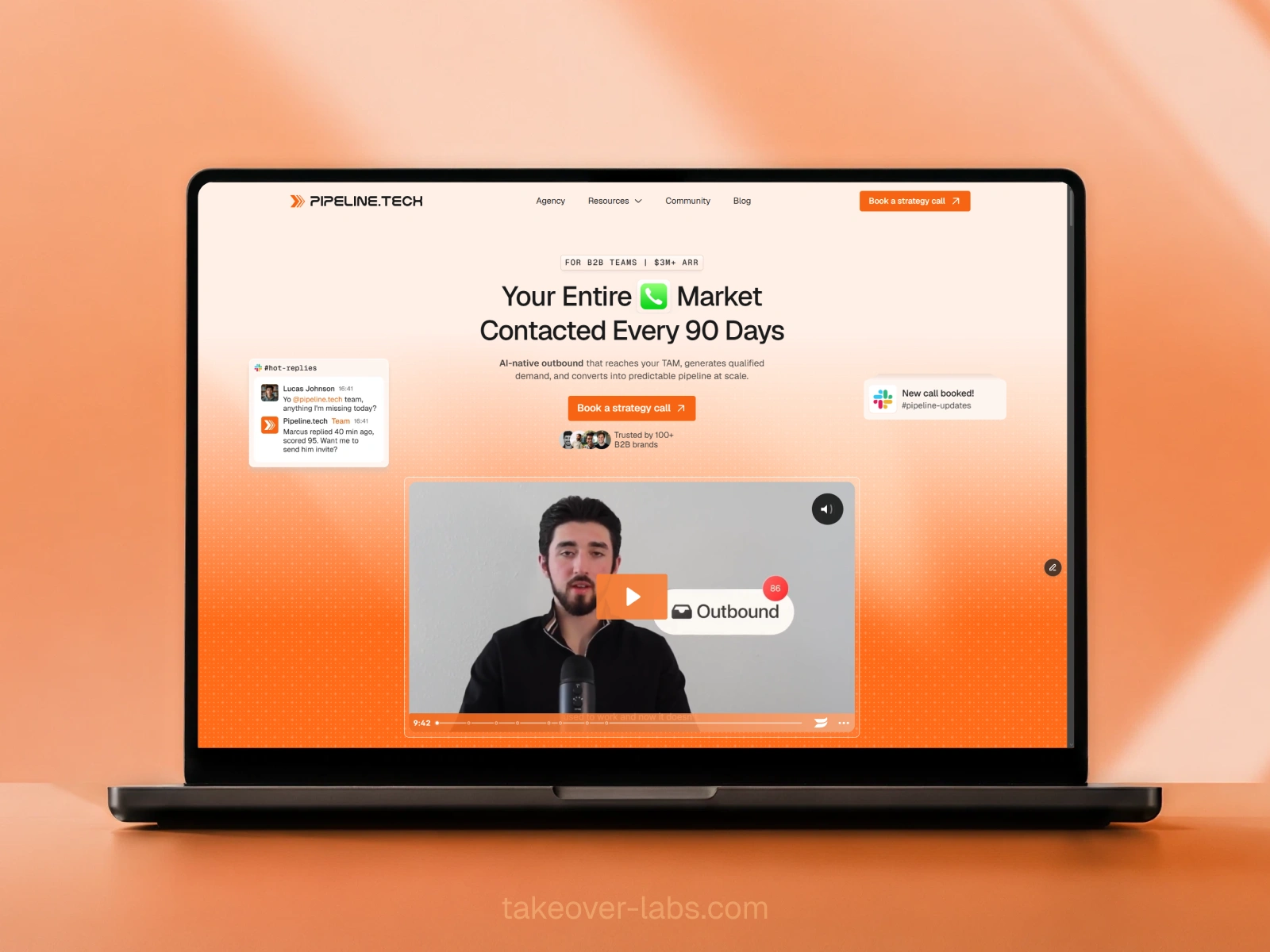
New hero section
Building a visual language for the GTM system
A major part of the project was creating a visual system that could explain how Pipeline.tech operates.
I extended the company's double-chevron logo into an architectural motif used across the custom graphics. That motif became the foundation for showing information moving through the outbound system.
Within the illustrations:
Circles represent people.
Squares represent tools and platforms.
Orange connections represent the flow of information and activity.
Socket elements allow different tools to appear within a consistent system.
This made the graphics functional rather than decorative. They help visitors distinguish the people, technology, channels, and workflows involved in delivering the service.
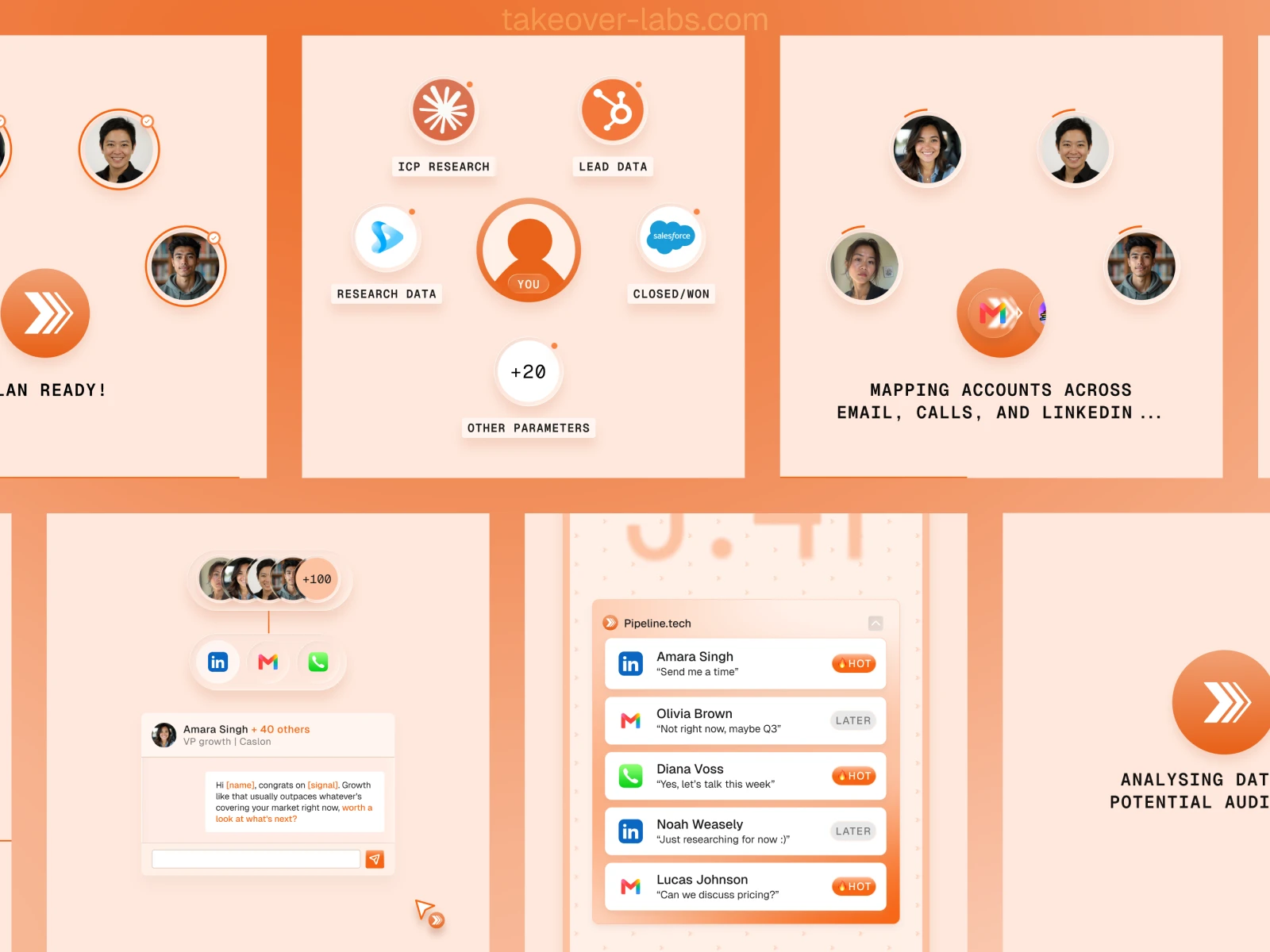
Animation illustrations for 3 layer system
Organizing the service into three layers
Instead of presenting a long list of deliverables, I organized the offer into three connected operating layers.
Layer 1: Research, strategy, and data
The first layer covers the work required before outreach begins. This includes mapping the available market, defining the ideal customer profile, researching accounts, scoring prospects, and verifying data.
The objective was to communicate that Pipeline.tech does not begin by sending messages to an unqualified list. The campaign starts with a defined market and a clearer understanding of which accounts should be contacted.
Layer 2: Multi-channel deployment
The second layer shows how Pipeline.tech coordinates email, calling, and LinkedIn.
These channels are presented as parts of one campaign rather than three disconnected services. The visual system demonstrates how the same market can be approached through different touchpoints while maintaining a consistent strategy.
Layer 3: Sales agents and RevOps
The third layer explains what happens once a prospect responds.
Replies must be reviewed, qualified, routed, and handed to the appropriate person. Sales agents and RevOps workflows connect campaign activity to the client's sales process.
Showing this final layer was important because outbound does not end when an email receives a reply. The operational handoff determines whether that interest can become a genuine sales opportunity.
Making the mechanism visible through motion
Some parts of the offer were easier to demonstrate through animation than through paragraphs of technical copy.
I created more than five custom motion sequences to show activities such as:
Mapping the total addressable market
Scoring and verifying ideal customer accounts
Coordinating outreach across several channels
Processing and qualifying responses
Routing conversations into the sales workflow
I also developed dedicated visual concepts for LinkedIn messages, email outreach, phone calls, hero notifications, and the final sales and RevOps layer.
The motion was designed to clarify what was happening on the page. It was not added simply to make the website feel more animated.
Establishing credibility in the right order
The website does not ask visitors to trust Pipeline.tech before explaining what the company does.
First, the page introduces the audience and offer. It then explains the operating model and demonstrates the mechanism. Proof appears after that context has been established.
The proof system includes:
Platform certifications
Operating metrics
Client testimonials
Video stories
Detailed case studies
Client logos
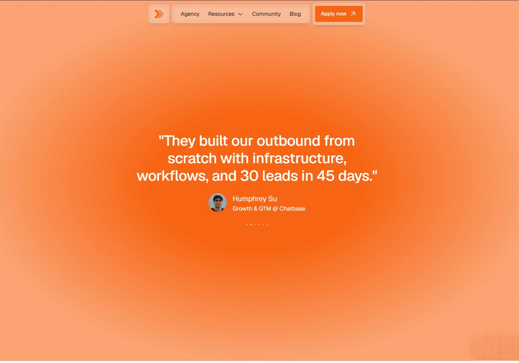
Testimonials
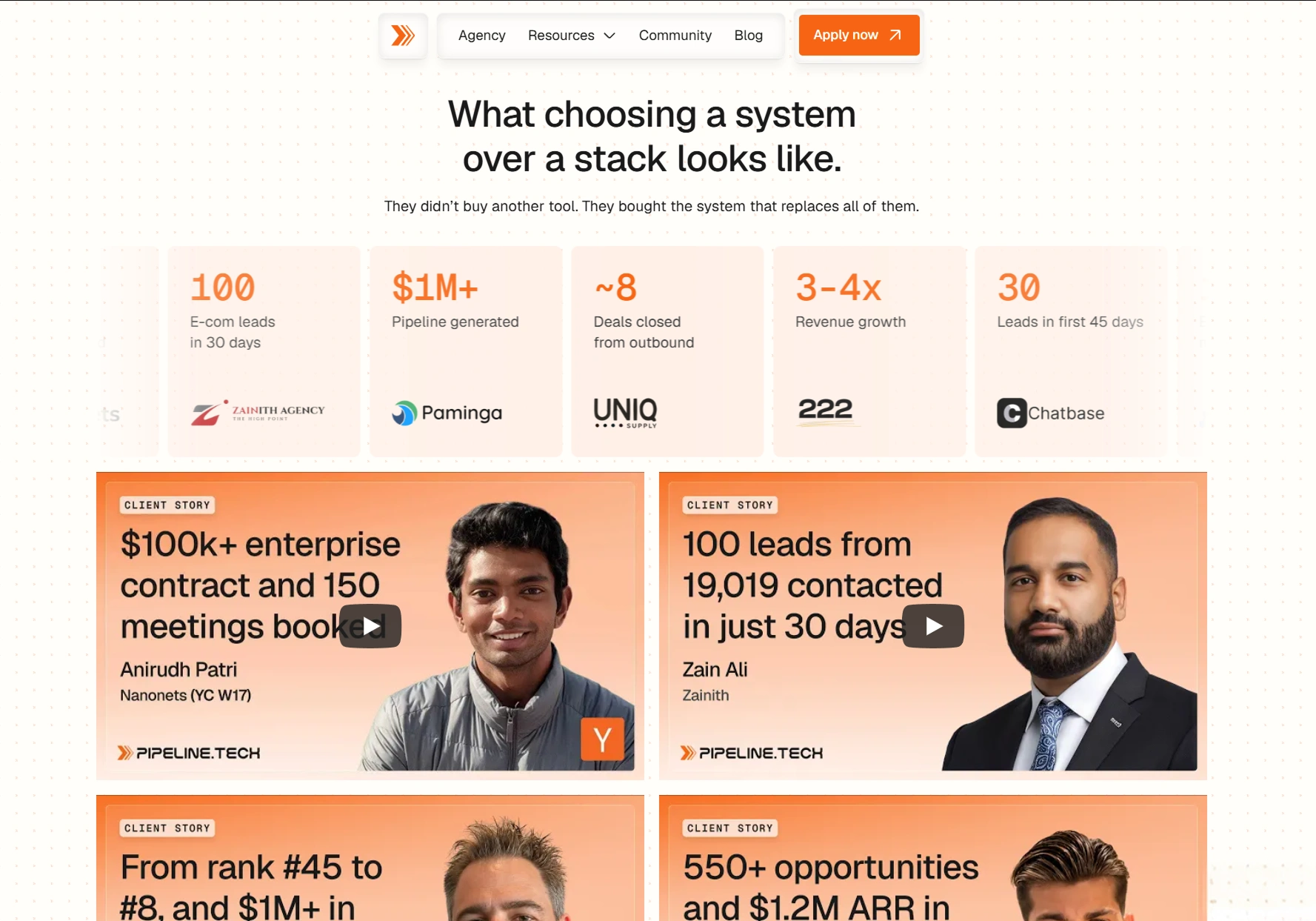
This sequence gives each proof point a clear role. Certifications establish technical familiarity, operating metrics communicate scale, and case studies provide more detailed evidence of how the work was performed.
I kept the messaging calm and specific throughout the site. Claims were based on information supplied by Pipeline.tech rather than expanded into unsupported performance promises.
Helping the right companies self-qualify
The website also needed to clarify who the service was built for.
Pipeline.tech primarily works with established B2B teams that have a sufficiently large market, meaningful contract values, and an existing sales function capable of handling new opportunities.
A fit-comparison section helps visitors assess whether the engagement is appropriate before booking a call. The following process section then explains what happens next:
Apply
Qualify
Launch
This reduces uncertainty around the call to action and helps set expectations before a prospect enters the sales process.
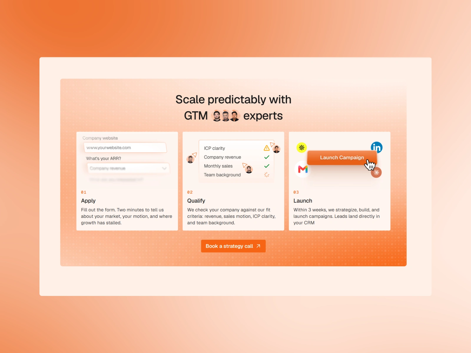
Creating a consistent visual direction
During the project, two potential visual directions were explored: a darker system and the warm, light theme developed for the website.
A hybrid approach was considered, but Pipeline.tech ultimately selected the light theme across the complete experience. This created a more consistent transition between the homepage, supporting pages, illustrations, proof sections, and calls to action.
The final direction uses warm cream surfaces, orange brand accents, restrained typography, and black text to create contrast without making the site feel aggressive.
For typography, I used a two fonts
Geist
Geist Mono
The type scale was adjusted across desktop, tablet, and mobile to preserve hierarchy and readability.
Designing and building the complete experience
The project began in Figma, where I developed the page structure, visual system, custom graphics, and motion concepts. The approved experience was then built responsively in Framer.
The final website covered four main areas:
Homepage
Case studies
Blog
GTM Bundle
Reusable visual patterns helped maintain consistency across these areas without forcing every page into the same layout.
The case studies were kept separate from the blog so prospective clients could access detailed proof without navigating through educational content. The blog retained its own long-form reading system and heading hierarchy.
The result
The final website gives Pipeline.tech a clearer way to communicate a complicated B2B outbound service.
Instead of presenting research, data, channels, tools, sales agents, and RevOps as isolated capabilities, the new experience shows how they connect as one operating system.
The result is not simply a cleaner interface. It is a more structured explanation of the business:
The hero establishes the audience and promise.
The problem sections reflect recognizable buyer challenges.
The three-layer model explains the service.
Custom animations demonstrate the underlying mechanism.
Testimonials, metrics, and case studies provide proof.
The fit section helps visitors self-qualify.
The process and team sections clarify what happens next.
This allowed the website to feel simpler without hiding the depth of Pipeline.tech's work.
My role
I was responsible for:
Website strategy and information architecture
UX and responsive web design
Visual direction and light brand refinement
Copy structure and messaging hierarchy
Custom GTM system graphics
Motion and interaction design
Figma design
Framer development
Case study and blog page systems
Project details
Client: Pipeline.tech
Industry: B2B outbound and go-to-market services
Platform: Framer
Design tools: Figma and Figma Motion
Project duration: Approximately three weeks
Live website: www.pipeline.tech
Like this project
Posted Aug 21, 2026
Redesigned Pipeline.tech’s Framer website to clearly present its B2B outbound services, GTM systems, client proof, case studies, and conversion path.
Likes
0
Views
16
Timeline
Jul 9, 2026 - Aug 10, 2026
Clients
Pipeline.tech